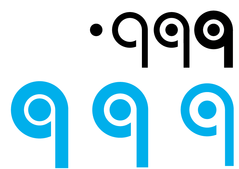
I began by creating and exploring the lowercase letter ‘q’ and creating a logo around it which slightly resembles the ‘Beats by Dre’ logo in a way.
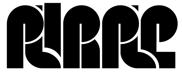
I then created the word “Purple” in Illustrator. This was achieved with lots of shape building tool and strokes. This is was a very difficult word to create.
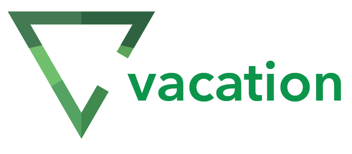
I was then able to create a logo using a triangle shape and the ‘pen tool’ tool in Illustrator to create a simple, clean ‘vacation’ logo.
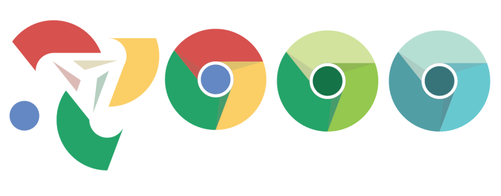
Following this, I was then tasked with recreating the Google Chrome logo. This was done pretty simply, with the finishing touch being added for the shading of each of the 3 colours.
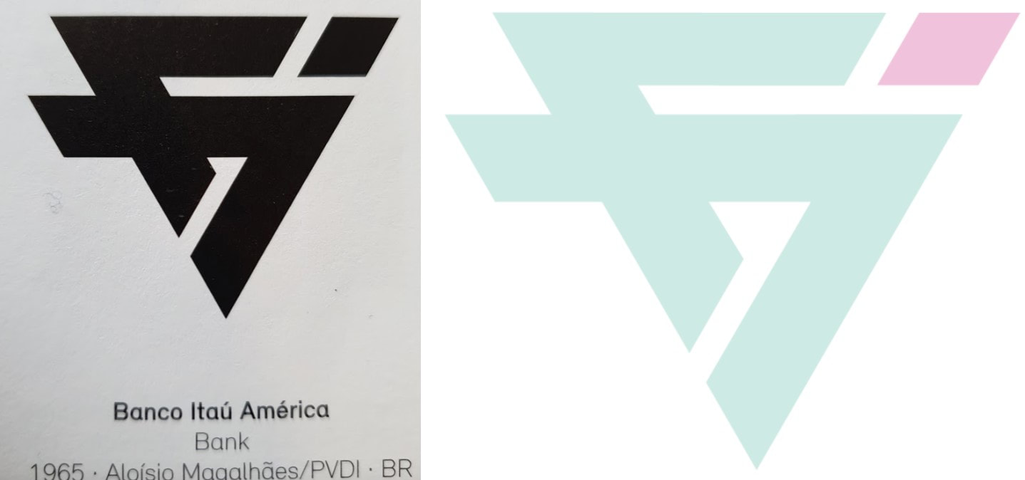
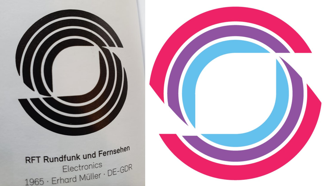
Using old logo’s from the 60’s in a book, I recreated them within Adobe Illustrator as well as giving it colour.

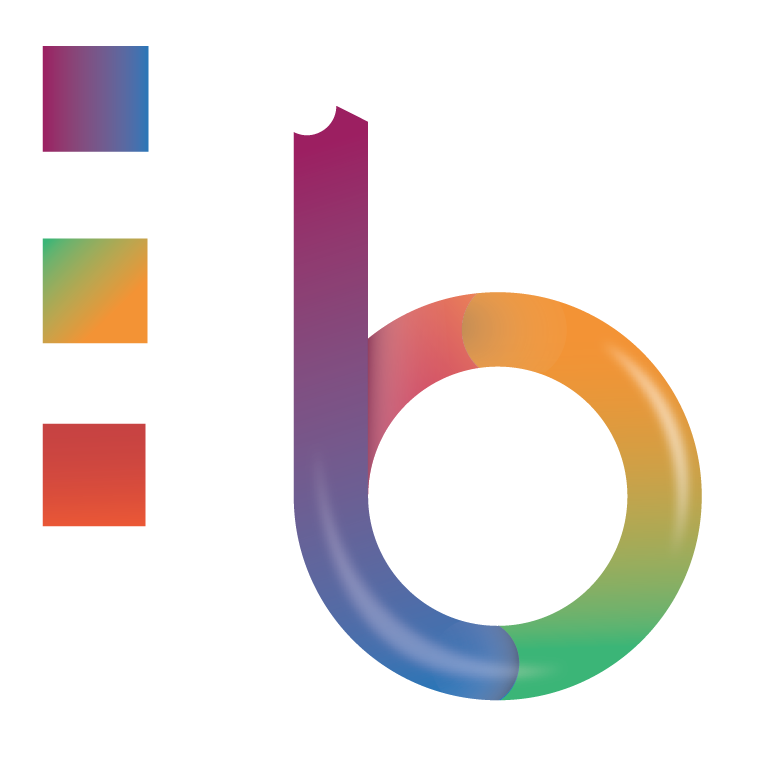
Making the letter “b”, I came across a challenge of the use of gradients and shadowing to giving it a slight “depth” – once understood, I was able to make the letter B slowly change into other gradients and even add light areas as if it is being hit by light.
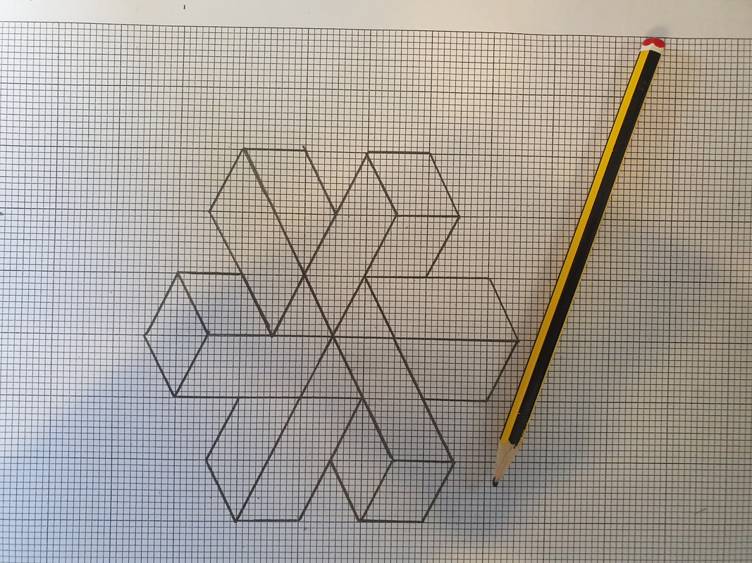
Following this, I sketched out an “impossible shape” from the web and then proceeded to recreate this shape within illustrator — using the gradient tool, shape builder tool and the pen tool for creating the lines.
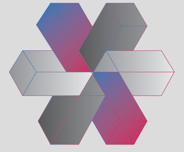
Digitalising the image within Adobe Illustrator.
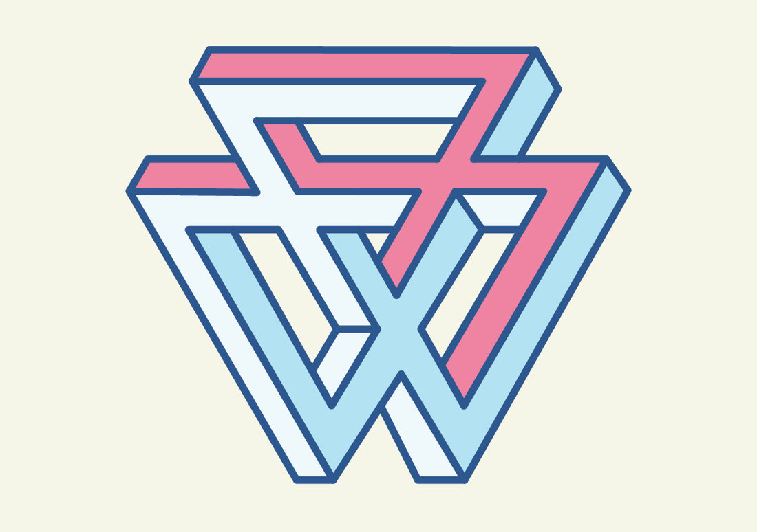
Following the same steps, I was able to create another impossible shape within Adobe Illustrator.
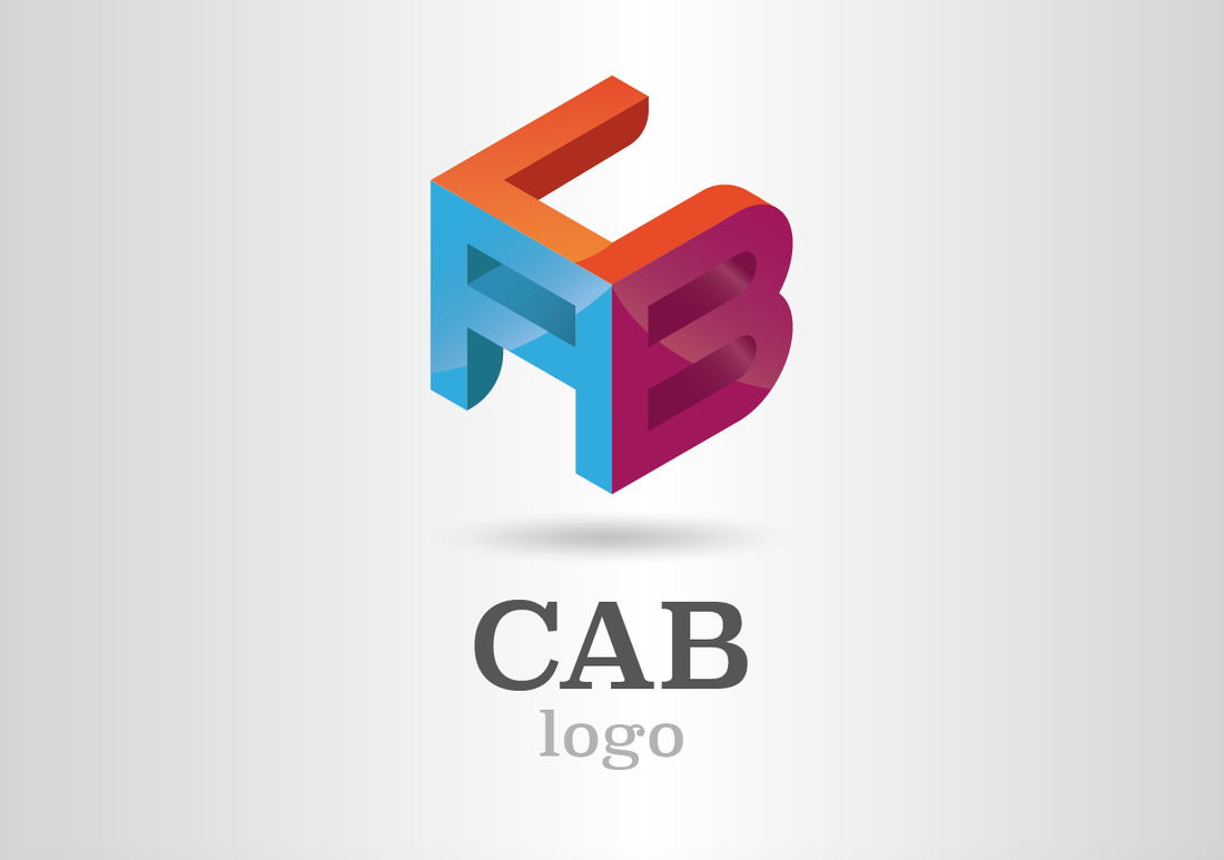
Following a tutorial – I created the ‘CAB’ logo which uses gradients as well as using perspectives to create a 3D like ‘cube’ with each letter. This was so I am able to understand and use perspective within logo’s.
Creating a logo for a business and business cards to follow
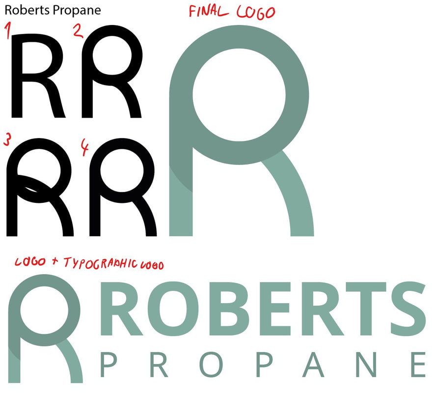
I began with creating the logo for the company “Robert’s Propane”. I began with a simple “R” which was taken from a font. I then attempted to recreate a similar style letter using shapes and the pentool. After this I began refining and improving it to find what I needed. In the end, I was able to create this logo which was the letters ‘R’ and ‘P’ made into one, this is shown by the use of colour as seen above.
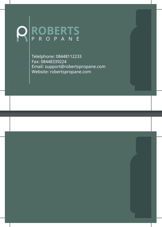
I then proceeded to create business cards for Roberts Propane which contained information about the business in a simple style with a minimalist propane tank on the right side. This was then saved as a .PDF file – ready to be sent off to the ‘client’.
‘Pentangle’ Games company logo assignment
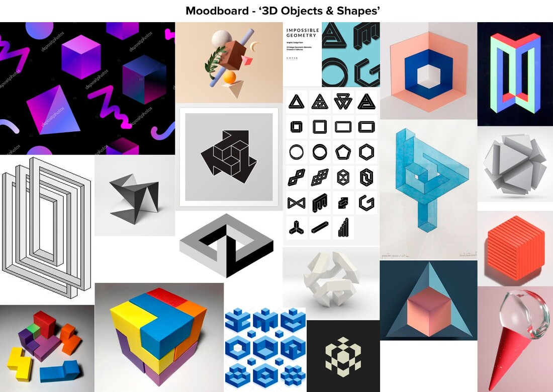
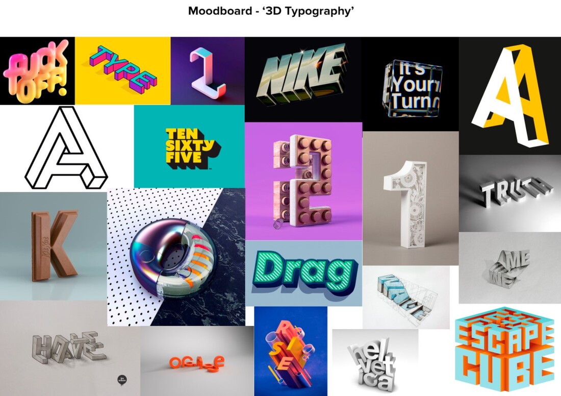
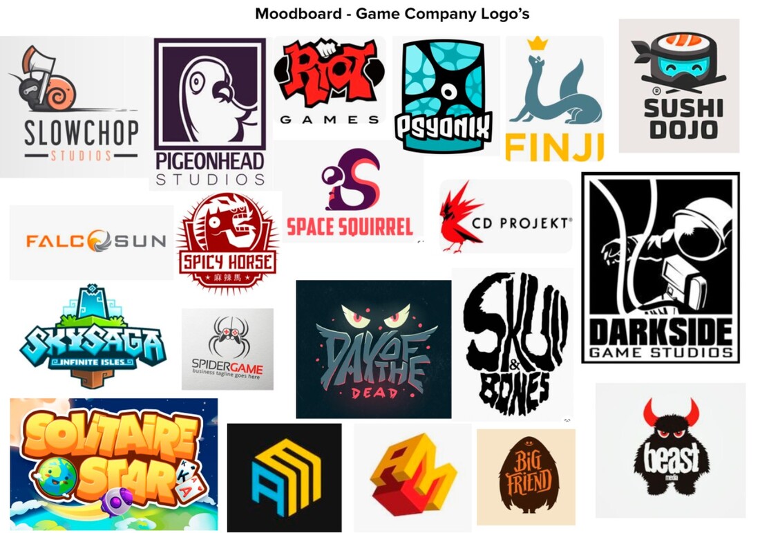
I assigned with creating a logo for a company named ‘Pentangle’ – my first step in this process would be to research similar logotypes, objects and shapes which would help me come up with an idea for the logo. To be able to do this, I created moodboards.
pt.2 – Research (Analyse examples)
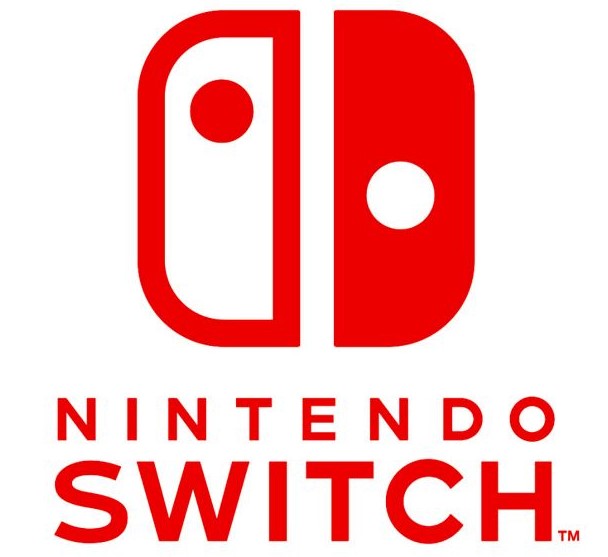
This logo is very simple. The logo utilises the colour of bright red possibly used to attract attention as it would make the eyes drawn to it purely just because of the colour palatte. It also uses negative space to it’s advantage when looking at the actual icons above the name, the shapes resemble the joycons used on the Switch however one is an inverted colour choice of the other which – I find very clever – and gives the logo some complexity which is easy to catch onto.
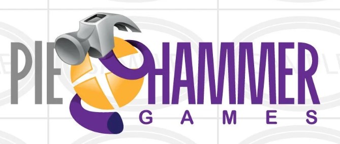
This logo incorporates 3 colours with shading and a use of perspective for the hammer. It also uses the companys name within the icon compared to the logo’s above which seperate the icon and the typography to their own ‘parts’. The use of yellow, purple and grey all complement each other and work together to create a logo that stands out if seen from a billboard, poster or any advert. This logo is also slightly more complex with the use of a twisting hammer around a pie which may mean that it would be less memorable for a consumer to be drawn from memory (compared to the ones above which are much easier to recognise and remember) however the ‘silliness’ of the logo could make up for being able to remember this company’s logo.
|
This logo is very simple. The logo utilises the colour of bright red possibly used to attract attention as it would make the eyes drawn to it purely just because of the colour palatte. It also uses negative space to it’s advantage when looking at the actual icons above the name, the shapes resemble the joycons used on the Switch however one is an inverted colour choice of the other which – I find very clever – and gives the logo some complexity which is easy to catch onto.
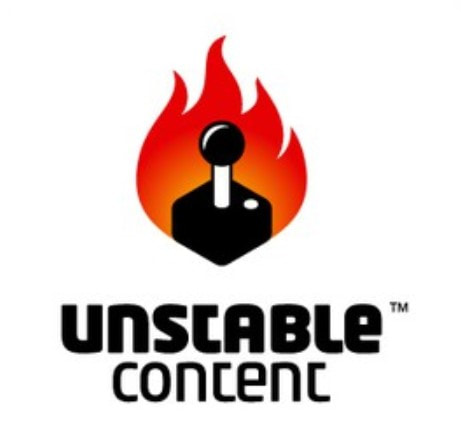
Unstable Content’s logo uses a games joy stick being on fire as the icon for the logo. This is possibly to suggest the company’s name being “unstable” therefore the joy stick is on fire. The company’s typography is layed below the icon coloured in black – this matches the joy stick being black to. The only thing with colour is the fire which uses a warm gradient from red to orange – this could be used to attract people’s eyes as red is a colour that a human eye will be drawn to.
|
“PENTAGLE” logo – Developing Ideas
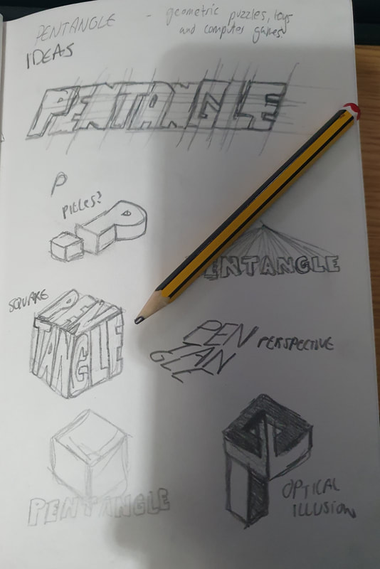
After researching already made logos, shapes and typography. My next step was to finally create and develop ideas for my assigned company “PENTAGLE”. Using the moodboards above – I began to sketch ideas for the logo.
|
I explored using a 3D square and somehow fitting the typography inside, however I did not find this idea appealing compared to other sketch ideas.
|
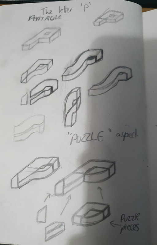
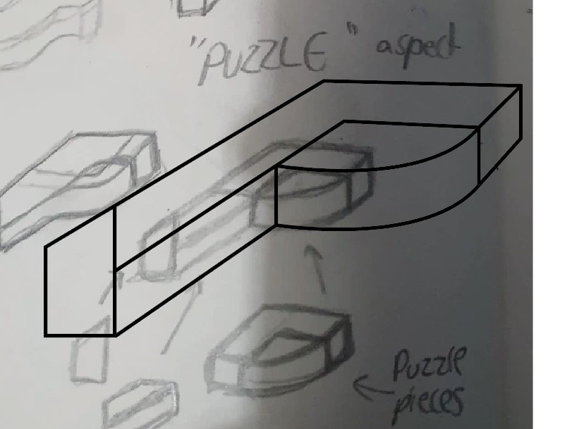
I began also developing the idea of the letter “P” laying on the side, with a 3D effect. Slowing developing the letter into shapes rather than one solid 3D letter. This would use the companies “toys and puzzles” aspect. I really enjoyed this idea.
|
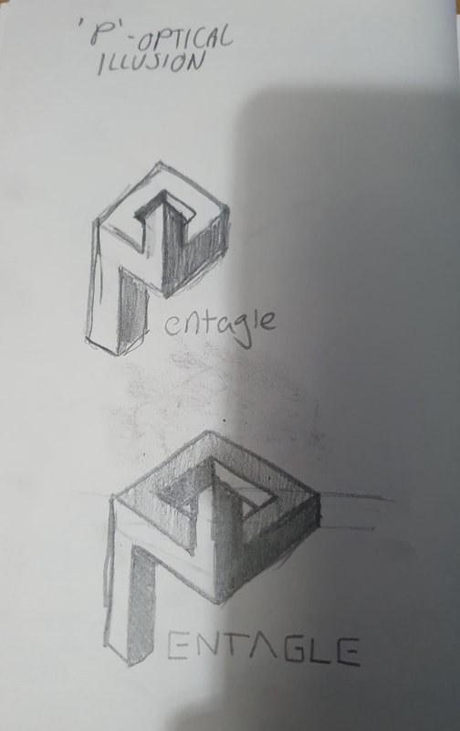
Another idea was to use an optical illusion. Here I create the letter “P” to have an optical illusion which was a hard task to draw but I believe came out very iteresting to look at.
|
Digital Refinement
‘P’ Optical Illusion Idea
With these sketches, I proceeded to Adobe Illustrator to refine them in a digital workspace.
|
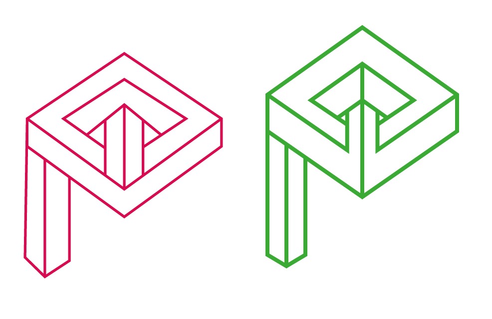
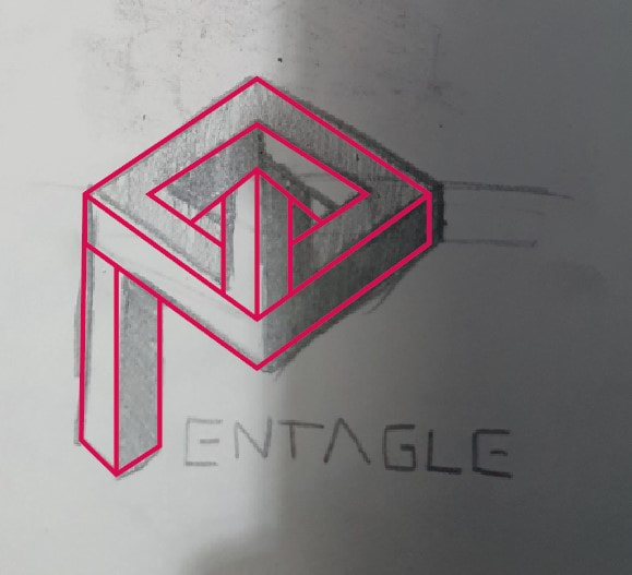
Recreating the optical illusion idea into Illustrator was a hard task and required me to retry this process multiple times before achieving what I believed to be the best outcome as I wanted all the lines to be perfect.
|

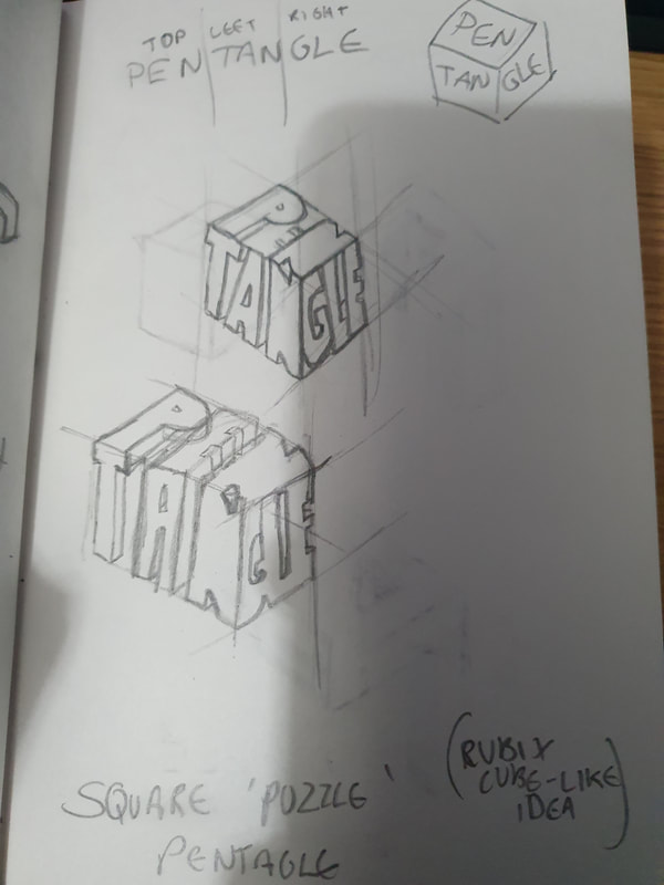
Pentangle – letter ‘P’ on side idea
I began by again digitising the sketched out logo. Only doing the outline with the pentool tool in Illustrator.
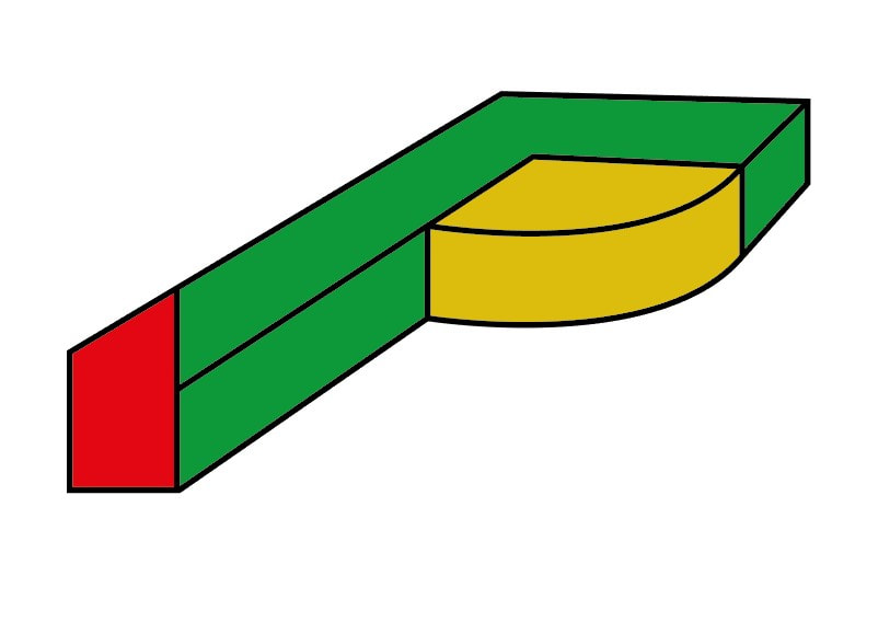
These colours are not final are only there to make it easier to tell apart each section.
I then chose to remove the outlines and give the shape some kind of shading by make areas darker so that it would be much easier to notice this letter is 3D.
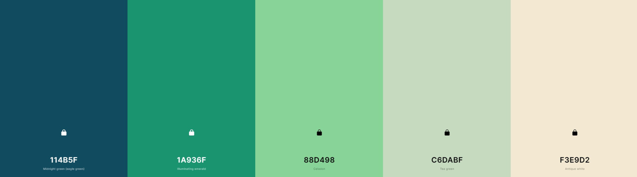
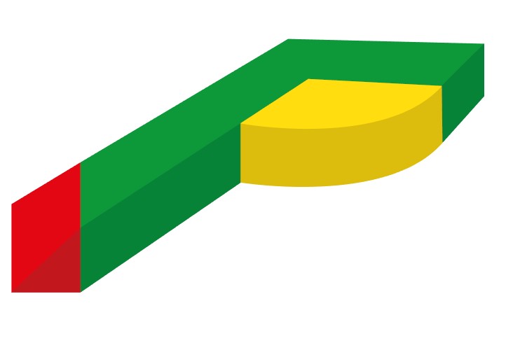
Using a website – I was able to find a colour scheme that I liked. This means that each colour complements each other and work well together. I used this colour scheme for the logo and the brand as a whole.
After applying the colour scheme, I moved the shapes out to give the effect of ‘shapes’. This plays well with the companies space of work which is ‘shapes’. I also gave a small square indent for the yellow shape so it was easier to tell its the letter “P” for Pentagle.

I also began finding the right typography to match this logo and came upon the font “Promixa Nova Bold” which matched the logo well. This created the final outcome of the logotype and iconography for pentangle.
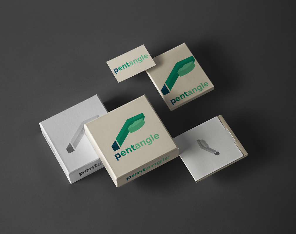
To finish off, I created a mockup look of the logo used as if in packaging. This would then be sent to the client to show how their branding would be presented on packaging. Overall I really like the outcome as the logo is something quite simple and easy with a simple colour scheme for a consumer to look at.
Design Report
| Unit 45 Design Report |
