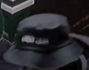
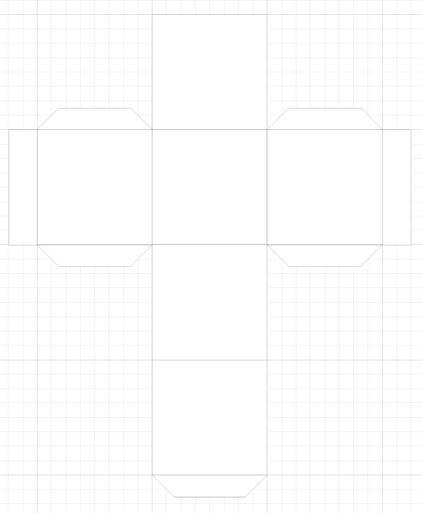
In this unit we were looking at designing and creating 3D packaging. To explore this unit, I first began by creating my own first 'tester' box with illustrator. This first box was to have a spiked ball inside. I began by measuring the ball and then creating a box template within Illustrator with tabs and folding lines.
After creating this first simple box, I then attempted an improved version. In this version, I added text and circles for holes - this was inspired by the recent branding of 'Off-White' where Virgil used holes in his bags and clothes.
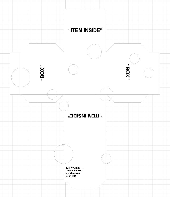
This is what I was able to create once I had cut the template out - along with the holes and sticking it together - with the ball inside.
Unit 43; Brief
My brief was to redesign packaging for 3 Ale bottles, by a company called 'Exmoor Ales'. By the end of this brief, I were to create 3 different labels for each of the labels and a box for each to be sold in boxes of 6/12 together.
To understand my brief, I began by answering three questions, to help understand my product.
What is the product?
I am developing packaging for a brand named 'Exmoor Ales' which is a beer brewery based in Wiveliscombe Somerset. The product will be made of a glass ale bottle possibly in a pack of four or six to sell them as a pack with design for the card to hold all the four bottles together as well as the label design on the bottle and a small design on the cap at the top.
Who is buying the product?
This product is targeted for a younger (20-30) but mature audience for the upper - more premium - class which could be sold in supermarkets such as Waitrose. This is suggested by Exmoor Ales focusing their branding on strong distinctive beers with great emphasis on British tradition. Therefore the packaging will need to appear more premium with the design and typography.
How are people buying the product?
This product is targeted to be sold at high-end supermarkets as well as being available on Exmoor Ales' official online store. For this product to be able to be sold at good volumes at the supermarkets, the packaging and overall look of the product has to entice consumers into making a purchase. This is done through the use of colour, typography and layout to help stand out on the shelf to compete with other competitor products on the same shelves.
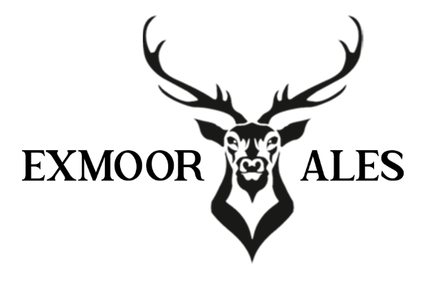
Branding
To understand the current branding for Exmoor Ales, I began by exploring the current designs, illustrations and typography used by the company. From here, I made a moodboard with these image.
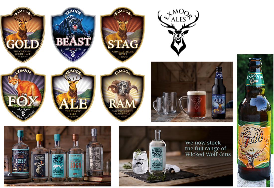
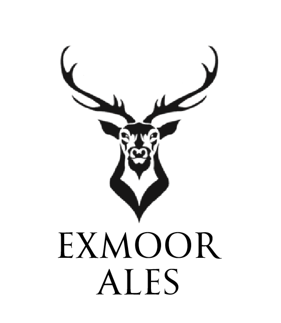
With this moodboard, I began exploring the companies logo. Exploring different illustrations and typography while still keeping in with the theme of a deer for their iconography.
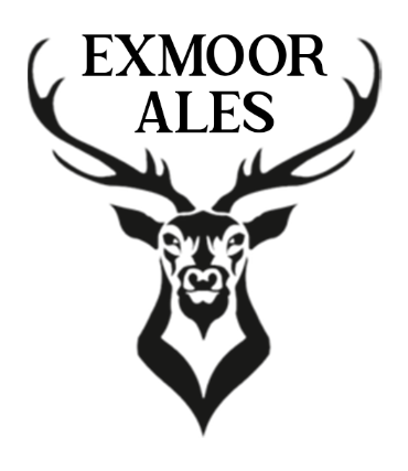
I decided to stick with the Serif font to keep the upperclass, premium feel and style which also could suggest a mature, older brand compared to a Sans Serif font which would suggest a modern approach which would appeal to a younger audience which I believe would not fit the target audience that Exmoor Ales already has.
I decided to stick with the Serif font to keep the upperclass, premium feel and style which also could suggest a mature, older brand compared to a Sans Serif font which would suggest a modern approach which would appeal to a younger audience which I believe would not fit the target audience that Exmoor Ales already has.
|
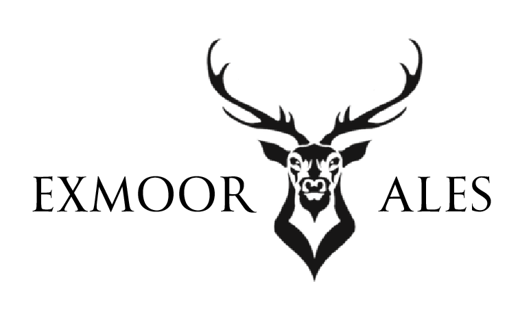
I played around with the layout and placing of the company name.
|
|
|
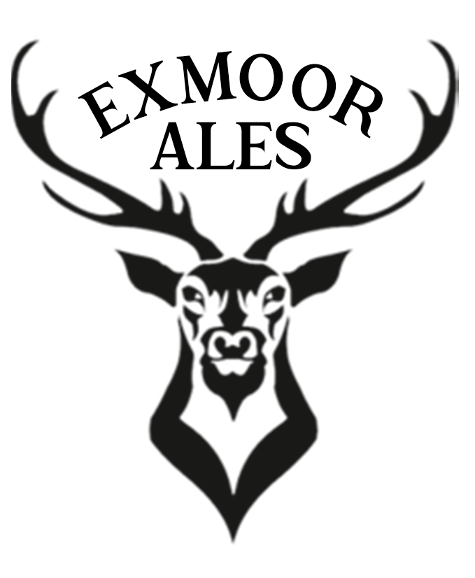
I then also played around with the use of a different, more bolder, font. Called: "The Texterius".
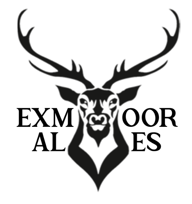
I attempted to use the logo to seperate the typography of the company however this did not work.
|
I also tested out the new font with the same placement of the previously used font.
|
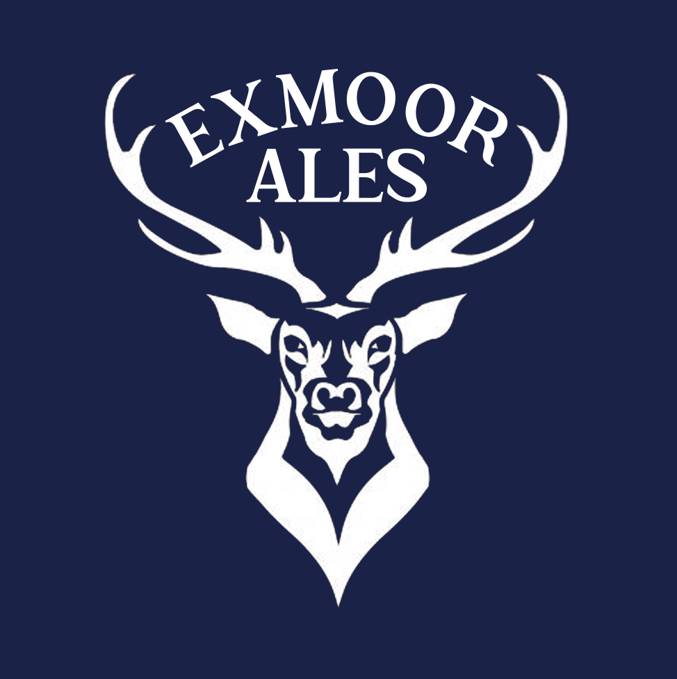
With this, I used the original iconography of the stag along with my own choice of typography for the logo to make this improved Exmoor Ale logo.
Packaging
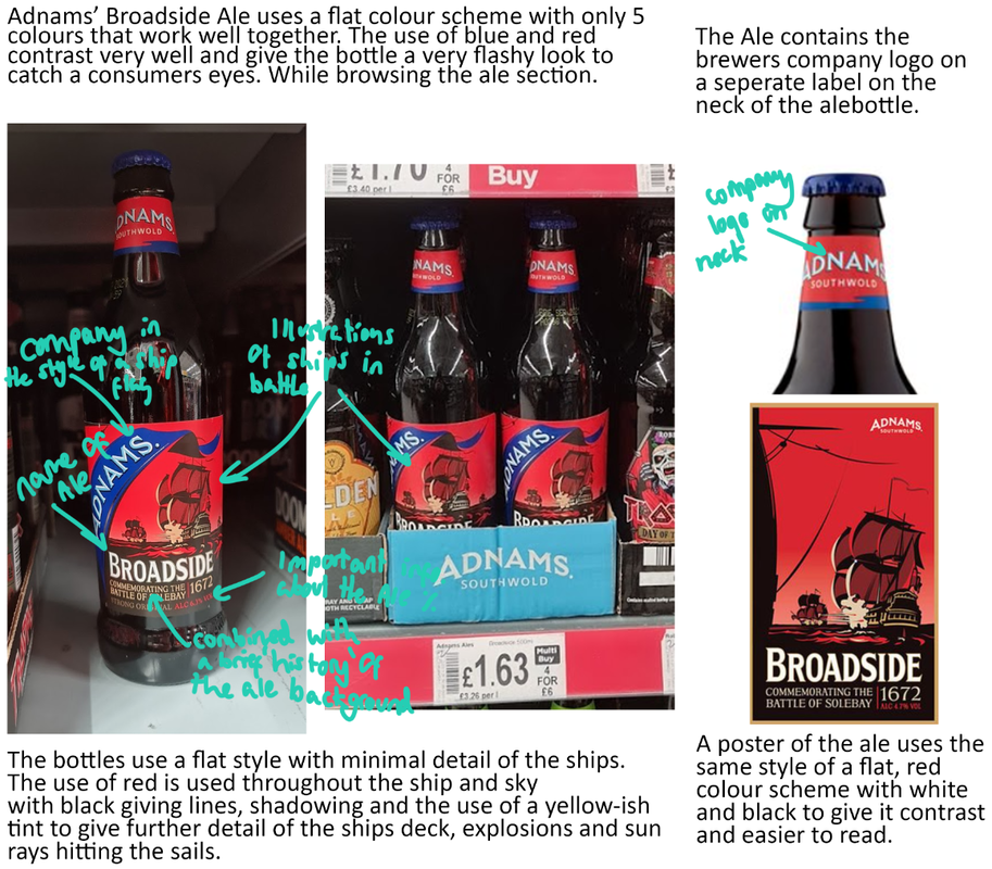
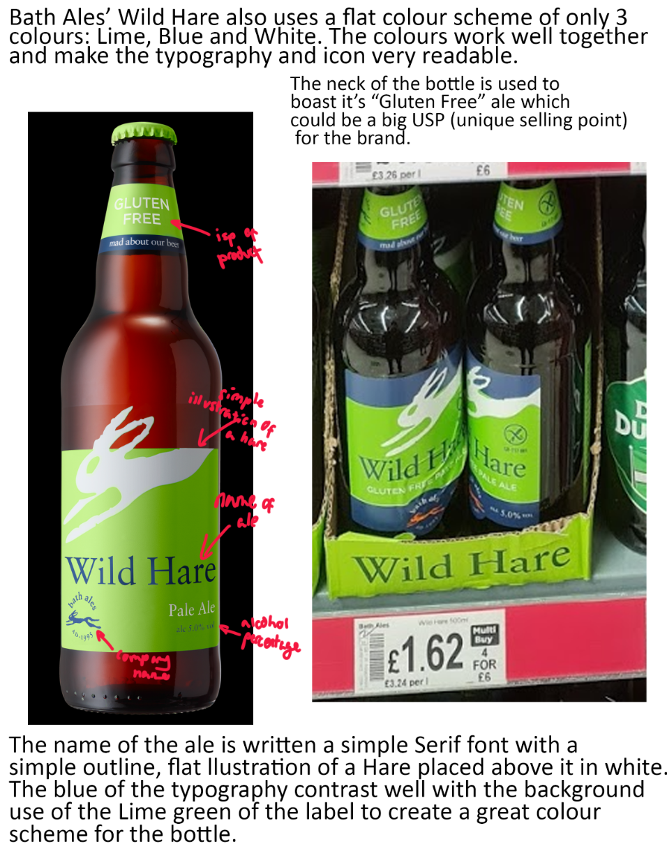
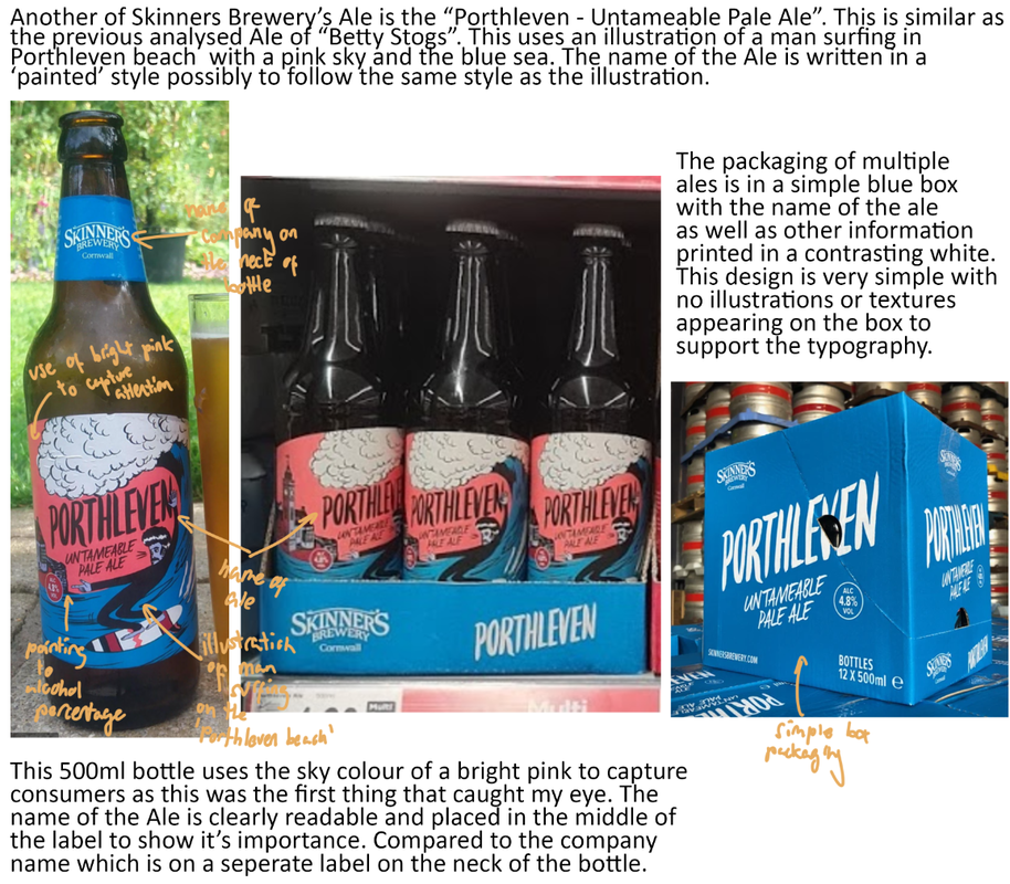
I was then tasked with identifying suitable materials for my ale bottles. So I selected & presented various potential packaging options for my product, from box packaging (of multiple bottles inside) to single Ale glass based packaging examples, below. These examples were found from the internet and real life in supermarkets.
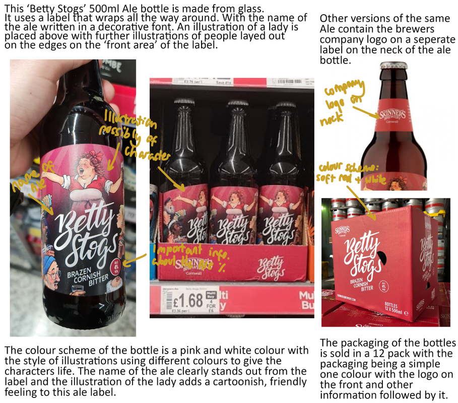
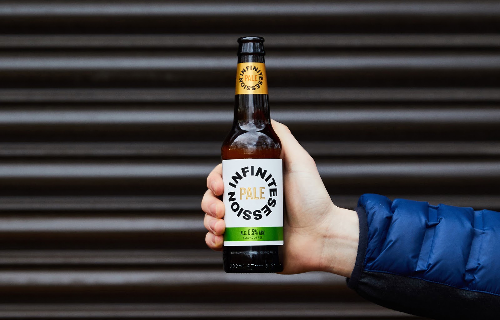
This beer contains a very simple typographic based label with the name of the ale displayed in circle with 'Pale' in the middle. The ALC Vol. is displayed in its own section in a green label below. This bottle also contains a neck label too however it contains the same information as the main label. In my opinion, this seems a bit useless as this neck label does not add much to the bottle in design or information so losing this label would not removing anything from the bottle itself. However, this bottle's typography-based label means that it is very easy and simple to understand as it only takes a couple seconds to read.
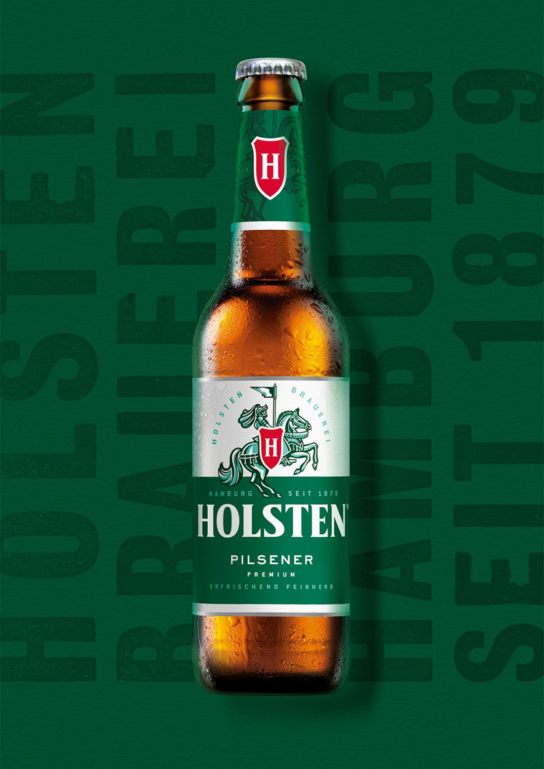
This beer contains a very simple colour scheme of green, white and a tiny amount of red for contrast. Different shades of green are used for the details on the house and the rider where as the label itself is split into two sections: white and green. The green section of the label contains the typography of the beer company and other information about the beer whereas the white is layed out above with the iconography layed out as flowing from the white into the green - connecting both the colours together. The use of green and white work very well together and the use of red makes the emblem and 'H' stand out very well.
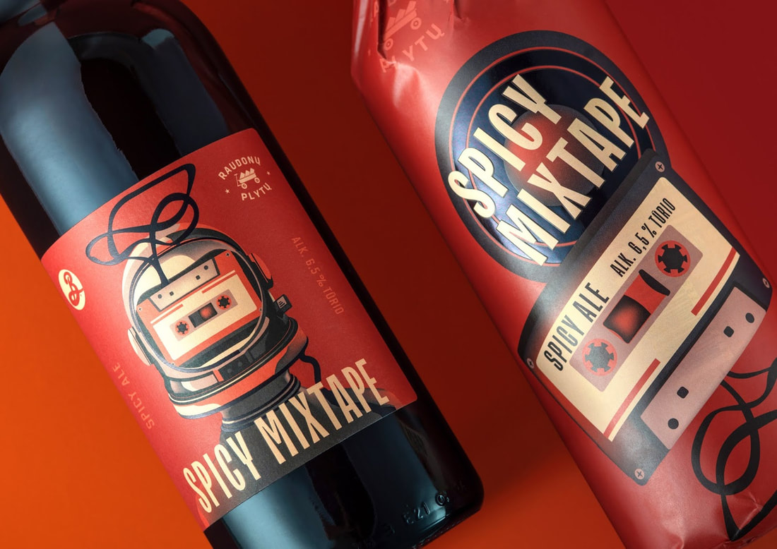
This cool label design contains a simple colour scheme of three colours; Red, Beige and Black. The colours white and beige work very well together whereas the black contrast with these colours giving it a great use of making outlines and also making objects stand out. The main label is a bright red where the subject illustration of a tape with a helmet being displayed as the main object of the label front. The title of the drink is displayed below in a Uppercase Sans Serif font making it easy to read and giving it a modern, stylish feel. Other information such as the taste and ALC Vol. are displayed on the sides in a light red making them readable but less readable as 'not-as-important' information compared to the name of the drink and the illustration.
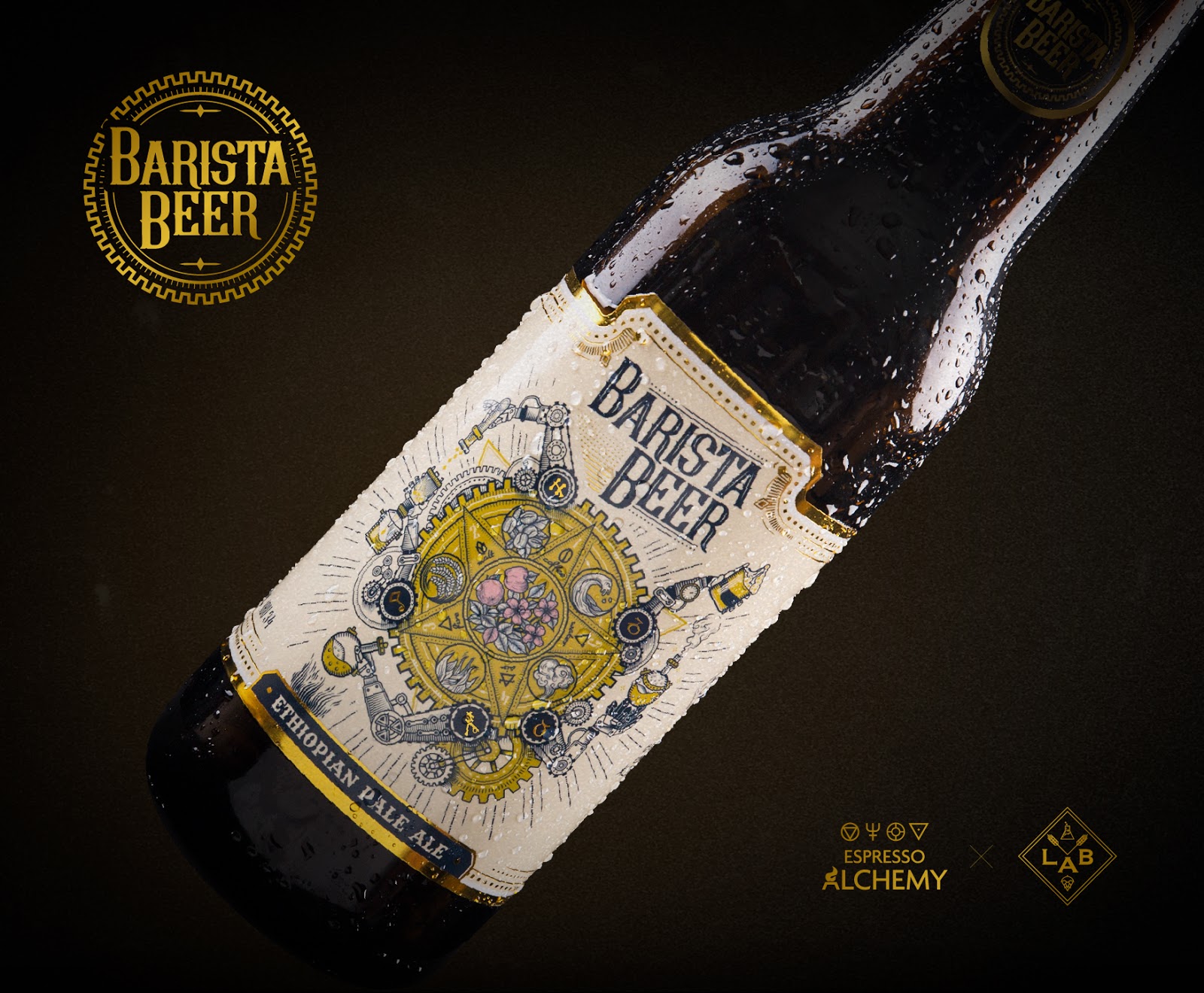
This final Ale label contains a very stylish and 'upperclass' feel with its font and colour scheme. The font is a very Serif, 'punk' type with works very well with the complicated illustration displayed in the middle of the label. The colour scheme is of a beige white along with lots of use of gold and dark-blue/black for the outlines of the illustration and typography for it to stand out. All this creates a very 'steampunk' feeling to this drink with the use of colours and typography to echo this which could possibly also give this drink a more premium, upperclass feeling.
Label Design
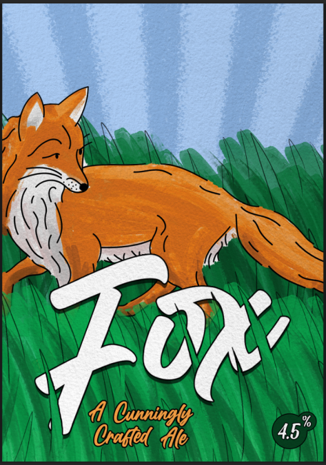
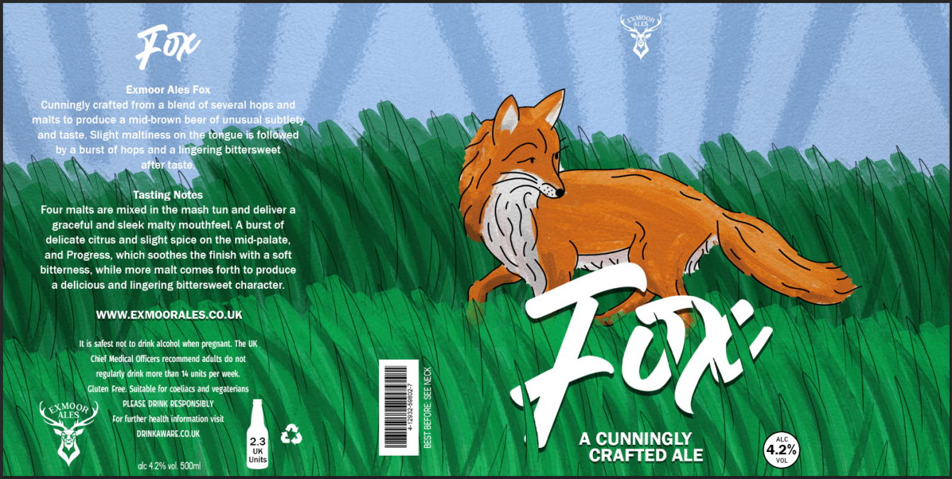
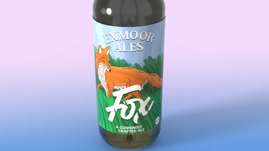
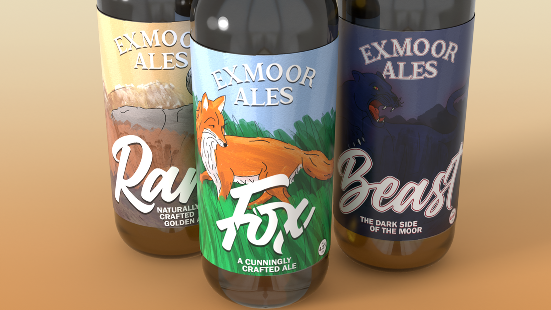
My first label design would be for Exmoor Ales' "Fox" Ale.
To begin I wanted to create a similar label layout for all three Ales and so whatever layout I would choose for the 'Fox' Ale, I would use a similar layout/style for the other two. With this - I began sketching ideas for the label and see which one would look best as the front and back label for the bottle.
To begin I wanted to create a similar label layout for all three Ales and so whatever layout I would choose for the 'Fox' Ale, I would use a similar layout/style for the other two. With this - I began sketching ideas for the label and see which one would look best as the front and back label for the bottle.
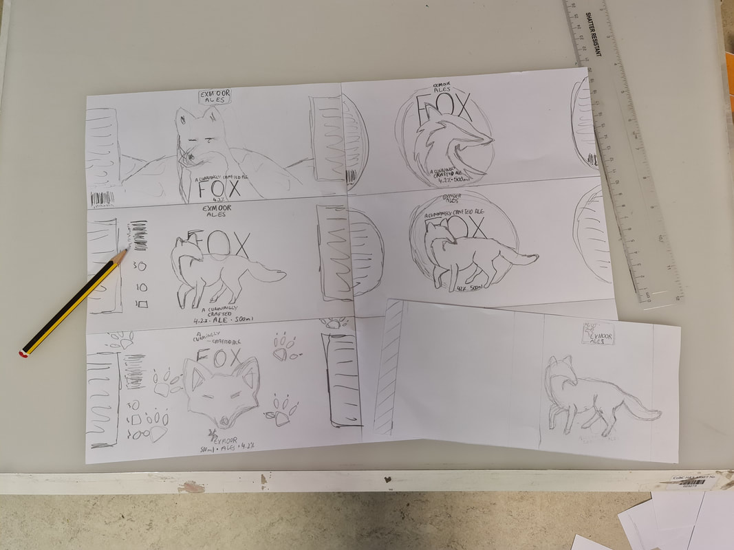
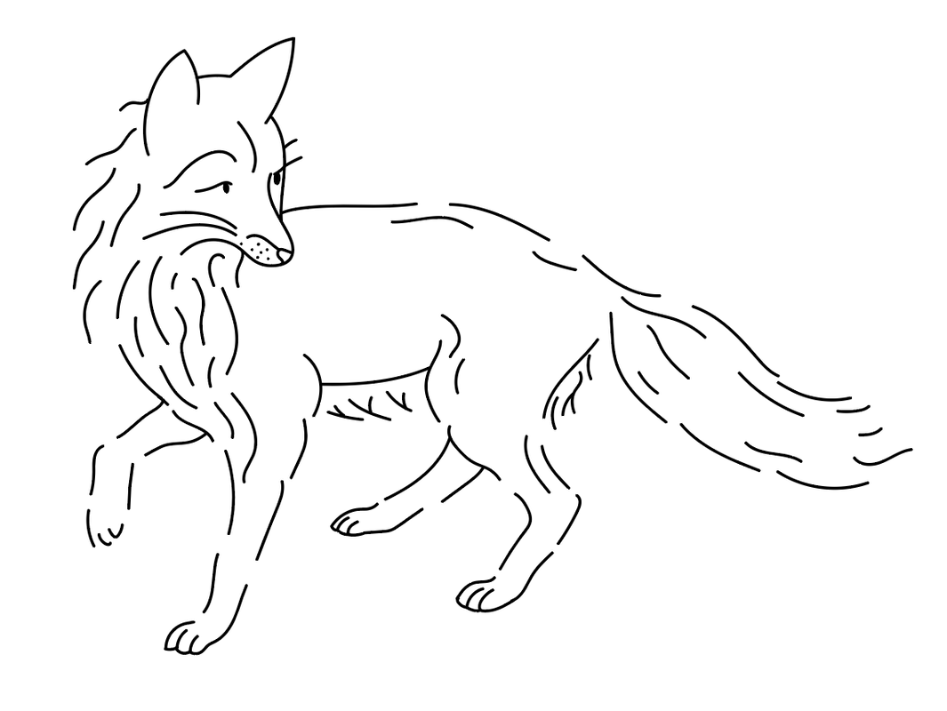
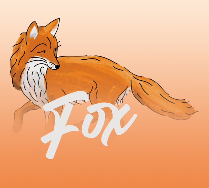
I then began sketching a fox similar to the idea I had on my label sketch ideas.
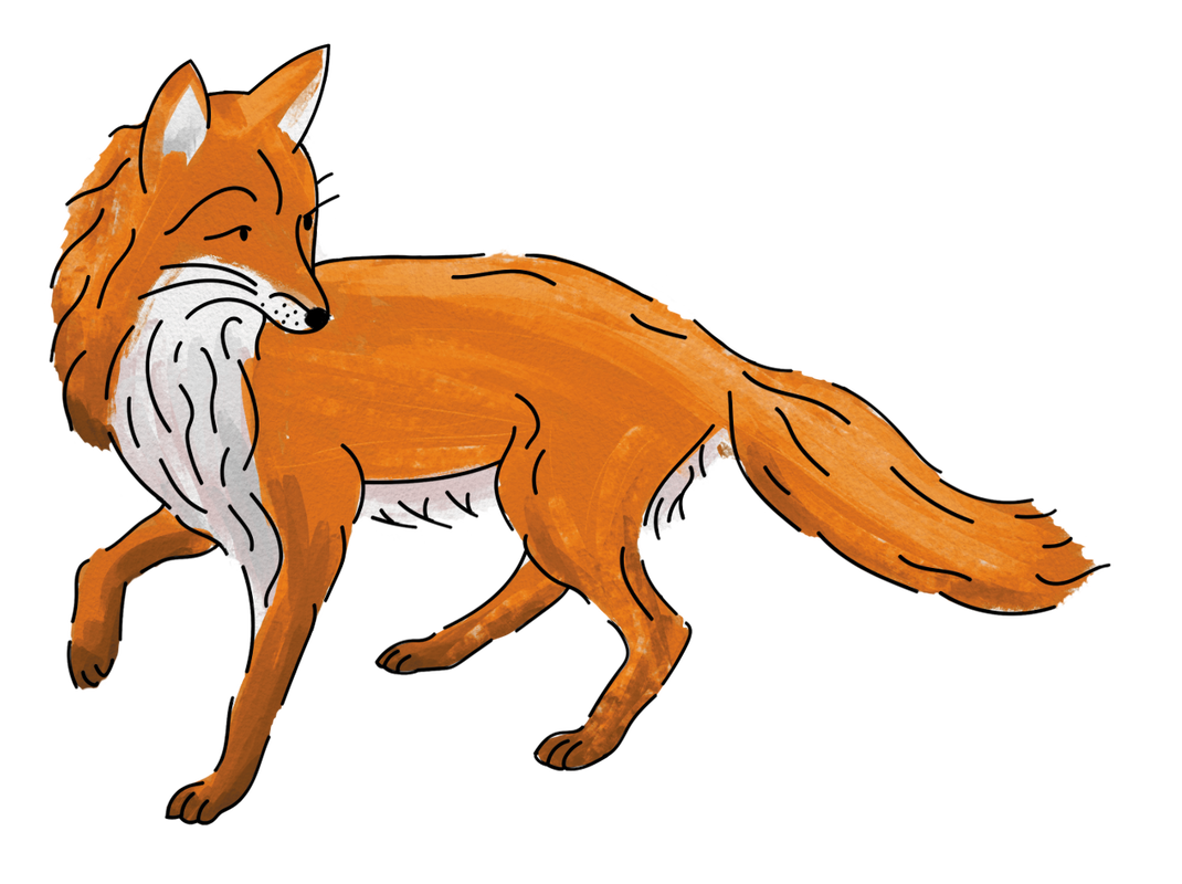
To colour in my fox, I used Photoshop with custom paintbrushes and created a watercolour effect. This was inspired by the 'Betty Stogs' drink I had previously used for research. I wanted to replicate a similar style to that and so that was used as my primary inspiration.
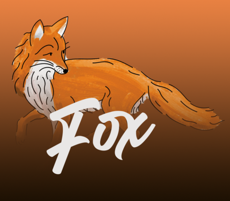
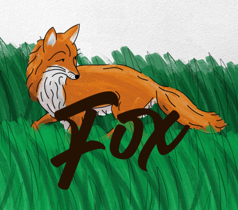
Similar to the 'Betty Stogs' designed, I attempted to use a gradient in the background of the label. However, this did not look great and so I attempted other methods for the background.
|
|
This is where I came up with the idea of painting grass in the same style as the fox. I the following step, I made is so of the grass went over the typography while still making it easily readible.
|
|
I then added the slogan to the Ale drink below the name of the Ale.
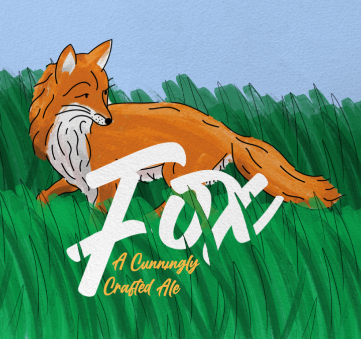
I then added the alcohol percentage which I then changed to a different style - similar to the style in my main inspiration of 'Betty Stogs'
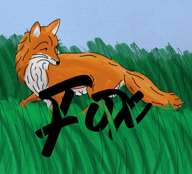
I also added line styled with the brush in the back which were seen in the previous design of "Exmoor Ale's Fox" label to honour the previous design on the bottle.
I also added line styled with the brush in the back which were seen in the previous design of "Exmoor Ale's Fox" label to honour the previous design on the bottle.
|
|
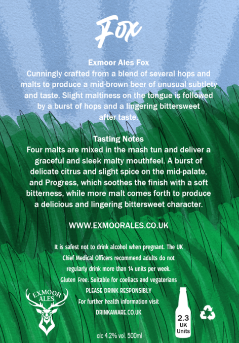
I then added information to the back side of the label which contains information on the Ale, Tasting Notes, Legal information and the name of the Ale along with the brewery and how many units it would be.
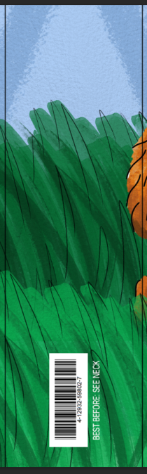
The side of the label would contain the barcode along with a notice for the Best Before Date.
The side of the label would contain the barcode along with a notice for the Best Before Date.
|
|
This would then all come together to make one label that would wrap around the body of the Ale bottle.
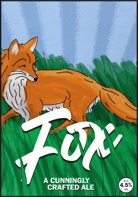
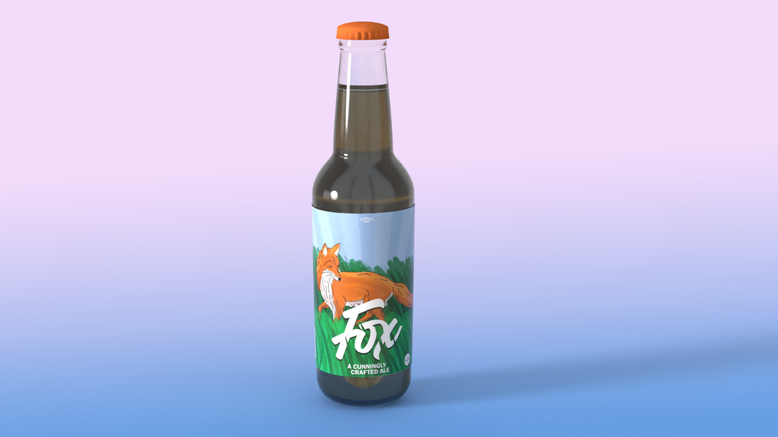
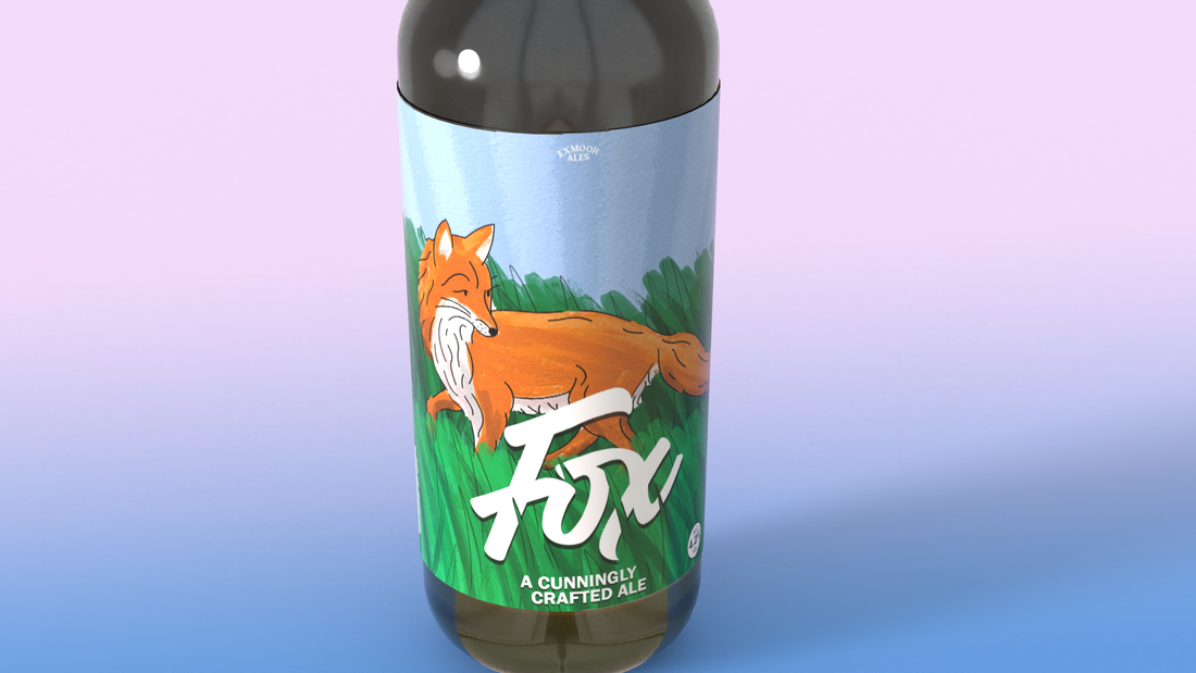
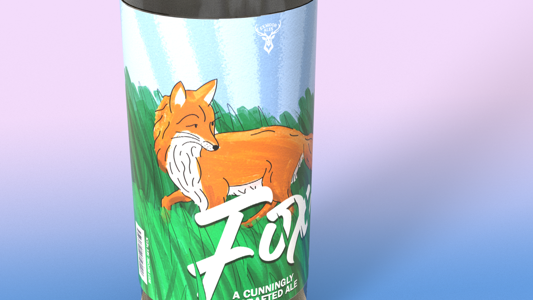
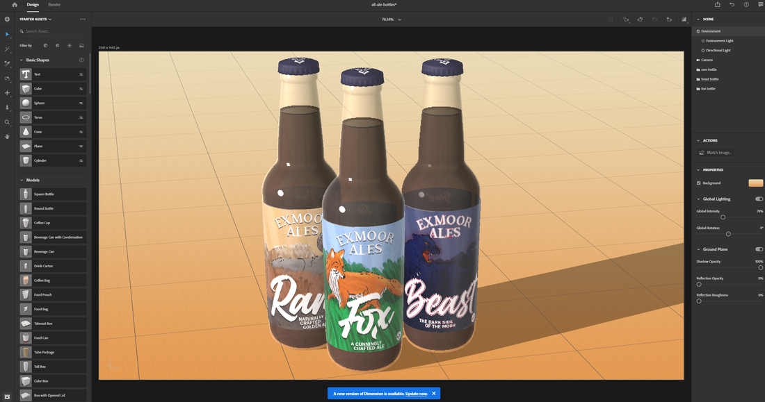
I then decided to render these with Adobe Dimensions however I do not like these and so below I improved the label.
|
|
|
I then decided to improve a few tiny things before using this label. I decided to make the 'Exmoor Ales' logo on the front label to be just the typography and improving the visibility of it by making it much larger. I also improved the typography for 'Fox' to make it more like it was written and altogether smoother style of writing.
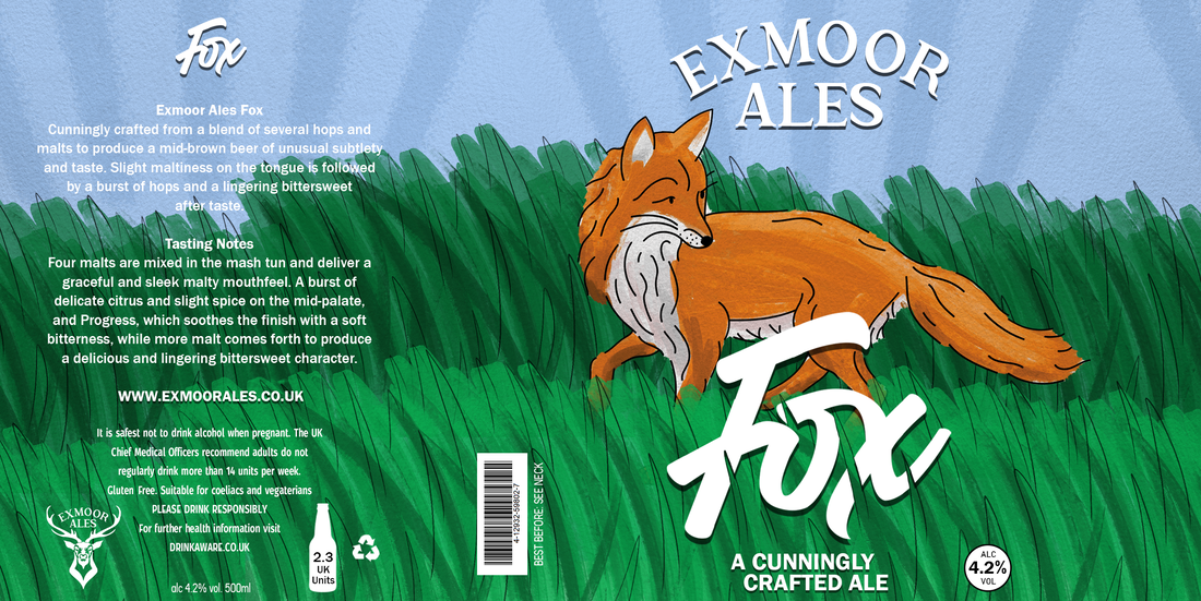
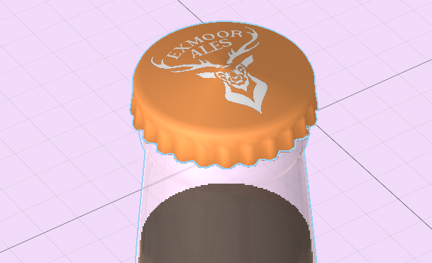
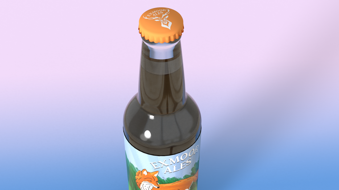
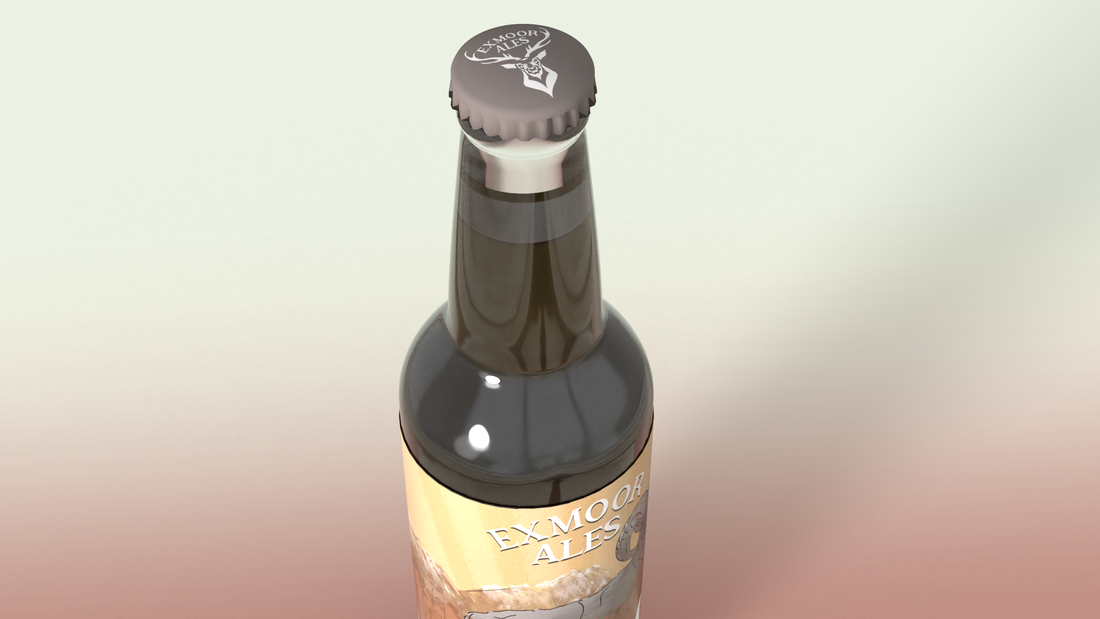
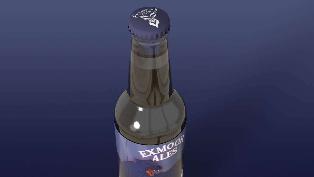
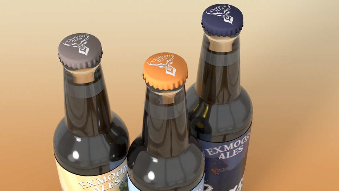
To finish off, I decided to put the logo at the top of the cap to further customize and brand the Ale bottle.
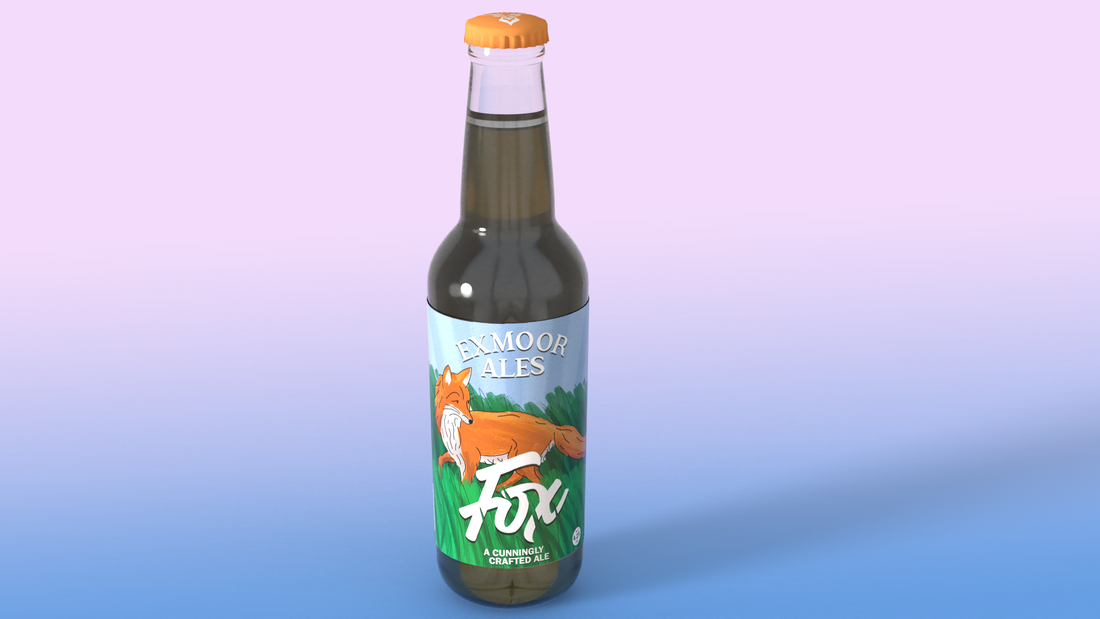
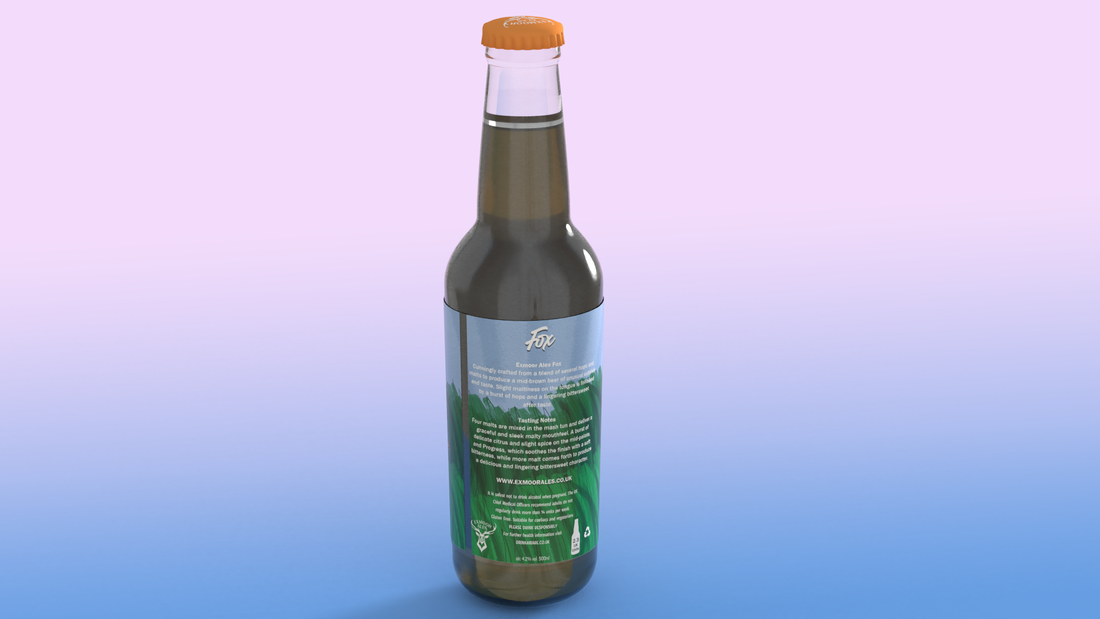
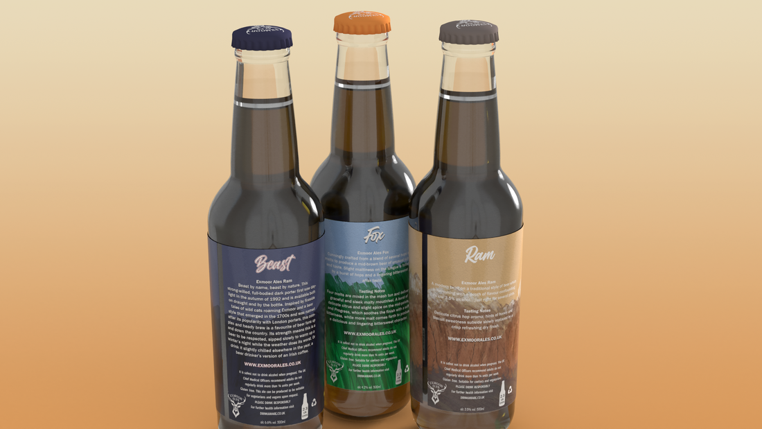
With this, using Adobe Dimensions, I was able to create a mockup of the bottle label being displayed on a model of a Ale Bottle. This shows the label in the perspective of where it would be visible in shelves and in hand for consumers ready to be brought.
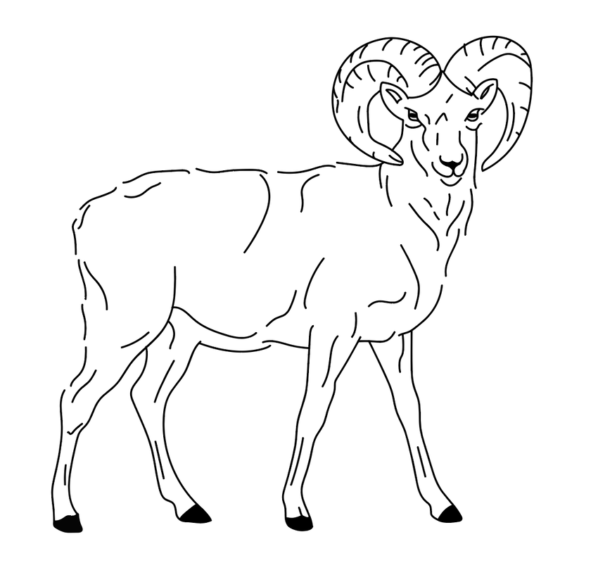
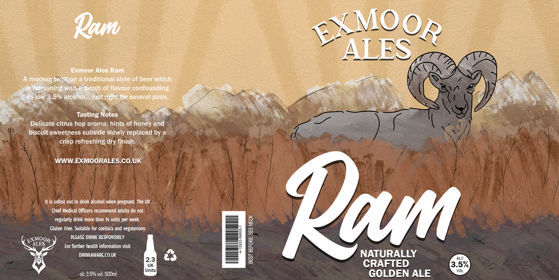
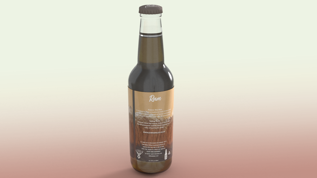
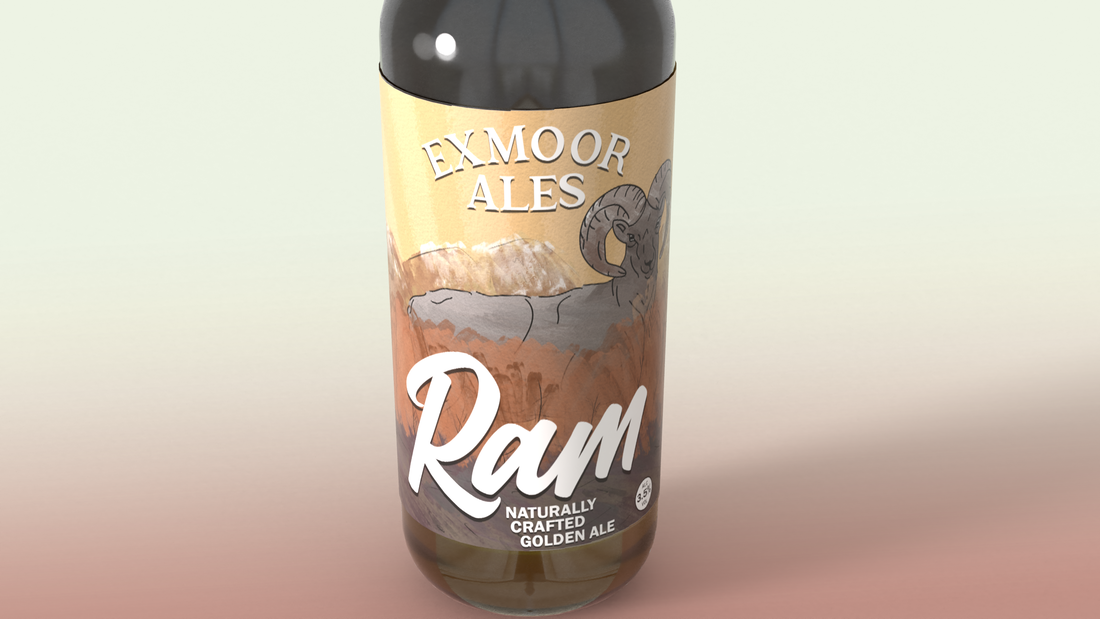
My second label design would be for Exmoor Ales' "Ram" Ale.
I followed a similar process to create this label that I did for the Fox Ale label.
This began with me creating an outline of a Ram animal using Adobe Illustrator which I then painted using watercolour brushes in Photoshop.
I followed a similar process to create this label that I did for the Fox Ale label.
This began with me creating an outline of a Ram animal using Adobe Illustrator which I then painted using watercolour brushes in Photoshop.
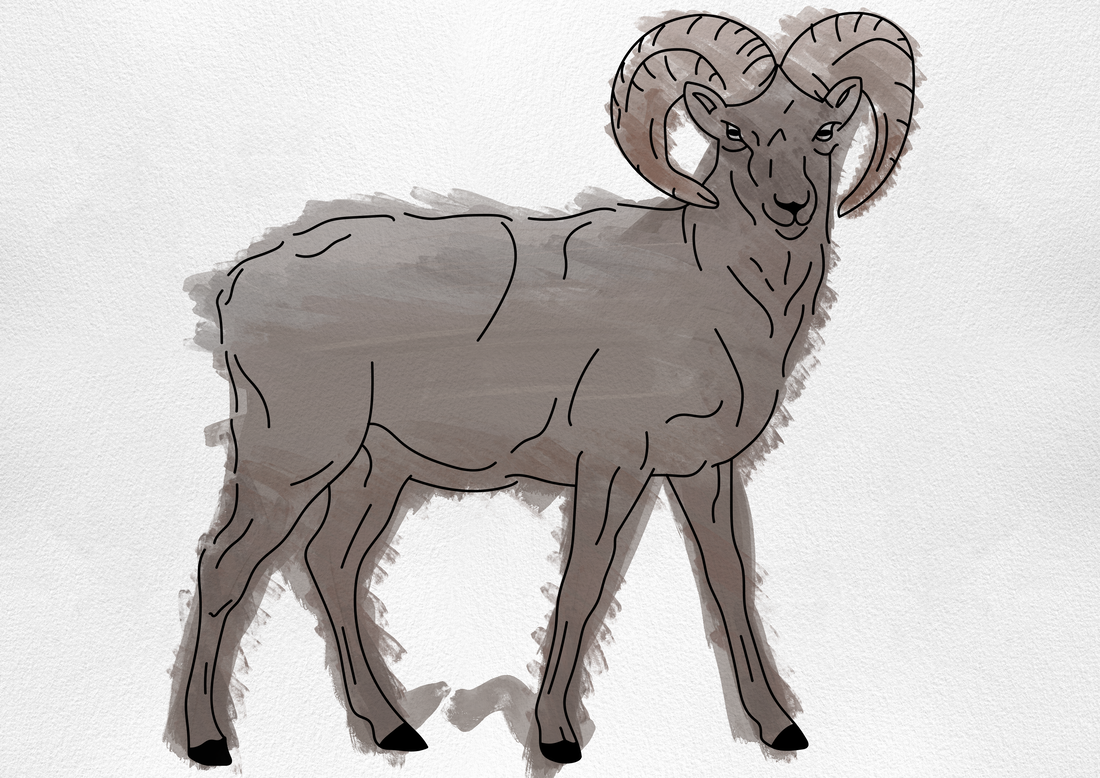
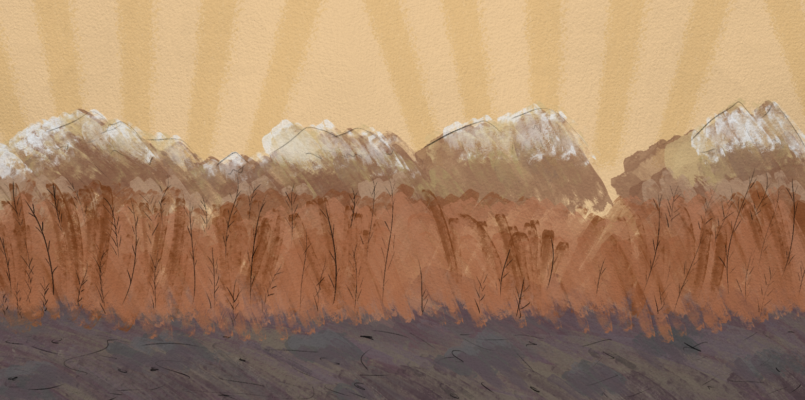
As this was an Ale with a Ram, I decided to further change the background of the label to suite the setting of the Ram.
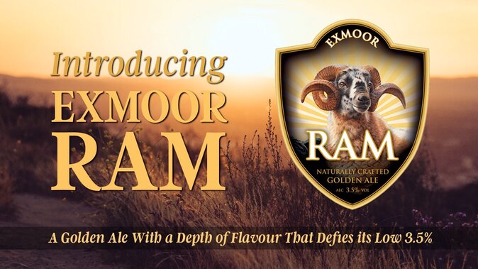
Inspired by the colours found within this image created by Exmoor, I saw to reproduce similar colours on the label - a warm colour pallete with a sunset. The use of the mountains was inspired from the original label where a glimpse of them could be seen behind the typography.
This was then followed by adding the necessary typography and other information to the label as similar to the "Fox" Ale label.
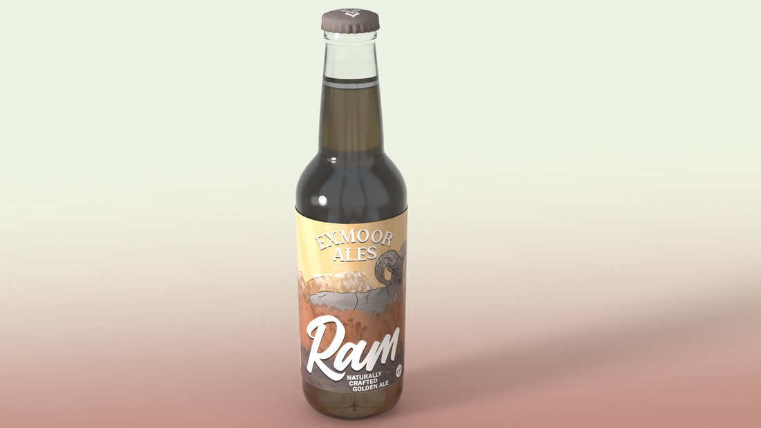
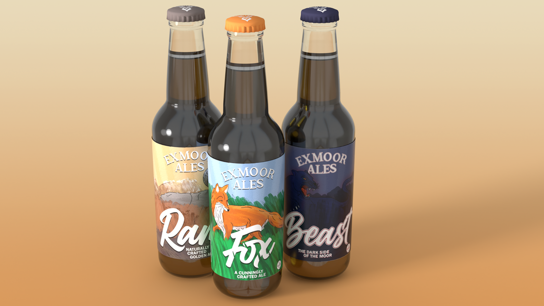
Lastly, using Adobe Dimensions, I added this Ale label to a mockup of now two "Fox and Ram" Ale bottles.
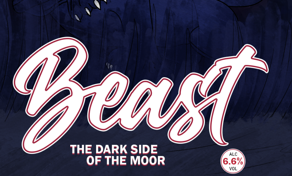
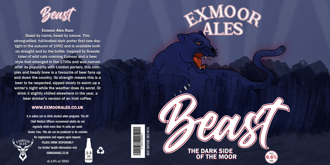
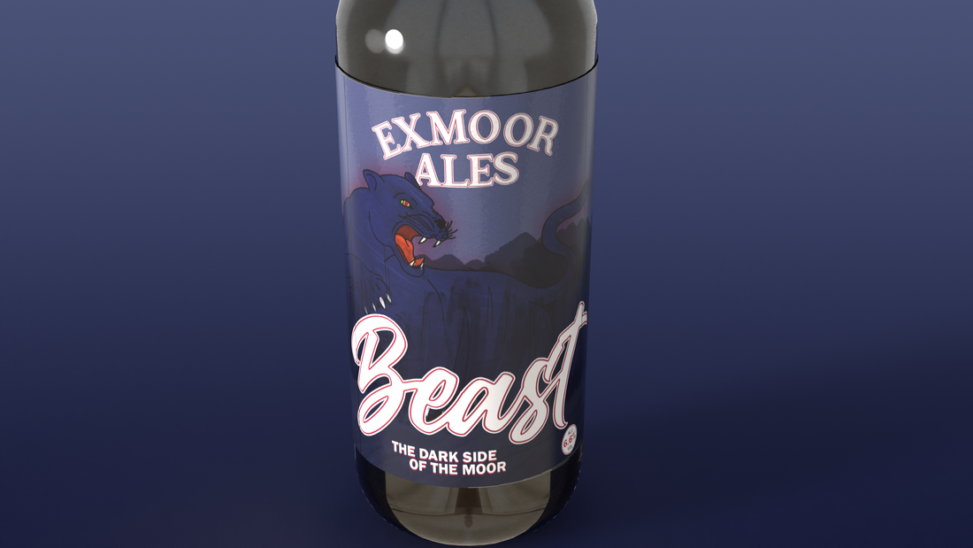
My third and final label design would be for Exmoor Ales' "Beast" Ale.
I followed the same process to create this label that I did for the previous two Ale labels.
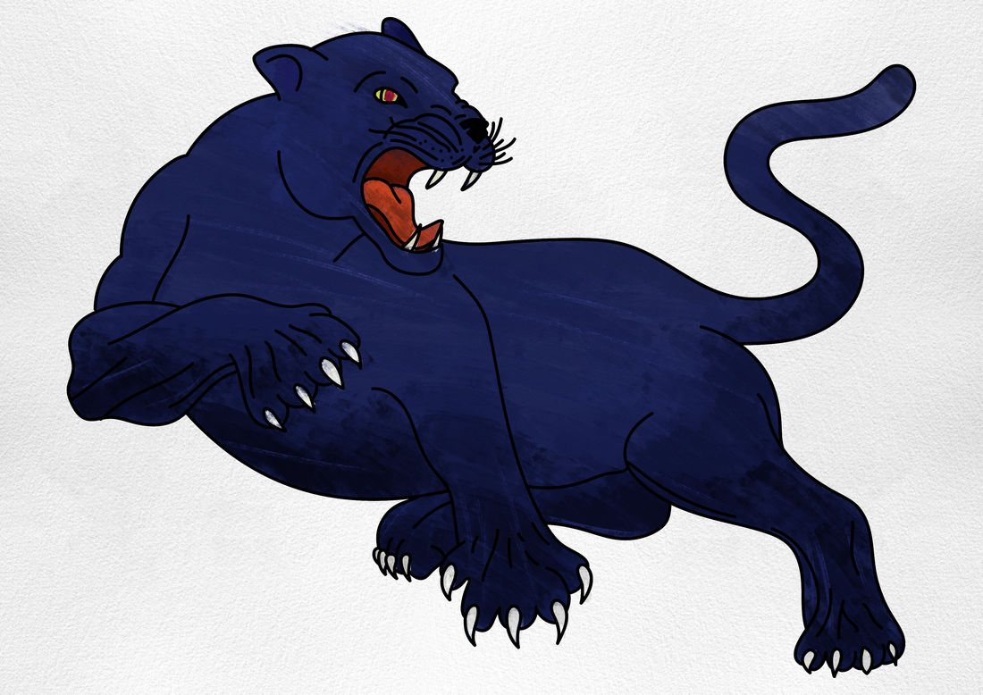
This began with me creating an outline of The Beast using Adobe Illustrator.
I followed the same process to create this label that I did for the previous two Ale labels.
This began with me creating an outline of The Beast using Adobe Illustrator.
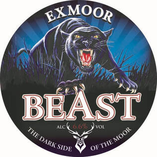
For inspiration for this label - I used the previous label design Exmoor Ales uses. This label is quite different to my previous two - as it its much darker colours and uses a lot of black.
I used Photoshop to once again paint the beast in a watercolour style using dark blues with a mix of very dark blues for shading.
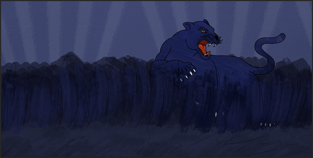
I then moved onto creating the label for the third and final Ale. With this, I created a dark background to fit the theme of the beast.
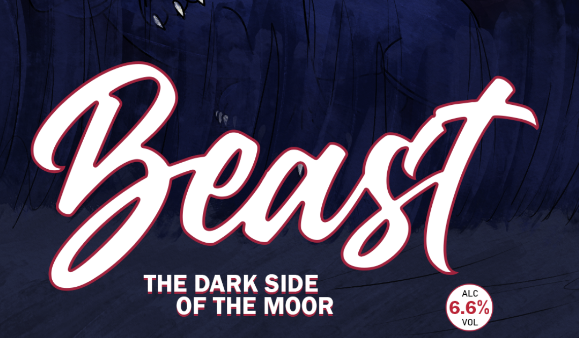
While trying out the title of the Ale, I attempted with just a red outline. However, this did not make the red outline or the typography stand out as much and so I decided to add another white outline on both the Ale flavour and the ALC Vol. which I believe made this label title look better and make it stand out more.
|
|
I then added the information needed on the bottle, the title of the Ale, barcode and to further added the mysteriousness of the beast, I added a red glow to make something 'other-worldly'.
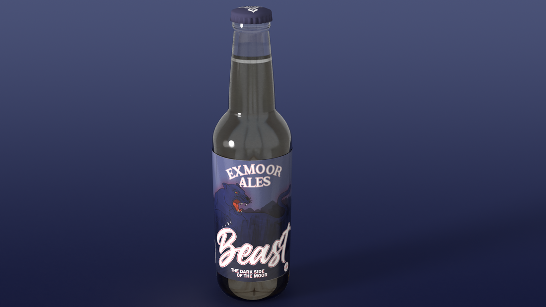
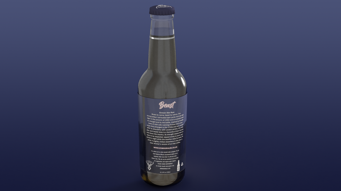
With all three labels done, I used Adobe Dimensions once more to create a render and showcase of all three Ale bottles layed out next to each other to showcase my work.
| Unit 43: 3D Graphics Application Design Report |
