Part A: Research & Skills
1. Read and make notes on “Don’t Make Me Think” Steve Krug intro & Ch1.
Technology has boosted, adapated and changed so much in the recent 20 years.
In 2000, the internet was used for visiting simplistic websites with a mouse and keyboard at a desk in the office, home or in a library. Looking at now, we use computers in our hands (phones), laptops, cameras etc. We rely on technology and web a lot more than ever before. From controlling our phones, booking and banking - we use our phones especially for many things.
We rely on the mobile phone for things that, when not available, furstrate us such as pay for parking or renew our driver's license which was all done in person. All can be done our phones.
Usability Consultant.
Clients send their projects such as a website or an app.
The consultant uses the project as a general user and make notes of any ways the medium confuses them or get stuck.
Meetings with the client's team to explain the problems "usability issues" and help them decide which ones are most important to fix and how it should be achieved.
A lot of companies do not hire or use a usability consultant. Knowing some usability principles and behaviour of a user will help you see the problems yourself. It helps stop the problem happening when the product is shipped to the general consumer.
Chapter 1
"Don't make me think!"
This is the first law of usability. The overriding principle- the ultimate tie breaker when deciding whether a design works or it doesn't. Make the design as humanly possible. Obvious and Self-explanatory.
The user should just "get it" which means they should get what it is and how to use it without expending any effort in thinking about how to use it or approach things.
One way to approach that is looking at a page that doesn't make the user think, all the thought balloons over their head say things like "There this here and that is here. Now this is where I want to go".
|
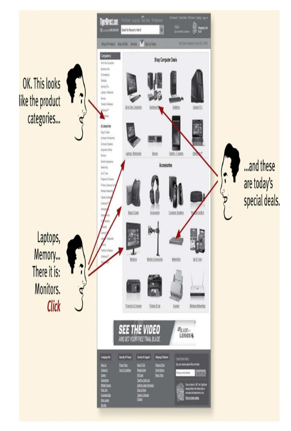
The user shouldn't have questions pop up while using the website. The website should answer these questions not create them. If there are, the product may not be as user-friendly or easy to understand.
The point is that every question mark adds to our cognitive workload, distracting their attention from the task they want to achieve. |
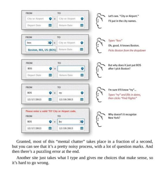
Making it user-friendly also means that the entire user face has to be consitent.
|
|
"On the internet, competition is always one click away. If you frustrate the users they'll simply head somewhere else instead."
Creating a seamless and user-friendly page or screen is like having good lighting in a store. It improves the ease of access and understanding for the user. Using things that are easy to use and understand makes the user happier where as having the opposite makes the user use more energy, enthusiasm and time - in turn creating a negative perspective on the creator/business.
2. Watch and make notes on “12 Principles on Animation”.
1. Squash and Stretch
Objects become longer or stretch out to emphasise their speed, momentum, weight or mass.
2. Anticipation
Character prepares for an action to give the audience a clue as to what will happen next.
Anticipation helps communicate actions to the audience by preparing them for the next action.
3. Staging
Staging is the presentation of any idea so that it is completely and unmistakably clear.
Can apply to; acting, timing, camera angle & position and setting.
4. Straight Ahead and Pose to Pose
Pose to Pose is generally good for most actions as it gives you the most control. You have an idea what the action will look like during the process.
- Keys - Make keys first and perfect them.
- Extremes - Use to decide the furthest the character will go
- Breakdowns - Use breakdowns to connect the extremes
at this point you can start inbetween-ing (connecting them all)
Straight Ahead is good for animation that is unpredictable such as fire, water particles, clouds of dust or explosions.
5. Follow Through, Overlapping Action and Drag
Follow Through - Parts of body that continue to move after the body has completed the action.
Overlapping - Refers to the offset between the main body and the objects that follow through.
Drag - The delay of the offset.
6. Slow In and Slow Out
Most all movement starts slowly, builds speed and finishes slowly. Without this, movement feels mechanical.
7. Arcs
Most living creatures will move in a circular path also known as an arc. Adding arcs to animation also adds a feeling of character rather than a mechnical, wrong feeling.
8. Secondary Action
Secondary Action is not Overlapping Action. It describes gestures that support the main action to add more dimension to the character animation.
Such as if a character is knocking on a door - if the main hand is knocking the other hand could have a lot of portrayal of emotion. A closed hand will signify angriness, a dainty second hand will portray a feeling of grace. A close hand near the chest could suggest a feeling of not wanting to be seen.
9. Timing
The personality and nature of an animation is greatly affected by the number of frames inserted between each main action.
A lot of drawings between each action/frame = slow
Less drawings between each action/frame = fast
Basically *less drawings = fast* and *more drawings = slow*
10. Exaggeration
Every action, pose or expression can be taken to the next level to increase the impact on the viewer.
11. Solid Drawing
To make sure forms feeling like they are in 3 dimensional space with volume, weight and balance.
Drawing lines on a sphere - follow contours on the sphere instead of flattness.
Cubes - avoid parallel lines, should be bent towards the vanishing point.
When drawing a rough sketch of the character - use basic solid shapes to construct the character.
When drawing the clean-line version of the character - be mindful of overlap. Without it, everything appears to be on the same plane.
Can define where surfaces come out and where they recede.
When drawing lines, avoid symmetry. They look flat. Pair straight line with curved line or offset two curved lines. Creates a more natural or dynamic look.
12. Appeal
Characters that are animated should be pleasing to look at. Should have some charismatic aspect to look at them.
Appeal does not mean good looking it means interesting. Giving a character a dynamic design, gives it appeal.
- Use a variety of shapes
- Play with proportions
- Keep it simple - can overcomplicate or make it harder to animate
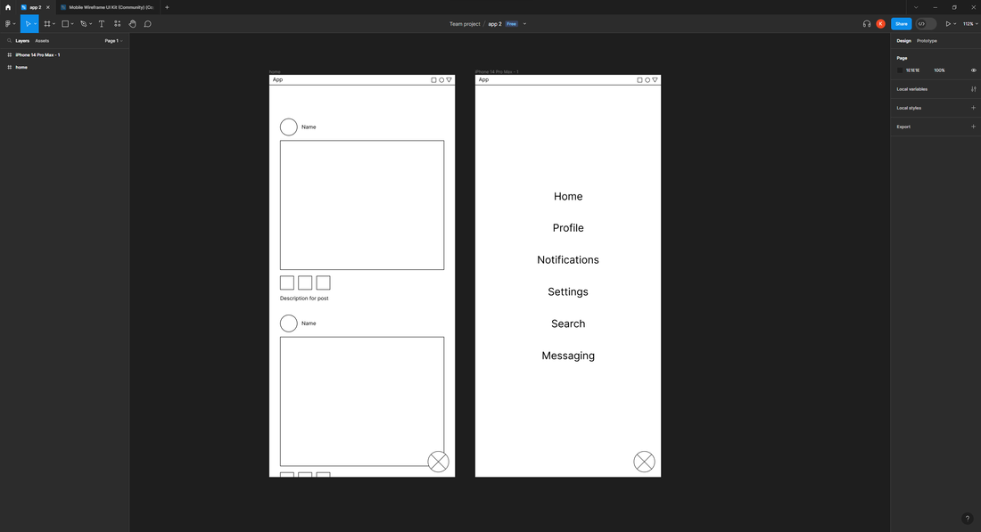
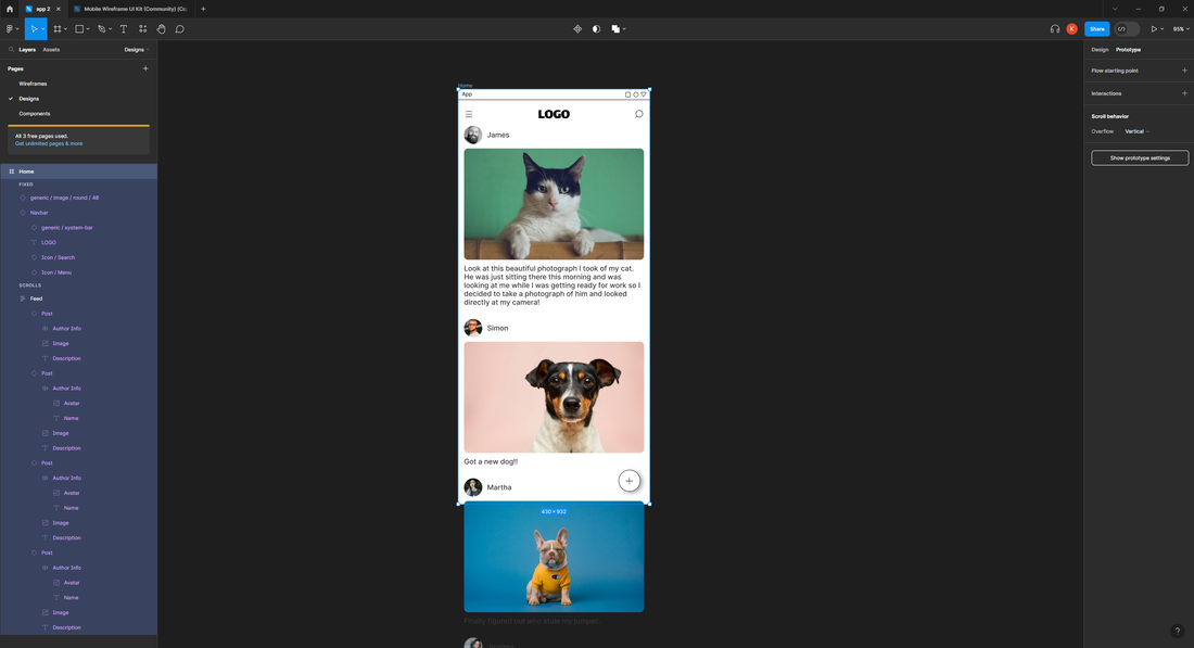
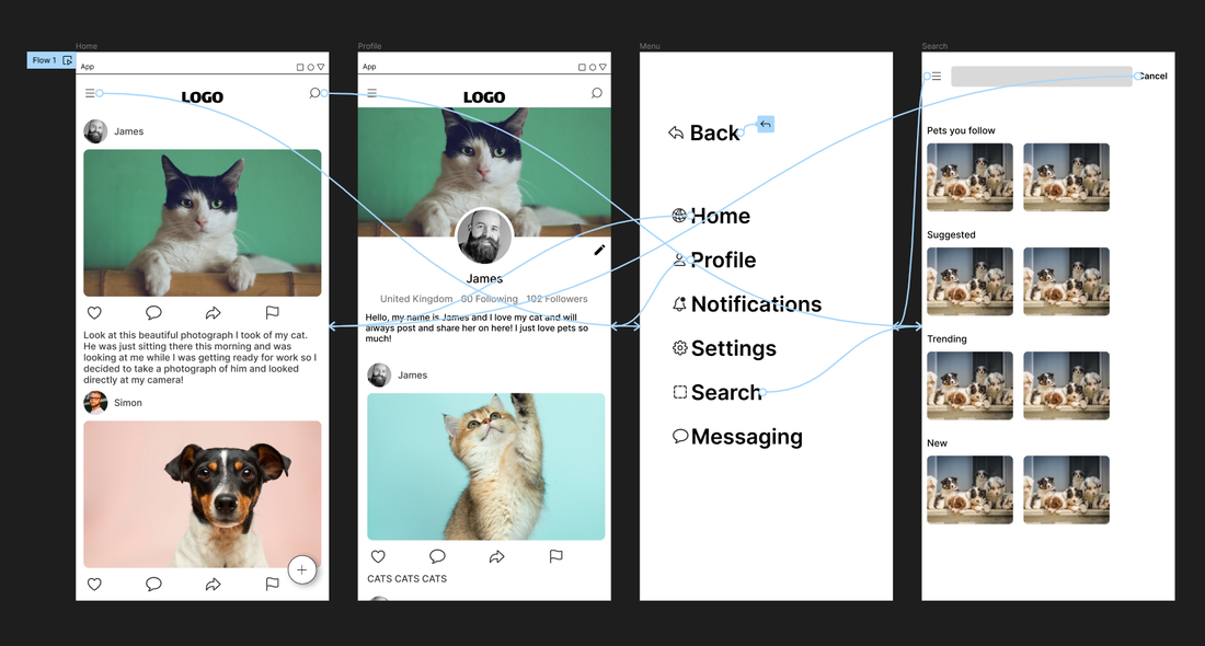
Figma Workshop
Following Figma tutorials, I made an app that was in the tutorials to learn how to use Figma.
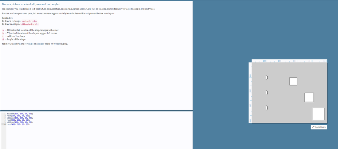
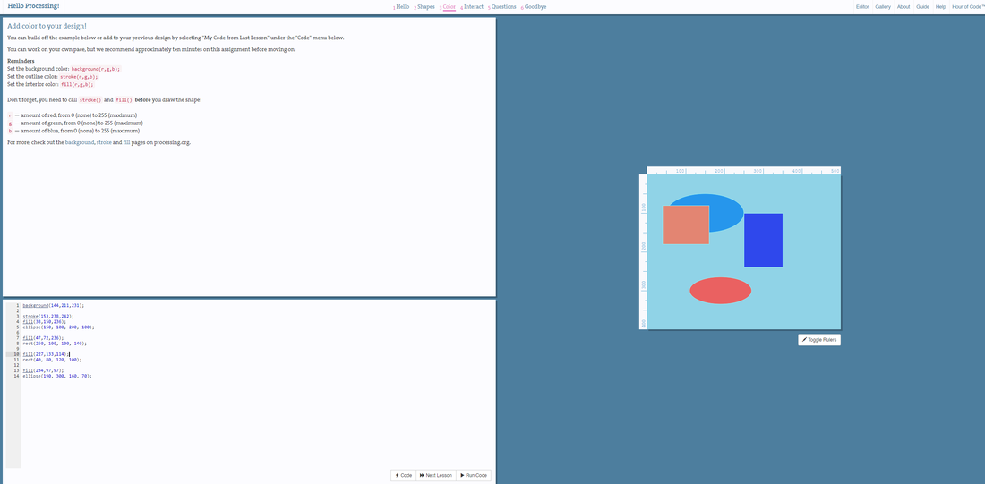
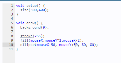
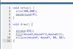
Processing Workshop
|

|
|
|
|
|
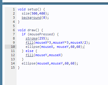
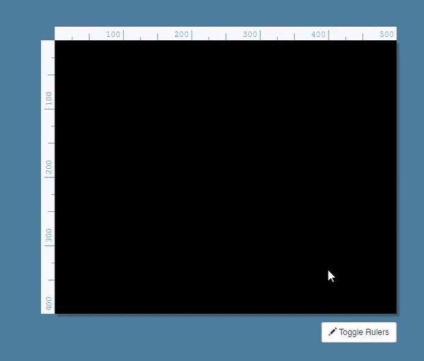
Try my code below.
INSTRUCTIONS: HOLD THE BUTTON DOWN TO MAKE COLOUR OR JUST RUN AROUND WITH BLACK AND WHITE
INSTRUCTIONS: HOLD THE BUTTON DOWN TO MAKE COLOUR OR JUST RUN AROUND WITH BLACK AND WHITE
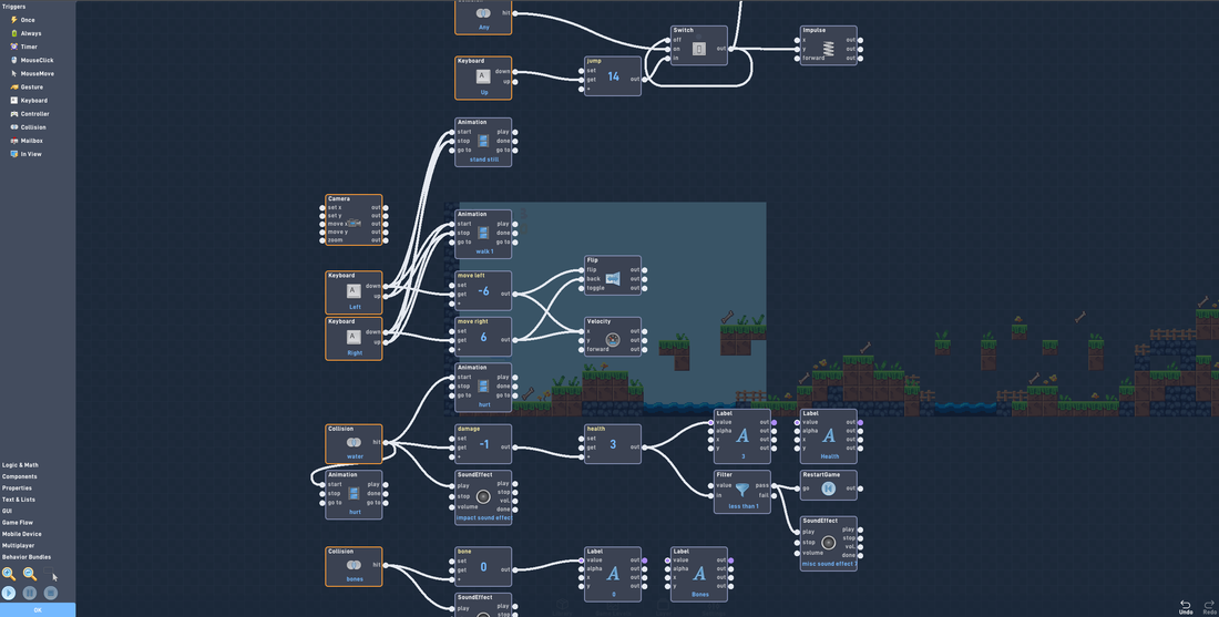
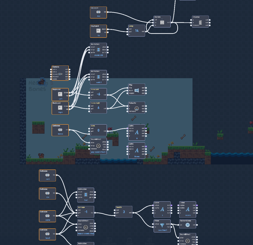
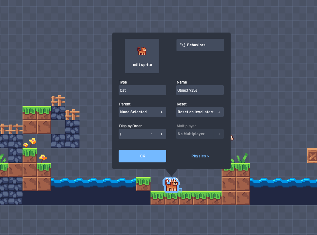
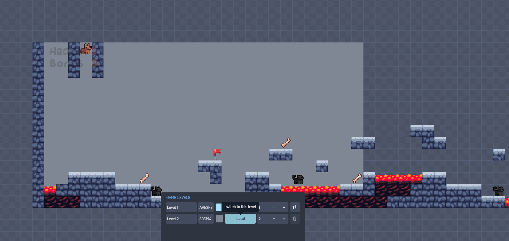
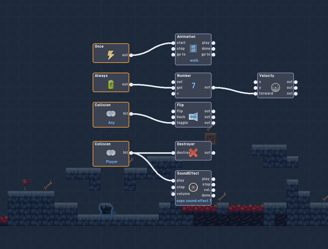
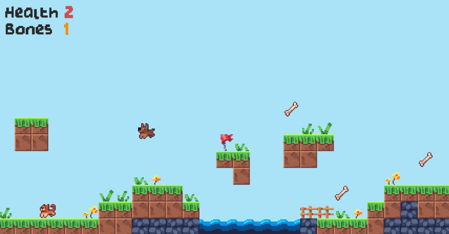
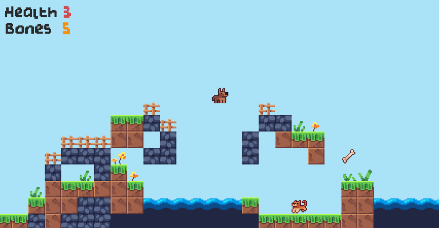
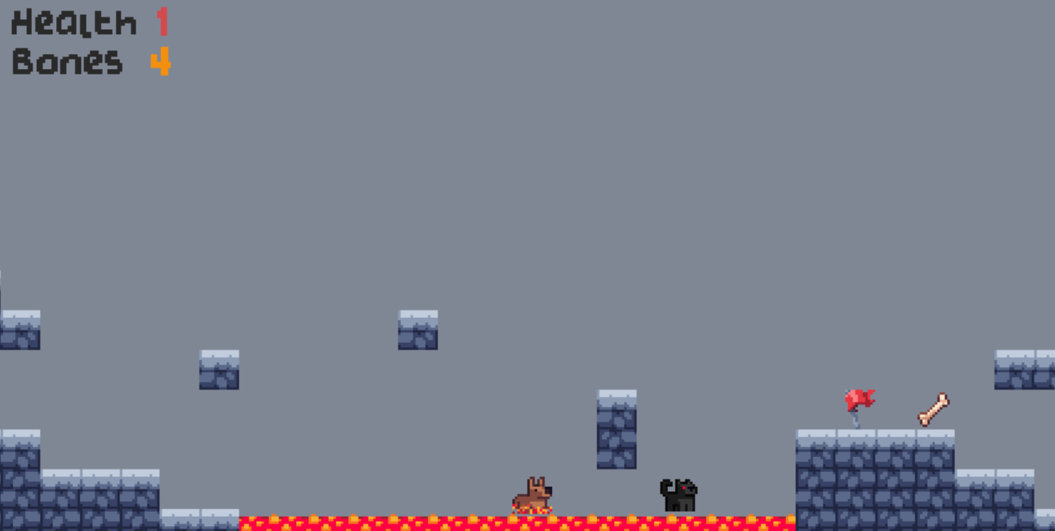
Flowlab Workshop
Following some Flowlab tutorials, I was able to a small game that ran well with objectives, enemies, levels, music and sounds playing.