My brief is to create a branding and packaging solution for a local grocers and wholefood retailer that specialises in non-animal products, ranging from fruit and vegetables to fermented products, plant based meat and dairy substitutes, plus raw desserts. These products are made, labelled and packaged in a nearby industrial unit. As well as selling through the physical shop, the company intends to break into the online subscription box market, offering select own brand gourmet products.
Research
To understand the brief, I began by researching into branding for Vegan/plant based products. The ethos behind veganism, products relating to plant based diets and the benefits of veganism.
Plant-Based Foods are generally classified into fruits, vegetables, legumes, grains, nuts, and seeds; their derived processed counterparts such as breads, pasta, breakfast cereals, cooked and fermented vegetables and legumes, and fruit purées, juices, and jams; and their derived ingredients such as oleaginous seed–derived oils, sugars, and some herbs and spices.
Plant-Based Foods are generally classified into fruits, vegetables, legumes, grains, nuts, and seeds; their derived processed counterparts such as breads, pasta, breakfast cereals, cooked and fermented vegetables and legumes, and fruit purées, juices, and jams; and their derived ingredients such as oleaginous seed–derived oils, sugars, and some herbs and spices.
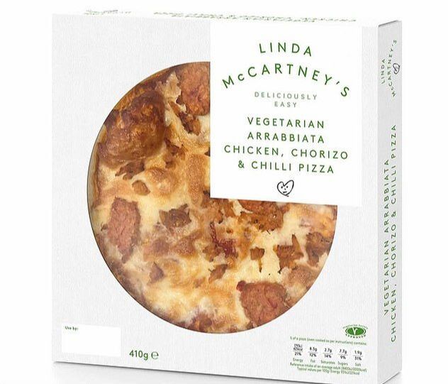
Linda McCartney
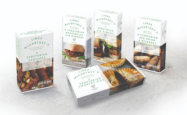
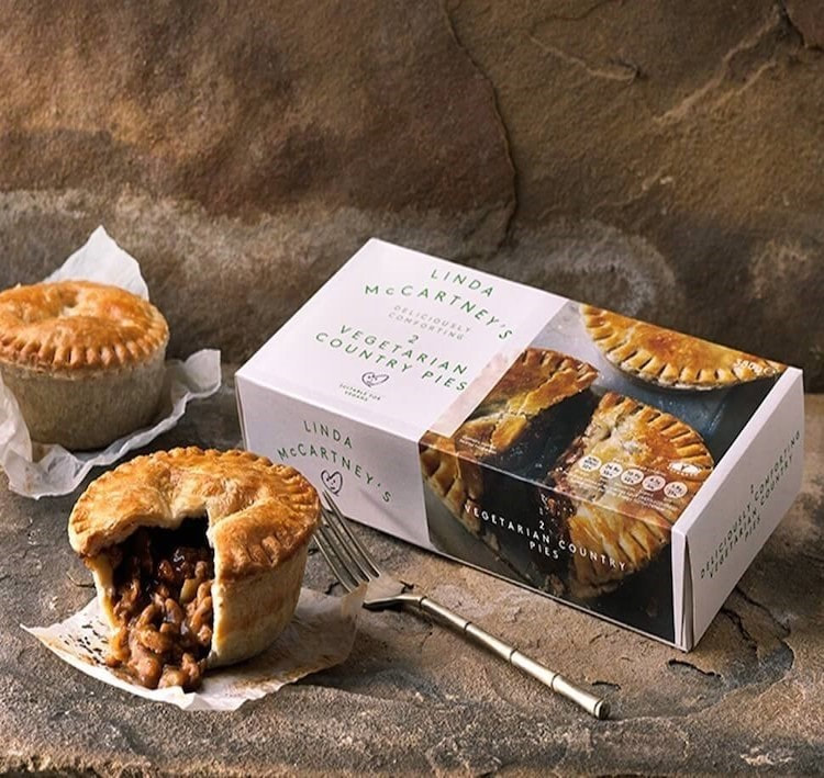
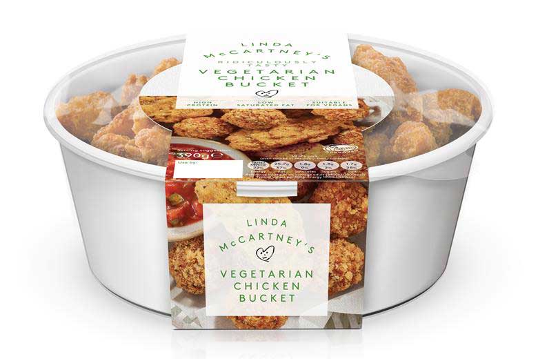
Linda McCartney started Linda McCartney Foods almost 30 years ago when vegetarianism wasn’t the mainstream movement it is today. The brand has paved the way for meat-free eating, pioneering change for what goes onto our plates today. Over 78% of Linda McCartney's range is vegan-friendly. Their packaging is also 96.4% plastic free to help benefit our planet to help create recyclable packaging which is a major plus for vegetarians and vegans.
The packaging uses a simple white and green colour scheme with a simple and effective uppercase, sans serif font for the brand name and information which makes the typography easy to read. Images of the food are also showcased to show off the food as something to be proud of by the brand.
|
|
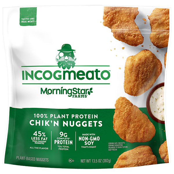
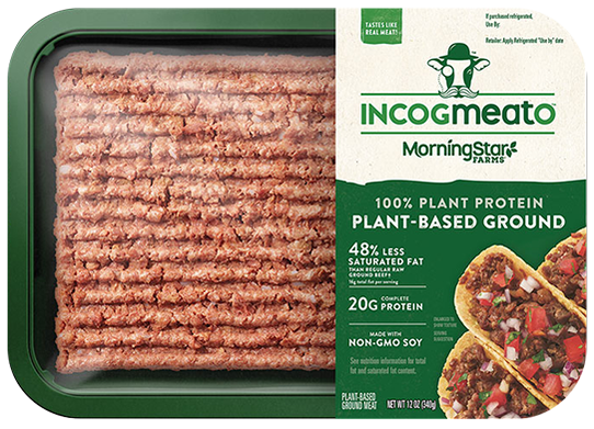
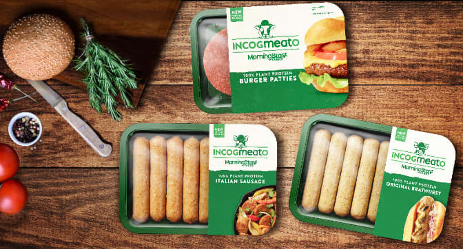
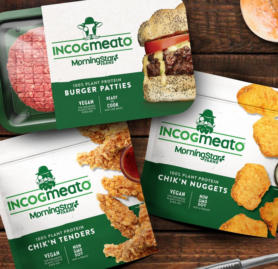
Incogmeato
Incogmeato from MorningStar Farms is a new line of next-generation plant-based protein that looks, cooks and tastes just like meat. It's a great-tasting, ready-to-cook meatless alternative including Burger Patties, Original Bratwurst, Italian Sausage and Chik'n foods. This brand prides itself on being 100% plant protein but still tasting just like real meat.
Incogmeato uses simple colour scheme of green and white to promote their products. The use of green suggests fresheness, use of plant-based products and healthy style with the white promoting a clean, simple and modern brand. As the previous brand, INCOGmeatO also uses the food all across the packaging to entice the consumer to purchase their product with the food cooked what seems so professionally possibly making customers hungry and wanting purchase something that looks like it contains meat despite being 100% plant-based.
|
|
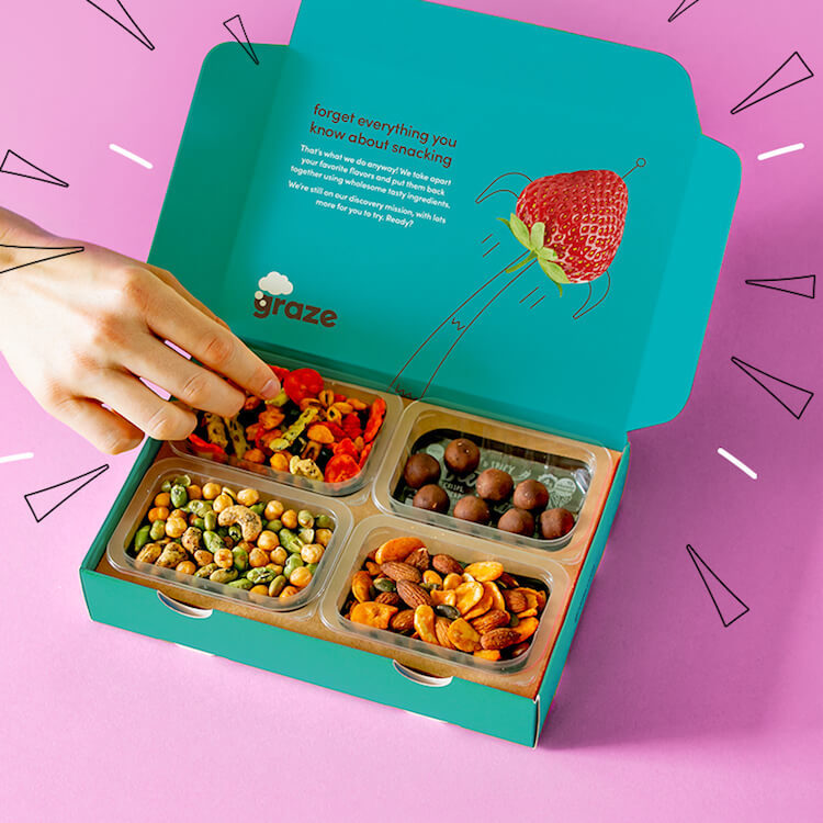
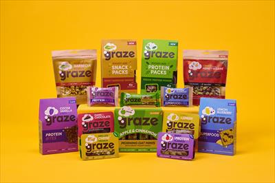
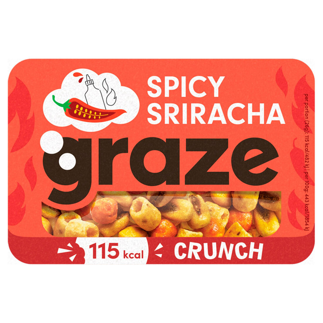
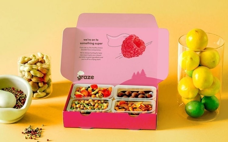
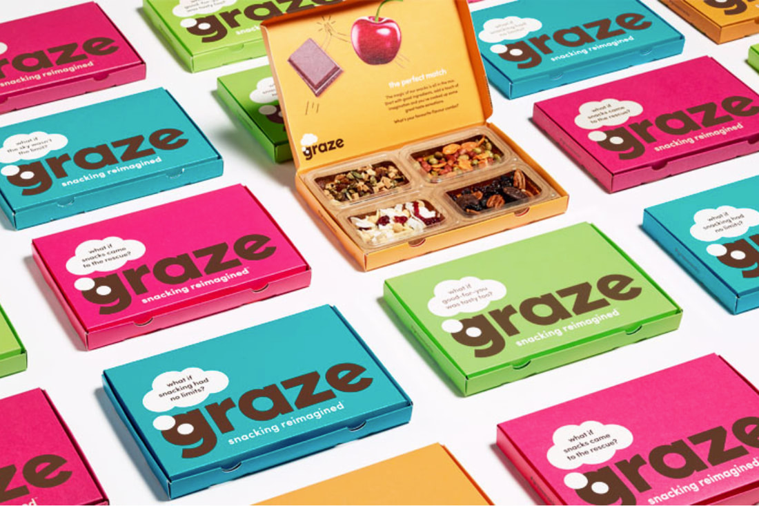
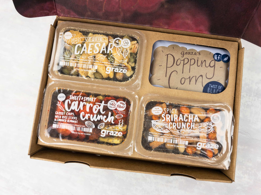
Graze
Graze is a United Kingdom-based snack company. Graze offers over 200 snack combinations through snack subscriptions boxes and online shop, recently expanding into retail stores too. The subscription box offers a monthly box with a selection of what you like and Graze has taste experts on hand to select and tailer the flavours of each monthly box to suit your taste.
Graze packaging is also 100% recyclable plastic (apart from the film lid) which shows how they also care for the planet and being as green as possible.
Graze uses very bright colours from around the spectrum which grab the eye of any consumer. It uses a lot of lowercase, sans serif typography through-out its brand to suggest a calm, simple mood from the brand. The brand uses colours of fruits and snacks to make the boxes and typography pop and attract the human eye. This is much different to the previous brands which contain a heavy use of green and white and have a more serious, modern approach. This is in stark contrast as 'graze' uses bright, contrasting colours and a more friendly and entertaining approach to its packaging and brand.
|
|
Brand
To come up with a brand name, I began brainstorming ideas for the brand name. This is where I came upon the name "bite" which I chose to be the name of the brand.
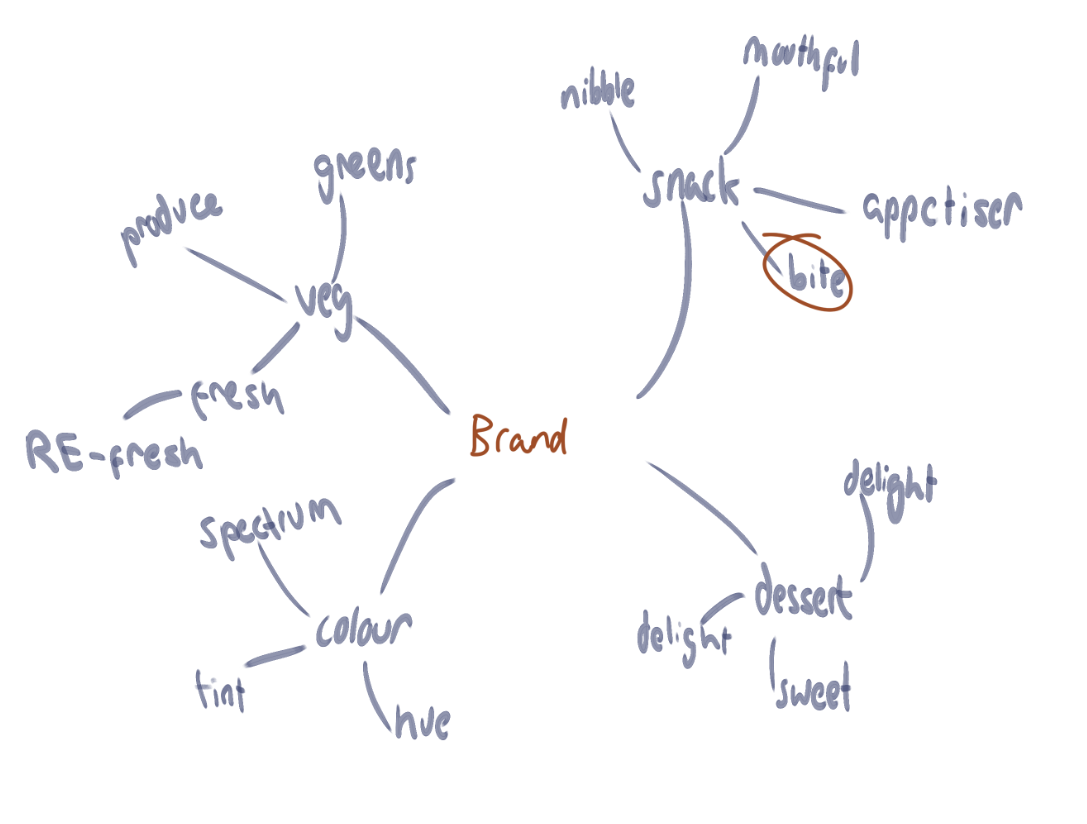
My brand would be about snacks and deserts that are vegeterian and vegan friendly to be sold on shelves and as a subscription box. This would be sold under the brand name 'bite' to suggest something small, snack-like and only take a couple 'bites' to finish.
I decided instantly I wanted to make a fun, calm and relaxed brand that would not look too upperclass but not cheap and would poke fun at things with packaging that would look clean but cheerful.
I decided instantly I wanted to make a fun, calm and relaxed brand that would not look too upperclass but not cheap and would poke fun at things with packaging that would look clean but cheerful.
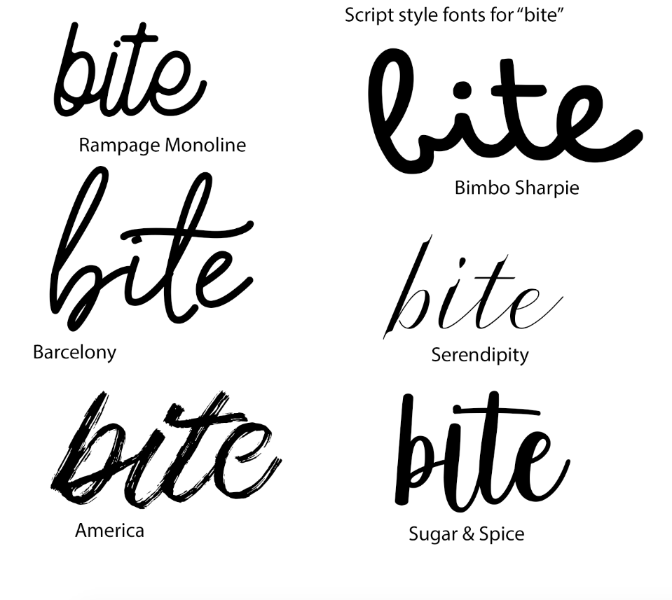
I then began sketching logo ideas. I decided to make the logo lowercase to suggest the calm and relax mood I wanted to give off. I also decided to make the logo in the style of stencil, chalk or eroded as I wanted to give a 'homemade' feel. This is where I attempted things with a pencil such as lightly scribble the paper to make the logo. I decided, I did not want to make the logo too bold or too Sans Serif/simple to keep within the style I had in mind.
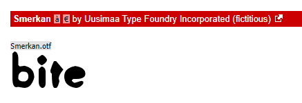
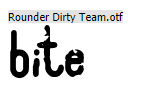
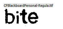
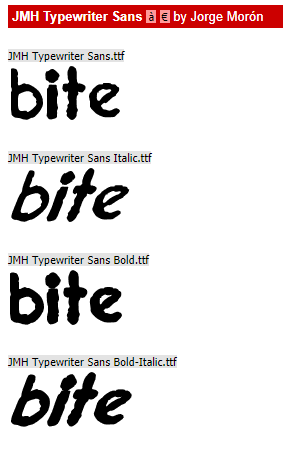
With this - I began researching fonts.
I looked into some playful script fonts however none of these fonts appealed to me and so I attempted other fonts which were more Sans Serif however had a handmade, simple shape style to them.
|
|
After coming across the font Smerkan, I knew this was the font I wanted to use for my logo. This was the style I was aiming for in my sketches on paper and I believe this font would be perfect for the brand logo and overall use of style.
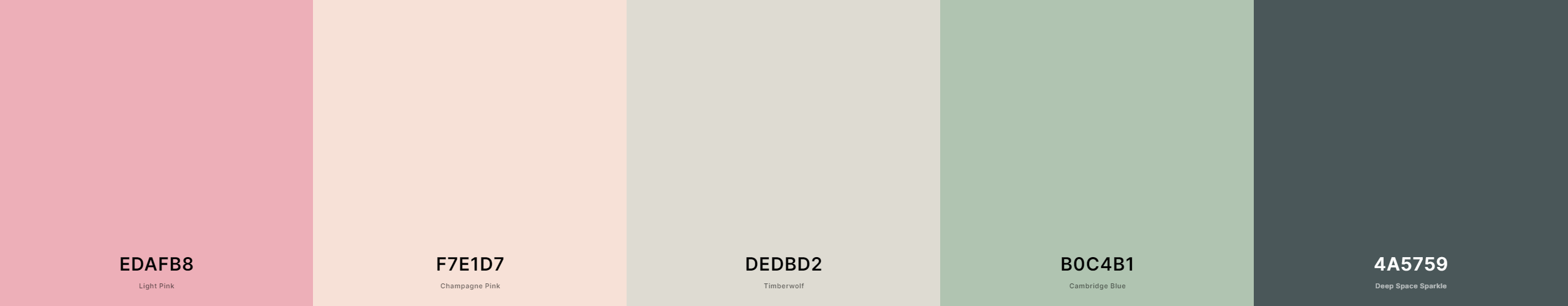
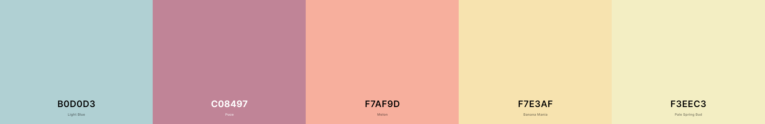
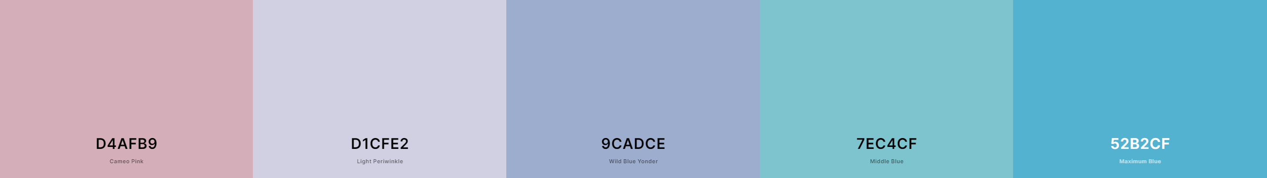
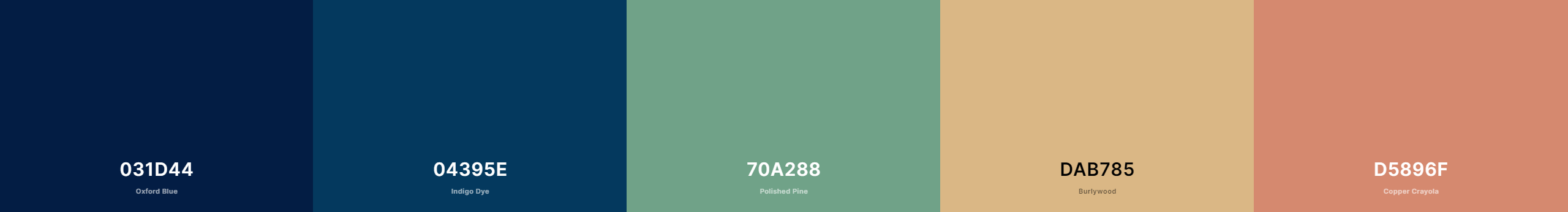
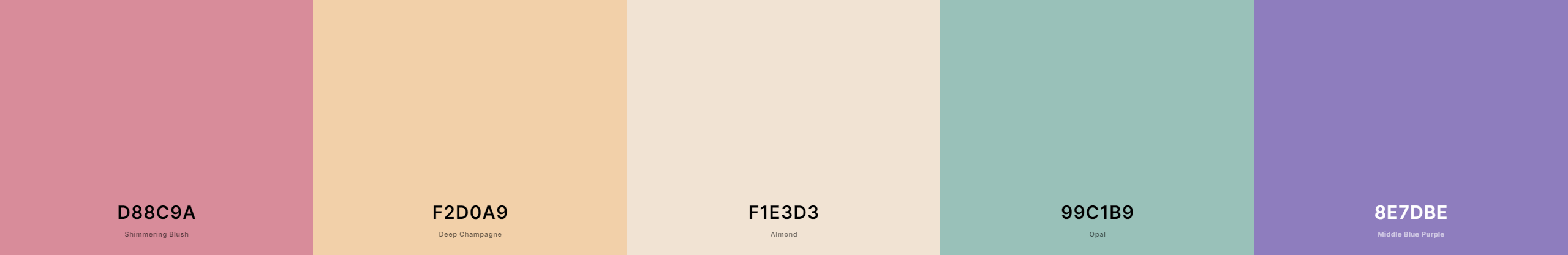
Colour Scheme
My idea for the colour scheme was to go for some colours that were light that were different but could all work together. These colours were all chose in the style of watercolours so that I could get that style in of watercolour yet still using the flat style I am aiming for. These are the five colour schemes I came up with that would work all well together so I could pick and chose different colours within each of them.
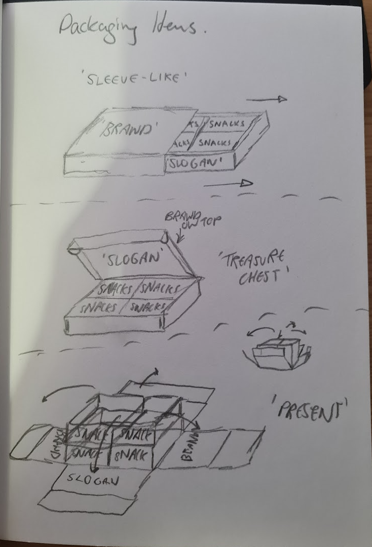
Packaging Ideas
I then came up with three different packaging ideas for the subscription box. These three unique boxes would have very different opening experiences and so I explored how each one would be opened and where the layout of typography would be.
I knew from here on out that I definitely wanted to have slogans from the brand to present on the boxes as more funny side of the brand as well as something to read when only opened.
I knew from here on out that I definitely wanted to have slogans from the brand to present on the boxes as more funny side of the brand as well as something to read when only opened.
What could go inside? / Products?
Research
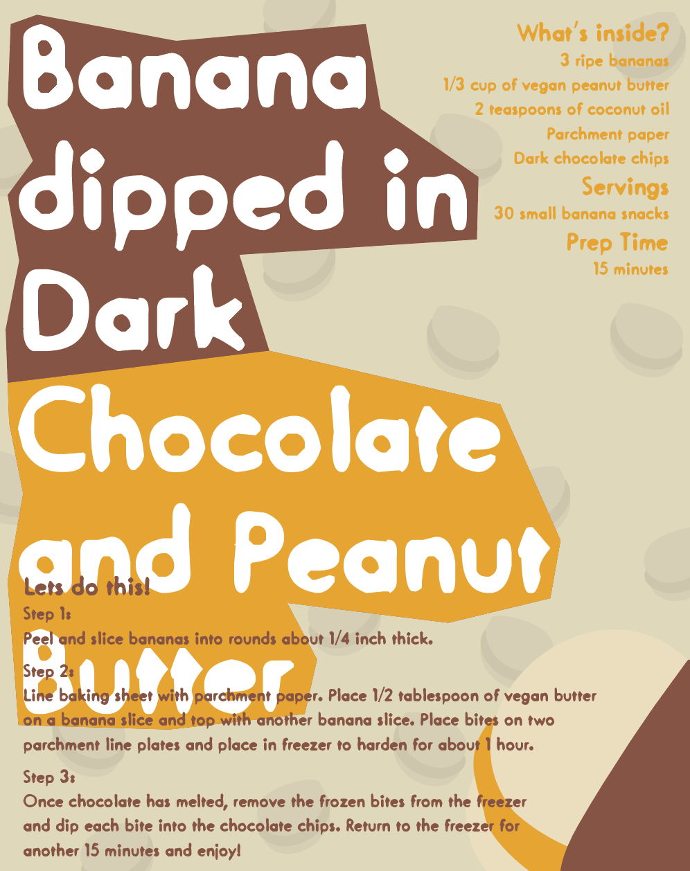
I decided to research what would go inside the 'bite' subscription box and on shelves - to then decide what the packaging would look like. I researched vegan-based snacks and other deserts. Heres what I found.
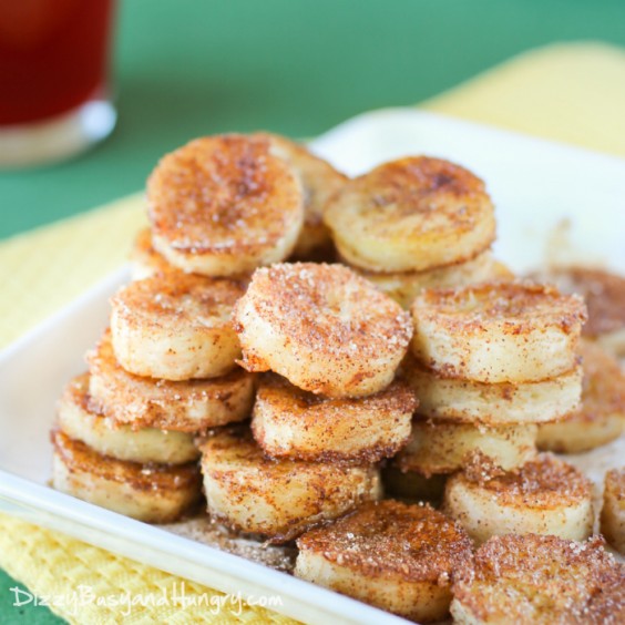
These snacks would be made by the person who ordered the package. The ingriedients and instructions would be provided within the box, with different product each week. Here are some cool and easy snacks that could be made at home:
These snacks would be made by the person who ordered the package. The ingriedients and instructions would be provided within the box, with different product each week. Here are some cool and easy snacks that could be made at home:
|
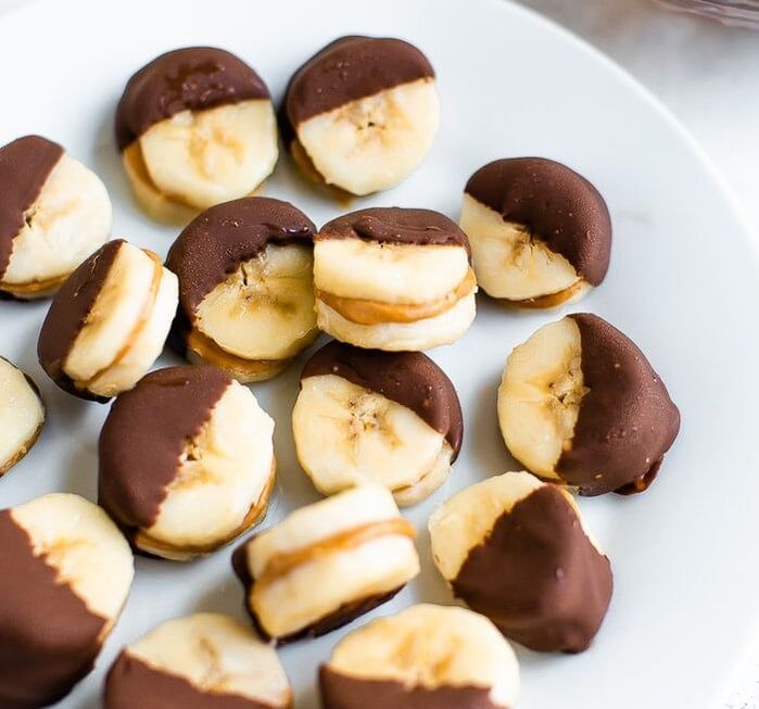
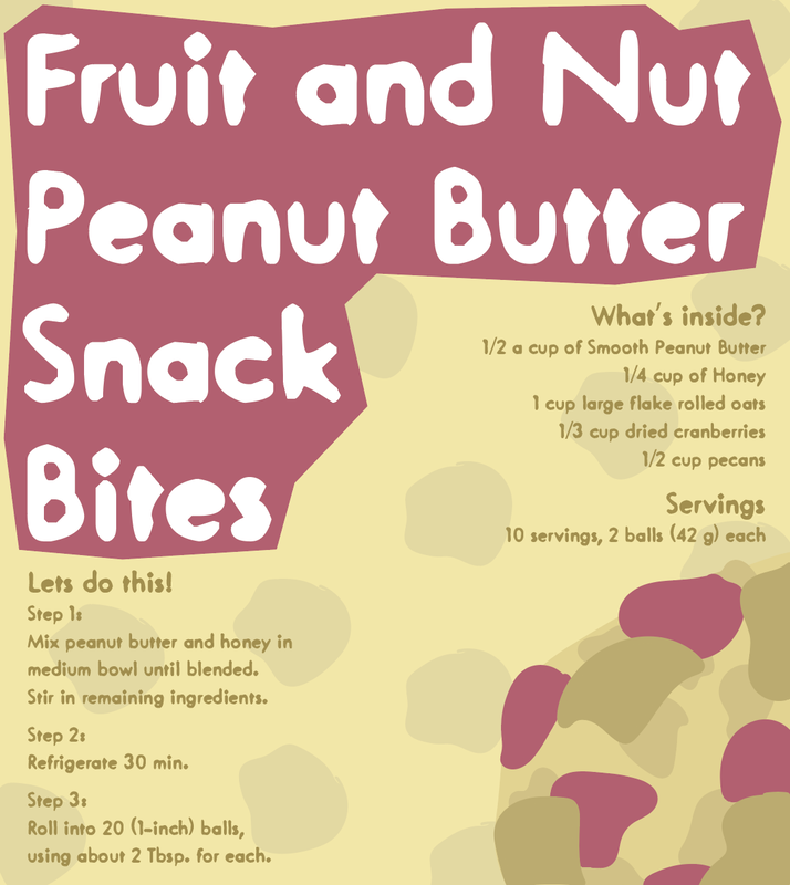
1. Fruit and Nut Peanut ButterFruit and nut butter, made from blended nuts, is a delicious vegan snack with many nutritional benefits.
The fruits provide fiber, vitamins and minerals, while nut butters are rich in fiber and protein that can help you feel full and energized. Popular combinations include bananas or apples with cashew, almond or peanut butter. |
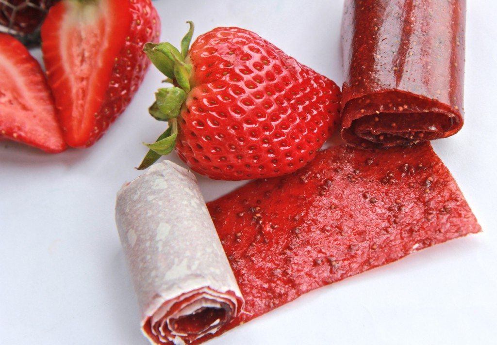
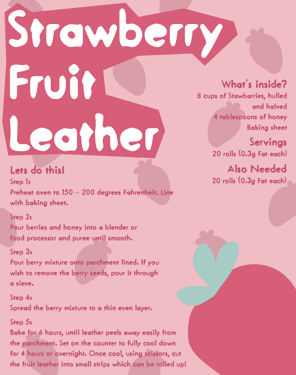
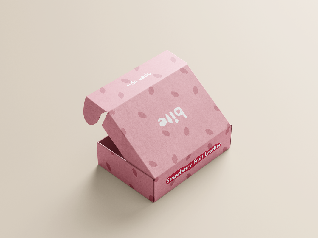
2. Homemade Fruit LeatherHomemade fruit leather is made from fruit puree that has been thinly flattened, dried and sliced.
It has similar nutrients to the fresh fruit from which it is made and is usually high in fiber, vitamins and minerals. Different fruit leather types: Peach and Raspberry, Blueberry and Banana, Strawberry Lemonade, Pineapple, Apple and Blueberry. |
|
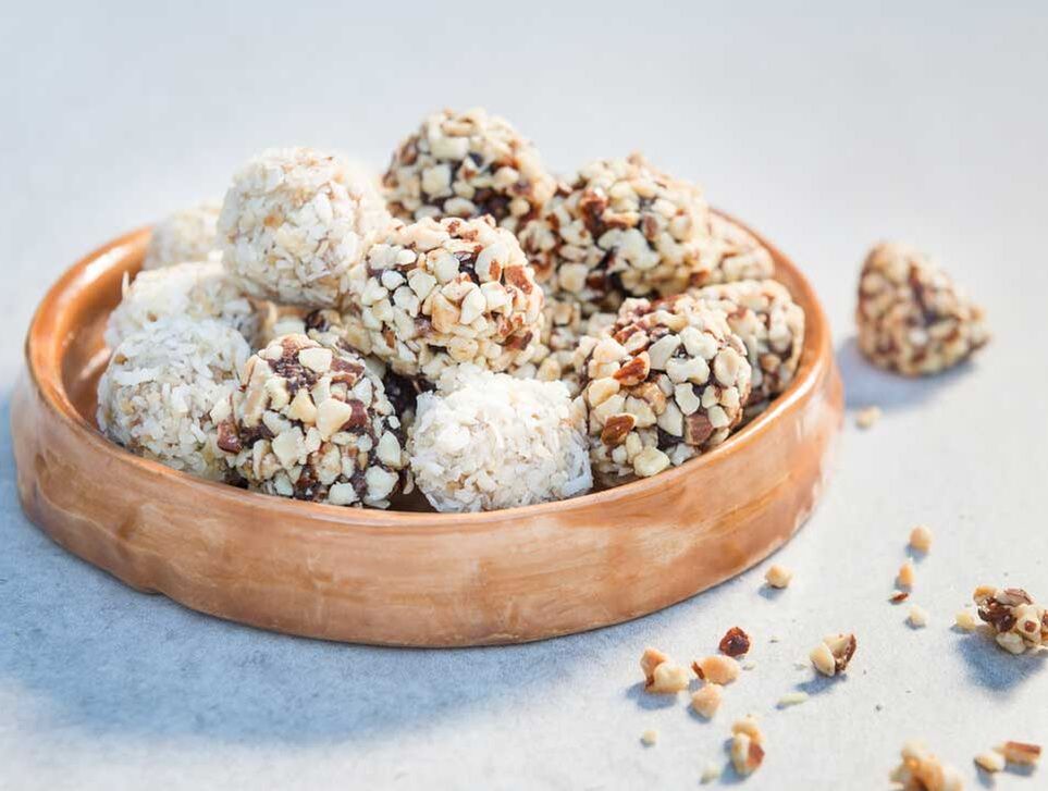
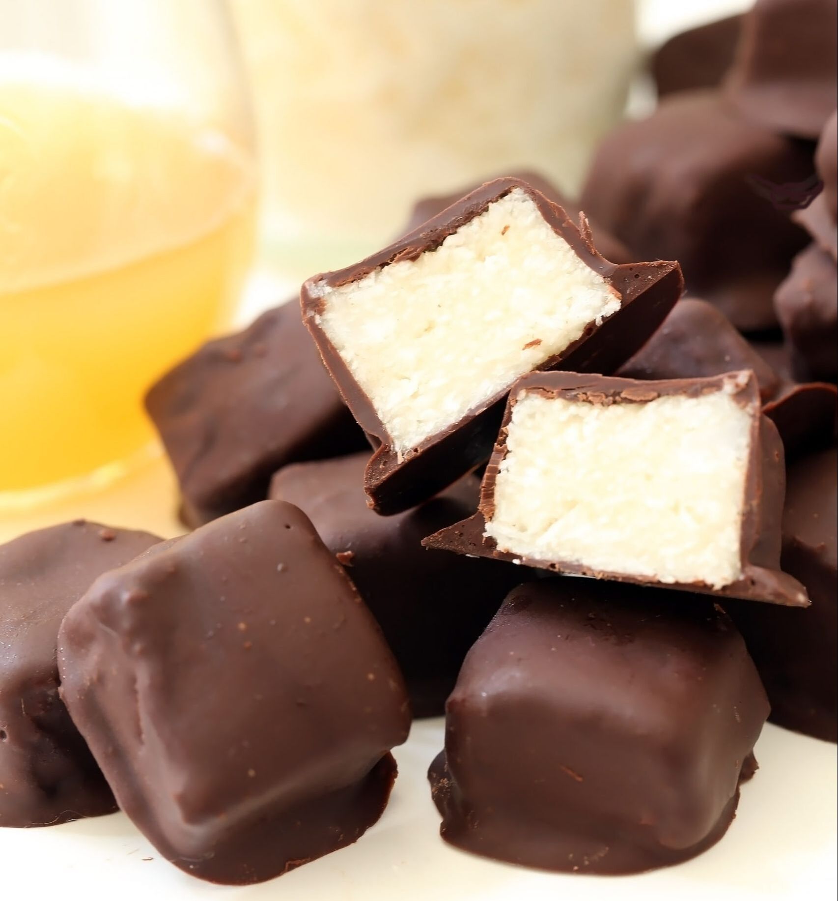
4. Dried Coconut and Dark ChocolateThis is a perfect alternative to the generic chocolate bites that everyone purchases in supermarkets. Combining dried coconut and dark chocolate makes a great sweet-tooth dessert that is also a healthy vegan snack.
As an added bonus, dark chocolate that is at least 65% cacao provides plant compounds and may have a number of health benefits. |
|
|
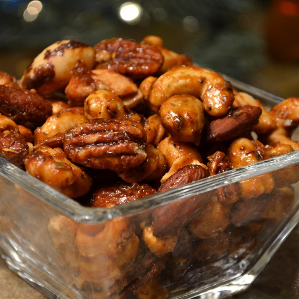
5. Sweet, Salty, Spicy Party NutsPopular types of nuts include almonds, pistachios, cashews, walnuts, macadamia nuts and pecans.
All nuts are an incredibly nutritious vegan snack option. For example, just one ounce (23 grams) of almonds has six grams of protein, over 12% of the DV for fiber and several vitamins and minerals (29). |
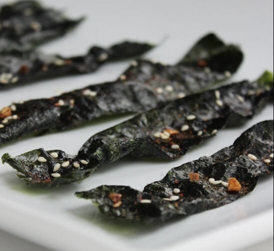
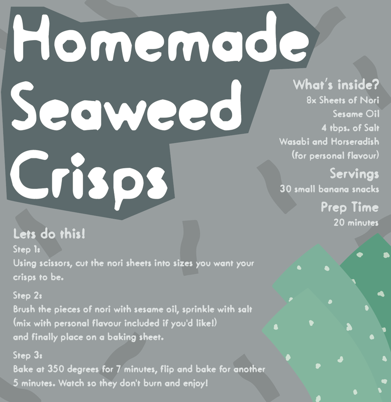
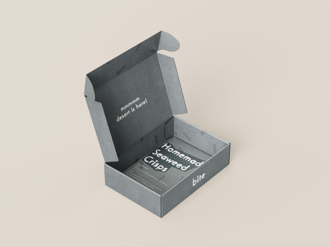
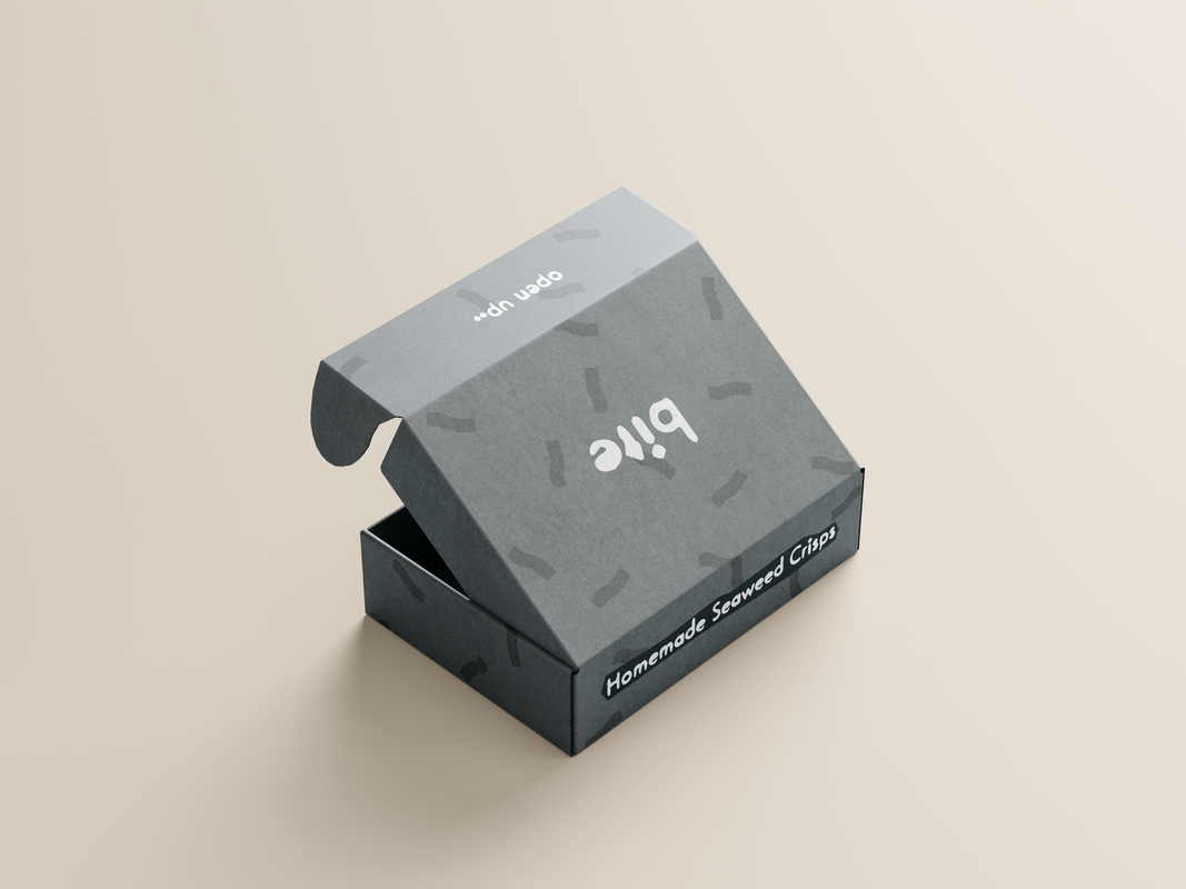
6. Seaweed CrispsThese seaweed crisps are a great addition to your snack-time rotation.
They're cholesterol-free, high in vitamin A, and seven of these spicy seaweed crisps are only 42 calories. Even if you don't love raw seaweed, you'll find that the texture and flavour of this nutrient-rich dense sea vegetable when made into the cripsy texture. |
|
|
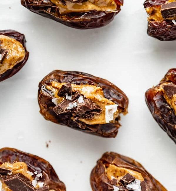
7. Almond Butter Stuffed DatesThese Almond Butter Stuffed Dates only have 4 ingredients and the combination of chocolate and dates make very a healthily sweet and delicious snack. The dates are chewy, brown fruits that grow on palm trees and have a sweet and nutty flavor.
They’re completely refined sugar-free and have a combination of healthy carbs, fats, and protein to keep you feeling full. |
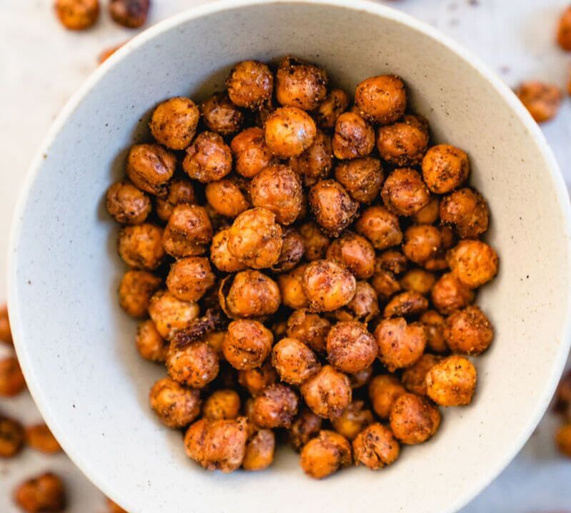
10. Crispy Roasted ChickpeasRoasted chickpeas make such a delicious and healthy snack! They’re perfectly seasoned, a bit spicy, and super easy to prepare. They’re perfect for parties, snacking in front of the TV, road trips and more.
As a rich source of vitamins, minerals and fiber, chickpeas may offer a variety of health benefits, such as improving digestion, aiding weight management and reducing the risk of several diseases. Additionally, chickpeas are high in protein and make an excellent replacement for meat in vegetarian and vegan diets. |
|
Development
Using the previous colour scheme and font I researched - I began testing out different colours to work well with the brand development. These colours are all from the researched colour schemes and work very well in my opinion with the style of the font.
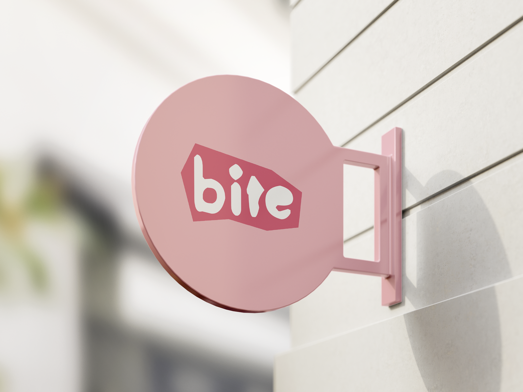
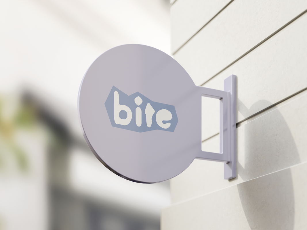
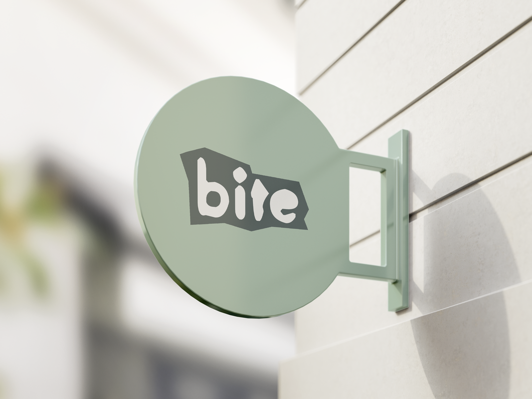
I also added a cool background shape to each of the logos that was a darker shade of the background colour to keep the logo white. This shape was different each time and I think that works well with the branding. Possibly suggesting the further idea of the brand going 'back to the basics' with the shape, look and typography to represent the plant-based products also being 'back to basics' and simple.
I also added a cool background shape to each of the logos that was a darker shade of the background colour to keep the logo white. This shape was different each time and I think that works well with the branding. Possibly suggesting the further idea of the brand going 'back to the basics' with the shape, look and typography to represent the plant-based products also being 'back to basics' and simple.
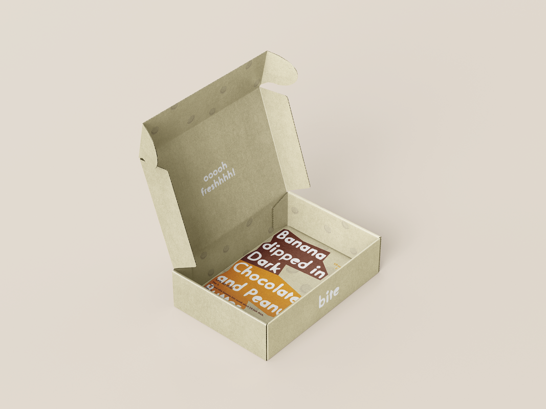
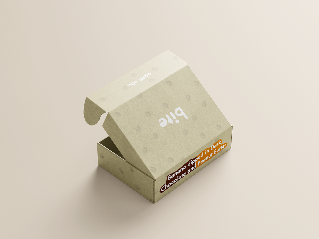
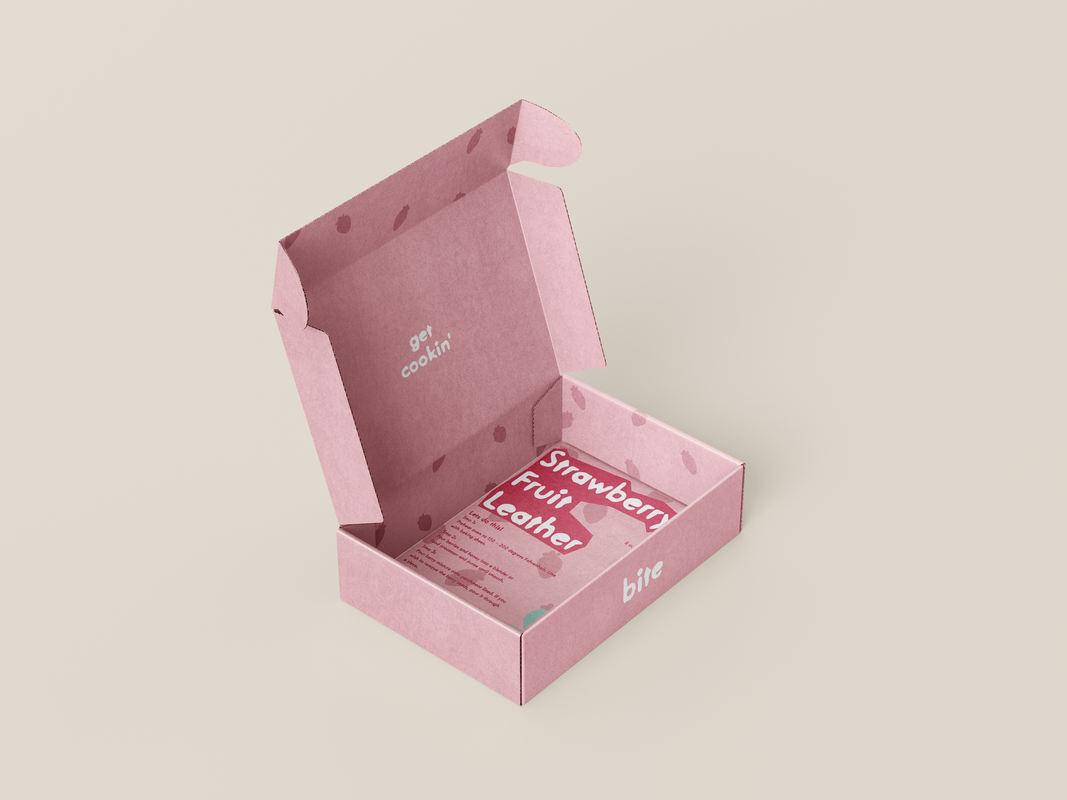
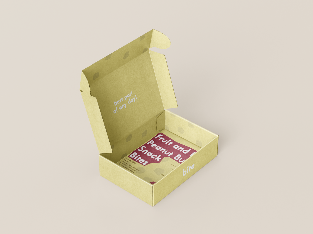
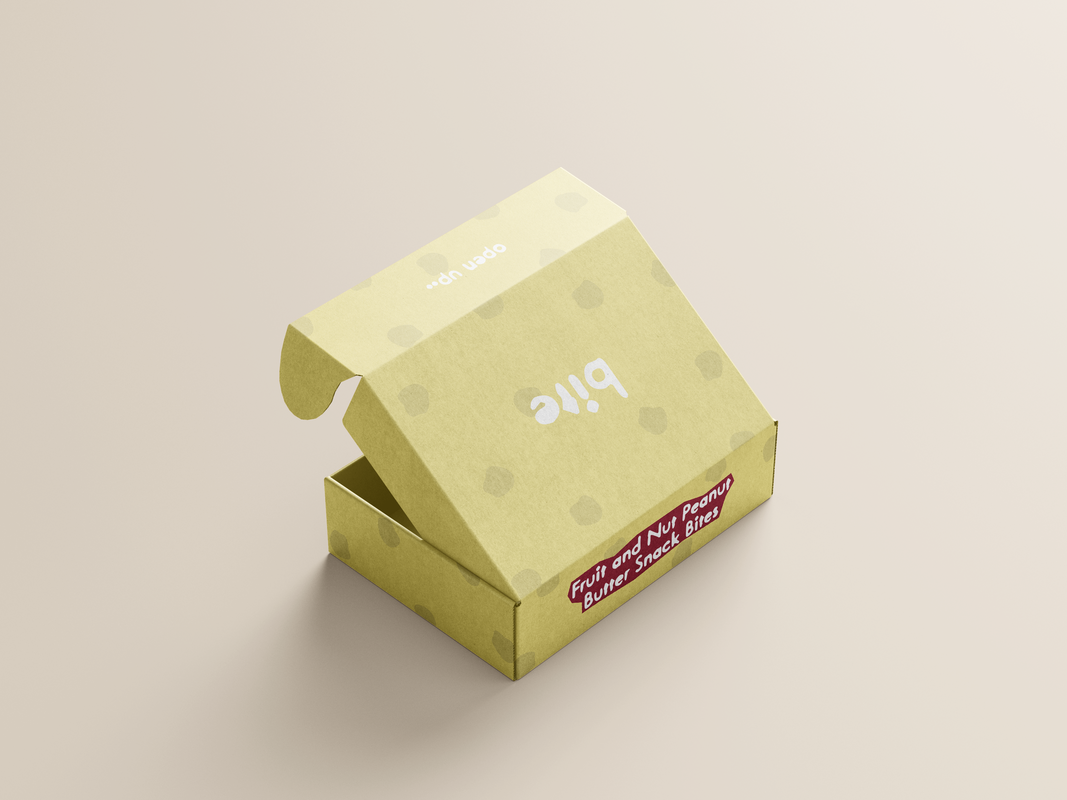
The subscription box
Kept in the style of the branding, the box contained the information of how to create the product (recipe) and other information within the box to keep printing and waste to a minimum instead of including extra paper.
The products would be packed with simple paper bags to reduce waste and all the components would be 100% recyclable to help support a greener world.
Each snack would be in a custom box which would styled in that specific products colours such as seen below.
The products would be packed with simple paper bags to reduce waste and all the components would be 100% recyclable to help support a greener world.
Each snack would be in a custom box which would styled in that specific products colours such as seen below.
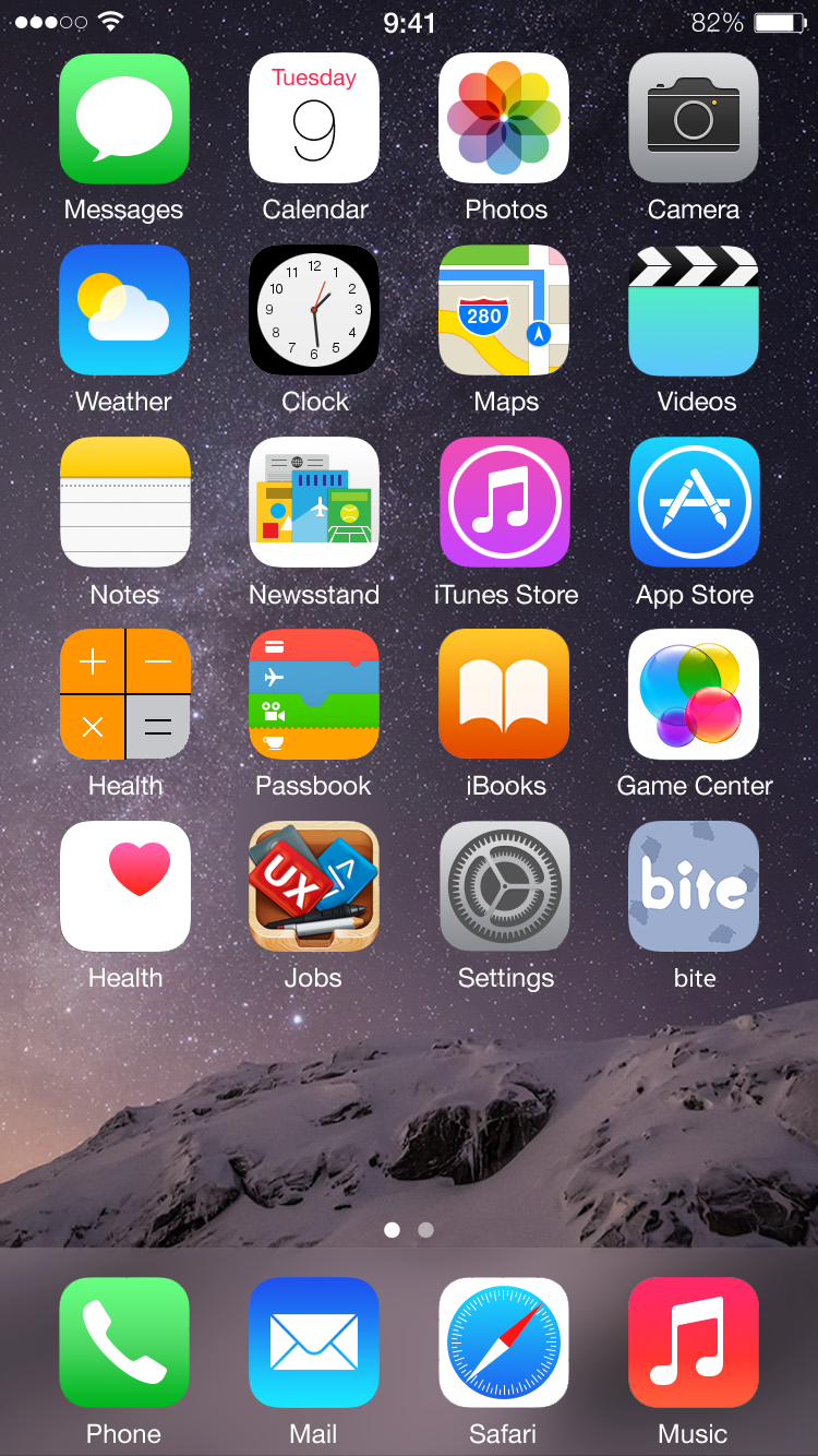
Mobile App branding
To show off the brand more, I decided to showcase the branding in other ways such as can be seen below as by an app icon.
|
|
|
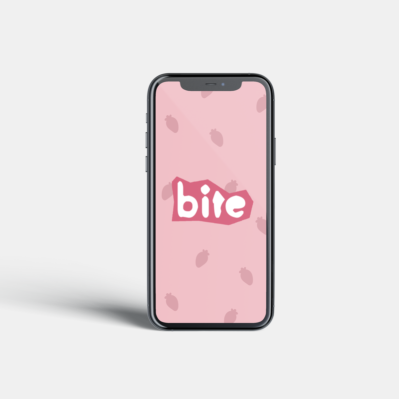
Once you open the app, you'd be greeted with the loading page which would be present as such
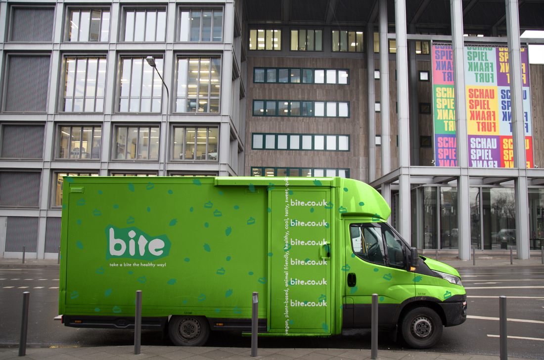
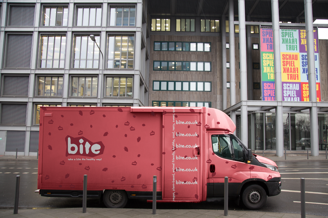
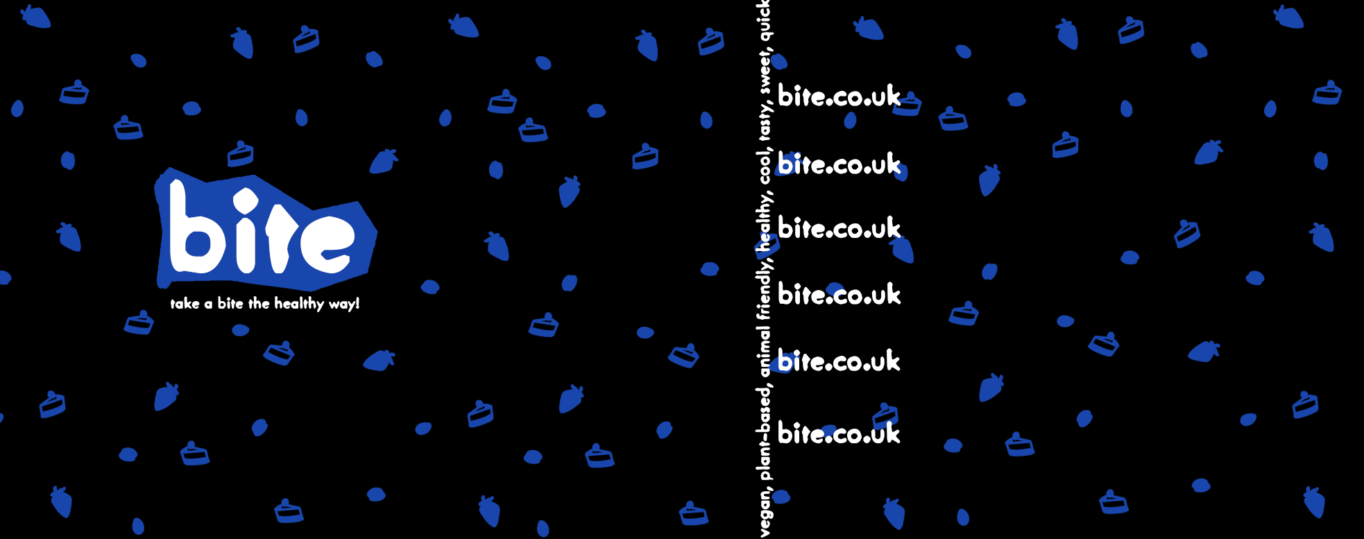
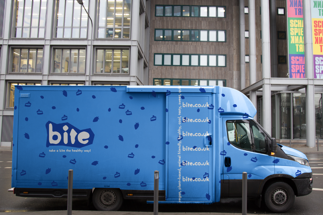
'bite' Vans
To finish off, I also created a design which could be displayed on custom vans which are out and about delivering the subscription box for customers!
| Open Brief: Processes for Design - Design Report |
