Type Classification Anatomy Type Suitability Workshop
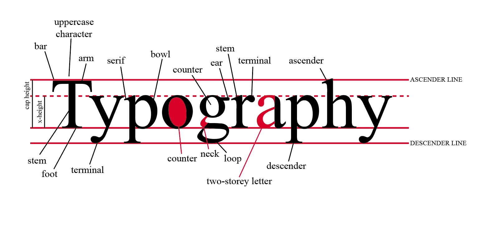
Type Anatomy
To understand typography I began by labelling the diferent parts of letterforms.
Types of typography
Below are a few examples of different types of typography that exist in the world. Each has it's own style, use and practicality.
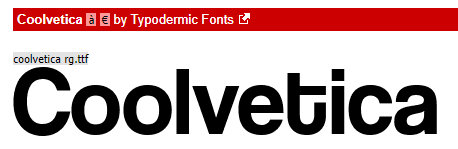
This font is a Sans Serif font. This is shown by no serif parts coming off from each letter. Each letter is simple with no elaborate designs. These fonts are perfect to portray seriousness or impact or something modern. This font suggest simplicity but can also be used to suggest something premium if used right as it suggests a sleek and minimalist design.
|
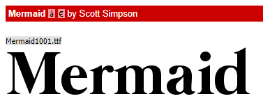
This is an example of a Serif Font. This is visible by the use of extra shapes and lines added at the ends of each letter. This font is great for something more elaborate, premium and suggets something extra that isn't possibly available to all. A great use of this could be a premium hotel or a product that has a target audience with a higher income.
|
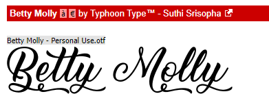
This is an example of a Script font. This is shown through the use of very elaborate lines that flow and move from one letter to another as if drawn by hand. This font can be used to suggest homemade, handcrafted or something close to home like something family-run.
|
Decorative Font
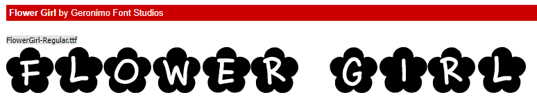
This is an example of decorative font. This type of fonts is very wide in range and can be used for something that wants to be decorative/stand out as it's never usually simple or minimalist hence why it's so 'decorative'.
|
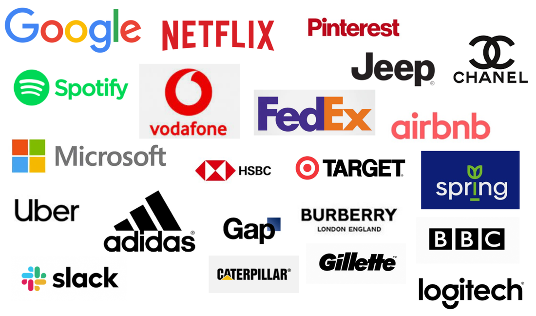
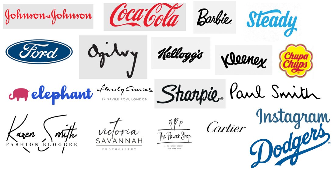
Examples of Sans Serif Font brands
Examples of Serif Font brands
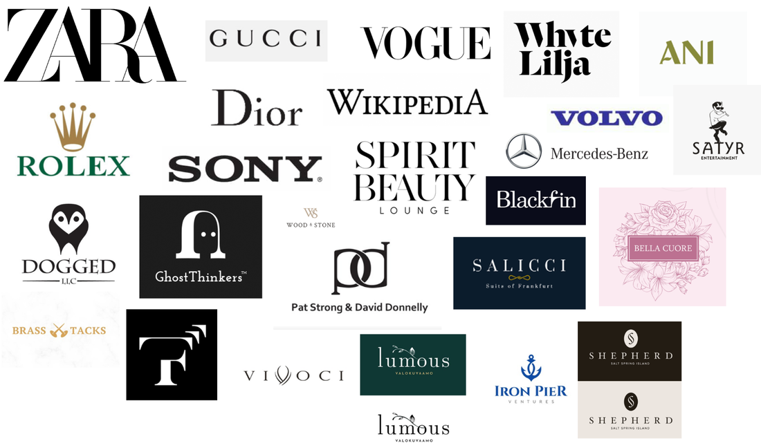
Examples of Decorative Font brands
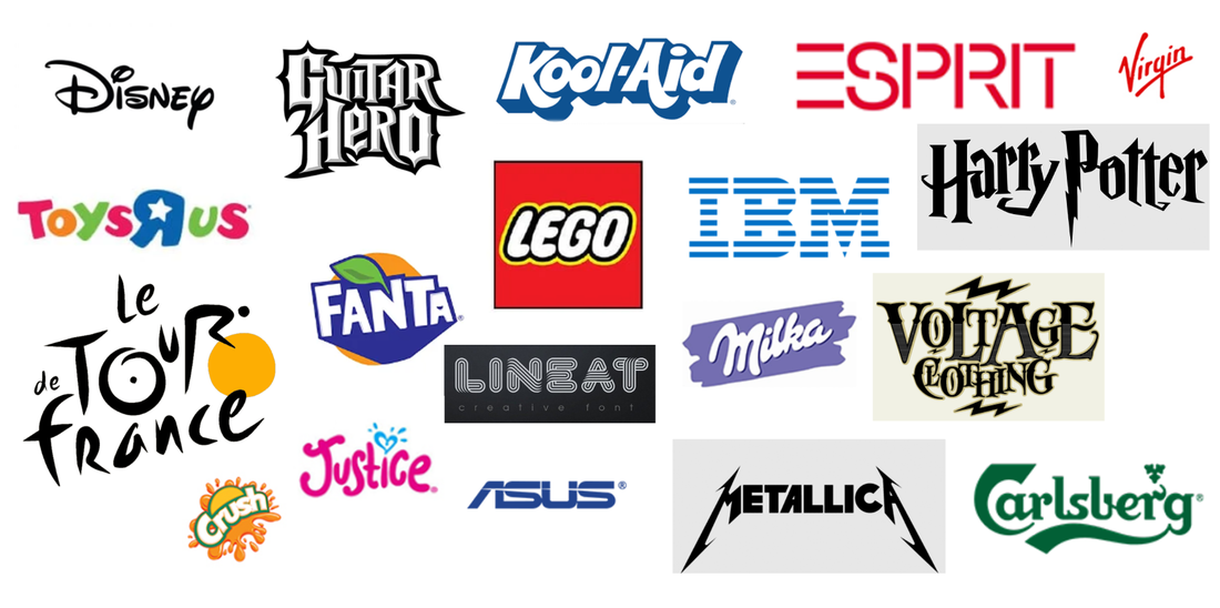
Examples of Script Font brands
|
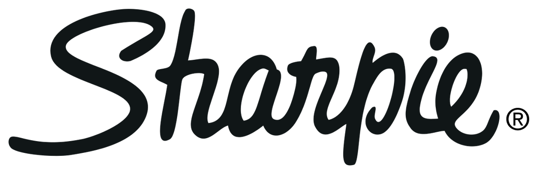
The Sharpie logo uses a script font. This is a great use of the font as the brand is all about writing implements such as pens and fine-liners. This matches and shows in the logo used as it looks like someone has written with a pen. The font is handwritten with small curls and changes thickness throughout to show the handwritten style.
|
|
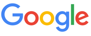
The Google uses a Sans Serif font called "Google Sans" this font reflects the companies style of simplicity and minimalism. The brand is know for their style and this is reflected very well in the logo. The use of colour suggest a playful feel but the font itself suggests futuristic, modern brand. This makes consumers feel like the brand is serious in their products but playful with the feel of each product as shown by the range of colours of their programs despite handling day to day things like Google Slides, Search and Android.
|
|
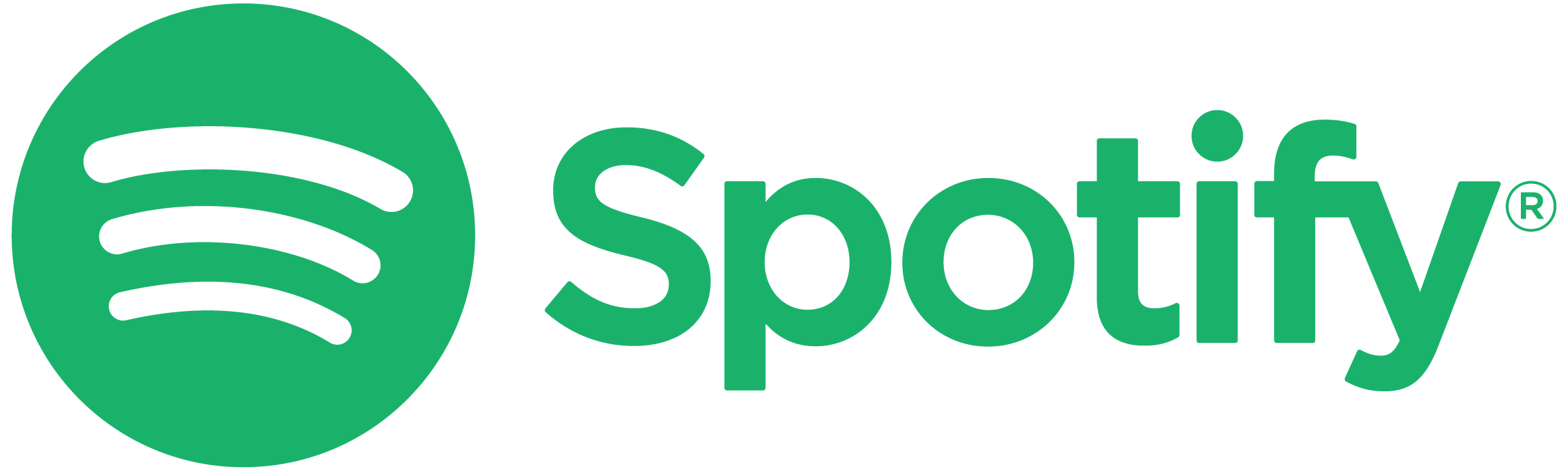
The Spotify logo also uses a Sans Serif font. This font is very simple and minimalist which reflects in the UI, look and feel of the app that the company has designed. This company provides a platform for music and so this look shows the simplicity of ease of access to millions of music on their platform.
|
|
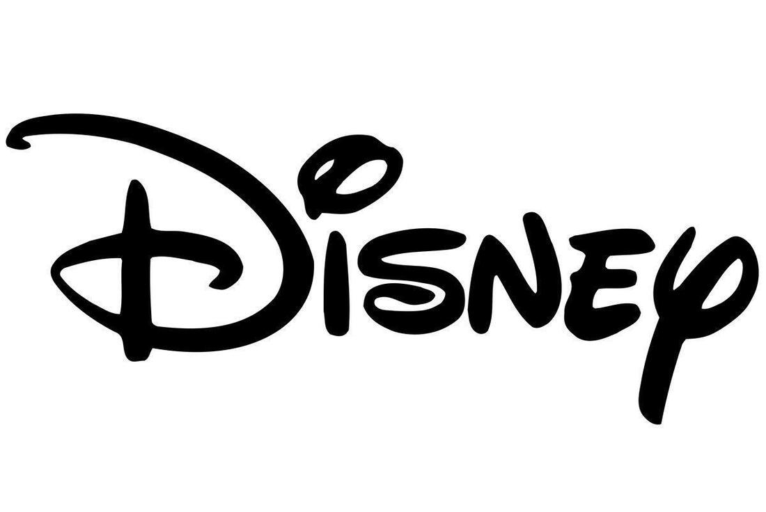
Disney is a huge company that provides entertainment to children all around the world. The companies logo reflects the target audience intended with the use of a decorative font to suggest playfulness and a childish feel. This fits the theme of the company very well as any other typeface would make the company feel different. For example, the use of a Serif font would imply that the company is more premium, big brand and less down to earth for children which would not fit the theme of their entertainment.
|

|
Vogue is an American monthly fashion and lifestyle magazine that covers many topics, including fashion, beauty, culture, living, and runway. Based in New York City, it began as a weekly newspaper in 1892 before becoming a monthly magazine years later. The logotype reflects this by using a Serif font which suggests a premium, upper-class and serious feel as it produces a magainze on fashion and lifestyle which appeals to a more premium target audience.
|
|
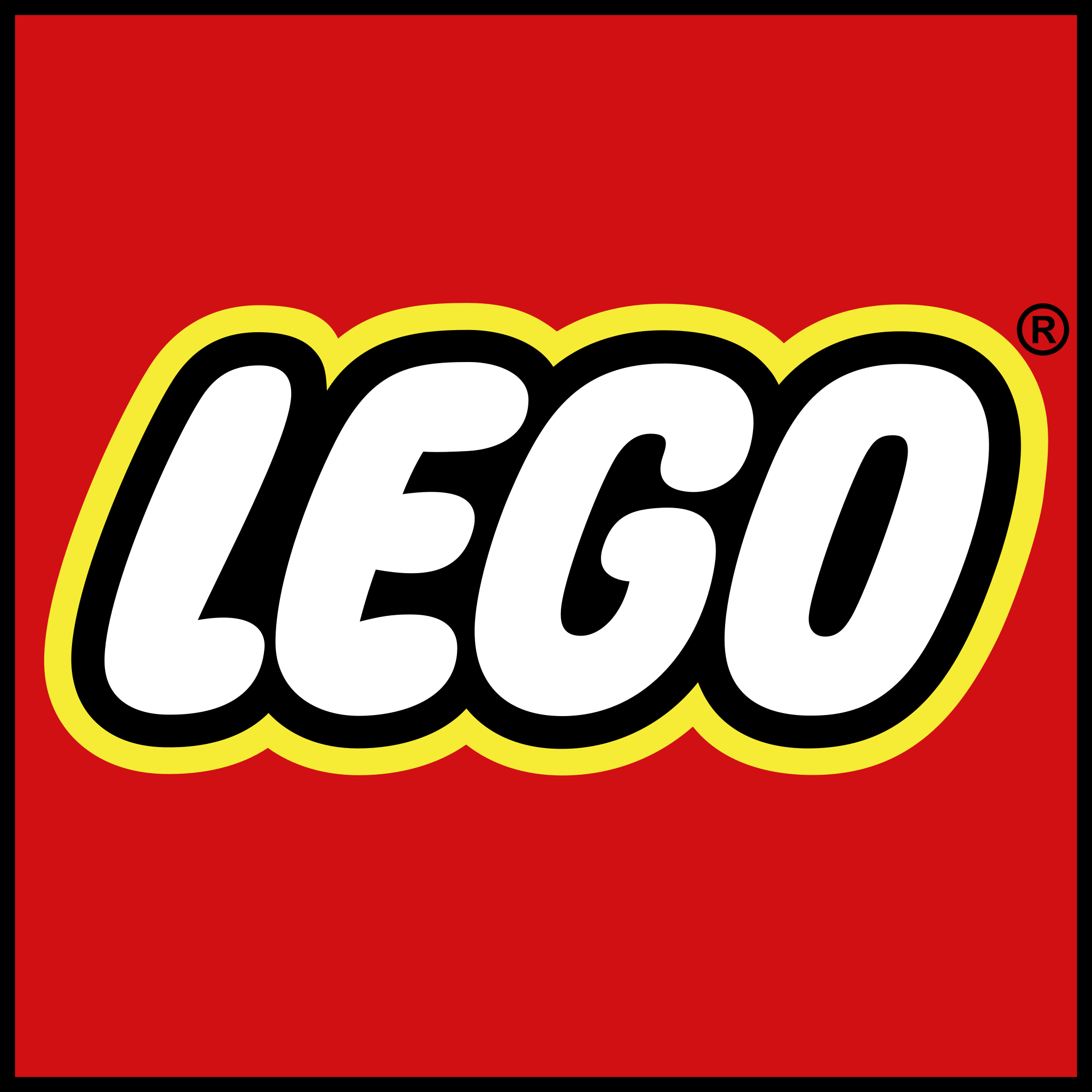
The Lego logo also uses a decorative font to suggest playfulness and a fun side to the company which perfectly shows the company as a whole. Likewise to the Disney brand, this company provides toys to children around the world and the typeface reflects that by using this type of font. Any other font would create a different feel to the company that would not suite the type of target audience the company is attempting to reach out to.
|
