Unit 9: Professional Practice in Art & Design
In this unit, I was tasked with updating my portfolio page and improving it. I began by researching and collecting artists work and their portfolios to explore what kind of styles, layouts and ideas they have.
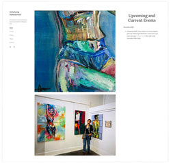
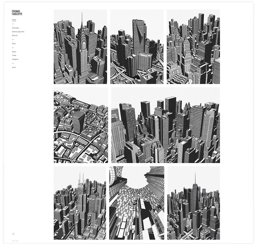
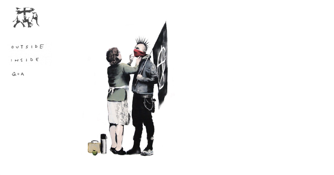
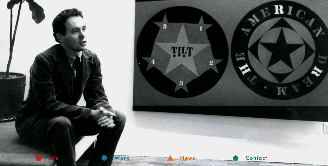
This first portfolio is by AshaAung Helmstetter. She has a very simple portfolio with the menu being on the left with all the pages such as contact, about and work. The work is displayed in the middle along with a small section on the right which has her upcoming and current events which is important for this artist as you can see from the images - her work is shown at different events.
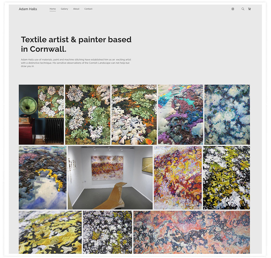
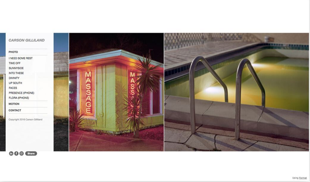
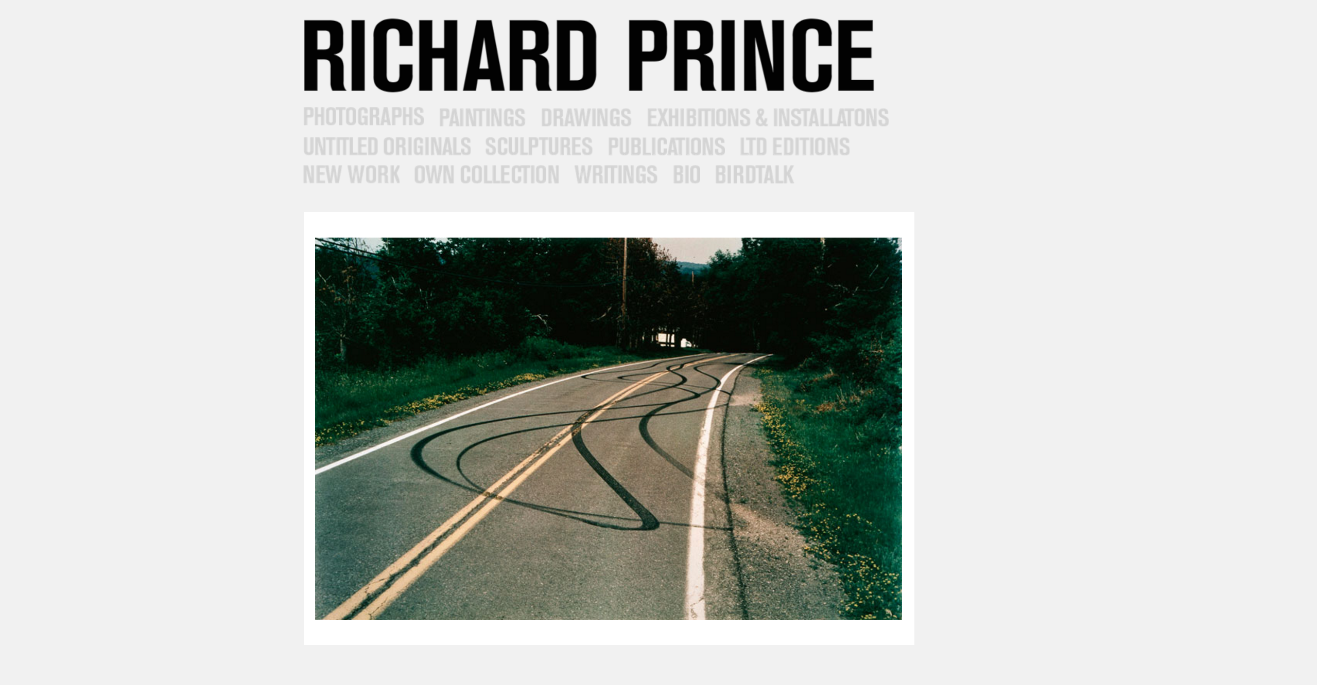
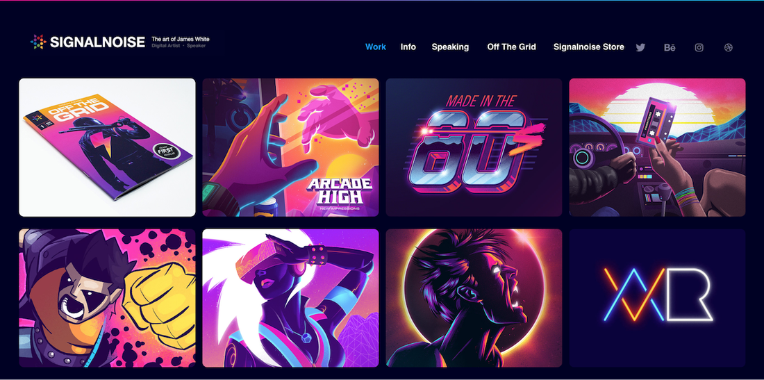
This second portfolio is by Adam Hall who is a textile artist and painter. This information is shown straight away by the big title at the top of the page. His work is displayed below this with many photographs of different works/projects scattered like a collage. The menu is nicely placed at the top of the website to not distract the viewer from the work is displayed much bigger and takes up much more space.
Making my own Portfolio
I had already previously owned this website and so I wanted to change the main homepage of it to fit the style I had been researched and was inspired by above. The home page contained a welcome paragraph along with a slideshow of my best work below. At the time this seemed the best idea however, upon review I found that I did not like the amount of writing and I wanted my work to show rather than be swamped in text. Ideally, my work would speak more words than the big paragraph instead.
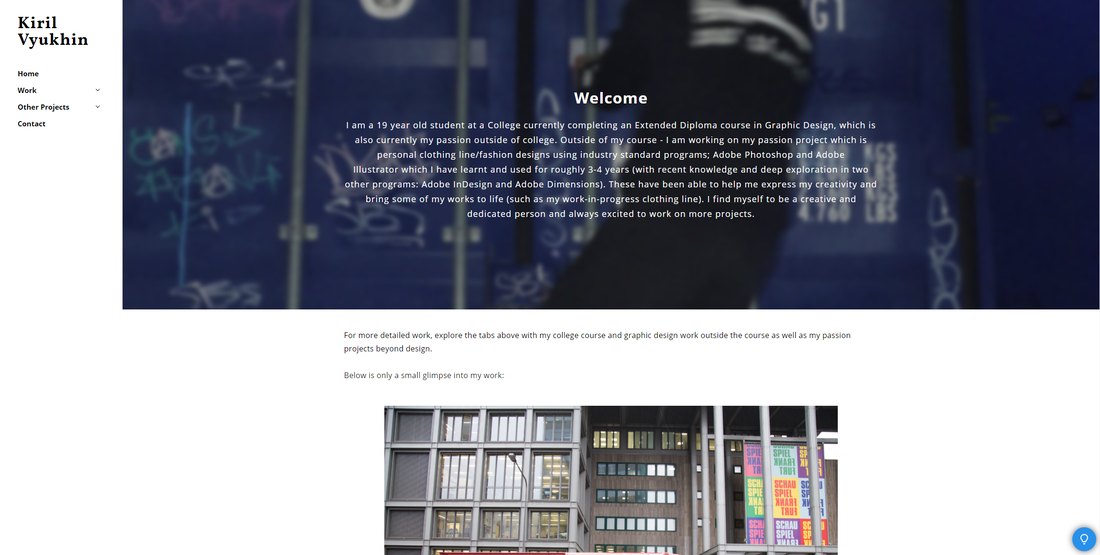
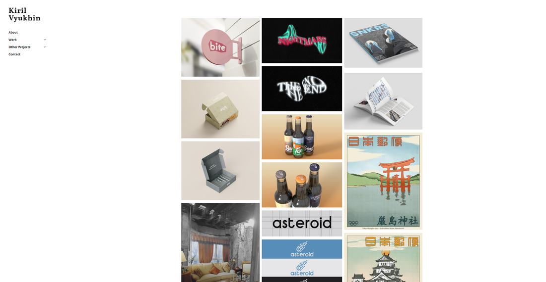
Using the websites I for inspiration, I decided to keep it my menu being on the left side with my work displayed in the center. I decided that my homepage would contain most of my best work to showcase as the first thing you see. The viewer would then use the menu on the left to look through my other projects which would contain further, more detailed work. My name would be displayed above the menu (very tidy and tucked away as I want to be blend in rather than stand out). I decided to go with a white background along with black typography everywhere as it would be the best choice as a lot of my work uses very different colours and colourschemes. Using white and black would work well with this and not clash with any of the other work.
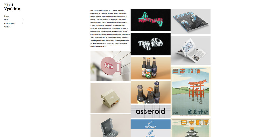
I then decided that I did not like the paragraph of text still visible in the top left area of the homepage and so I completely moved it to a new page which I called "About" which would mean that this entire page would just be my work without an interuptions. You can also see that I improved the spacing between all the artworks so that there is a slight white border each one so that it seperates each work a bit.
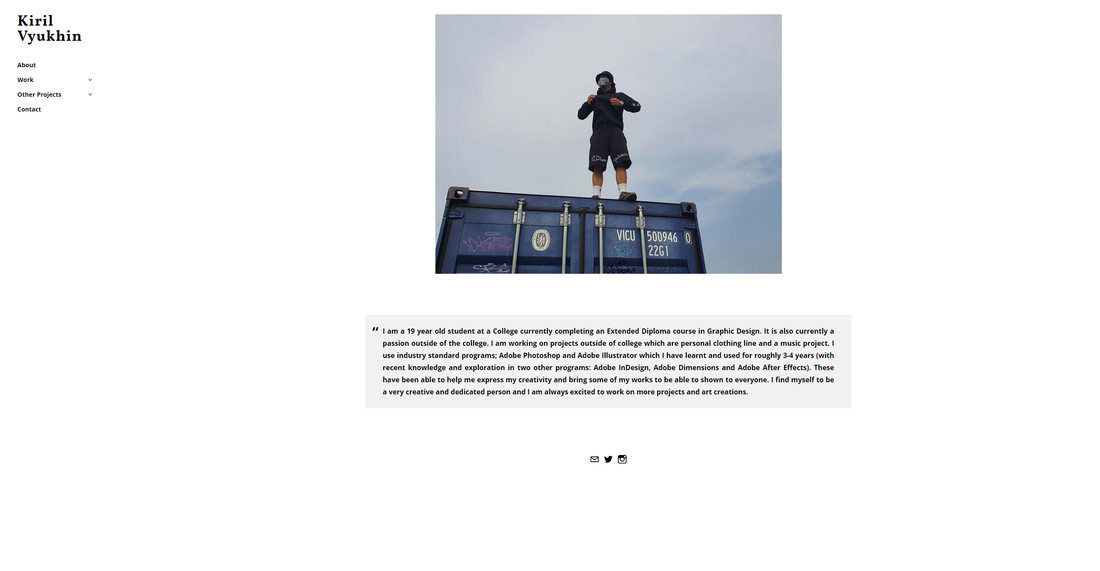
My 'About' page contained a simple picture of along with the paragraph being placed in below with a bit of detail about me and who I am. I then included links to my socials below that to keep everything simple and clean.
Summary
In this 2 year graphics design course, I was able to finish many units with ranging topics from Infographics, Book Covers, Packaging, Logo Design and Collages. My favourite units were definitely Unit 42, Unit 38, Unit 3, Unit 40, Unit 43, Unit 41 as well as my Open Brief and of course my Final Major Project. I was able to complete these units with final outcomes that I was proud of and I am happy with the research, development and overall process of each of those units.
I was able to create a collage that explored abandoned buildings with furniture from the 80s and 90s which resulted in a really great collage that looked like the furniture really belonged there. Another one of my favourites is the ale bottles I was able to design for Exmoor Ales. I am really proud of the illustrations I created for these labels and the overall look of the ale bottles really stood out and looked very professional. Each animal for each flavour had a similar style while being easily understood and the colour scheme of each bottle made each bottle look nice both alone and together. My unit for the Japanese postcards required me to make four illustrations in the style of block printing. Each of these illustrations took many hours to create however I am very proud of the outcomes of each one as they contain a lot of detail as well as replicating the style that has existed for centuries. Finally for my Final Major Project, I was able to create a clothing brand in my own style that I liked. I created lots of research to explore the style and from there, I was able to create a clothing brand a webpage that showcases the products I had designed. This outcome really made this brand feel like it is real and I think it answers the brief I set out from the start of that unit.
I was able to learn and explore the industry standard programs Adobe Photoshop, Illustrator, InDesign, Dimensions and After Effects to be able to create and showcase my work on this blog. Each program was able to help me create what I invisioned as well as present the work exactly how I would've imagined it.
Each unit had a clear structure to how to reach my final outcome and I was able to follow this structure to help me build up to my final outcome and be able to back it up with research and progress development; trying different ideas out as well as attempting new styles and ways of achieving this outcome. This will also definitely help me in the future as this would mean I would be able to create projects with this progress behind it to better understand what these projects would be about rather than jumping straight into the deep end.
This helps build up my portfolio to show all my work to be presented to help me in the future, as I am striving to eventually work at a creative agency to create logotypes, branding and packaging for companies and groups in a creative agency or as a freelancer.
