I began learning a new program called "InDesign" by Adobe. This program is used for magazine layouts and design. I was able to create this mock-magazine within Adobe InDesign using images and text from the internet.
Recreating a magazine within Adobe InDesign
I replicated an already made magazine double-page within InDesign using techniques such as Text Wrap. For places where the text was located, I used Lorem Ipsum to fill the space.
I replicated an already made magazine double-page within InDesign using techniques such as Text Wrap. For places where the text was located, I used Lorem Ipsum to fill the space.
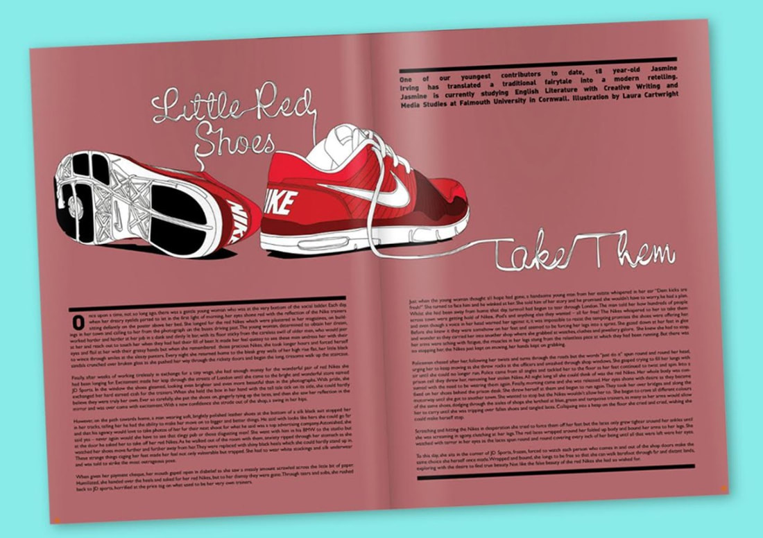
Original found magazine.
|

|
Final outcome from replicating the already-made magazine.
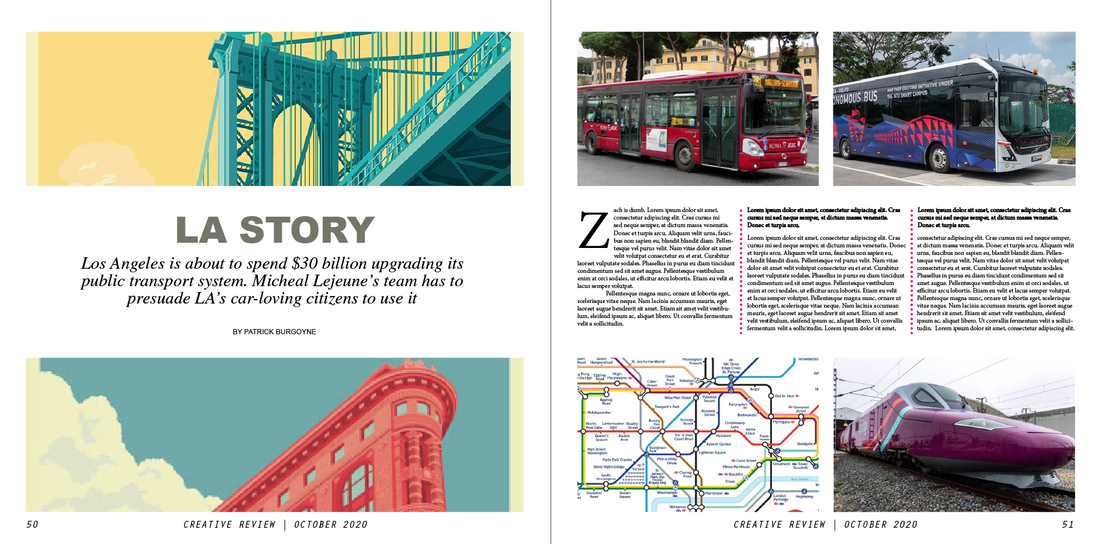
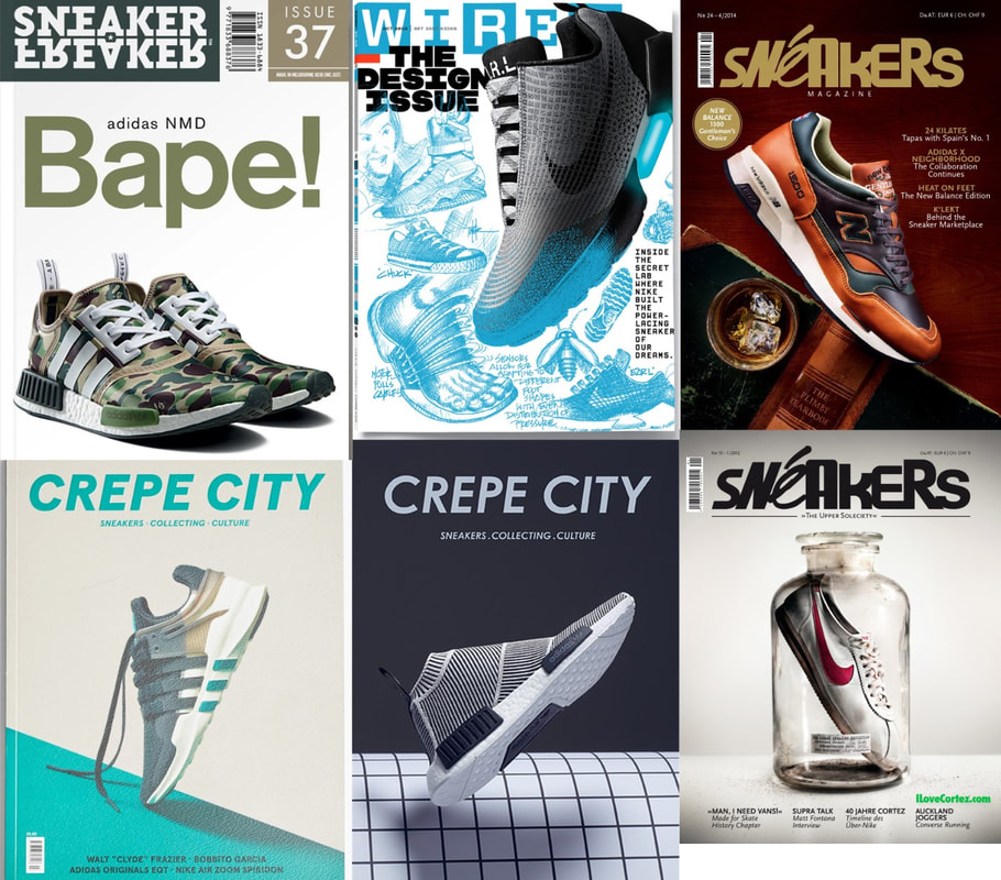
Analysing double page spread magazine's and their layout, content and placement.
The analysing articles below also contain numbers 1 to 3 which follows the order of what grabs the viewers (my) eyes first in order.
Click each image to expand the view.
The analysing articles below also contain numbers 1 to 3 which follows the order of what grabs the viewers (my) eyes first in order.
Click each image to expand the view.
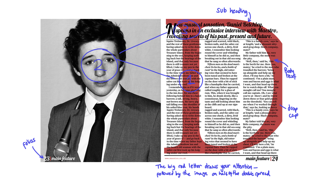
This first double page spread contains an image for the left side. On the right page, the letter 'D' is in red (This is the first letter of the person which the article is about) which could be put in to grab the viewers attention. The subheading is displayed above in a stylish font with the body text being layed out in 3 columns below. The folios (number of page) is placed below the body text on the corners. This article uses a very simple black and white colour scheme with a red used for one letter to draw the attention of a viewer. Even the photograph on the left is black and white.
|
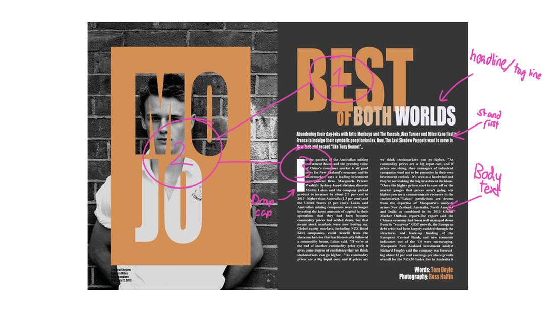
This double page spread follows a similar layout as the one above, the left side is taken up by an image of the person which the article is about with the title of the article placed above the image - using negative space for the letters. The other side contains a tagline/subheading and the body text takes up the bottom of the second page with only two columns this time. The article uses a very simple colour scheme of black, white and shades of orange. The orange sticks out very well from the black and white and could be used to draw attention but in a calm way compared to the article before which uses red which is seen as a more 'aggressive' colour.
|
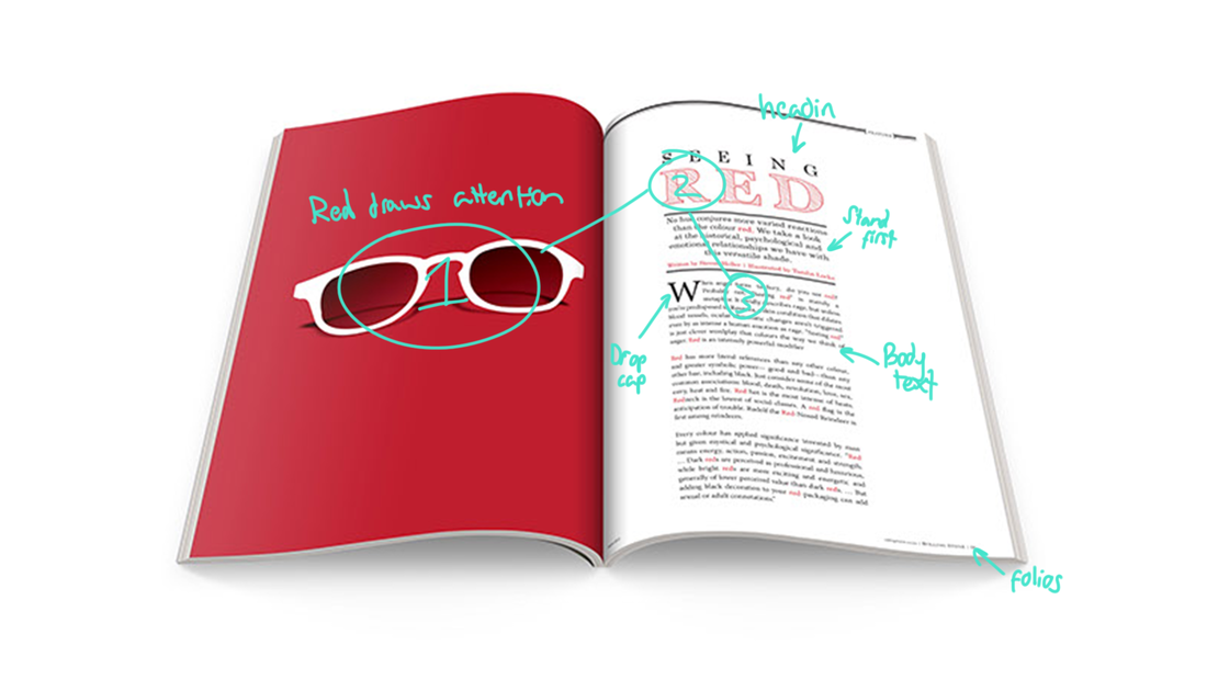
This double page spread, once again, uses the left side to contain an image taking up the whole page. This time, the image is of sunglasses which contain a red background which draws the attention of the viewer instantly - being the first thing they would view when opening these pages. The headline is once above on the right, however the body text is only in one column - not taking up the whole right side of the page with a column of white space on the most right - to help the body text fill to the bottom of the page possibly and also to make it easier to read.
|
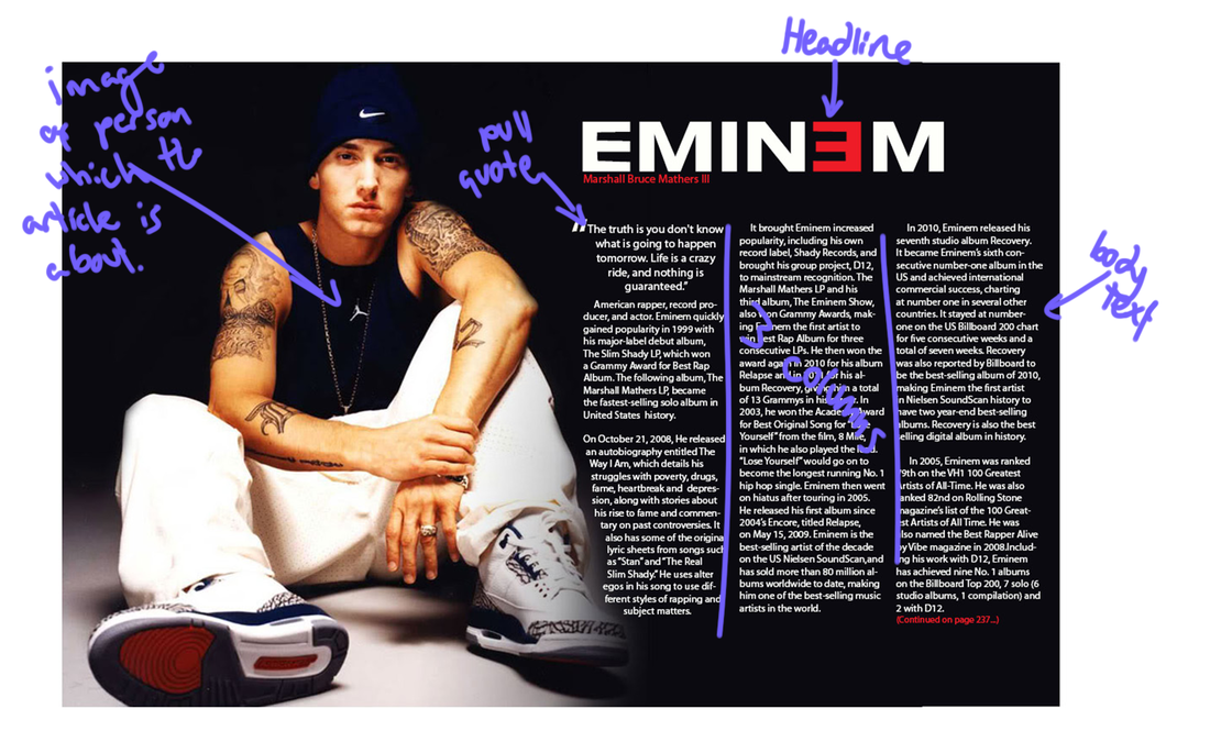
This article contains an image, again, on the right with the text taking up on the right. The headline is also displayed at the top. This time with a pull quote before the body text - which is divided into 3 columns. The image of person of which the article is about takes up half of the double page spread and uses a black background just like the background of the text on the right. The image on the left takes up the same or even more than the body text on the right possibly suggesting the importance of the image as this a very well known celebrity.
|
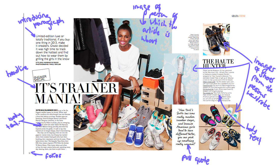
This article uses 3 columns on both pages. However those 3 columns are not always used for body text. The middle and right columns on the first page are used for a photograph of the person of which the article is about with the left column containing body text and a headline for the article in the middle which overlaps the image. The right side of the double page spready is scattered with images of the shoes which the celebrity has along with body text and a quote that from the person. The placement of the images could possibly suggest the messiness and craziness of this wardrobe look.
|
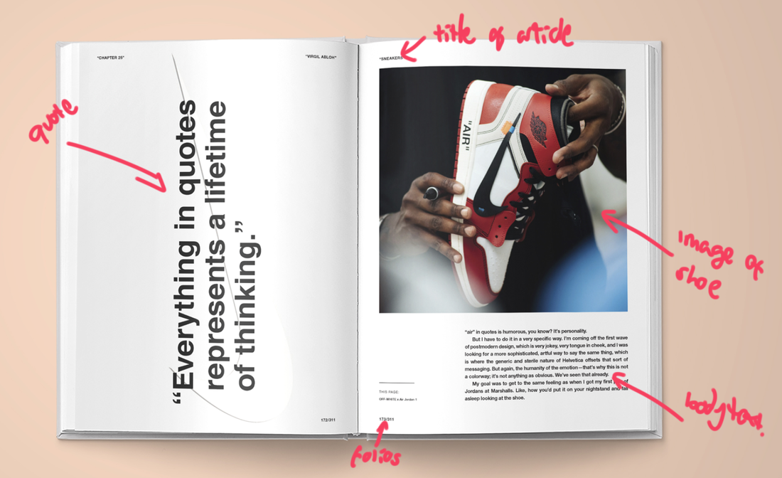
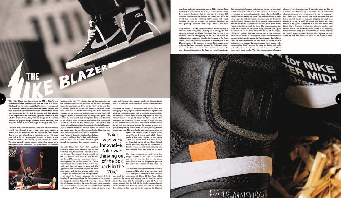
This final double page spread uses a quote to take up all of the left page along with a Nike 'swoosh' in the background. This is possibly because the artist which this article is about likes to use quotes in a lot of his works. The right page uses an image of a shoe designed by the artist along with text on the bottom third. The whole article is a lot more minimalist than any of the previous articles as it only uses black and white for its overall look except from the image used. This shows the main looks of this double page spread is the quote on the left and the image with the text being so small and hidden on the side possibly suggesting that the image and quote are made to seem more important compared to the body text.
|
Recreating another magazine in Adobe InDesign
|
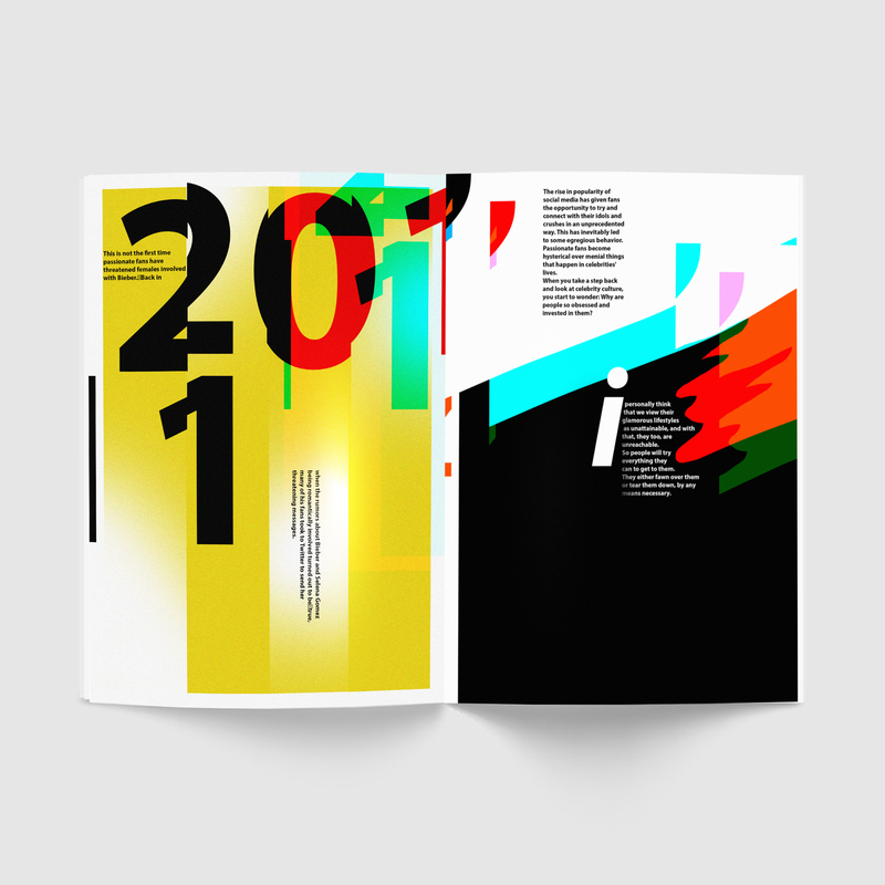
I was tasked with re-creating a double sided page from a magazine. I used Adobe Photoshop for this to create all the complicated lines, shapes and effects such as the numbers being split into colours and cut up. This was a difficult double page to replicate as there was a lot of detail, shapes and colours I had to recreate however I am happy with outcome as I believe I came very close to the real version without using any measurements or overlaying from the original to 'cheat'.
|
|
Above is my own recreation of the magazine I had found.
Brief: Design & Creating my own Articles
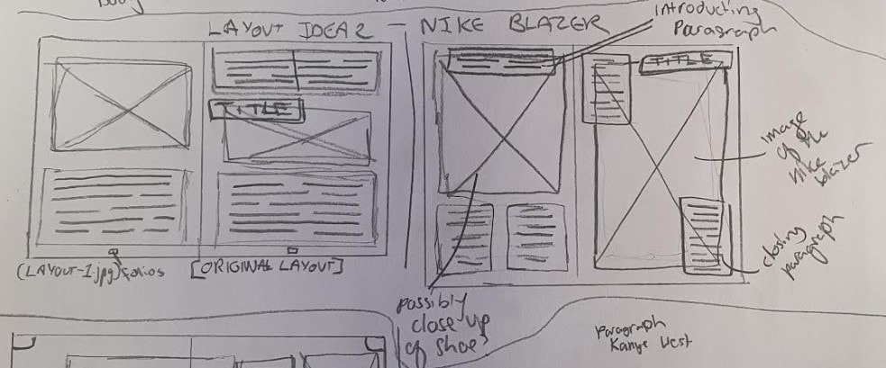
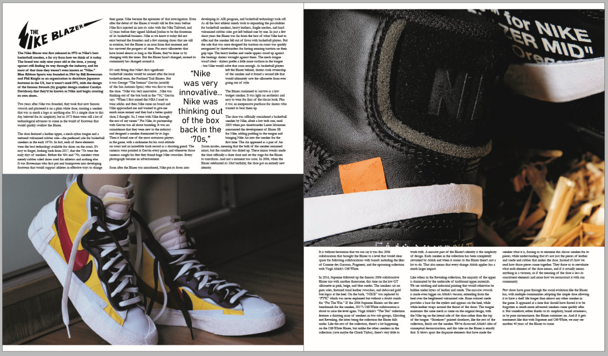
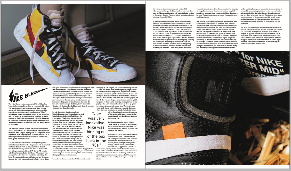
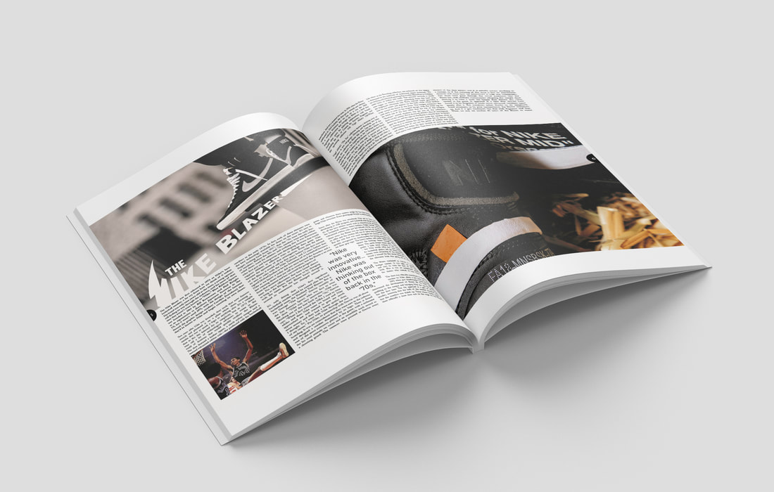
First double page spread: Nike Blazer
Both of my articles are on Footwear.
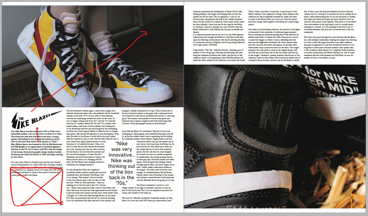
I began by searching for articles written about different footwear, my first one was about the Nike Blazer titled 'Why the Nike Blazer will never go out of style'. I found an image that I decided to use for inspiration for the layout process of this article.
I began by searching for articles written about different footwear, my first one was about the Nike Blazer titled 'Why the Nike Blazer will never go out of style'. I found an image that I decided to use for inspiration for the layout process of this article.
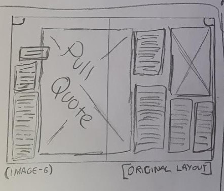
Using this, I sketched the layout and developed it into my own idea.
With this, I began working on the Headline for the double page spread.
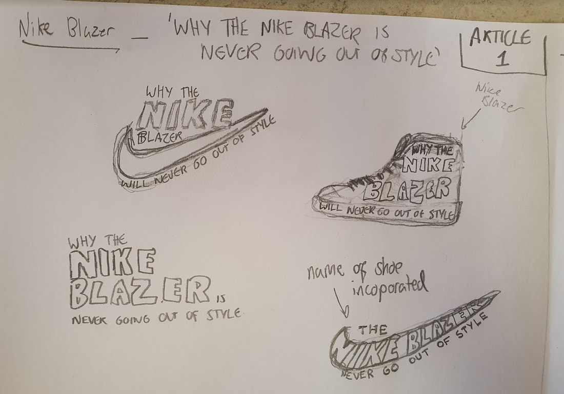
This headline was then digitised in Adobe Illustrator. I decided to remove most of the headline and keep it to a very simple 'The Nike Blazer' as I believe it makes the headline much quicker, snappier and easier to read compared to the sketch I had developed above.

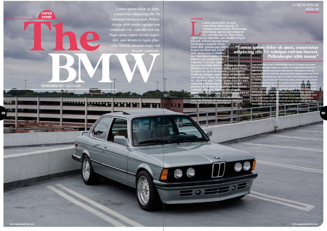
I then began work on this double page spread in Adobe InDesign. However upon reflection, I did not like the use of two columns on the left as I believed that text would not look best with an image below as I had planned previously and so I chose to use three columns instead.
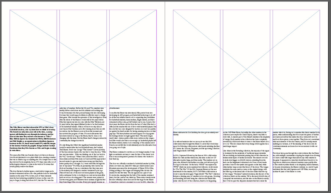
I then added secondary source images colerating with the article, along with the heading. I also decided to add a 'Pull Quote' that I used the effect 'wrap text' available in InDesign.
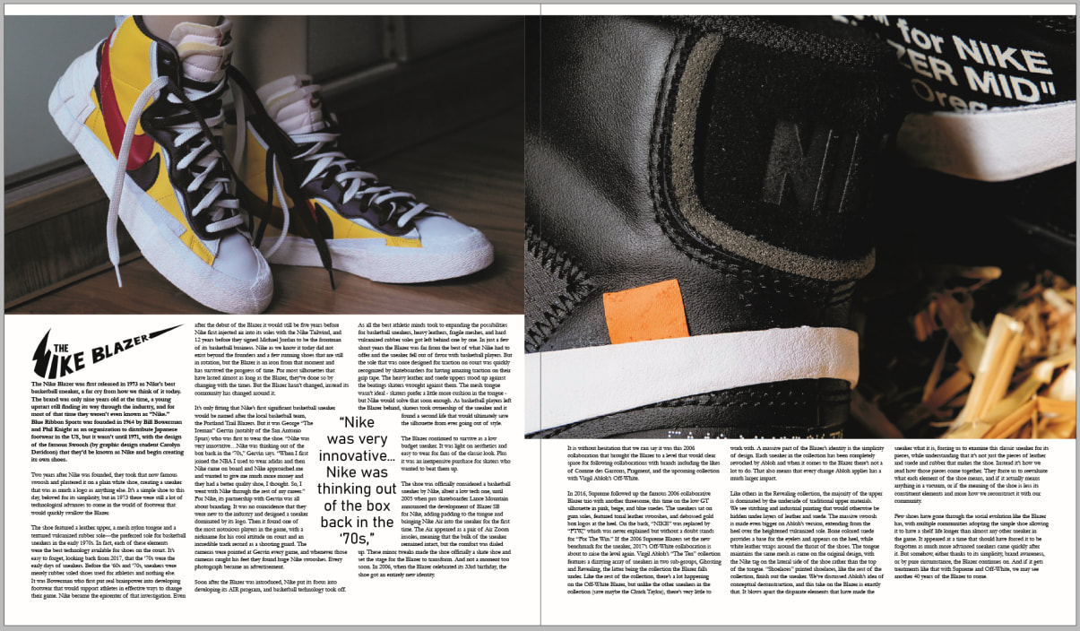
I also tested to see the placement for the left page image being either below or above the text.
|
|
However I came up with the idea of moving the Headline above into the empty space on the image which mean I was able to move the introductory paragraphy and article body text up along with being able to include an image in the bottom left.
Following this, I had changed the left side image and had moved the headline to the bottom left of the image
|
|
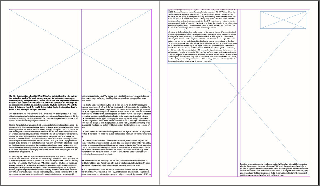
After a few more adjustments, I included the folios (page numbers). I also fixed the placement of text to create straight edges on both sides, corrected placements of all images to create the margins visible.
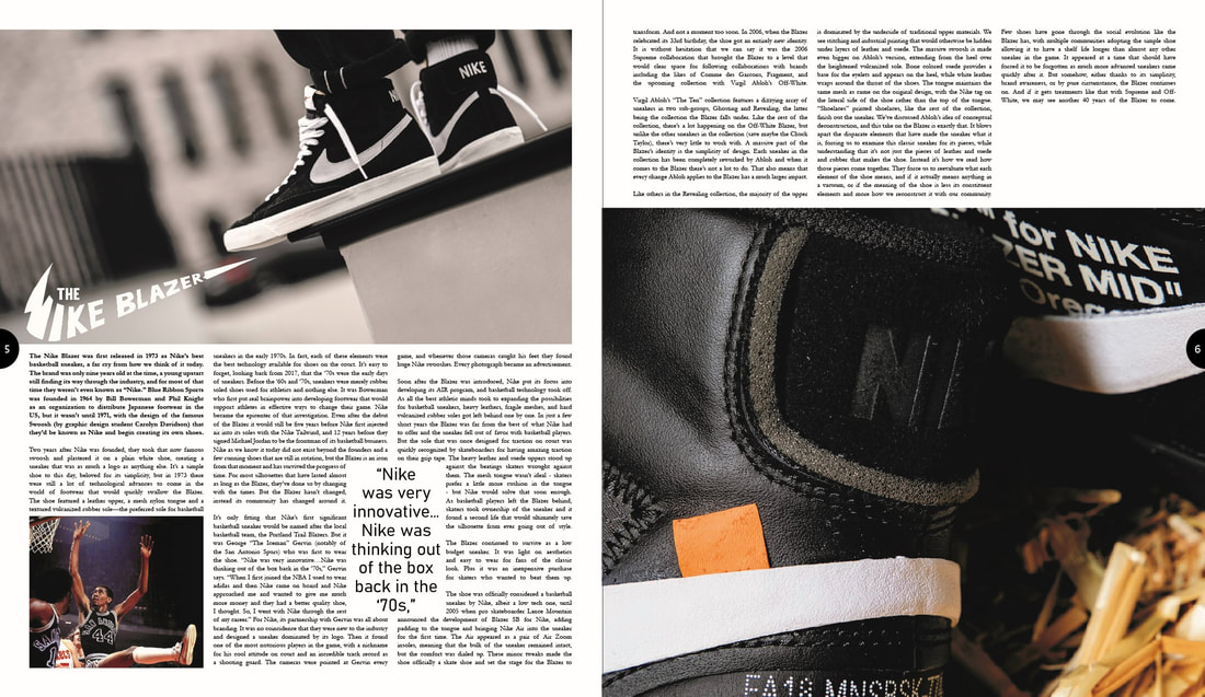
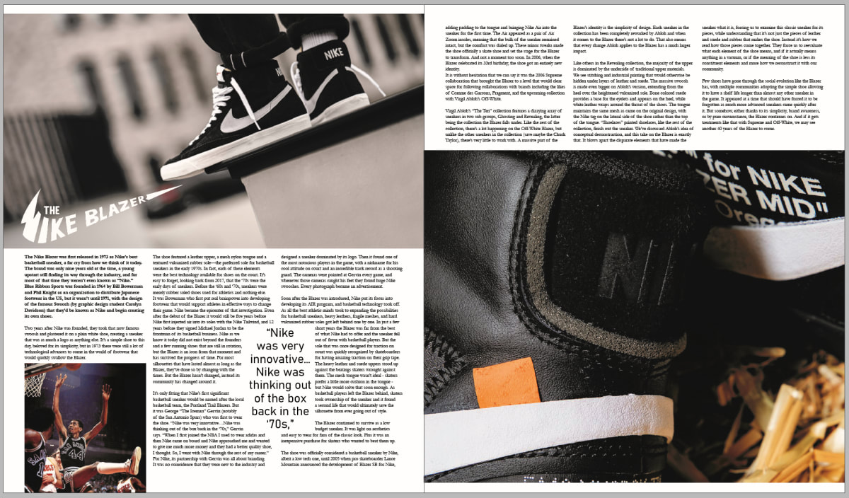
After this, I decided to increase the size of the heading of the article and improved the spacing in the paragraphs on the second page at the top. This was then the final outcome I was able to achieve for my first double page spread.
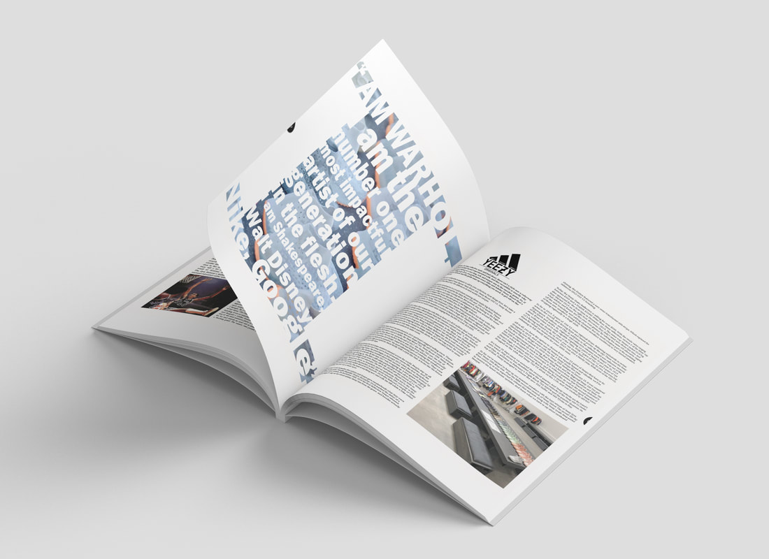
Second double page spread - "Brief History About Yeezy's"
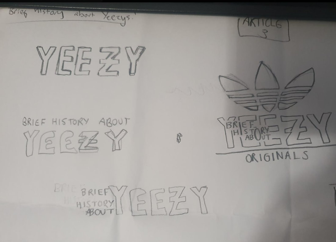
My second article is titled 'Brief History about Yeezy Originals' I found this article and drew a similar layout on paper.
|
|
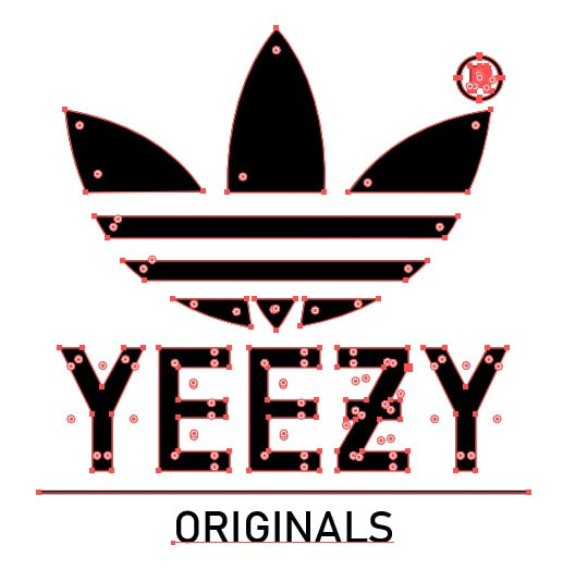
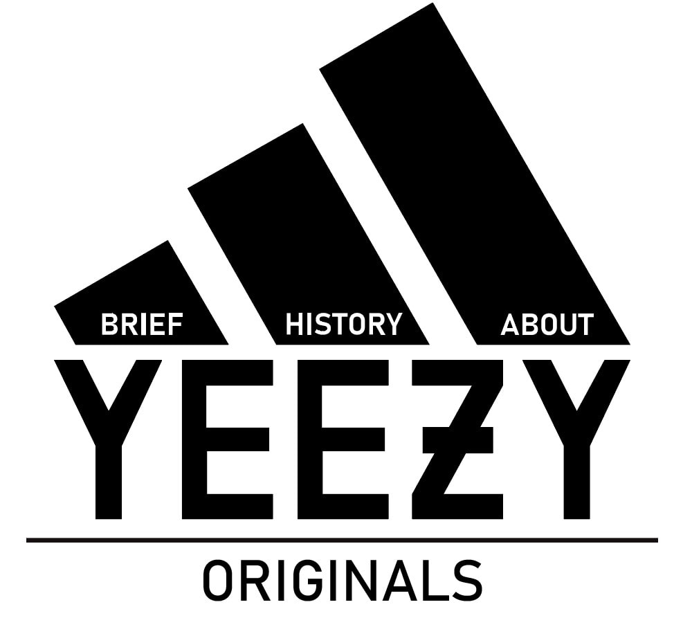
First, I decided to make the headline for the article 'Brief History about Yeezy Originals'. I started this process by creating sketches of the headline - incorporating the Adidas logo and the Yeezy logo within the headline.
|
|
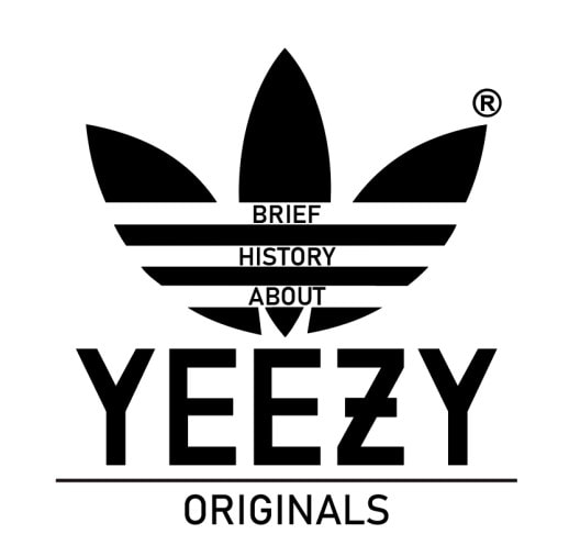
However, I did not like the digitised version of one of my sketches and therefore decided to use the other Adidas logo, this version came out much better. This time, using the other Adidas 'three stripe logo', I also added the 'Brief History About' part of the headline within the Adidas logo which I believe worked out very well.
I then began replicating the layout previously sketched within Adobe InDesign, I also used 'Lorem Ipsum' text to fill in the text boxes.
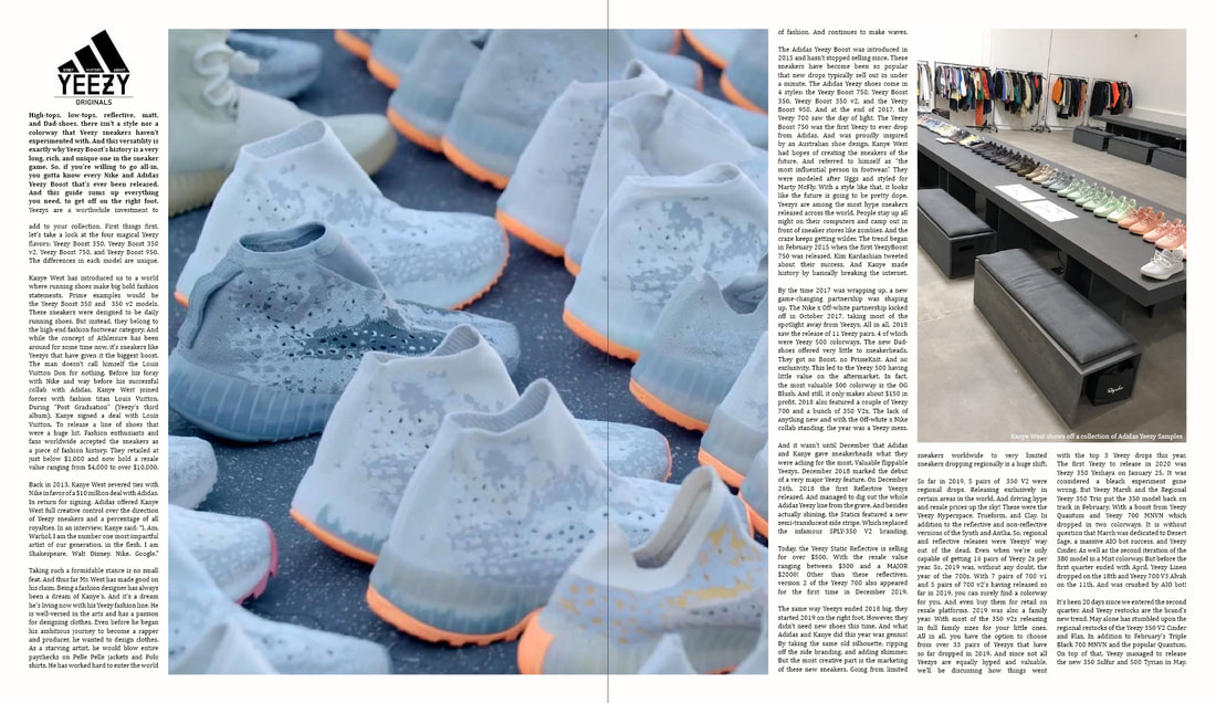
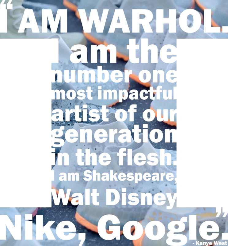
I then added the images and added the correct text and also lined it up using a feature in InDesign. However, with all the content added I was unhappy with my design. I decided that this designed looked too simple and I wanted to also include a quote somewhere on the page. With this, I began sketching a quote from the article and decided to use the big image in the middle of the double page spready and include the quote inside this image.
|
|
With this, I added it back into the double page spread and moved around the text to fit this new pull quote. I also added images where appropriate to support the article.
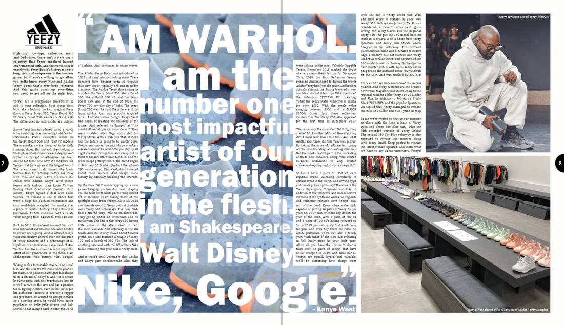
After consideration, I decided to trial out moving the pull quote onto its own page on the left. I then updated the pull quote to make sure all the letters reached the edges of the letter "i". I then decided move all of the body text to the right. This would make this double page spread easier to read compared to the previous which could have been harder to read. I also had made the double page spread from four columns down to two columns to further make it more readable.
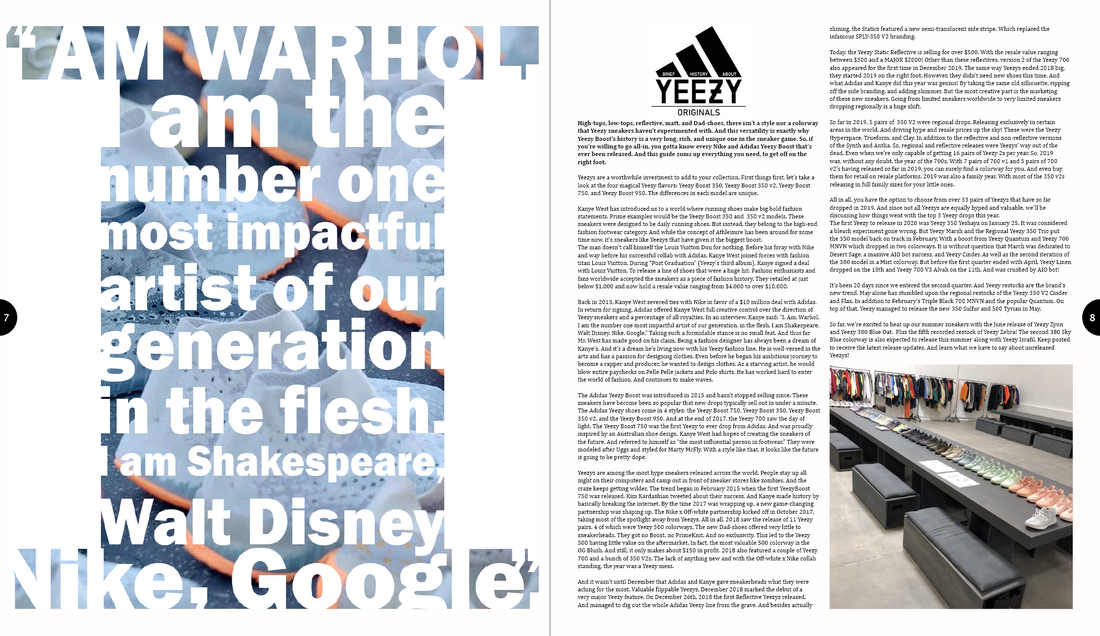
I am now happy with my second double page spread and it's design with the images and text placement after many steps of improvement.
Masthead development
To understand mastheads, I began analysing mastheads I found from the internet.
The first masthead I found was an interesting red, flat masthead. This masthead used variations of styles for every single letter of the name. The letter 'N' is seen to be italic which is in vast contrast to the letter 'e' which is in a handwritten font. Personally I do not like this masthead as it does not look very appealing to me.
|
The second masthead was also a flat designed title. The second word was flipped and mirrored under the top one and this masthead used a sans serif font in uppercase. This portrayed a modern, sleak look and I very much liked this approach. The star in the middle between both the A's was a cool addition too.
|
This masthead used a simple san serif uppercase font with a white outline and black colour which is the same as the background. It is easy to read and snap however it would not draw the viewers eyes towards it as it has no element of colour or effect to make it stand out from other things such as the background.
|
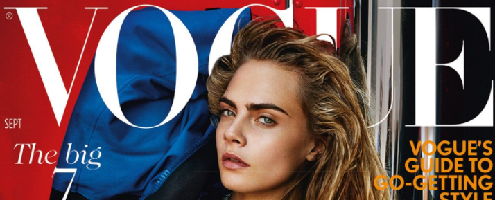
Vogue is a very popular magazine. It's masthead is very recognisable. This is shown by the vact that the celebrity pictured is able to overlap it's masthead and still have the magazine be recognisable. The font used is an uppercase serif font and creates a sense of elegance, futuristic and minimalism - this reflects Vogues' magazine content which is fashion and lifestyle.
|
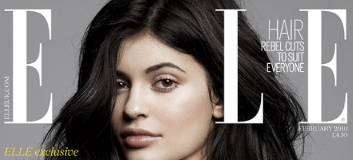
This masthead is very similar to my previous analysis of the 'Vogue' masthead as it's use also presents the celebrity on top of the masthead, hiding one of the letters of it's title. This, again, shows how recognisible this masthead/magazine is - they are so recognisable they don't need to show their full name. This, like the previous magazine, uses a Serif and uppercase font to show an expensive and stylish feel.
|
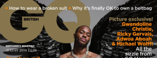
GQ's masthead further follows the line of putting the masthead behind the character. This masthead is portrayed always in the top lefthand corner with some of the headlines of articles placed above in white. The colour used in this masthead also matches the overall colour scheme of this front cover - however this makes the title blend in rather than stand out meaning it isn't attempting to catch the viewers eye with the masthead alone.
|
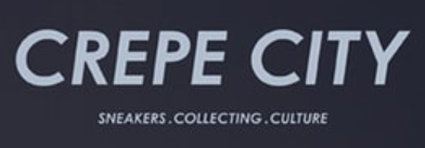
'CREPE CITY' uses a masthead that is very simple in style. The font used a Sans Serif font that is all uppercase. This masthead also uses a colour that contrasts the background of the magazine to help it stand out and be readable to viewers. This masthead also contains a slogan below which uses the same font too.
|
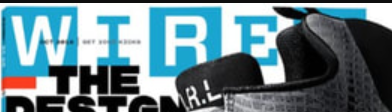
Wired also follows the same style of the previous big magazine brands by also using a masthead that is behind an object of focus. This further suggests how big brand magazines use their masthead as more a design pattern rather the staple of their front cover. The object/celebrity seems to always placed in front showing how well known these magazines are that they don't even need to show their full face.
|
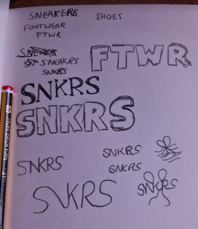
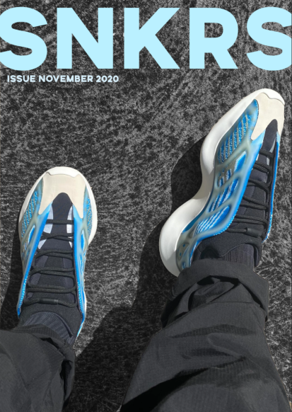
I decided to use the word 'SNEAKERS' for my personal magazine front cover. However, inspired by Kanye's Adidas Yeezy collaboration naming scheme, I shortened the name to 'SNKRS' which (if said outloud) would still pronounce "sneakers". This would be the title of my magazine and used on the front cover.
I began with sketches with the name 'SNKRS'. I quickly began liking the Sans Serif font compared to the Serif and Decorative font. I then went on dafont.com to look for similar fonts to my sketch idea and picked out 'Silverstone Sans' font to be the Masthead for my footwear magazine.
I began with sketches with the name 'SNKRS'. I quickly began liking the Sans Serif font compared to the Serif and Decorative font. I then went on dafont.com to look for similar fonts to my sketch idea and picked out 'Silverstone Sans' font to be the Masthead for my footwear magazine.
|
|
|
|
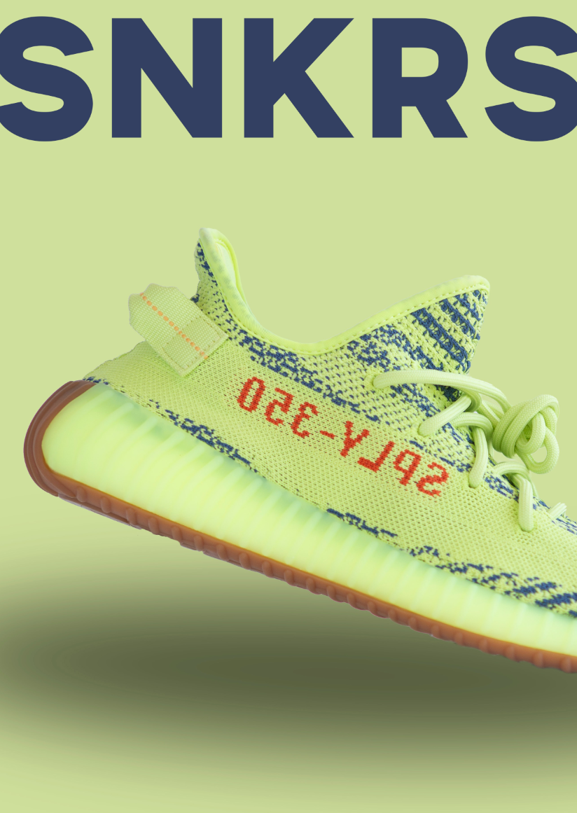
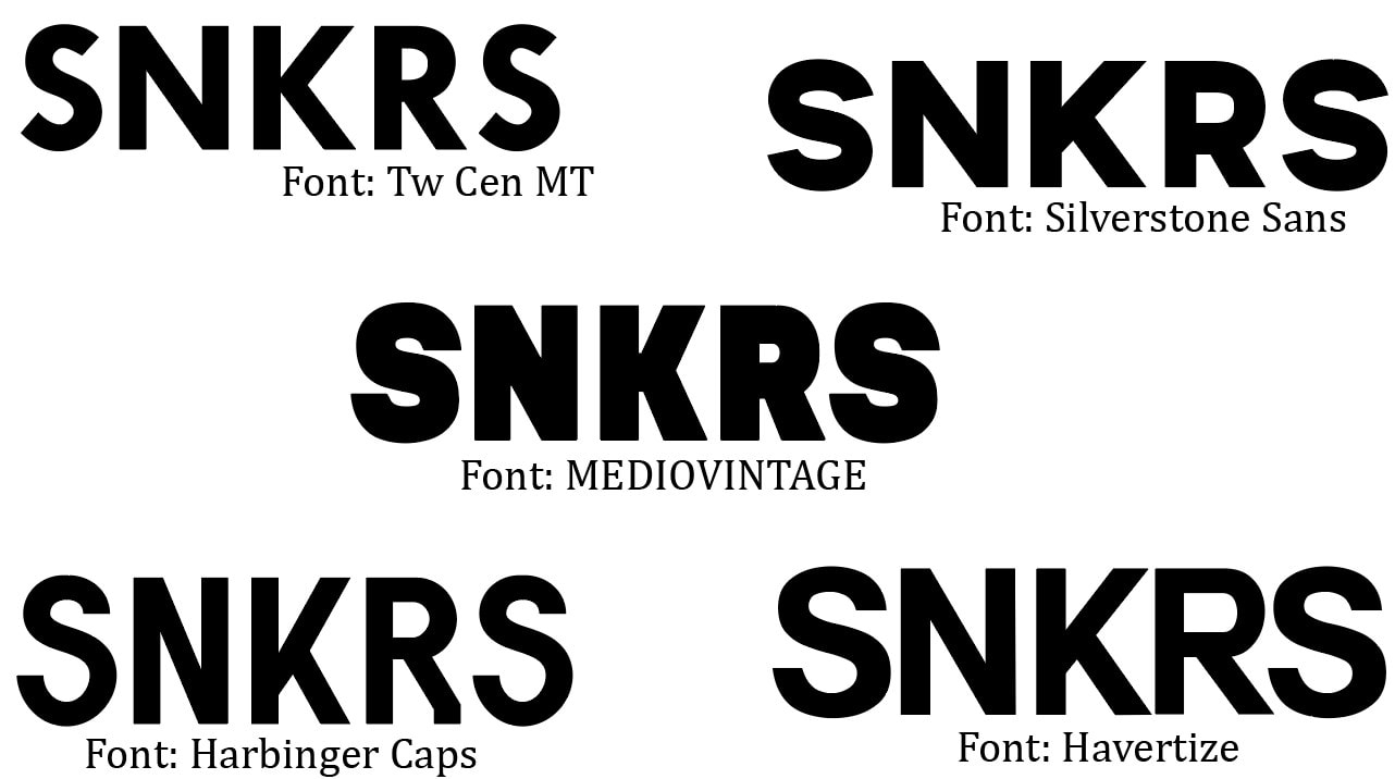
My first masthead test was with the font "Silverstone Sans" I had found above. This font worked well in my opinion as it was sans serif font which gave off a clean, professional feel which I was going for. This style of the masthead also created a sense modernism which fits my target audience of young adults who have an interest in fashion and sneakers.
|
|
|
With my second masthead I decided to use the serif font 'Bogat Bold'. This font worked well with some of the background images but not all. However this font does give a more premium, upperclass feel which was also seen in the previous san serif font but in a less sense in my opinion.
|
|
|
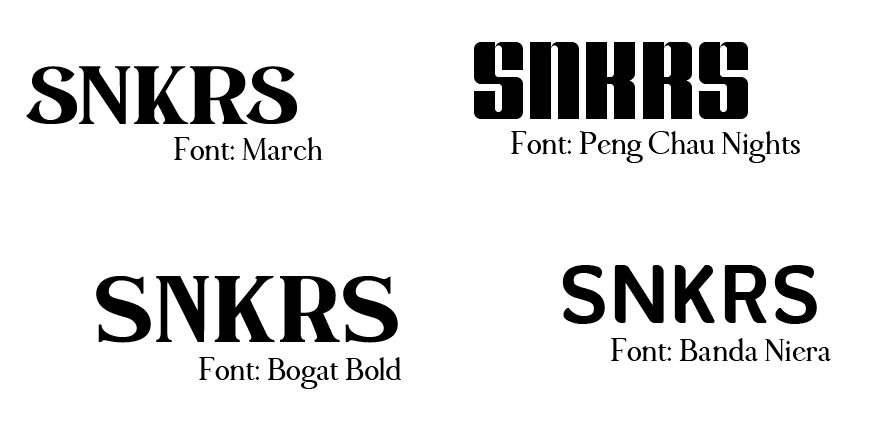
The third masthead was followed with the font 'Peng Chau'. This is definitley my least favourite as it makes the title of the magazine harder to read and overall does not seem to be relatable or appeal to my target audience. I believe this would not entice a viewer as much to look into this magazine further if they saw this title.
|
|
|
My fourth font I looked at was the 'SEGA' font which I very much liked. This made the magazine look very modern despite giving off a retro style as this is the 'SEGA' font which is from a well-known retro gaming company.
|
I then made a small moodboard with previous designed shoe magazines to give a sample and idea for my own front cover magazine. All contained a huge image of a shoe which took up at least a third of the front cover along with the top area containing the masthead.
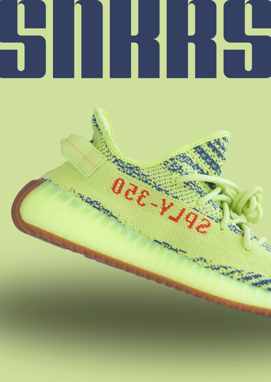
With this moodboard and an image of a recently created Adidas Yeezy image I found from the internet, I began creating the front cover inspired by the layout and ideas above.
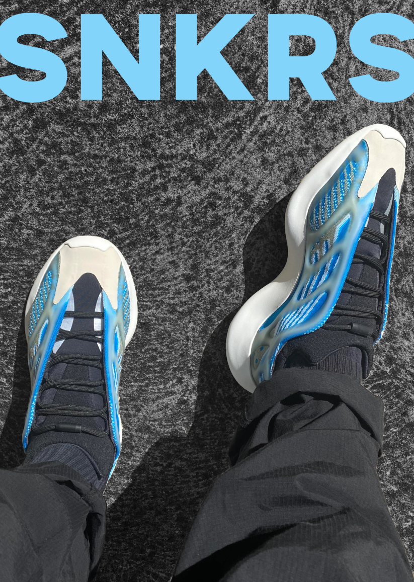
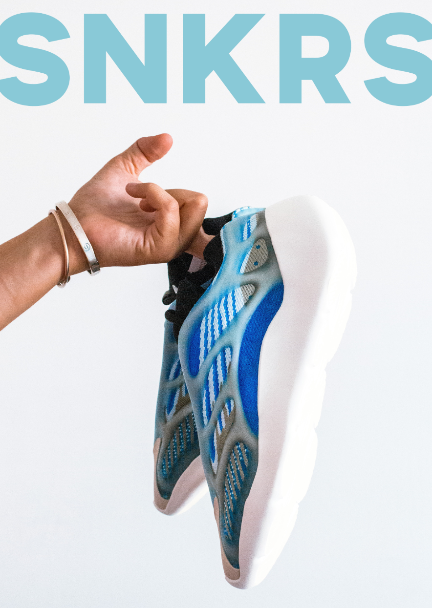
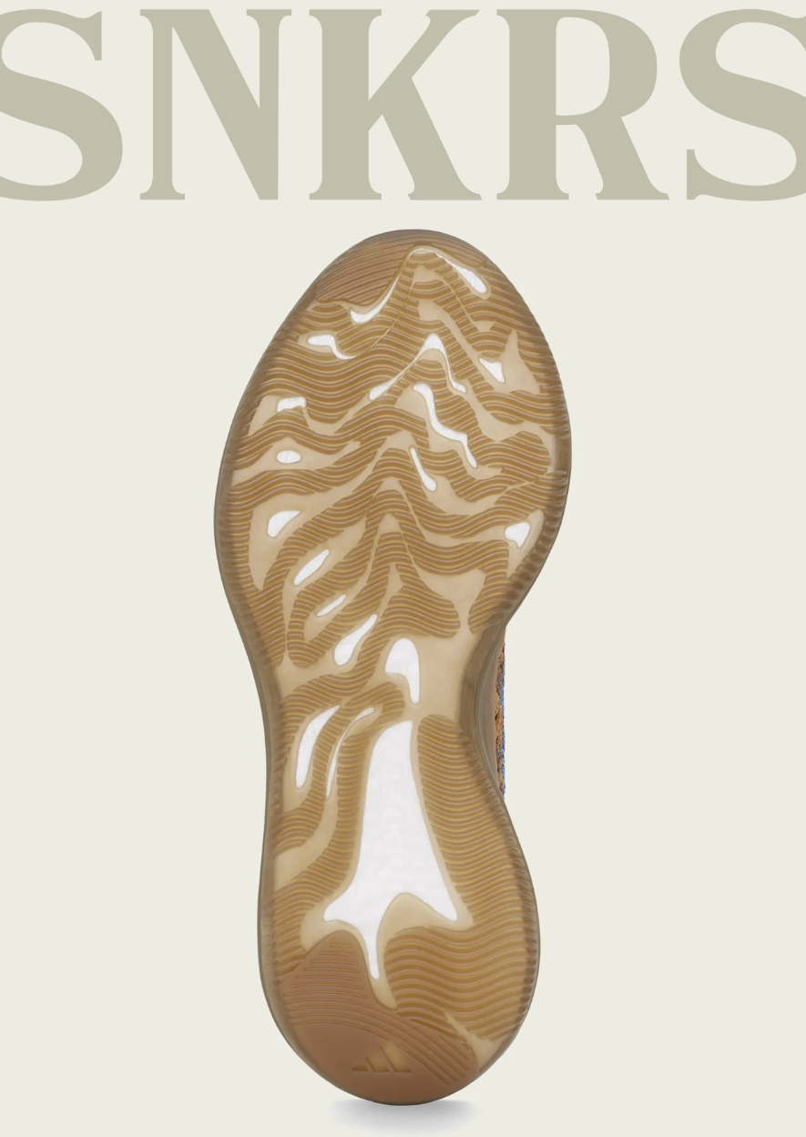
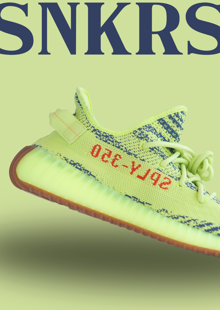
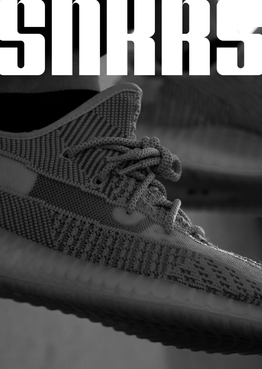
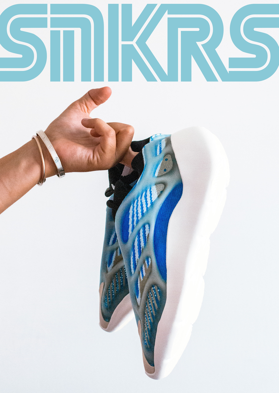
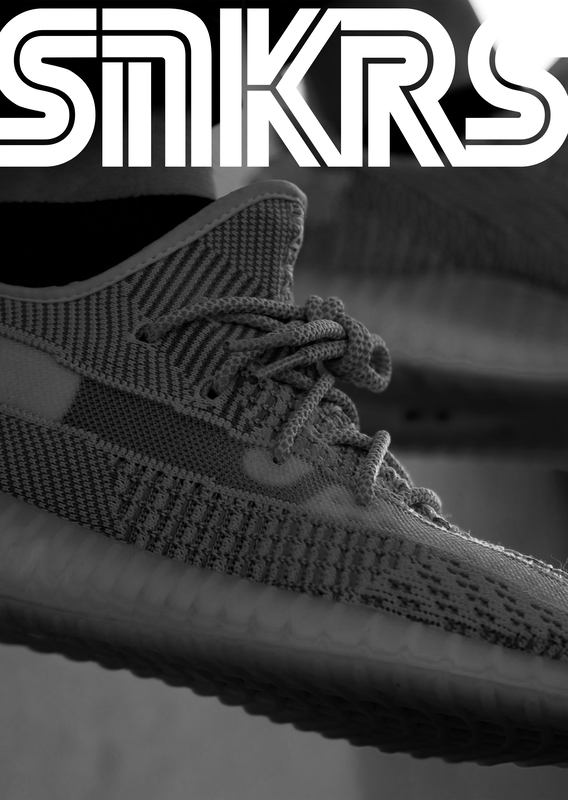
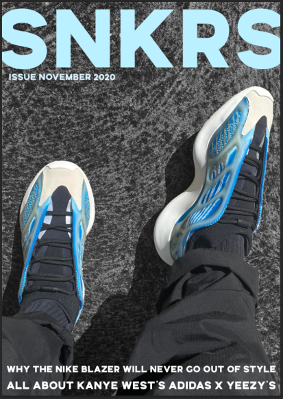
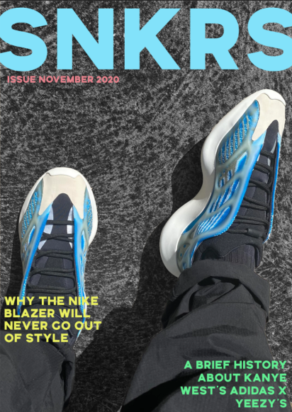
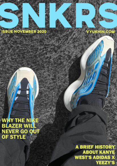
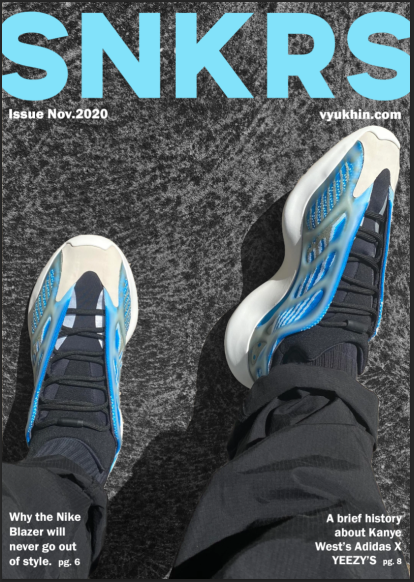
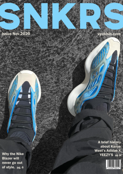
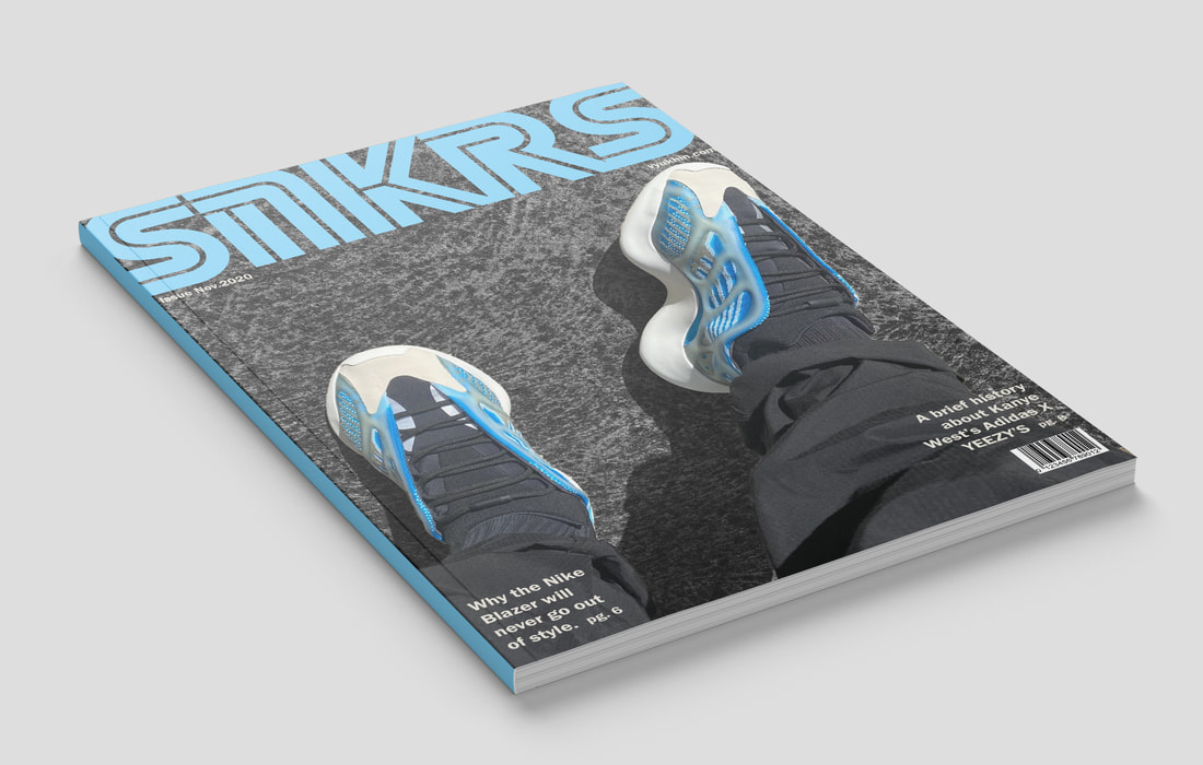
Inspired by one of the mastheads I analysed "SNEAKER FREAKER" and using one of the fonts I had used earlier for testing out different styles for the masthead. I used an uppercase, sans serif font for the masthead font called "Silvertone Sans". I began with a photo which I made the background dark to emphasise the colour of the shoes. Then I played around with the titles of the articles inside. The placement, colour and font changed throughout the process to eventually reach the final outcome of the front cover.
Inspired by one of the mastheads I analysed "SNEAKER FREAKER" and using one of the fonts I had used earlier for testing out different styles for the masthead. I used an uppercase, sans serif font for the masthead font called "Silvertone Sans". I began with a photo which I made the background dark to emphasise the colour of the shoes. Then I played around with the titles of the articles inside. The placement, colour and font changed throughout the process to eventually reach the final outcome of the front cover.
|
|
|
|
|
|
|
|
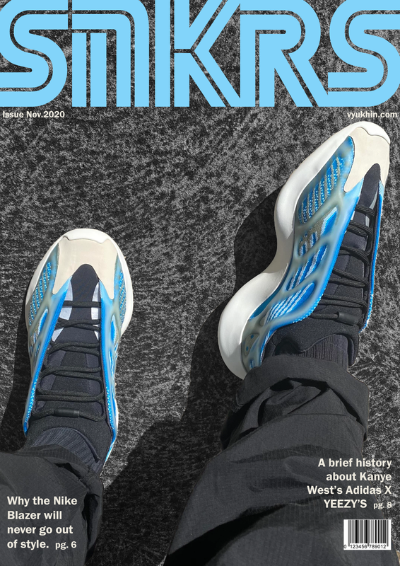
After many interations, I decided to try out the 'SEGA' font which I very much liked. Upon using this, I decided it was a much better font suiting this front cover and so I decided to use this as the masthead for my magazine.
With this completed, I had finshed making the front cover and two double page slides for the brief. I finished with creating a mock up of these three completed designs to show off the work and what it would look like if it were printed in an actual magazine.
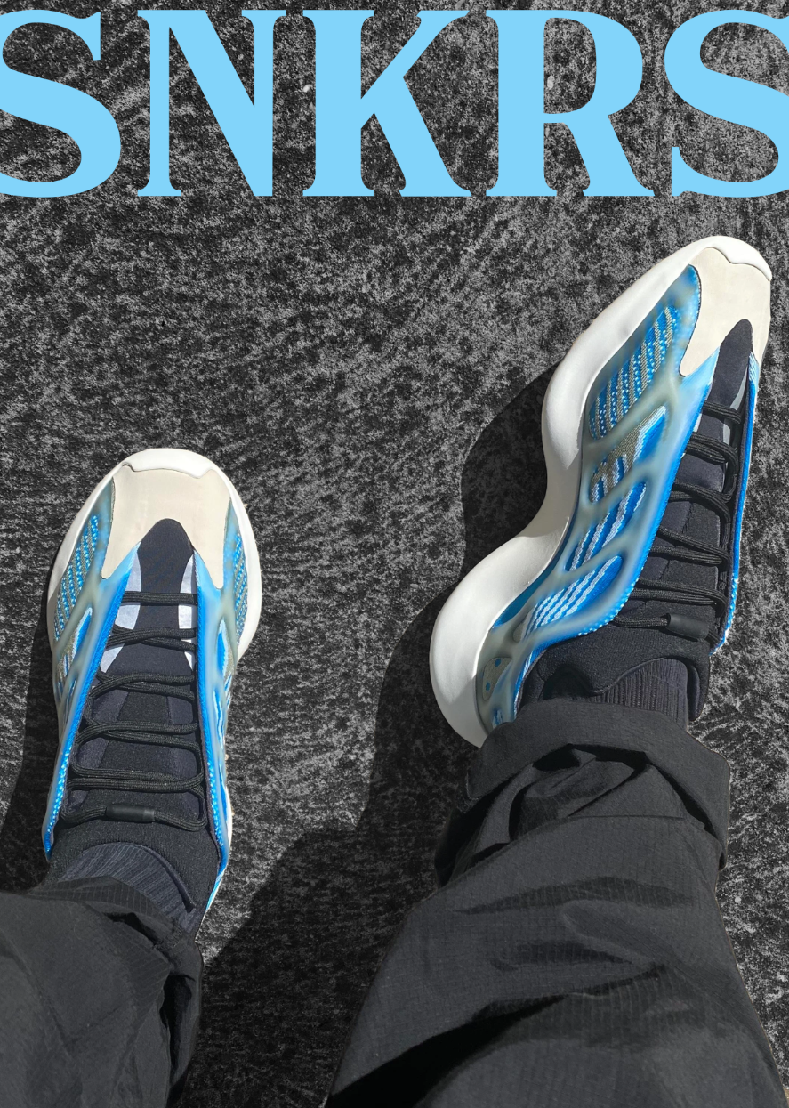
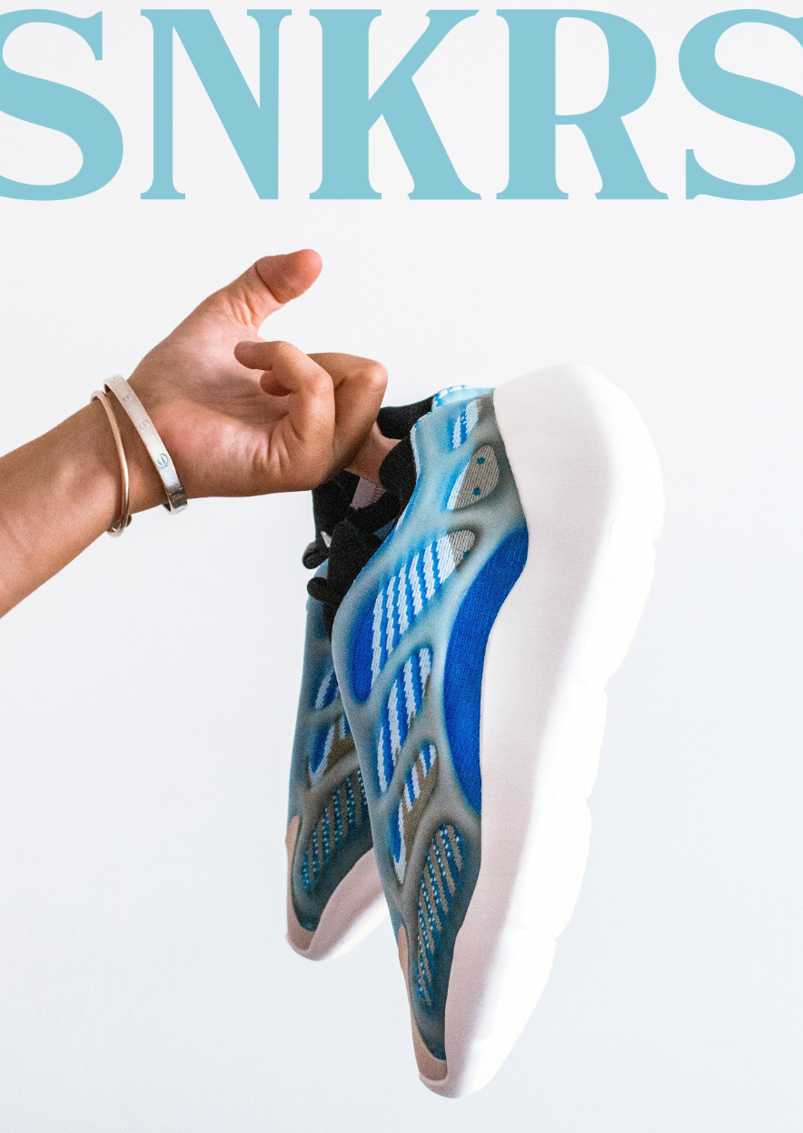
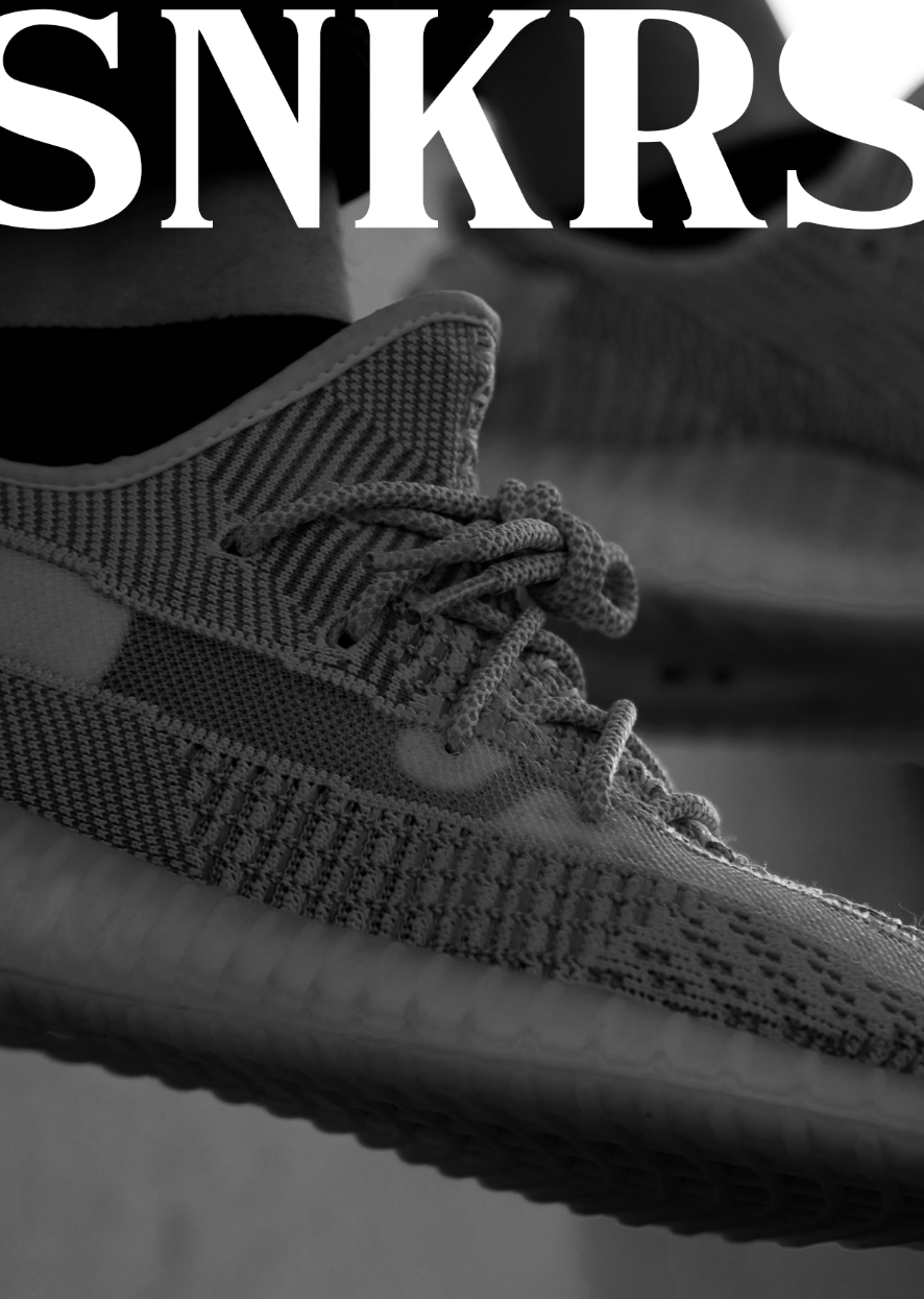
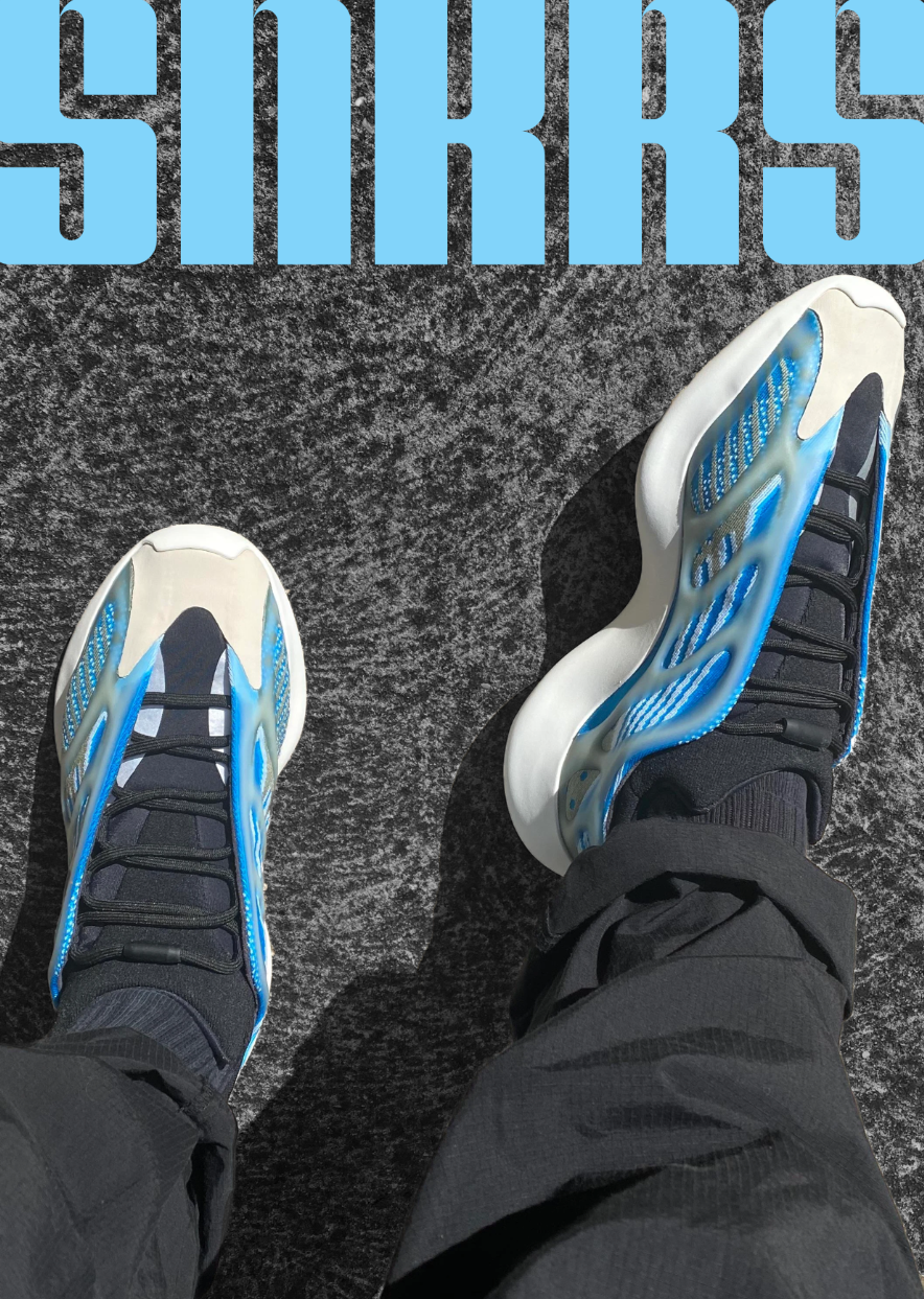
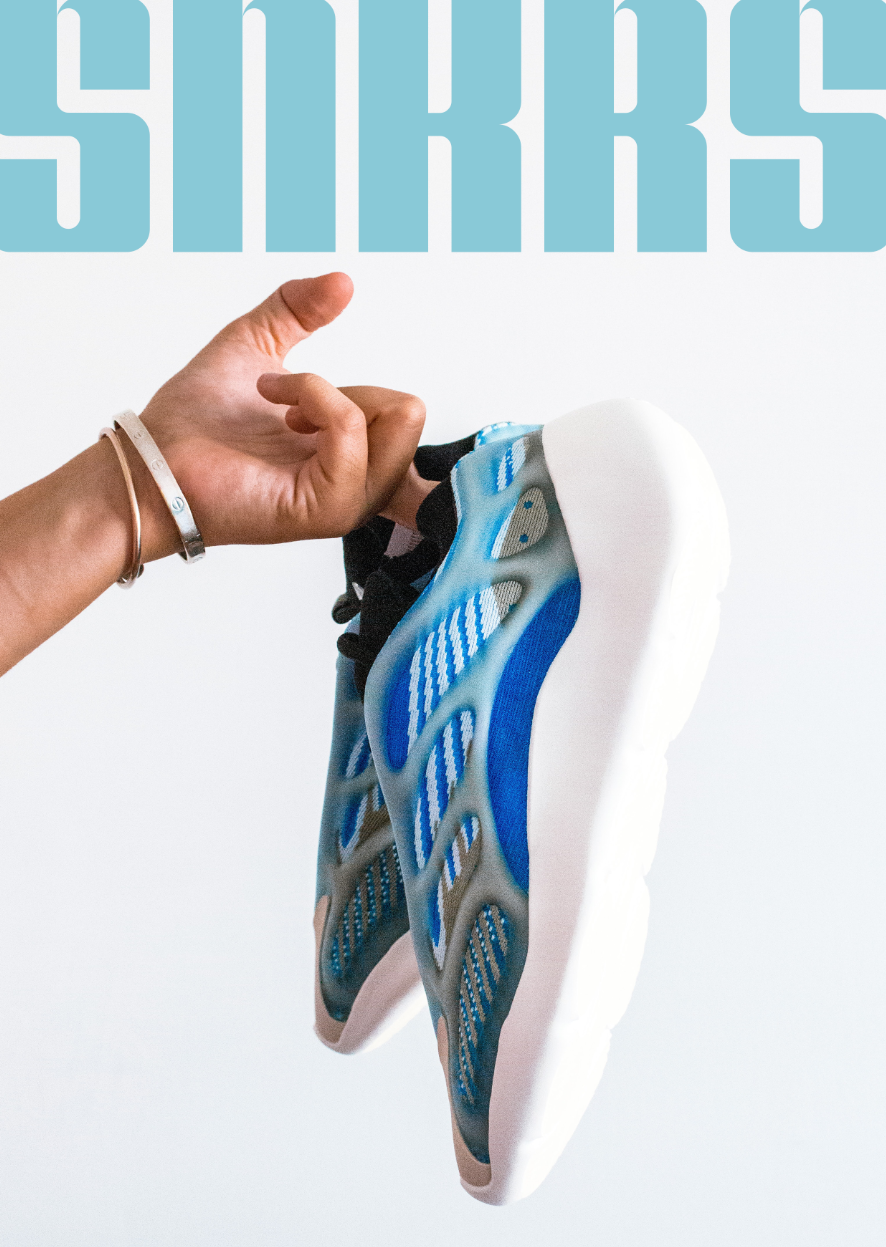
Mockups of the final outcome of my 'SNKRS' magazine
Slideshow of the brief outcome.
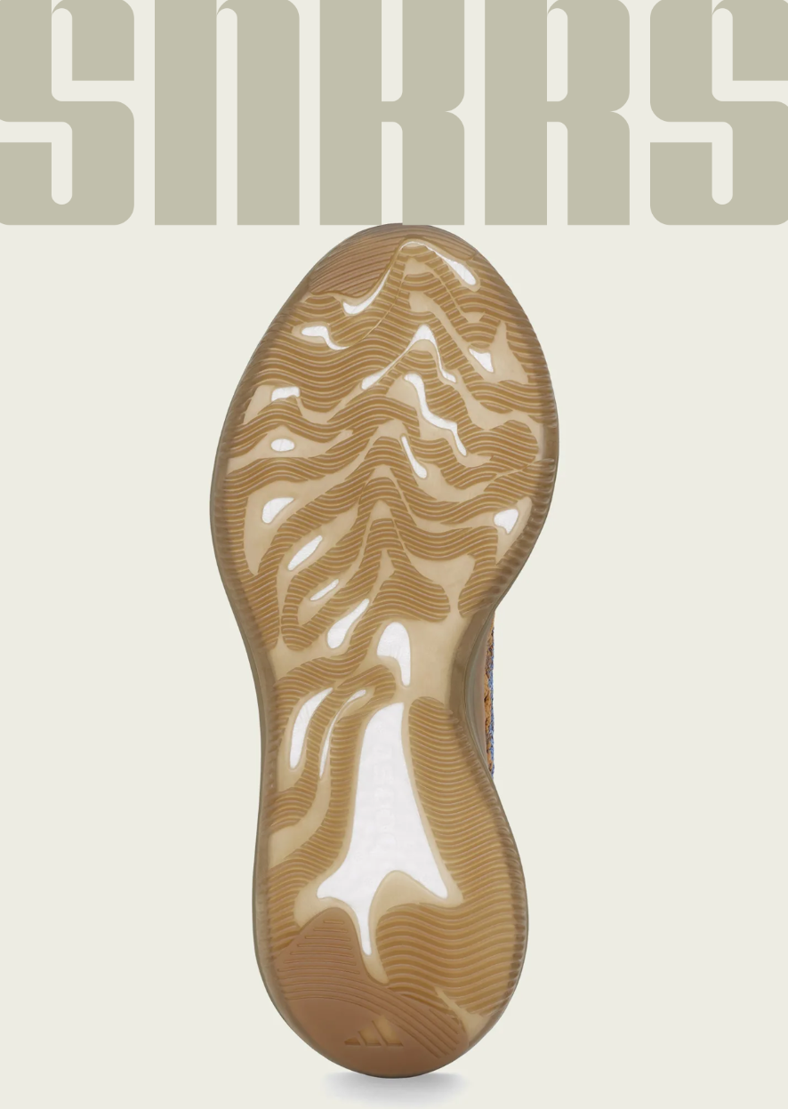
Front Cover
First Double Page Spread
Second Double Page Spread
| Unit 50: Typography Layout Design Report |
