Main Brief
A 'Self-Published Zine'
In this first brief, I was tasked with creating a 16 page Zine that informs or entertains the reader. I chose to create the content with the theme of 'Music & Politics'. I was also set to only use a maximum of two colours.
I decided that my Zine would be about the artist band 'IC3PEAK' and their interesting battle with the Russian government. Russia is known for a currupt power that is abused by the people in power and this band shows how powerful the government in Russia is. Through research, I will find out how much trouble this specific band has gone through with the people in power as well as any other bands that are also being silenced by the government.
Research
Zine Research
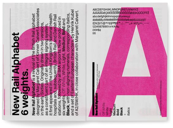
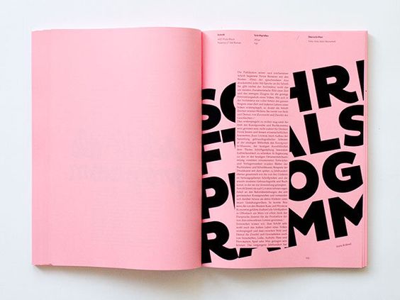
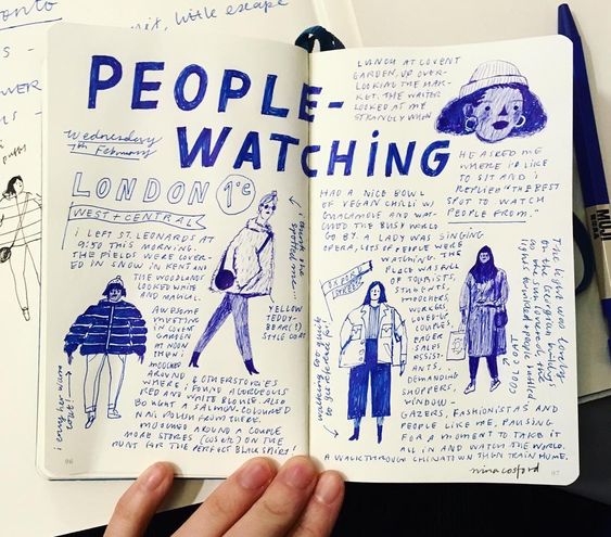
I began by first looking at previous zines and typography styles on pages to use as inspiration for my personal zine that I would be designing. These gave a lot of ideas for my own and I would definitely taking inspiration from a few of these.
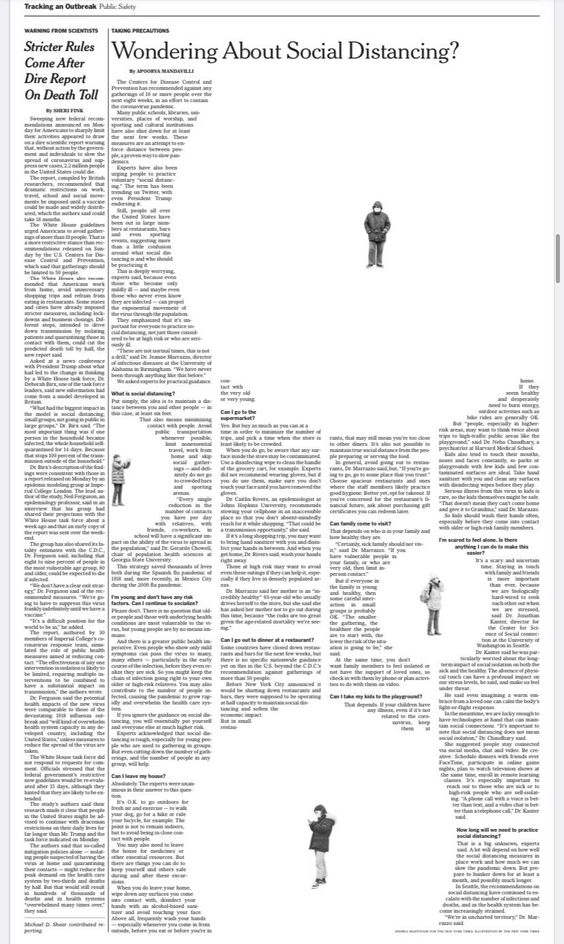
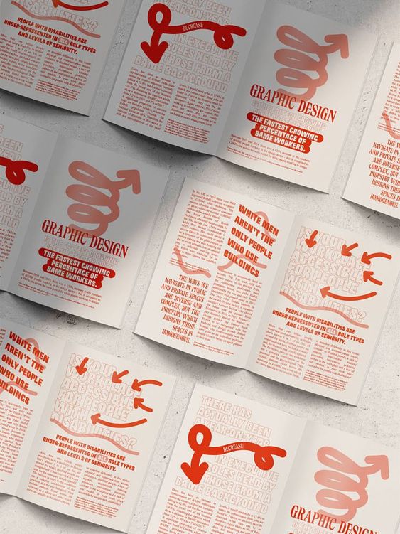
This article has a play on the title of "social distancing" where the people have white spaces around with the main text of the article being built around these bubbles. To show how distant each person is.
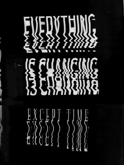
This type is distorted heavily possibly with a printer and a scanner. The type is stretched and 'wobbled' this works well with the sentence of "Everything is changing except time".
|
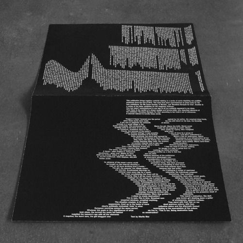
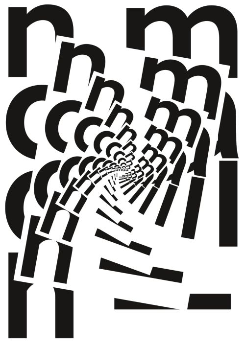
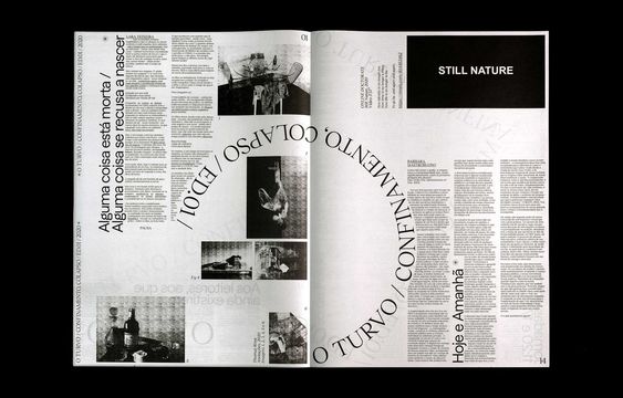
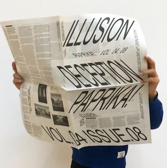
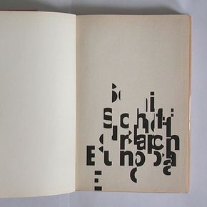
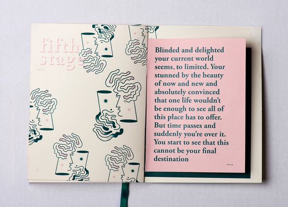
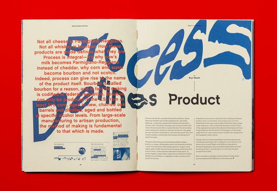
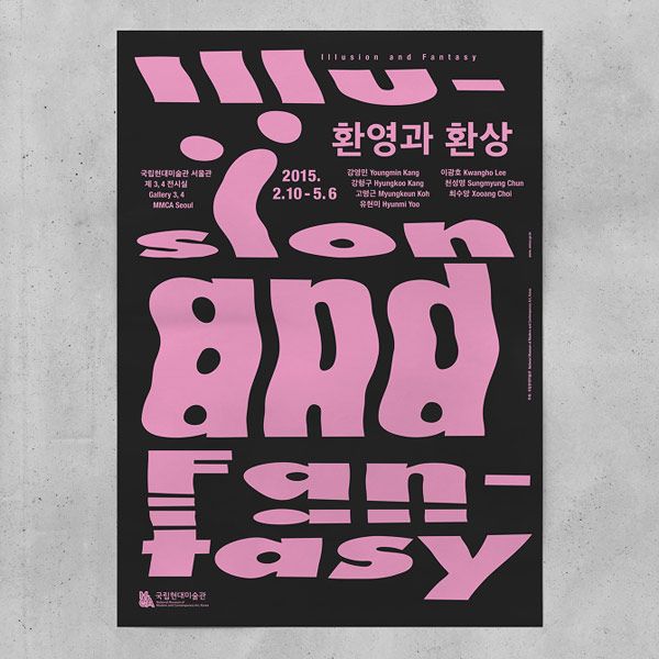
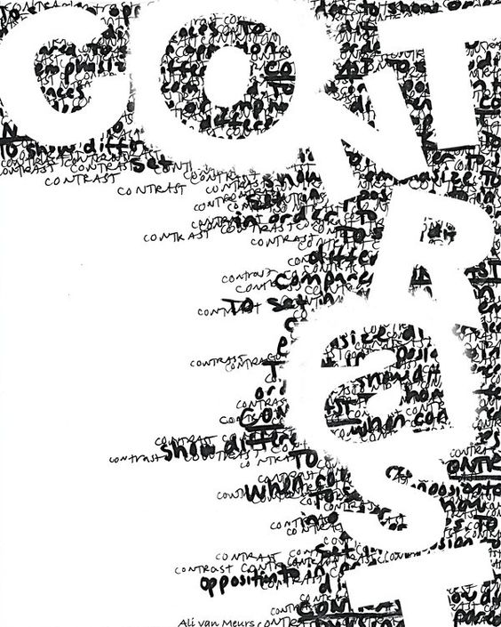
This zine style has a lot of typography that uses placement as its main factor. A large letter is displayed on each page with paragraphs layered on top.
This typeface seems like it has been cut into and moved to create a distorted text.
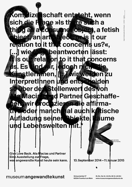
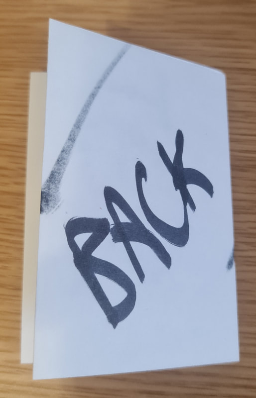
This page has a written paragraph structured simply with a graffiti "Love Back" layered on top covering some of the text in a random style where some letters are lowercase and some are uppercase - along with rotation and not in line with the text. Showing the significance of the text placed on top as its very different from the paragraph layered below.
|
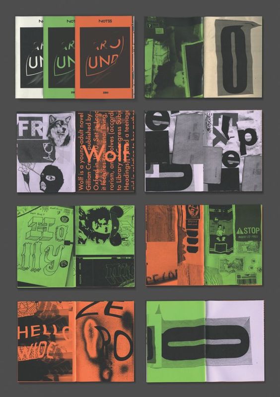
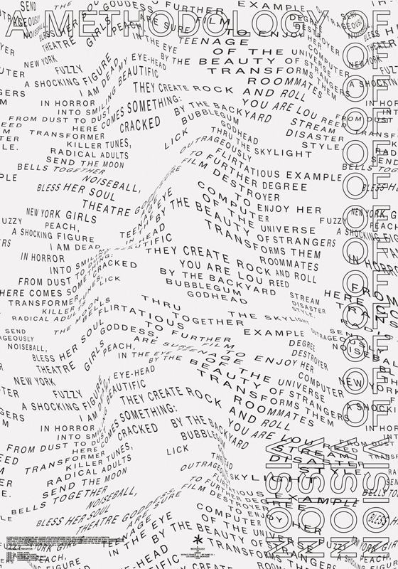
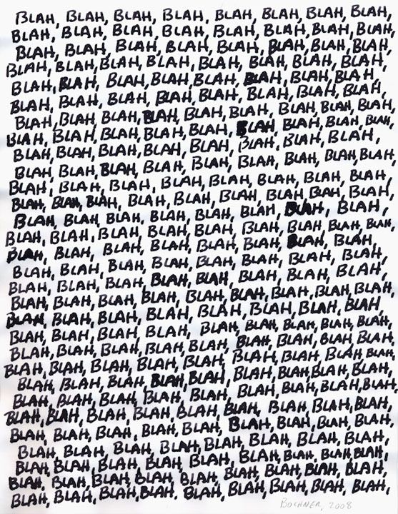
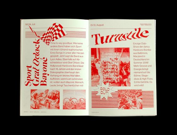
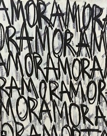
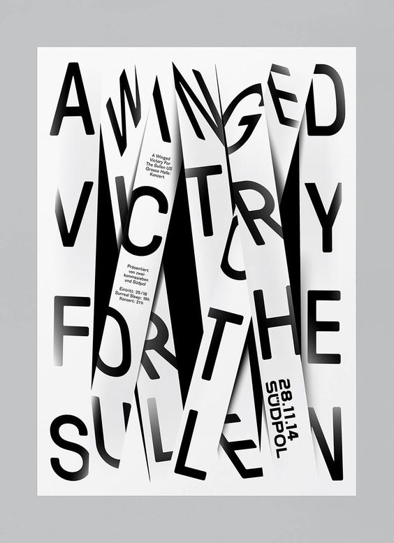
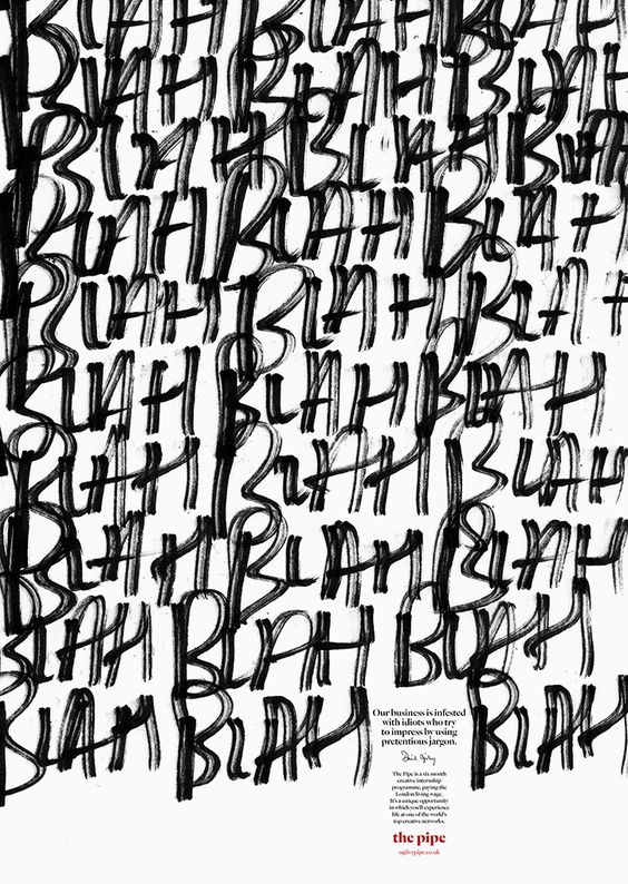
These two pages have a lot of layers as there is big, distorted text that is plastered all over the two pages in contrast with the main paragraphs being placed in neat areas on top of the big type.
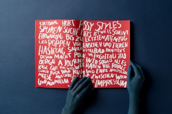
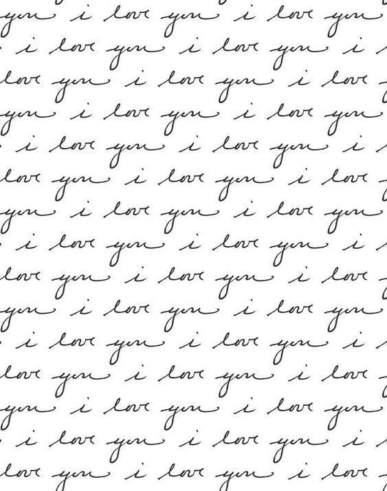
These zine two pages are in red with white type written on top in a handwritten style. This type is also written with barely any structure as some words are gradually bigger or smaller, changing size and placement each word pushing and shoving the other.
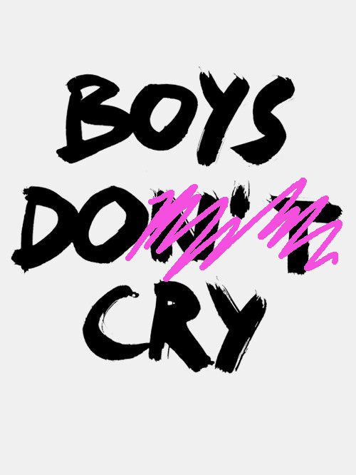
This type has been edited by having letters being crossed out to change the meaning of the sentence from something negative "Boys don't cry" to "Boys do cry" to show that boys do really cry whereas people usually say that boys shouldn't and don't cry.
|
This research helped me create a lot of ideas and inspiration for my own zine. I found a lot of these zines had played around with typography with the placement, colour and sometimes even distorting the type on the page to create an effect or mood.
|
|
|
|
|
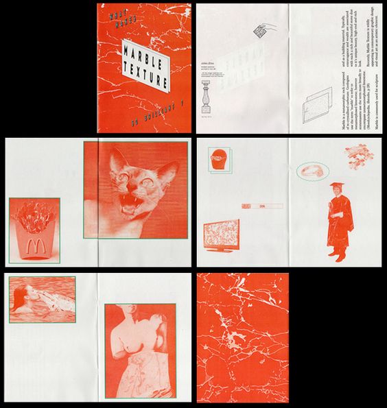
This previously made zine also inspired me to make something that would contain a poster on the inside that would be able to be seen once you open the entire zine up to make one big poster that is not visible when you are looking through all the pages.
Research
Russian Political Research
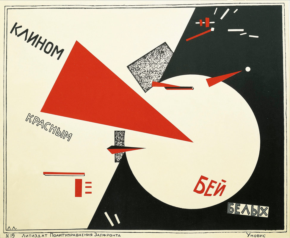
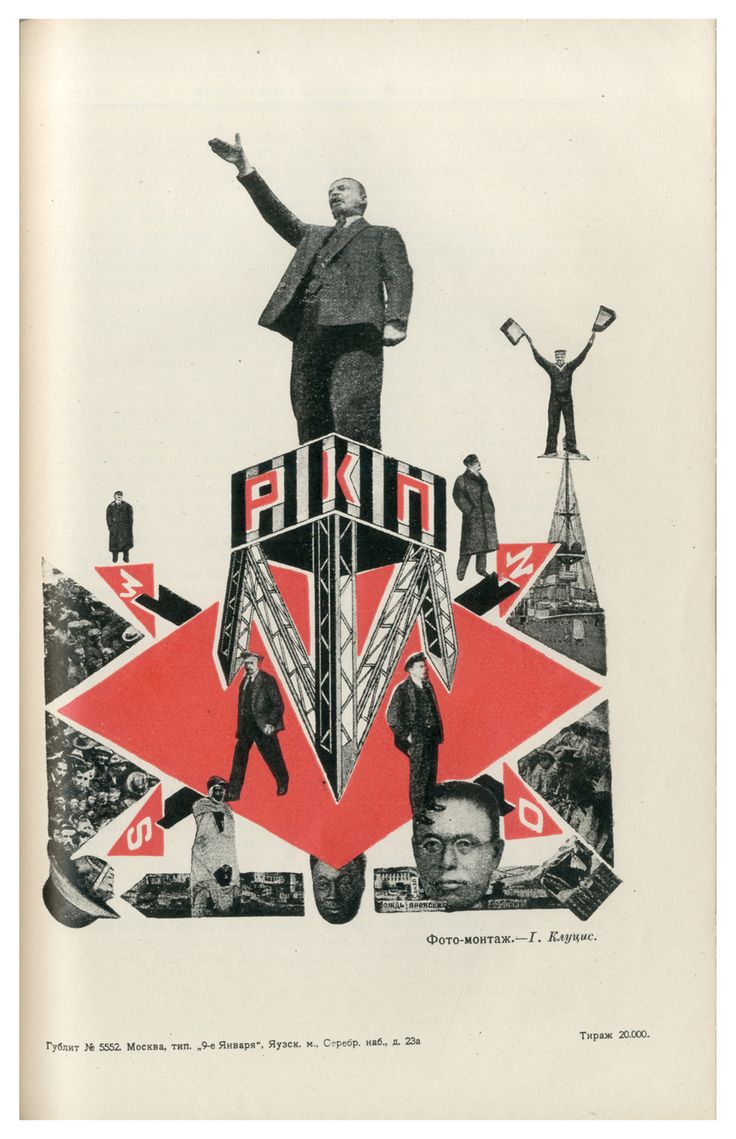
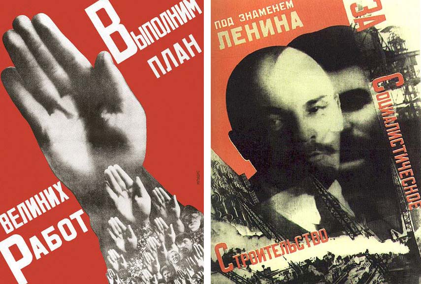
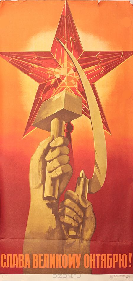
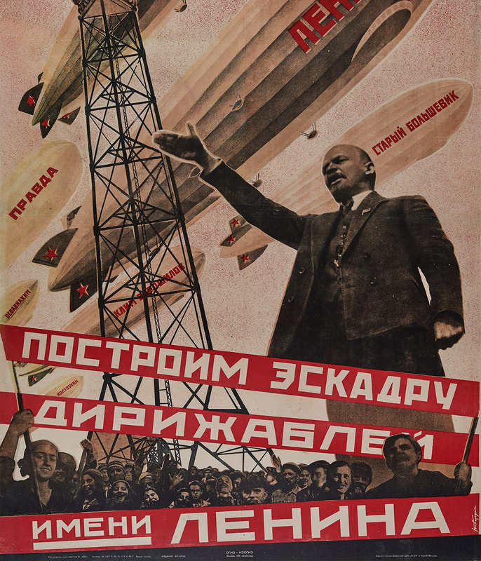
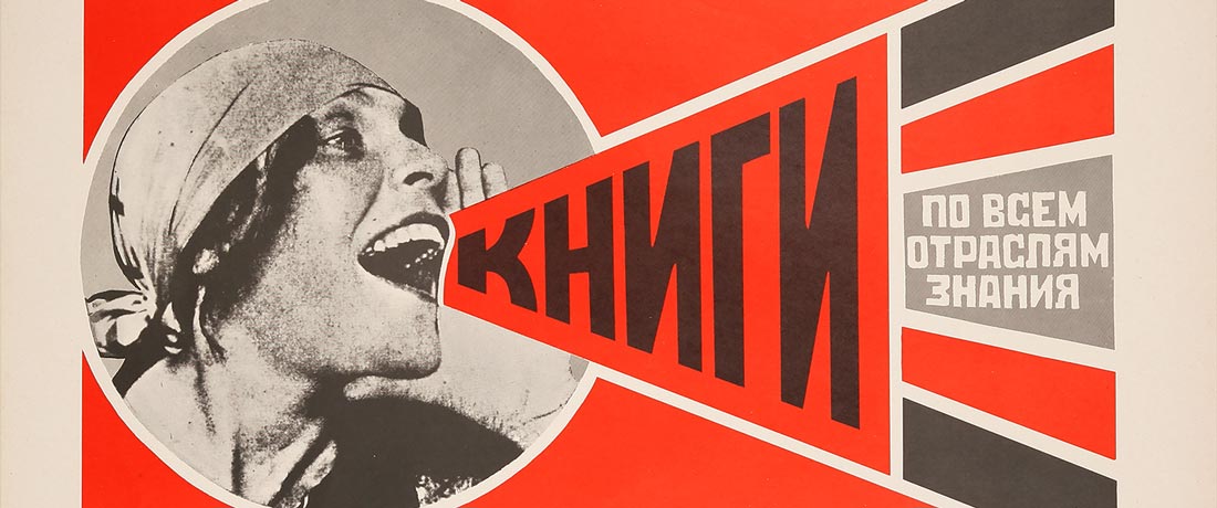
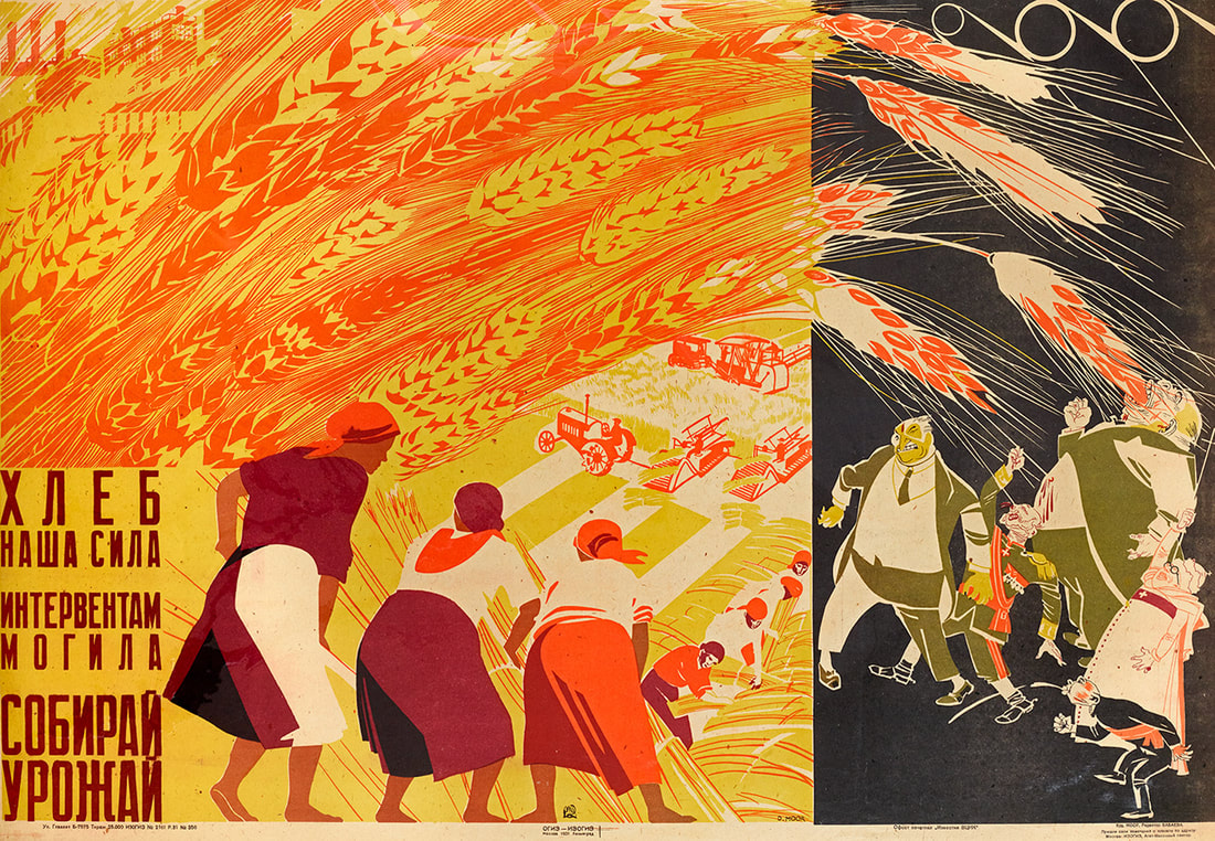
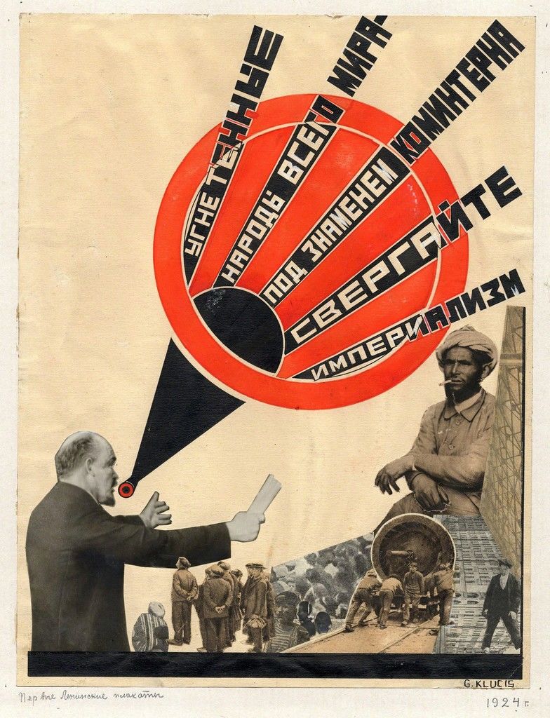
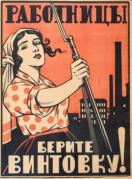
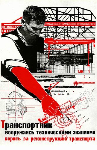
As my Zine is about Russia and the government there that is battling and silencing artists speaking their mind - I turned my head to the Russian soviet revolution which also had similar effects of the government being in power and controlling what happens and what people learn and see. I found many posters and art styles that show a strong and relevant style that is clearly visible as the old Russian soviet union. I could use this style and theme within my own Zine to show how time has not changed in Russian and the abuse of power is still visible today showing how the falling of the USSR did not change how people are treated today.

|
|
I found that a lot of the posters and designs had a similar colour scheme of Red, Black and White. I also found that they used a lot flat colours along with collage style of adding images/photos into the poster. This was super cool in my opinion and something I would love to use in my own Zine design. I will definitely chose my two colours to be Black and Red and use my paper as the White to replicate this USSR style of posters in my own design.
I also found that most of these posters used a very bulky, square Sans Serif font for the typeface. This was to attract attention, being modern (as the USSR was going through massive changes) and be easy to read from far. I have decided that I must look at appropriate fonts to use in my own Zine that are inspired by these posters.
These posters gave me a lot of inspiration along with the typographic pages above which could work very well together.
Research
Artist Inspiration
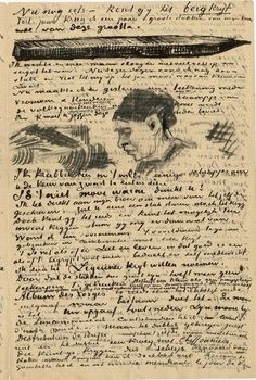
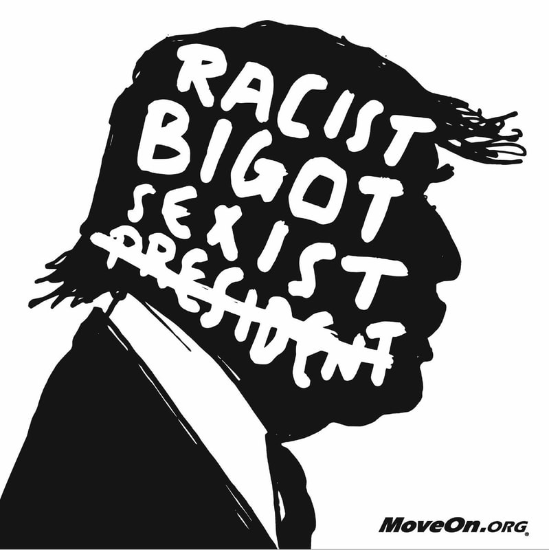
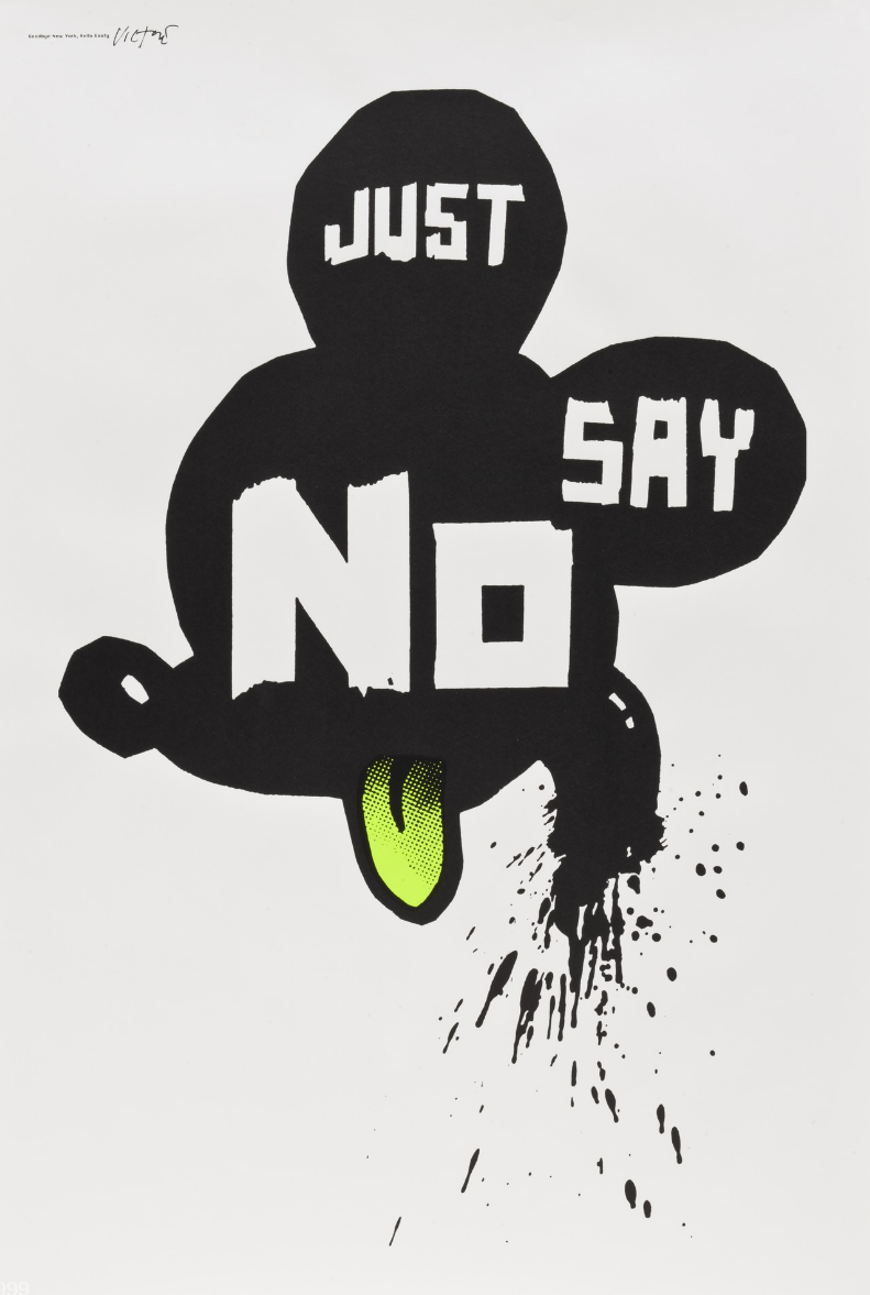
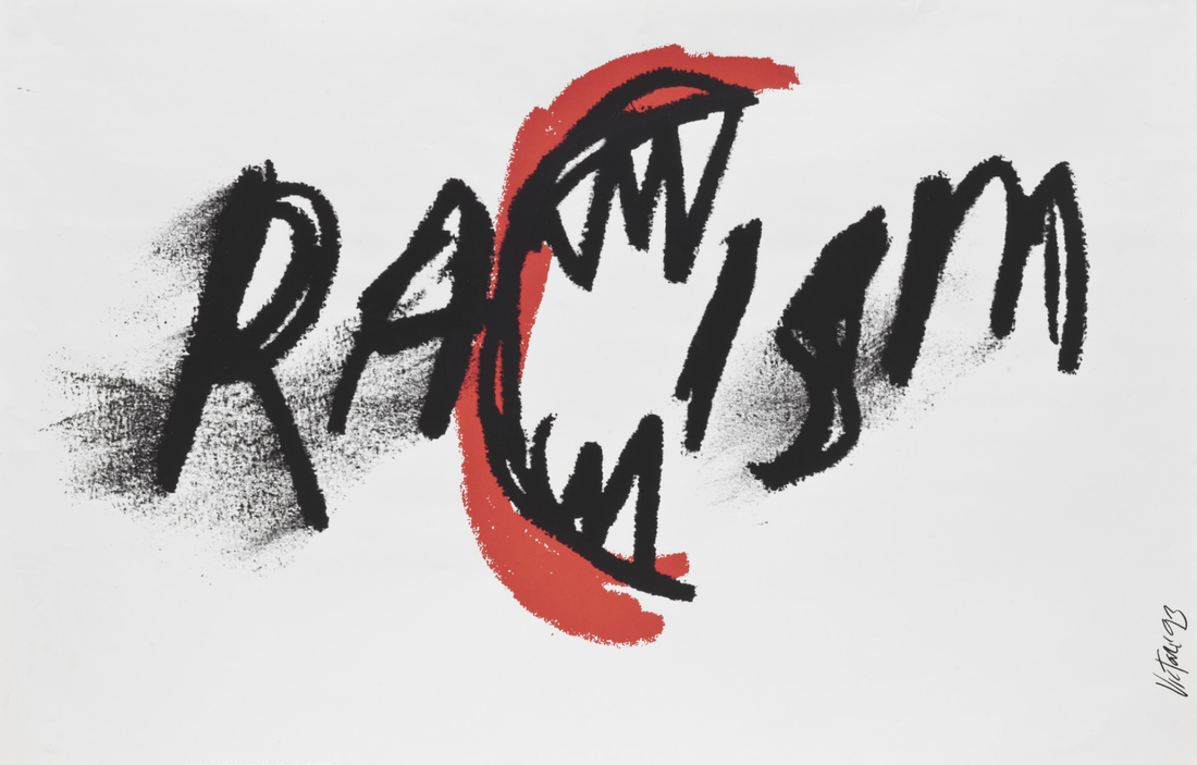
I was also recommended to research the artist "James Victore" who does a lot of political art. I found a few of his works and found them interesting as they all had very strong messages and made in a hand made style of a tick marker or charcoal that has been sketched by hand without much attention to detail.
|
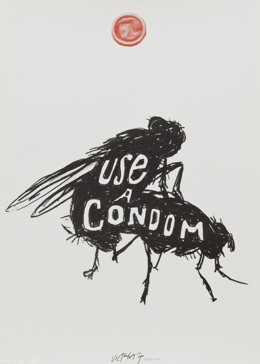
These two images on the left and above seem to use charcoal for the actual art. They both portray a serious and strong message and have very minimal detail especially the left one. They seem both to made roughly with little to no care about each stroke such as how smudging is seen on the letters on "RACISIM" or how not the entire bug is filled in.
|
Research
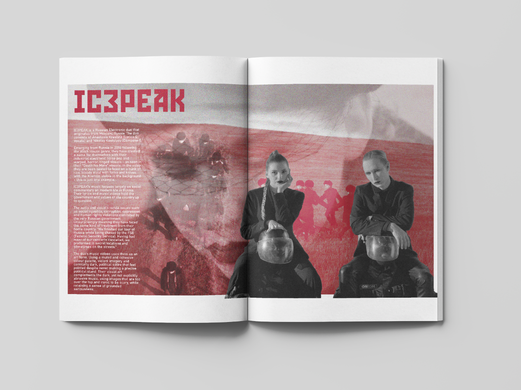
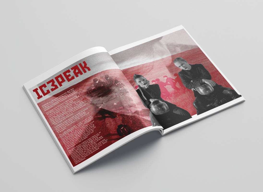
'IC3PEAK'
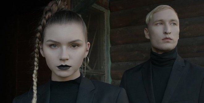
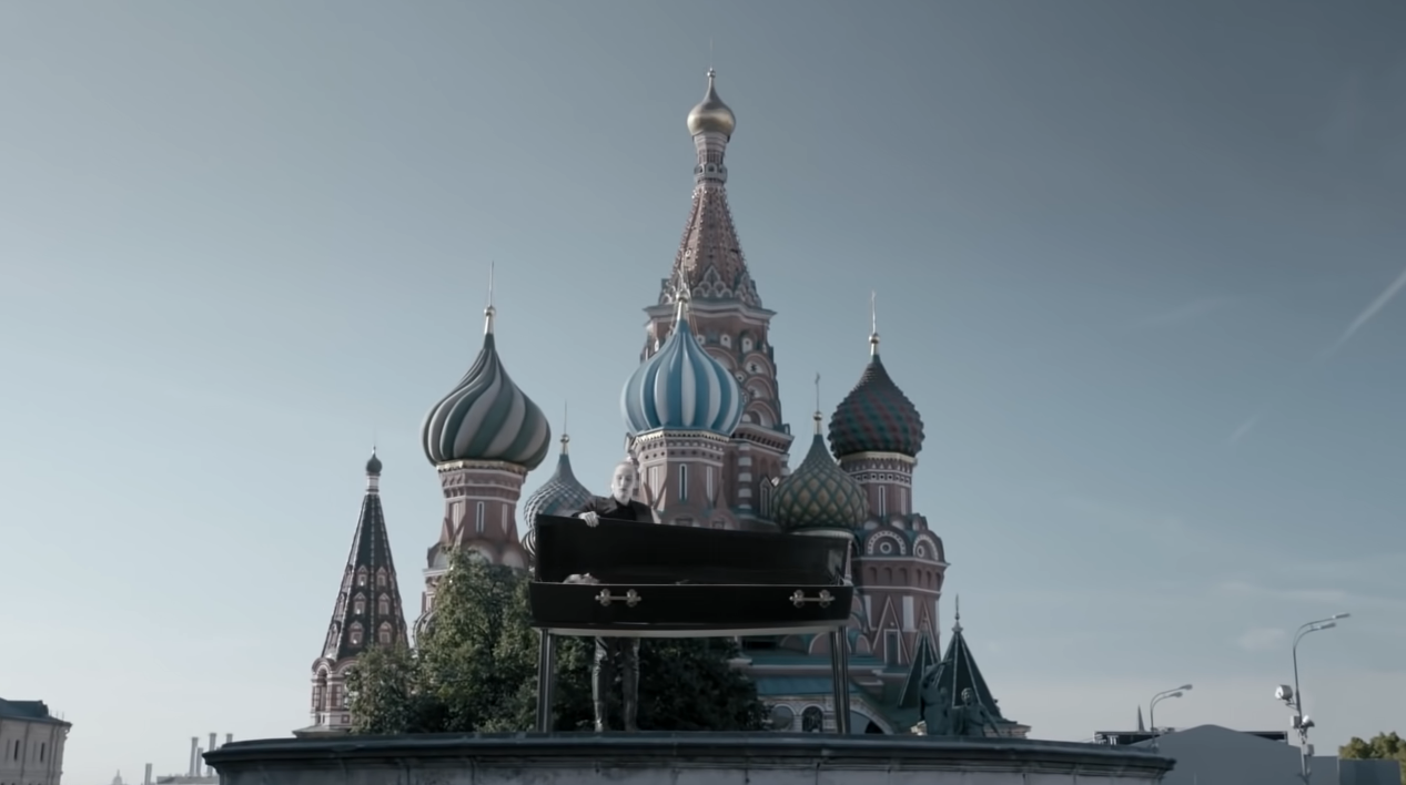
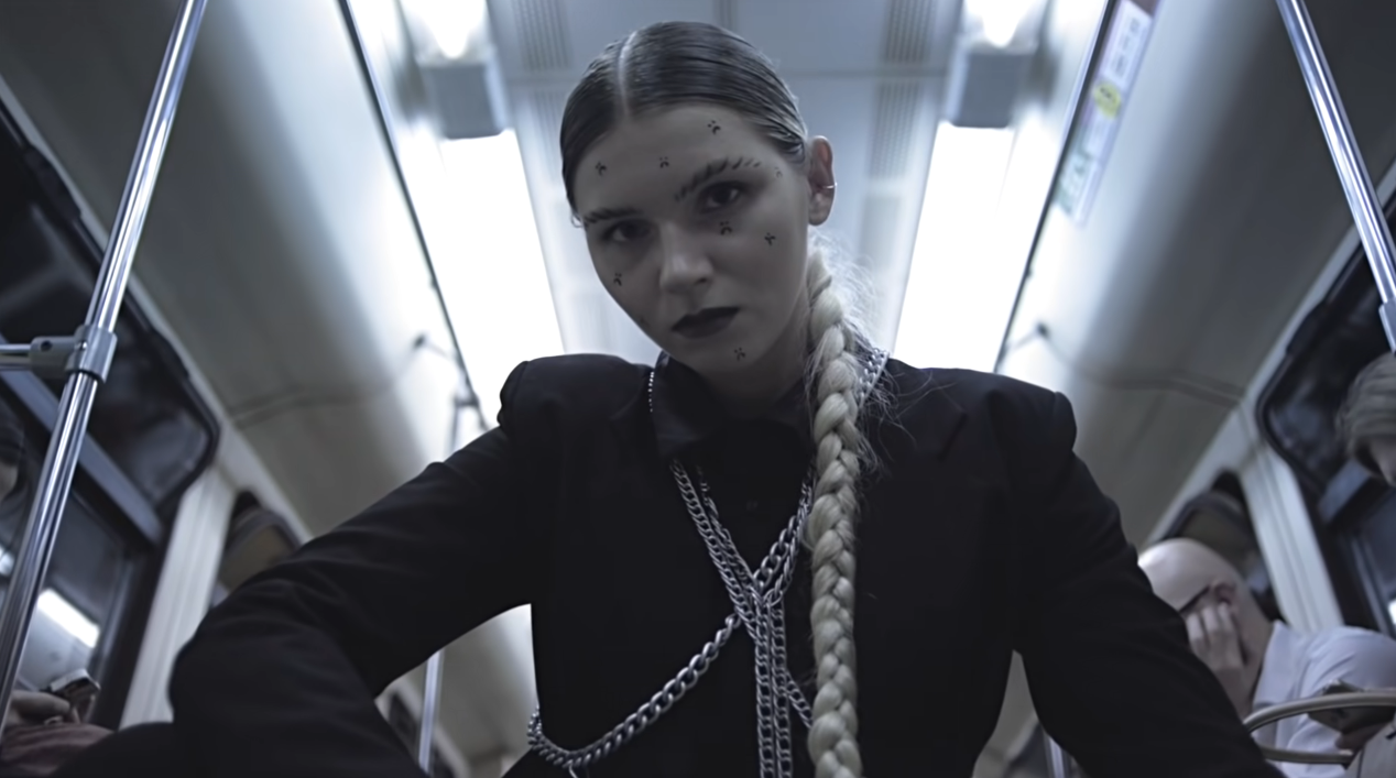
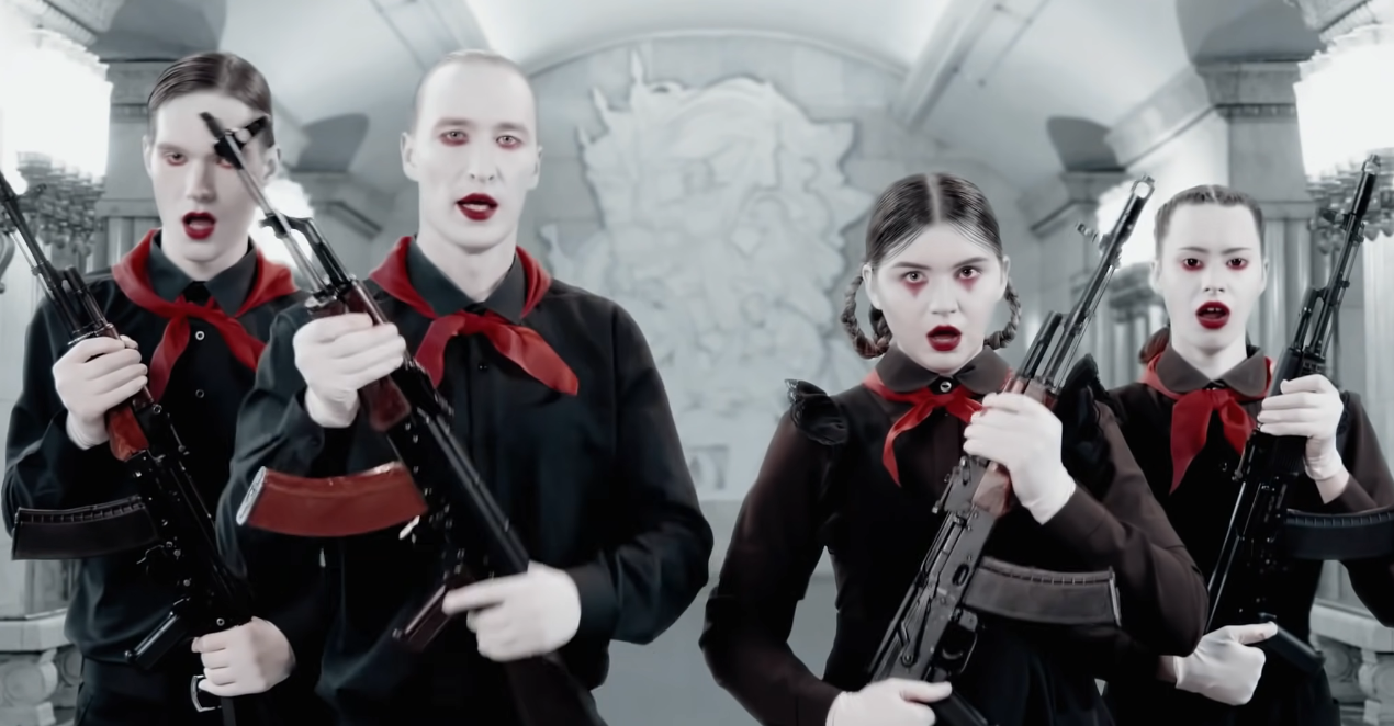
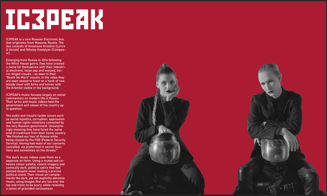
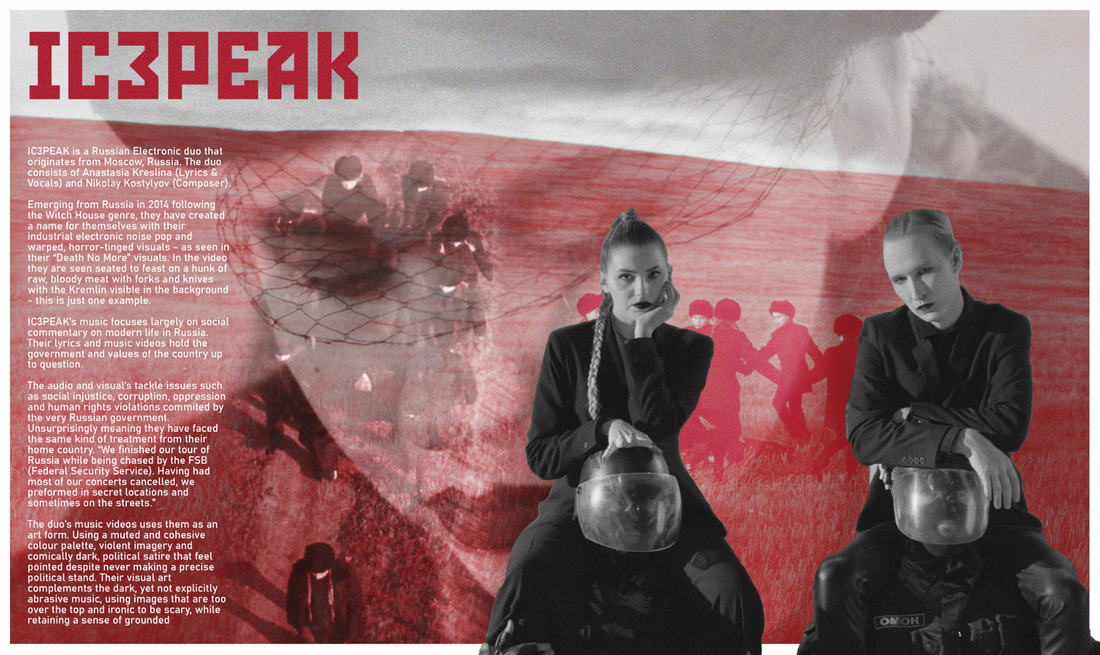
IC3PEAK is a new Russian Electronic duo that originates from Moscow, Russia (October 13). Most of their music began in English however their latest music has become almost all exclusively in Russian. The duo consists of Anastasia Kreslina (Lyrics & Vocals) and Nikolay Kostylyov (Composer). IC3PEAK's music focuses largely on social commentary on modern life in Russia. Their lyrics and music videos hold the government and values of the country up to question. Due to this they have been put on a "Russian Blacklist" meaning they are government scrutiny. In December of 2018, traveling to one of their concerts, they were found by police and detained at the train station. They recieved no charges however were held long enough to miss out on their gig. Another artist known as "Husky" also had his show cancelled and arrested after performing on top of a car. To me it seems like the government in Russia is attempting to take control of music and pressing it's own views and opinions on everyone and if anyone out speaks against them or negatively about the country - this has to be taken into control and stopped. Russian President Vladimir Putin "Rap and other modern [forms of art] are rested upon three pillars: sex, drugs and protest" then claiming that banning concerts would be counterproductive however the government's job is to lead youth culture.
|
|
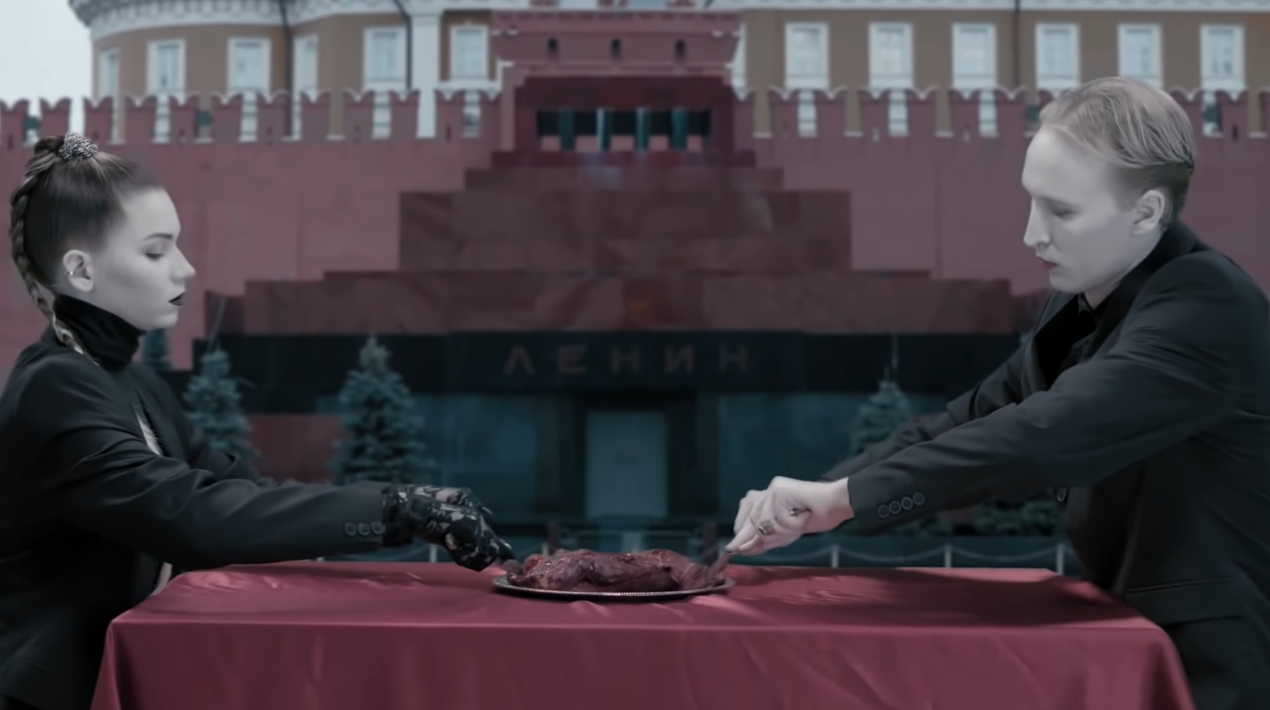
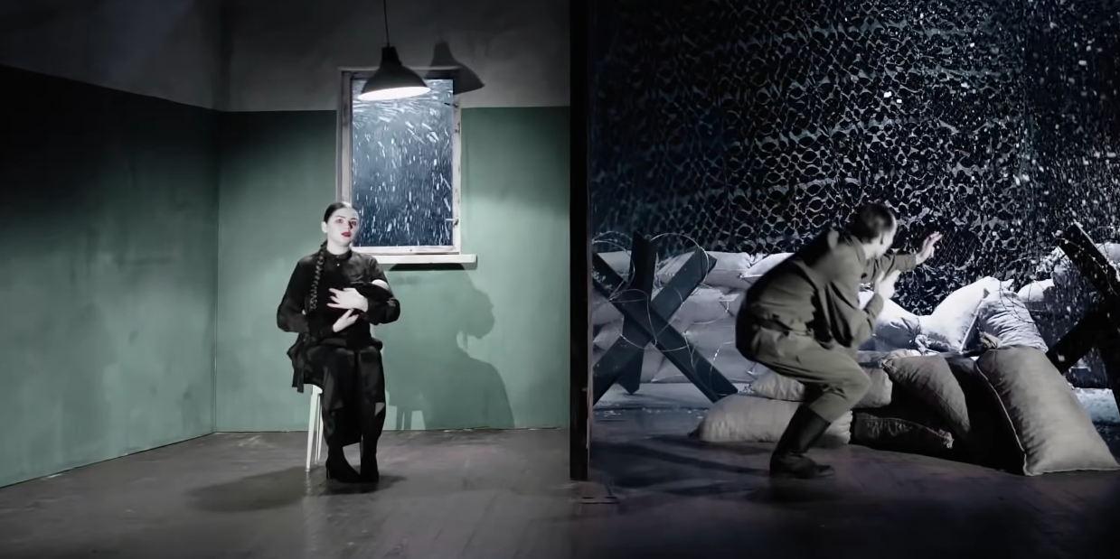
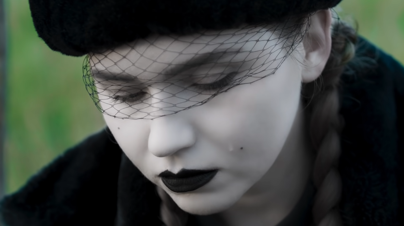
Looking through IC3PEAK's music videos - they use a lot of black and white along with red as their main choice of colour for their videos and art. I decided to use this as inspiration for the choice of my colourscheme for my Zine. The topics of the music videos are very political such as protesting in front of the government as well the social comment on men having to go to the army and having children that would also go to the army too.
Reseach
Additional Images
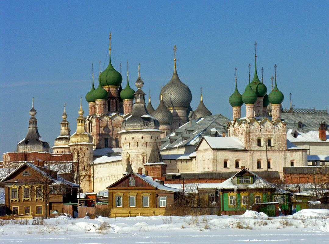
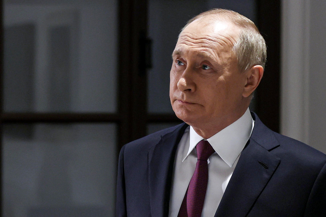
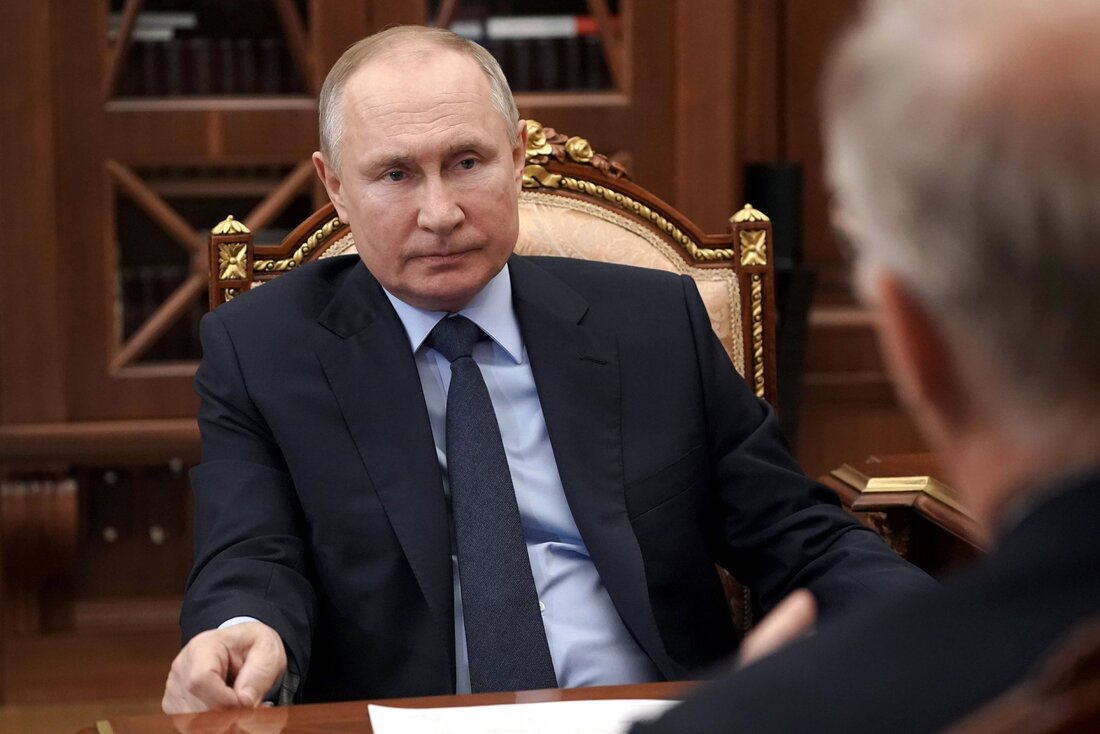
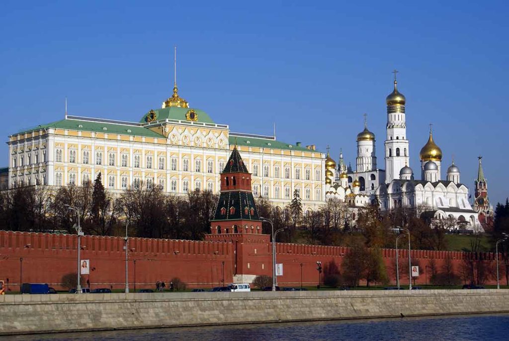
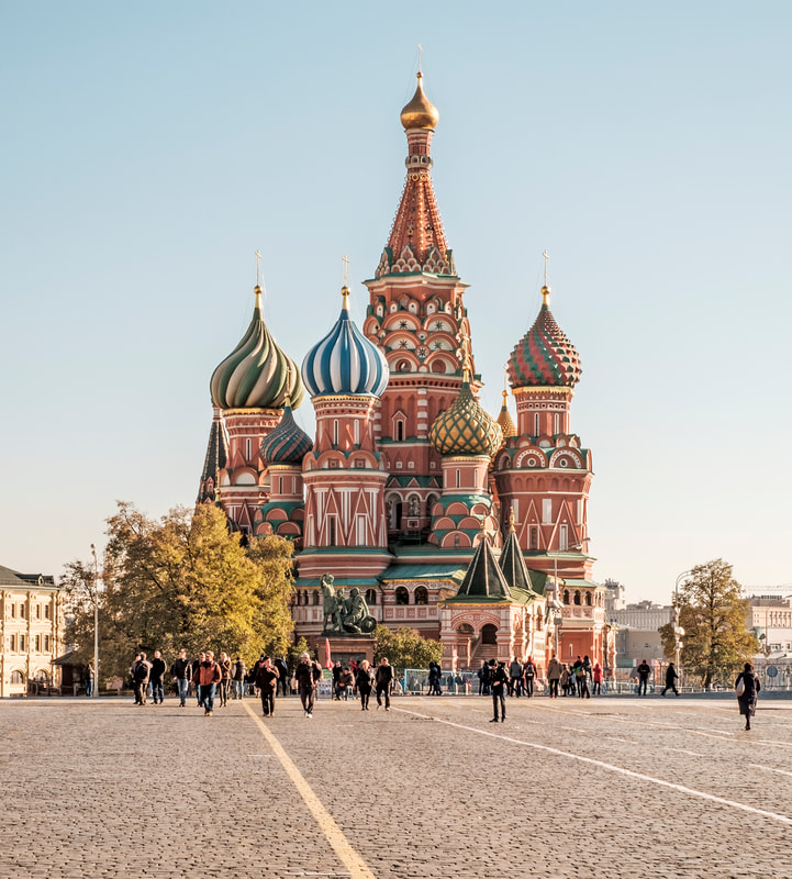
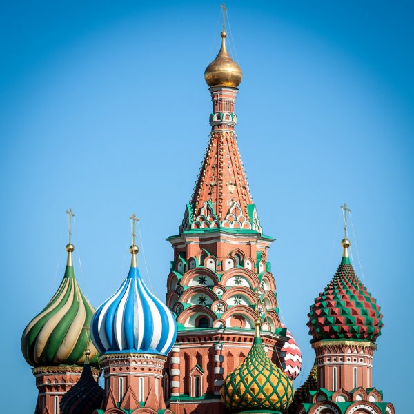
I also found some secondary source images of things I may use in my magazine. This would be images such as Putin (President of Russia) and any Russia landmarks that I may use for my collage.


|
|
Colourscheme
As previously stated - the colourscheme I will be going for is black, white and red. The choice is reflected on IC3PEAK's music videos. Personally I think that red is great choice as it used in the music videos as well as being a famous colour used for the USSR. A lot of previously looked posters also used red as the choice of colour. The other colour would be black to represent the bleakness and negativeness - to show off this emotion of unhappiness as that an emotion this colour portrays if used right. The Zine would be printed on white and so I would use negative space to achieve that colour.
With that - I began looking at the perfect colours to use in the Zine. Below I used a website to look at the right colours that would work well together.
With that - I began looking at the perfect colours to use in the Zine. Below I used a website to look at the right colours that would work well together.
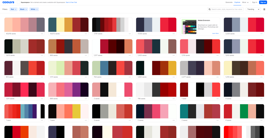
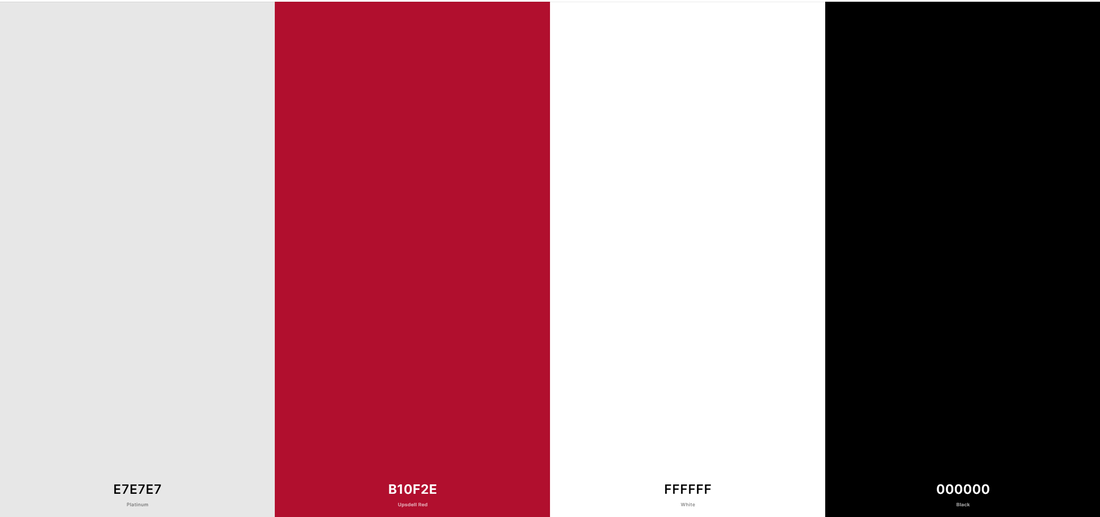
This colour scheme stood out to the most as this specific red worked very well with the white and black along with it. The grey was also great choice that could be used as shading or make anything stand out from the white and black.
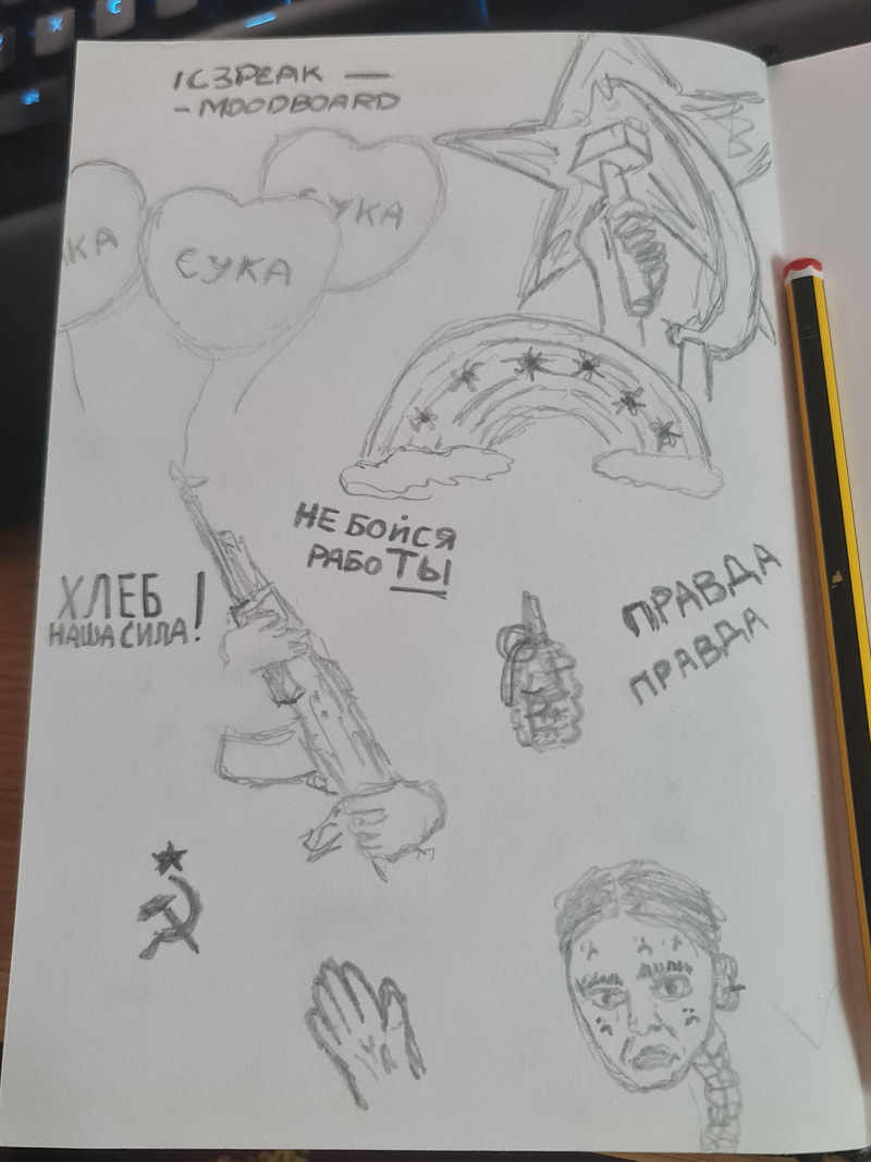
I made a small page to sketch anything that stood out from the music videos of IC3PEAK as well as the posters I had used for my research to possibly use in Zine.
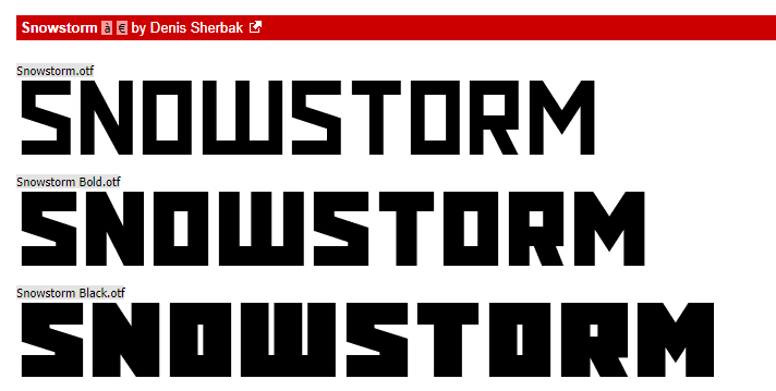
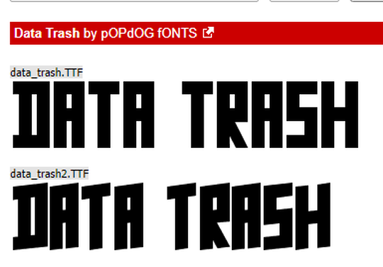
Typography
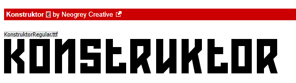
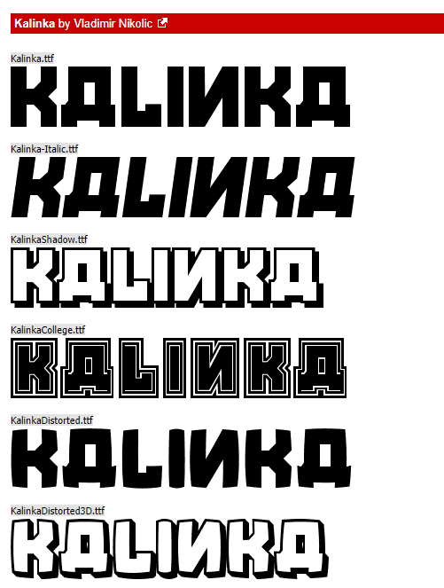
I also looked at different fonts inspired by the posters that I will use in my Zine. These fonts would be Sans Serif and be very square to fit the theme of the posters that I looked at that were made during the USSR and the revolution.
|
|
Layout
To be able to make a Zine that opens up to a poster, I had to layout specific pages and make the entire zine work. I therefore made a quick mockup of all the pages to know which page would go where.
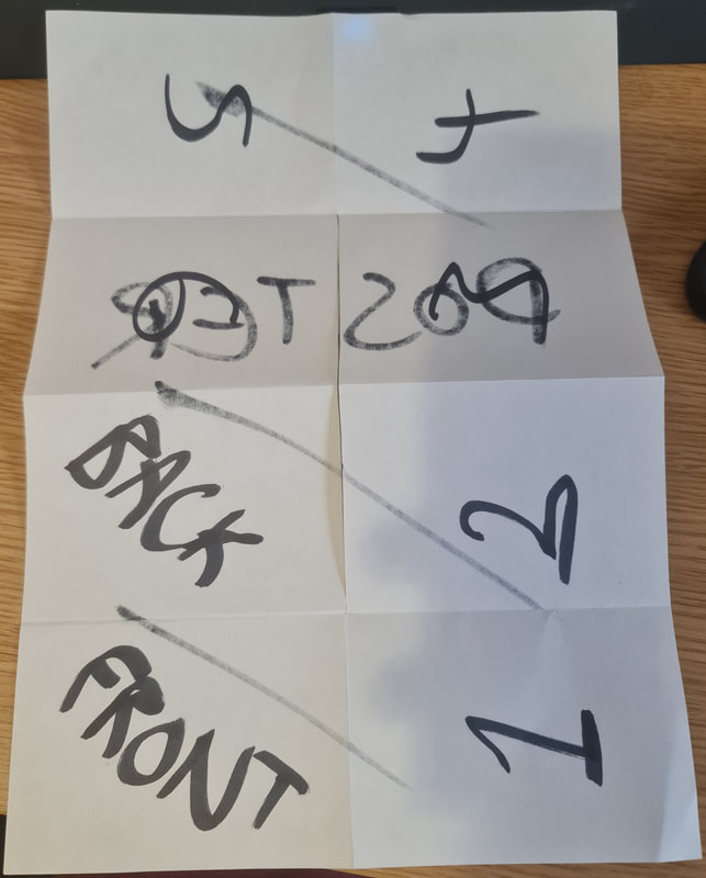
This would be the side with the front, back and the rest of the 6 pages of the zine.
|
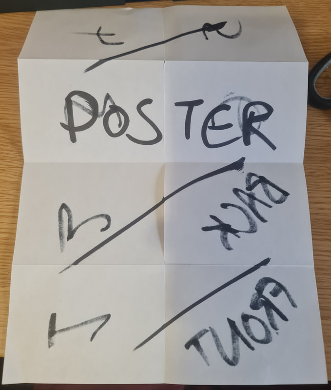
This would be the poster side.
|
|
|
|
|
I then came up with ideas on the content on each page and what it would contain. I decided that the first and second page of the double page spread would be about IC3PEAK and their beginnings. The third and fourth page would be about the Russian Blacklist. The final fifth and sixth page would be about other protests in Russia that I would further research on about later on.
Title & Style
For my zine. I was heavily inspired by collages and I wanted to portray the photographs of the country and its people. From my research of zines - I found some used imagery along with typography - I did not want to play too much with typography as I think that using images would describe the mood and theme better in this setting than typography.
The title of the zine was going to be 'Political Notes'. I came up with this name as this zine is about Music & Politics. I came up with this by picking the words 'musical notes' and changing this to be about politics hence the name of my zine. The play on words shows the theme of both politics and music in the zine and how both work together to portray a message.
The title of the zine was going to be 'Political Notes'. I came up with this name as this zine is about Music & Politics. I came up with this by picking the words 'musical notes' and changing this to be about politics hence the name of my zine. The play on words shows the theme of both politics and music in the zine and how both work together to portray a message.
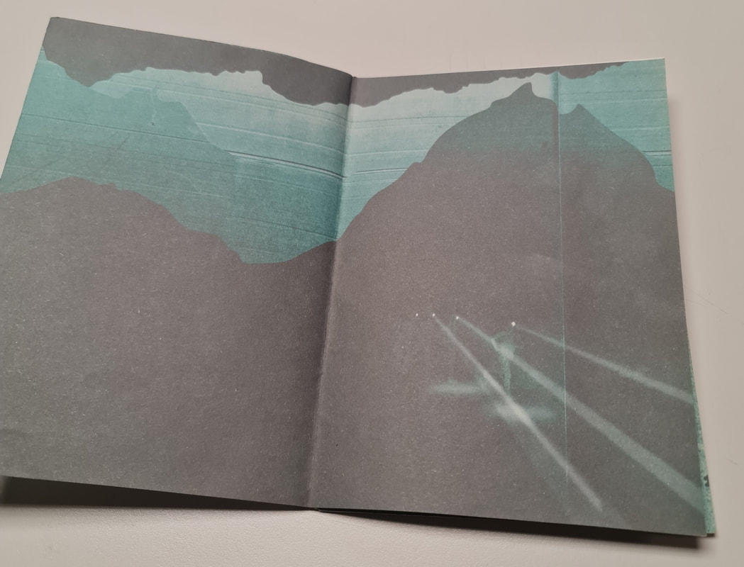
Poster
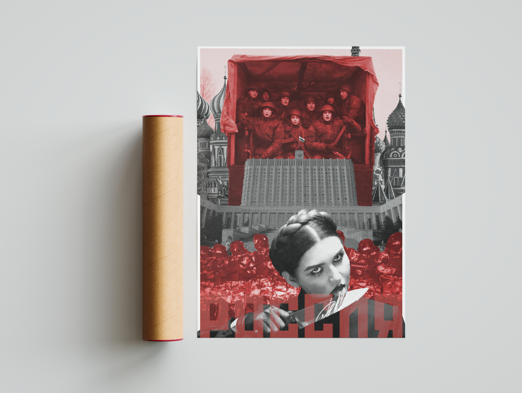
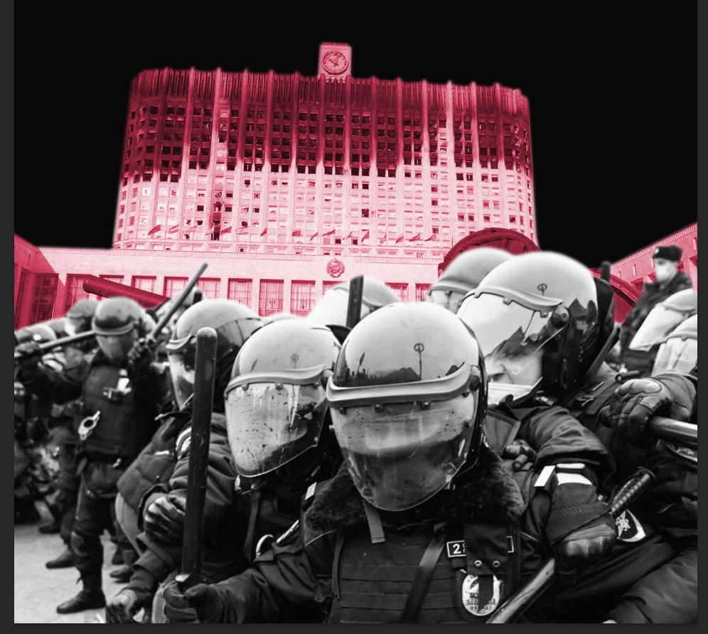
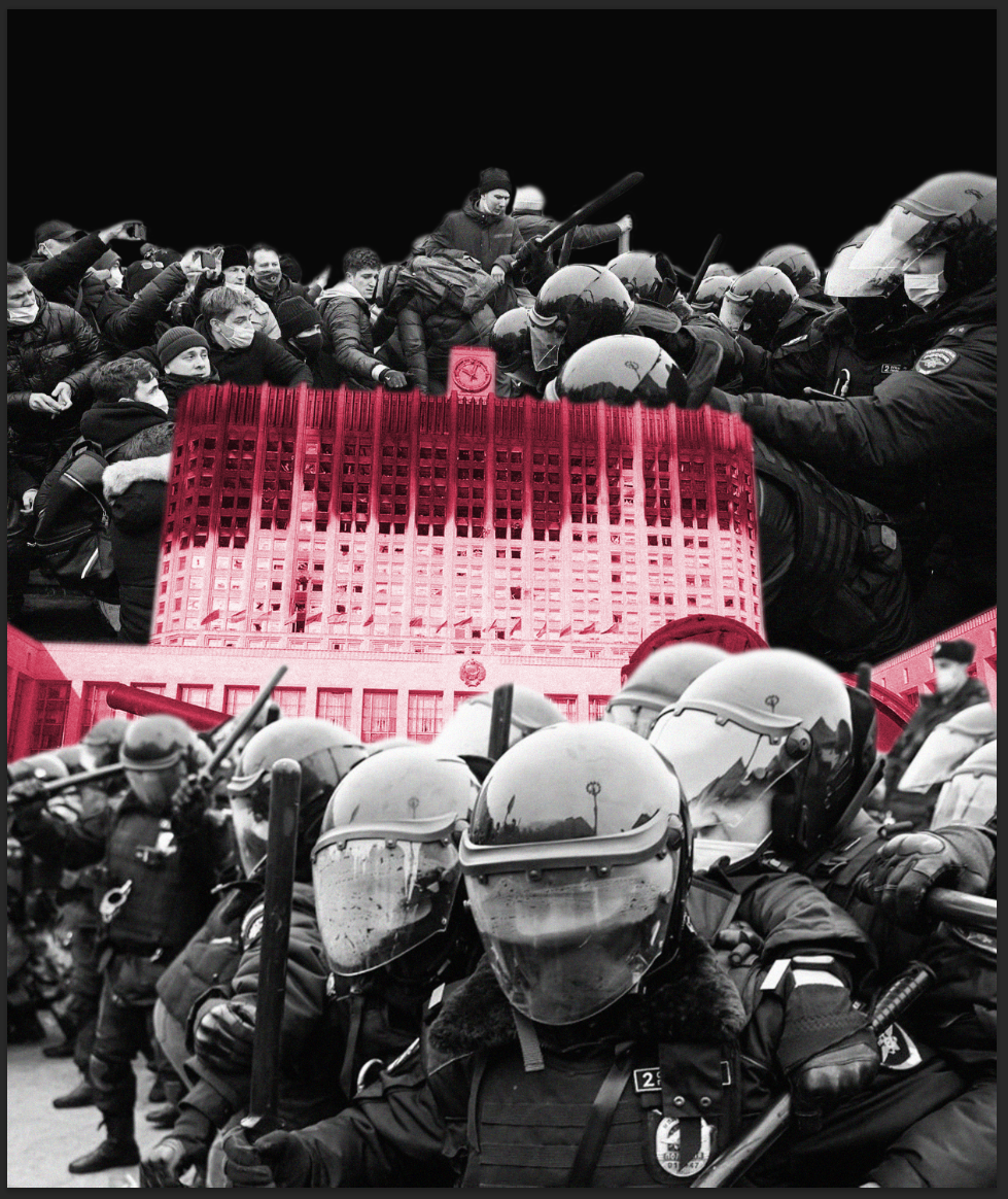
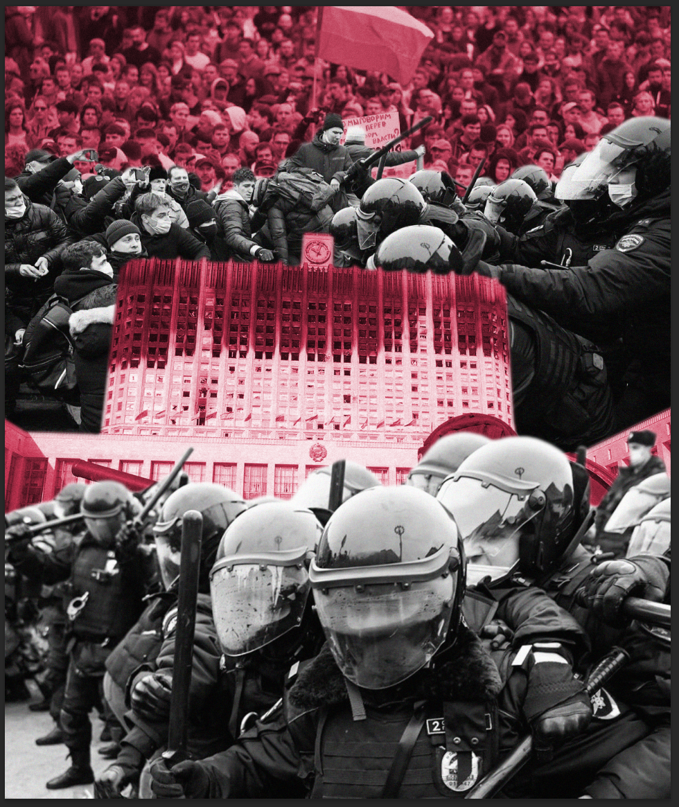
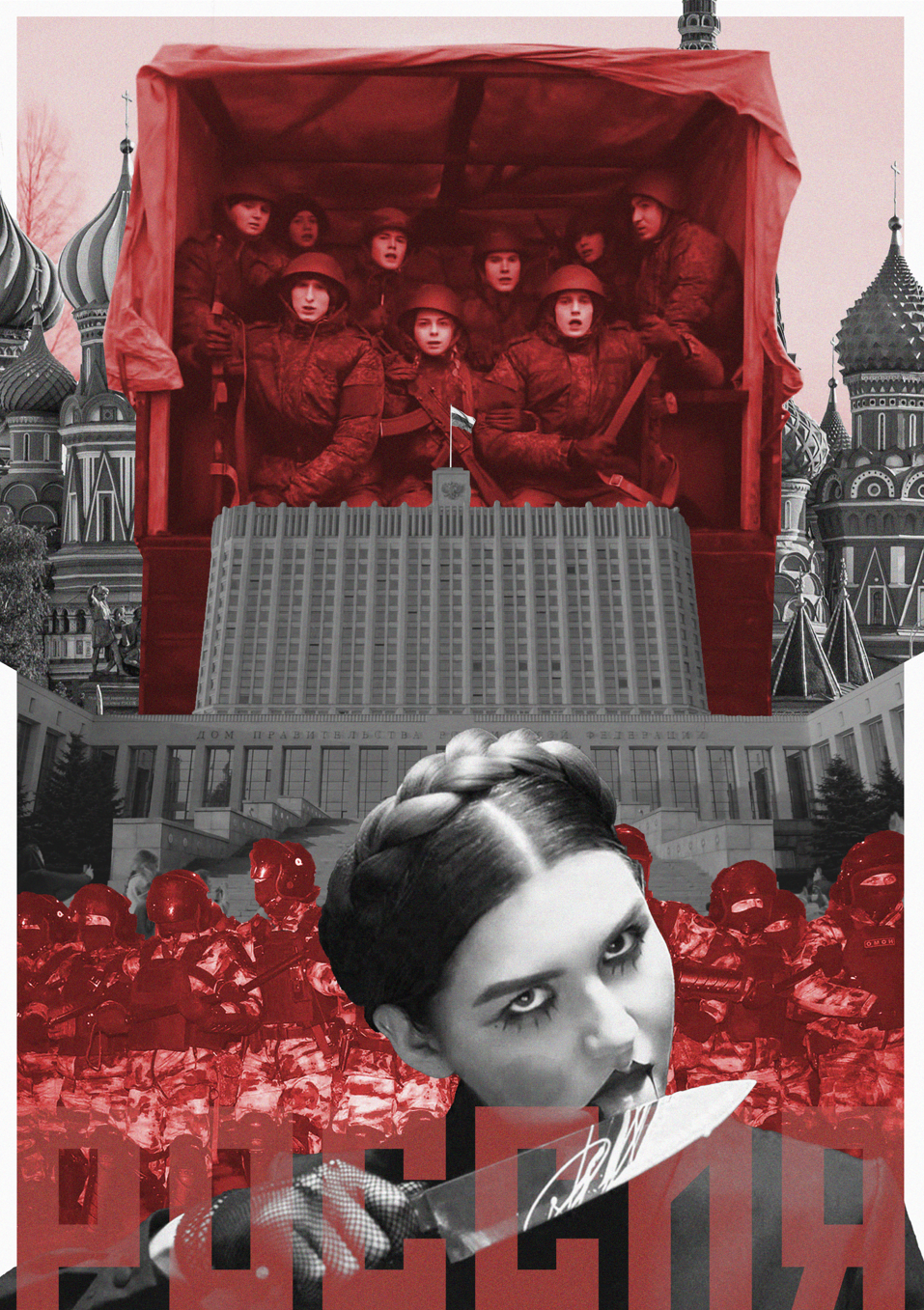
I began by working on the poster that would go on the back of all the pages. Once the zine would be read - the viewer can open up the entire thing to reveal a big poster. I chose to start with this to be able to get the feel and theme of the entire zine.
|
|
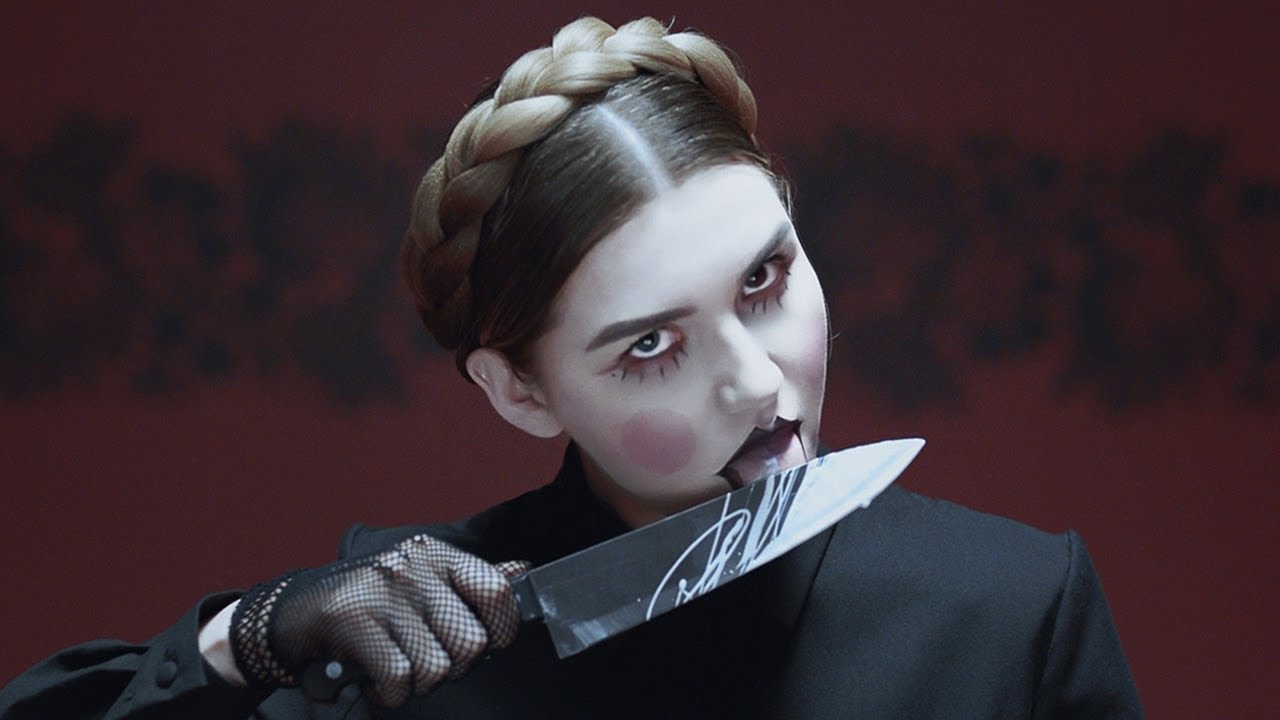
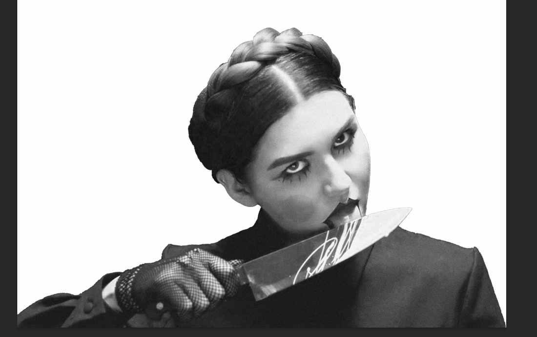
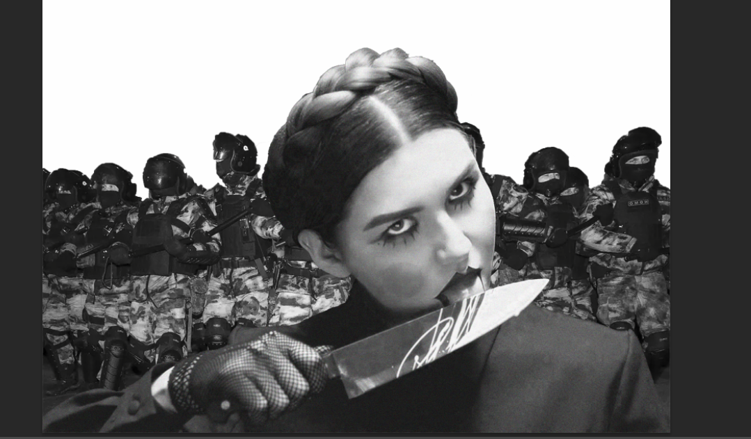
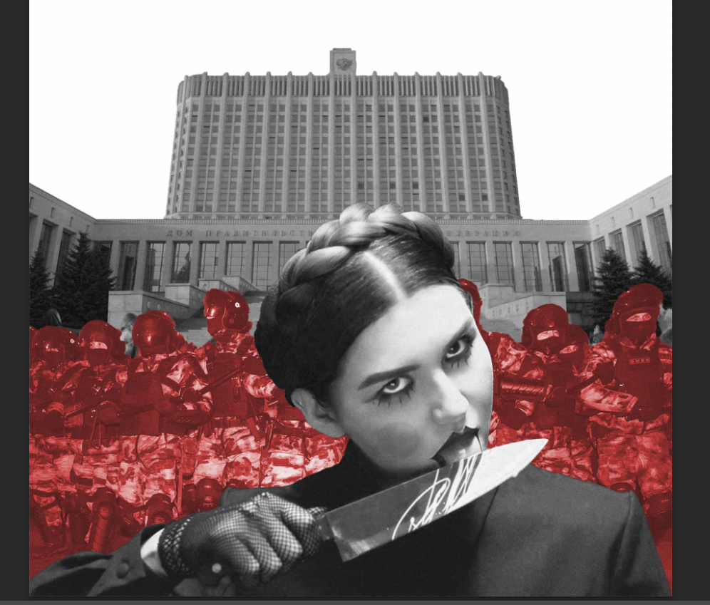
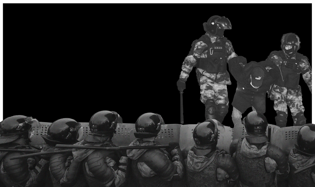
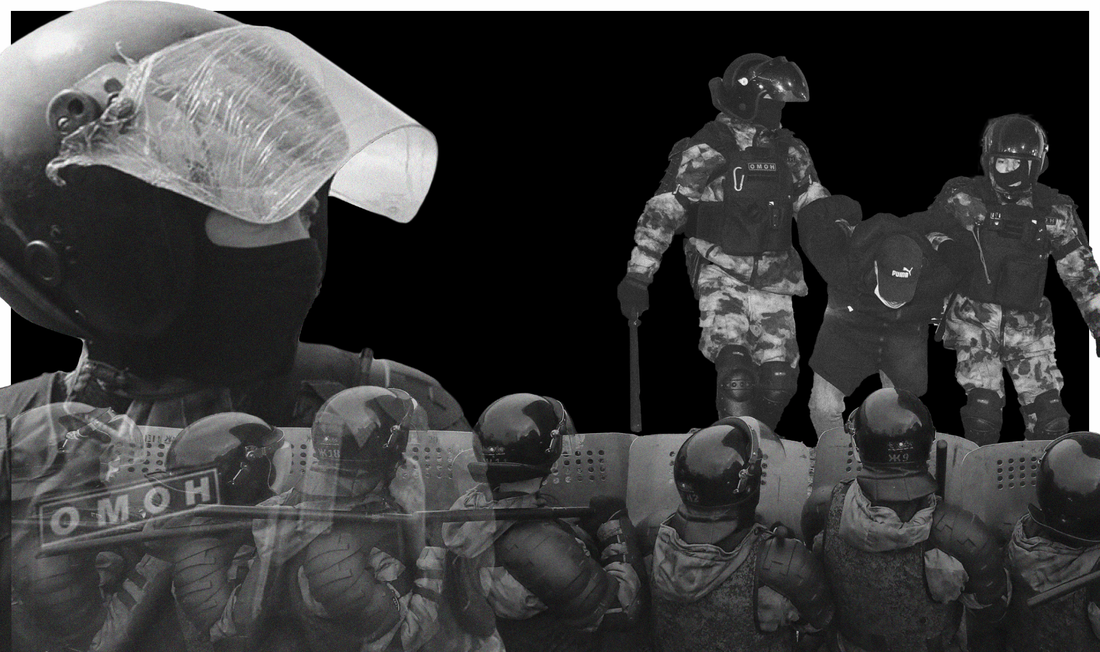
I collected an image from one of IC3PEAK's music videos and cut it out of the background to use in my collage poster.
|
|
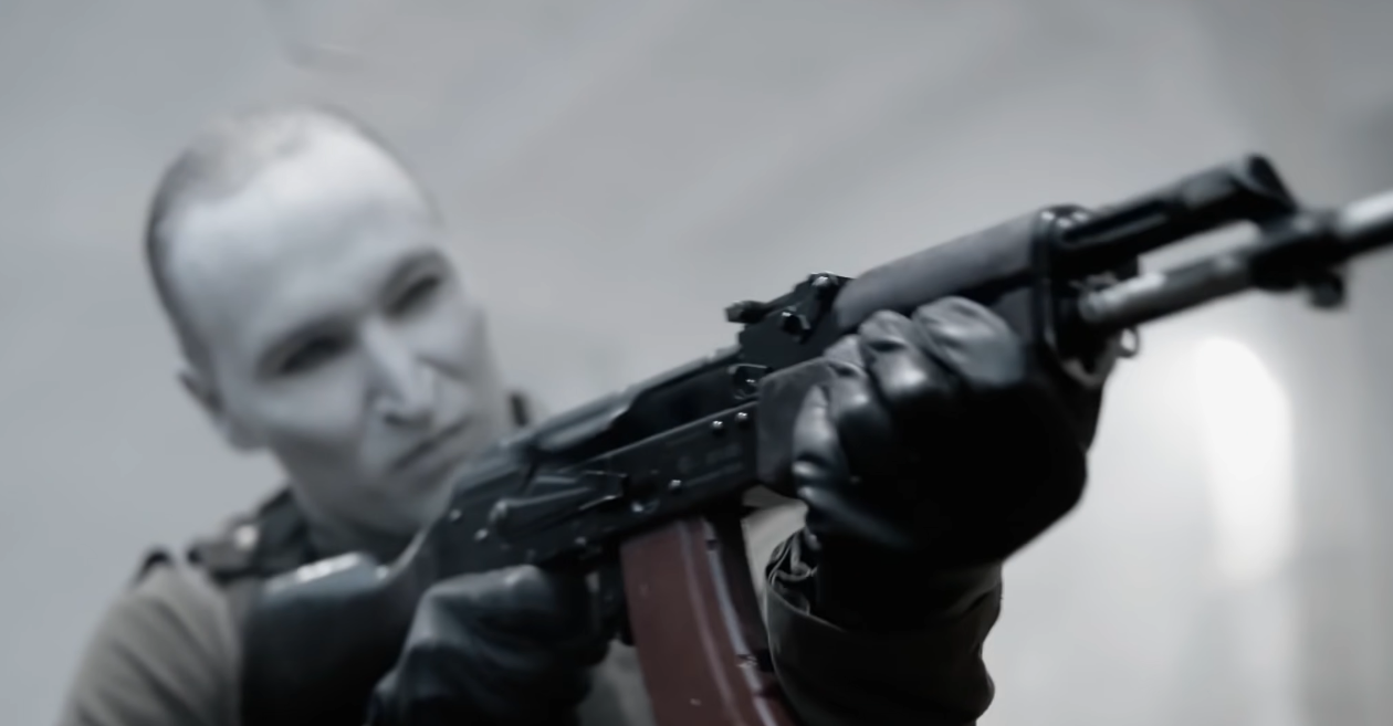
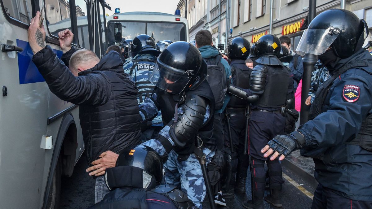
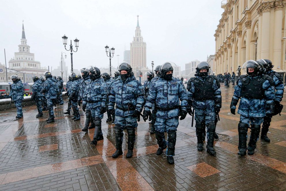
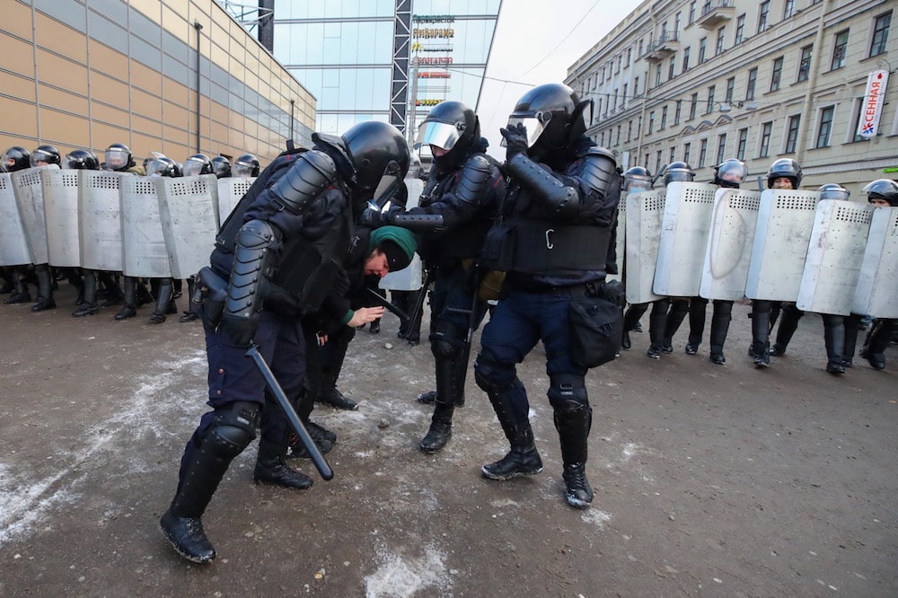
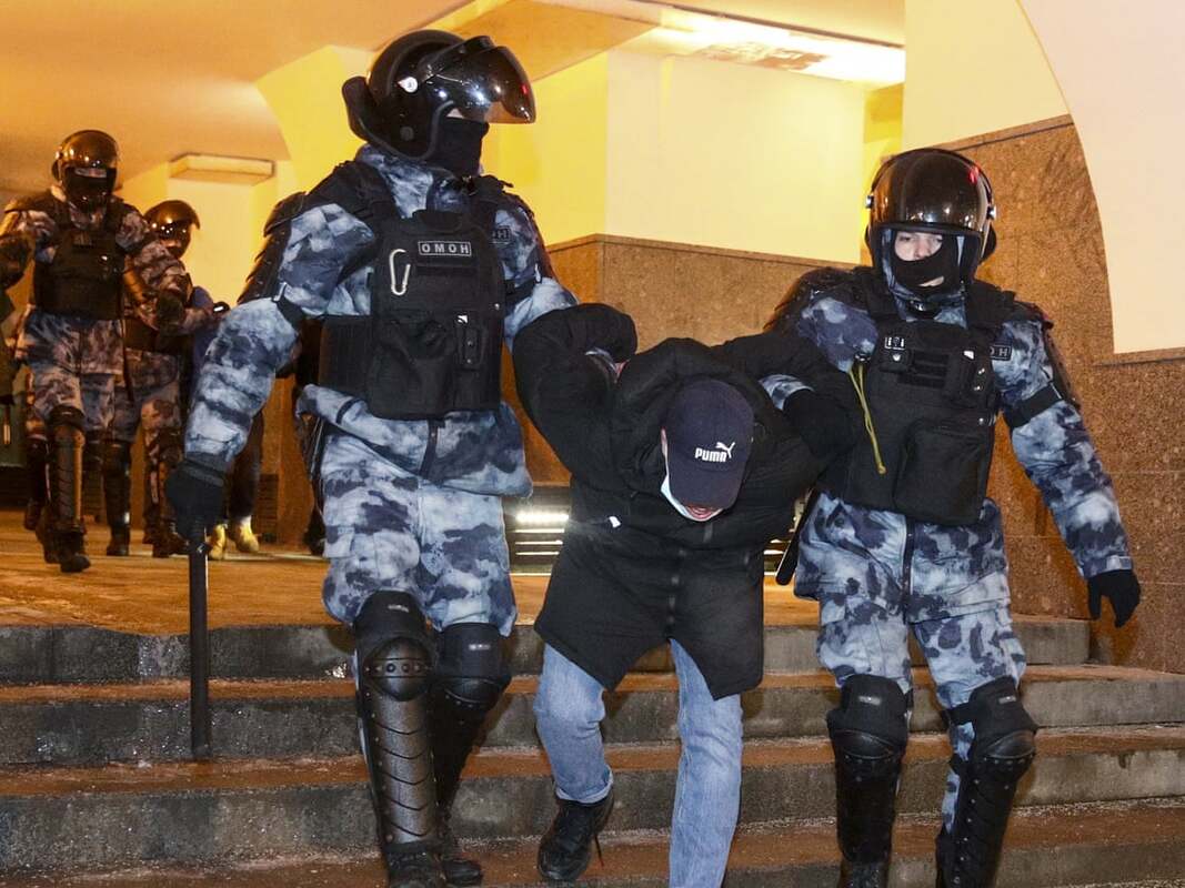
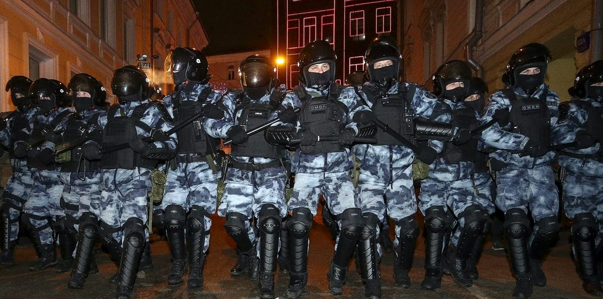
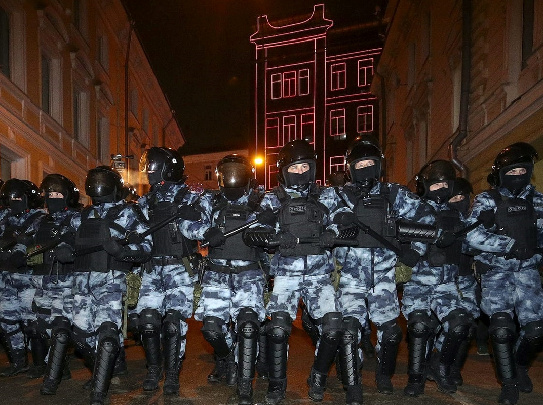
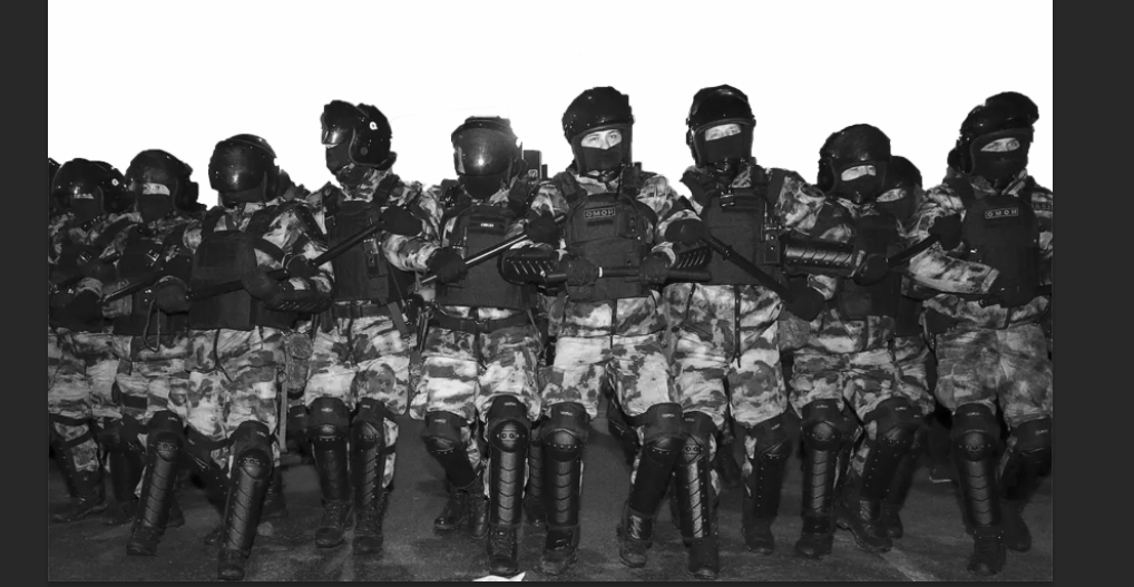
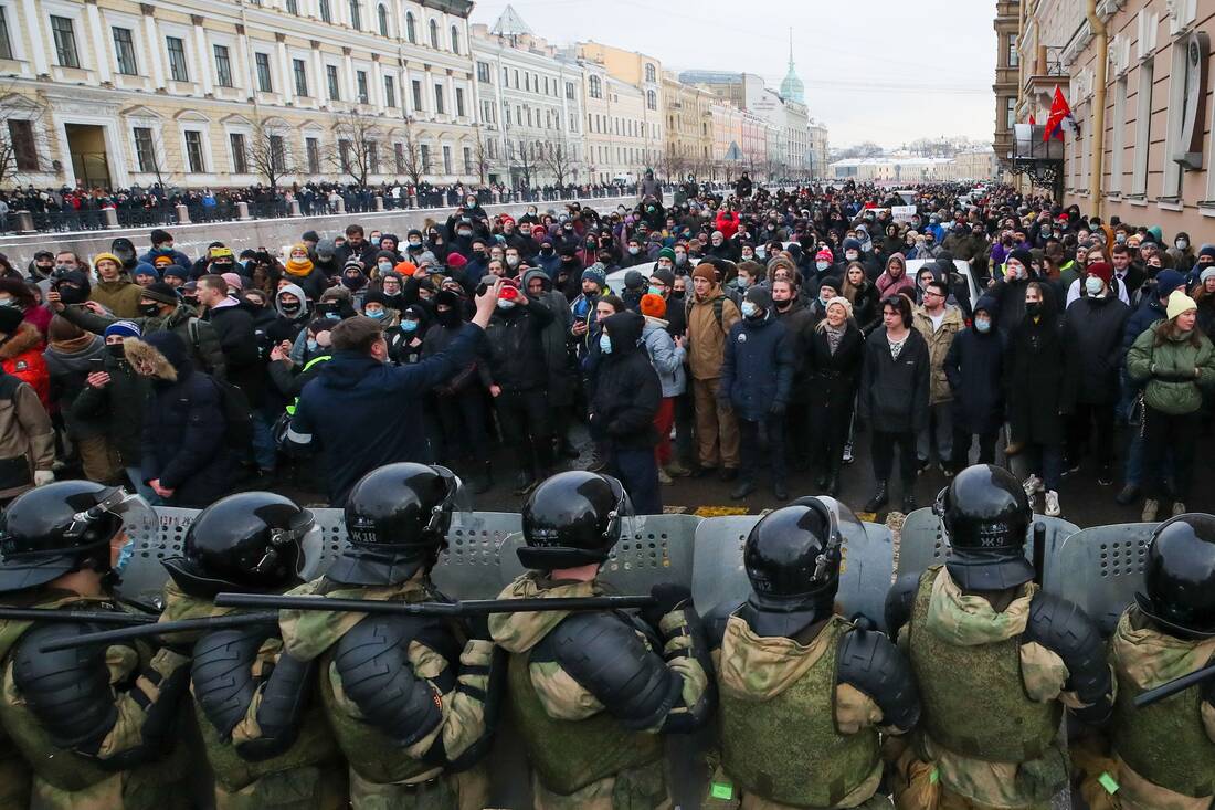
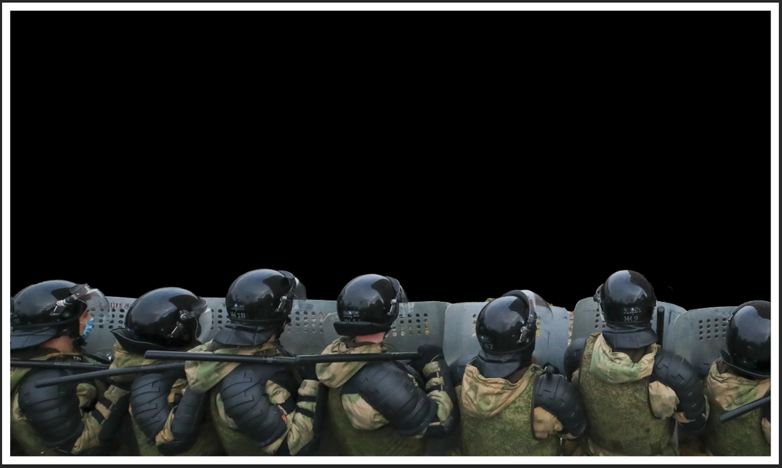
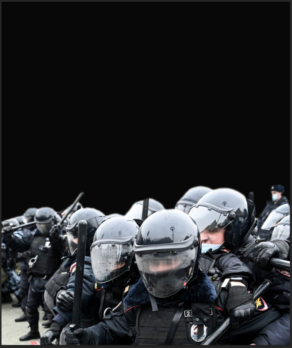
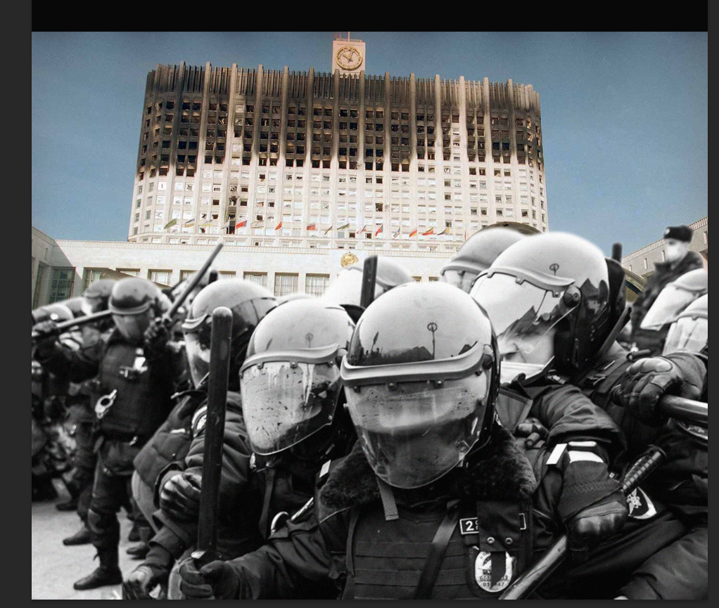
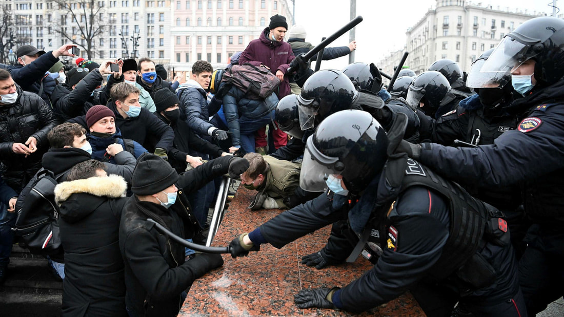
I then used an image of russian riot police I found from google to use within the image as this shows the power of the russian government as they have used this force before to stop protests and riots.

|
|
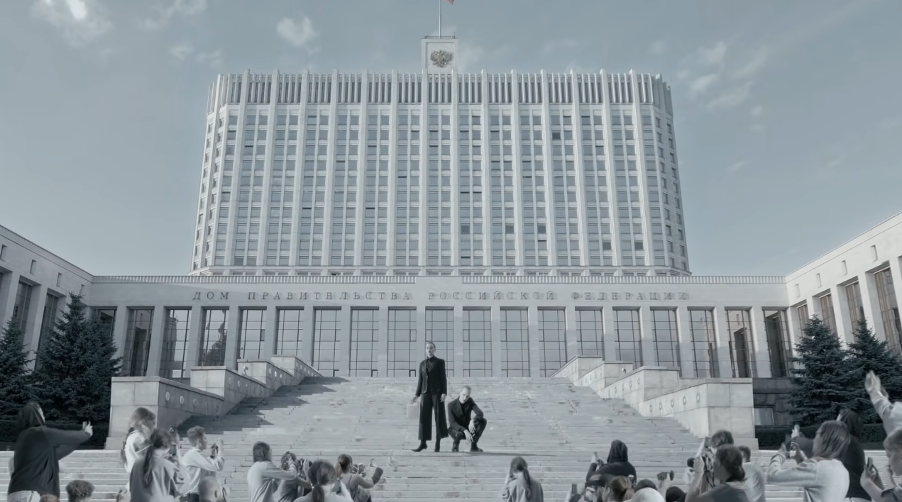
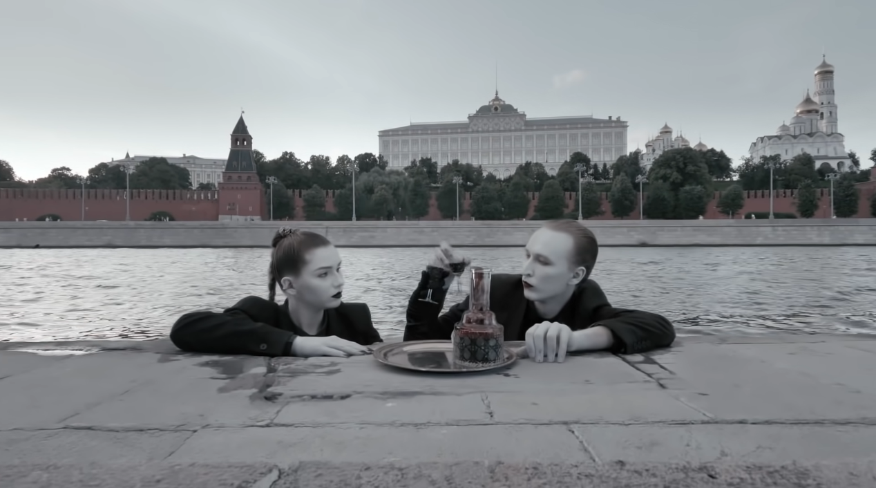
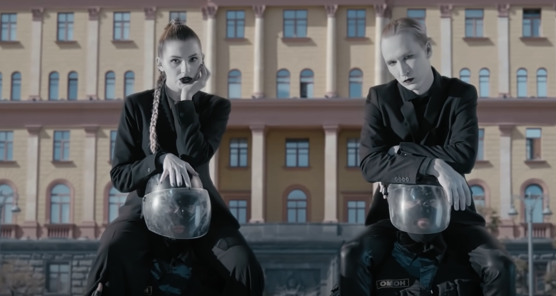
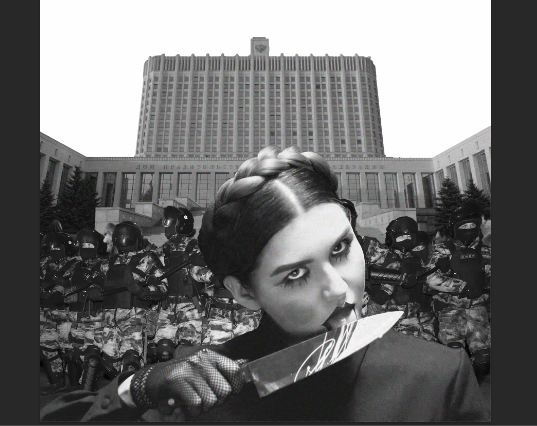
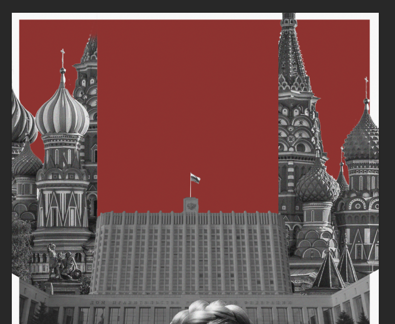
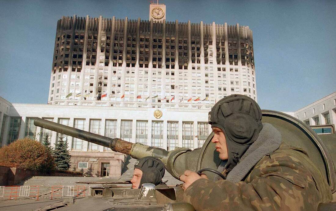
Using another image from a music video - the Russian White House - is a very famous government building. In this video, the band is seen pouring gasoline over themselves and so this was a very staple part of the video that - some say - may have helped put IC3PEAK on the russian blacklist.
|
|
|

|
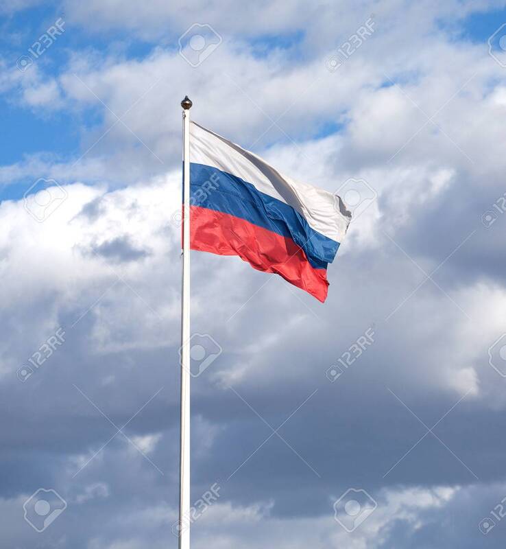
The video had the russian flag cut off and so I also got an image off the internet and put it at the top where it is meant to be. This was very important to me as the russian flag is a big symbol and I knew it had to be used in my poster.

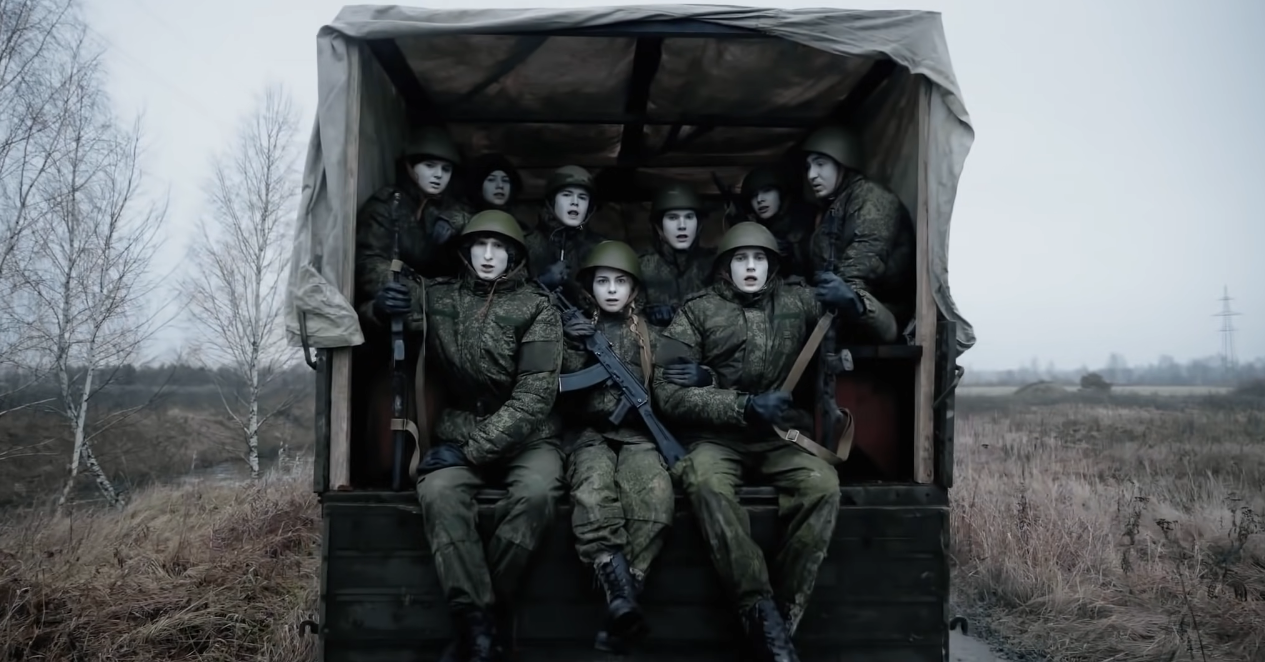
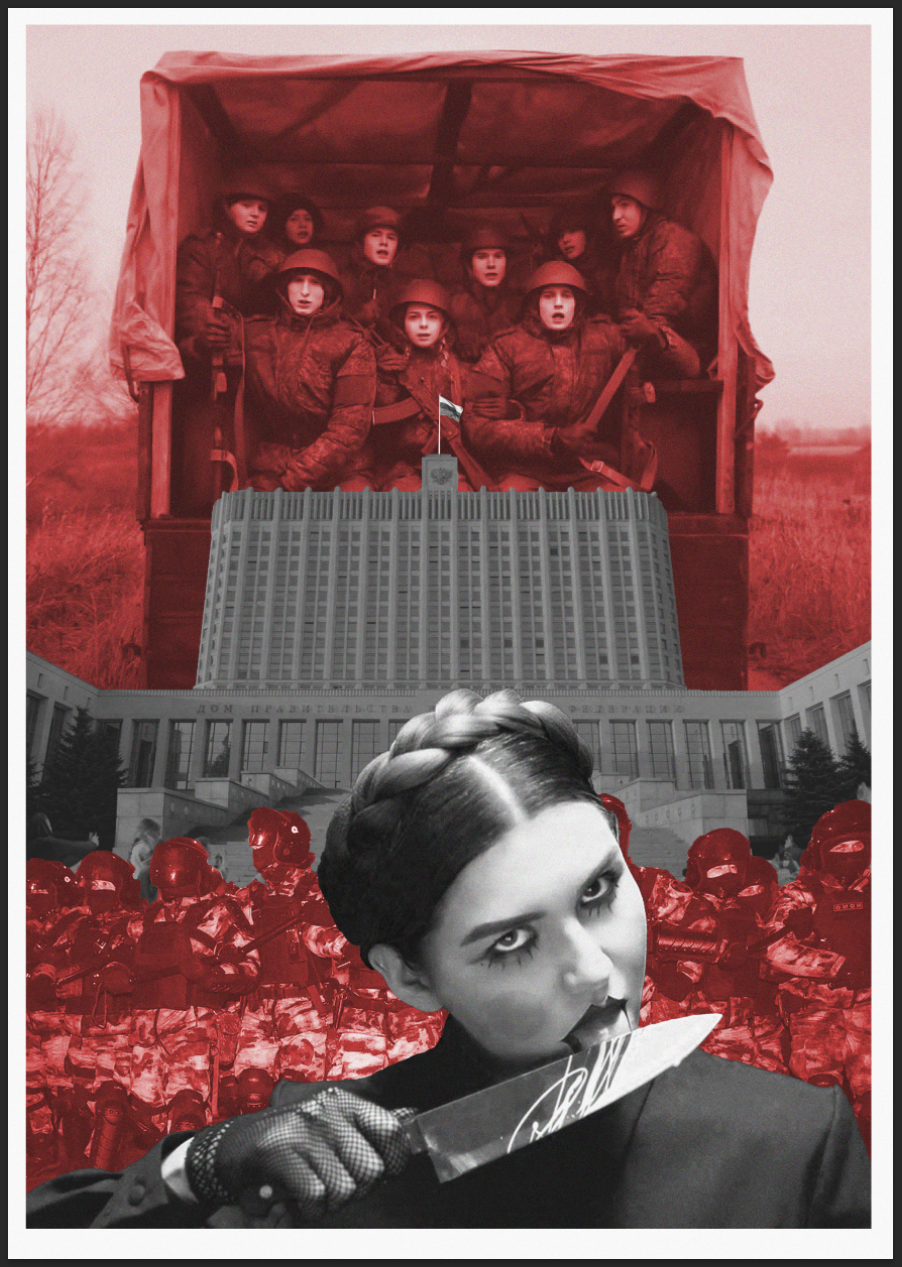
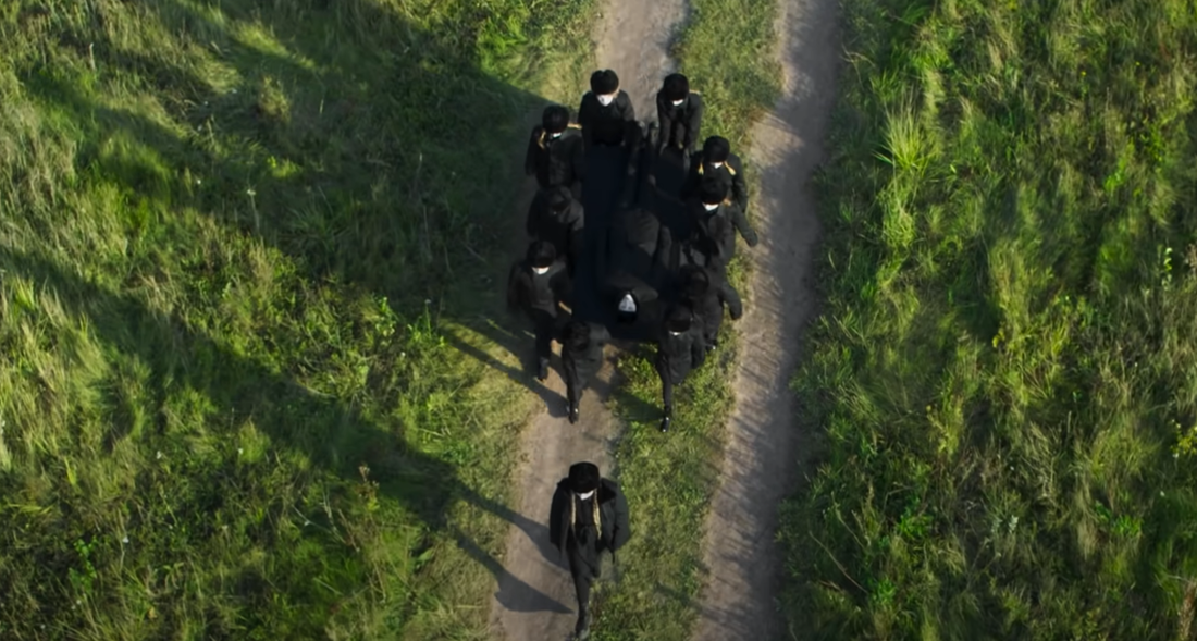
Another image from a music video was of russian soldiers that had been drafted from their homes. I used this as my background for the collage as most people who reach 18 are sent to the army to serve russia for some time. This is not voluntary.
|
|

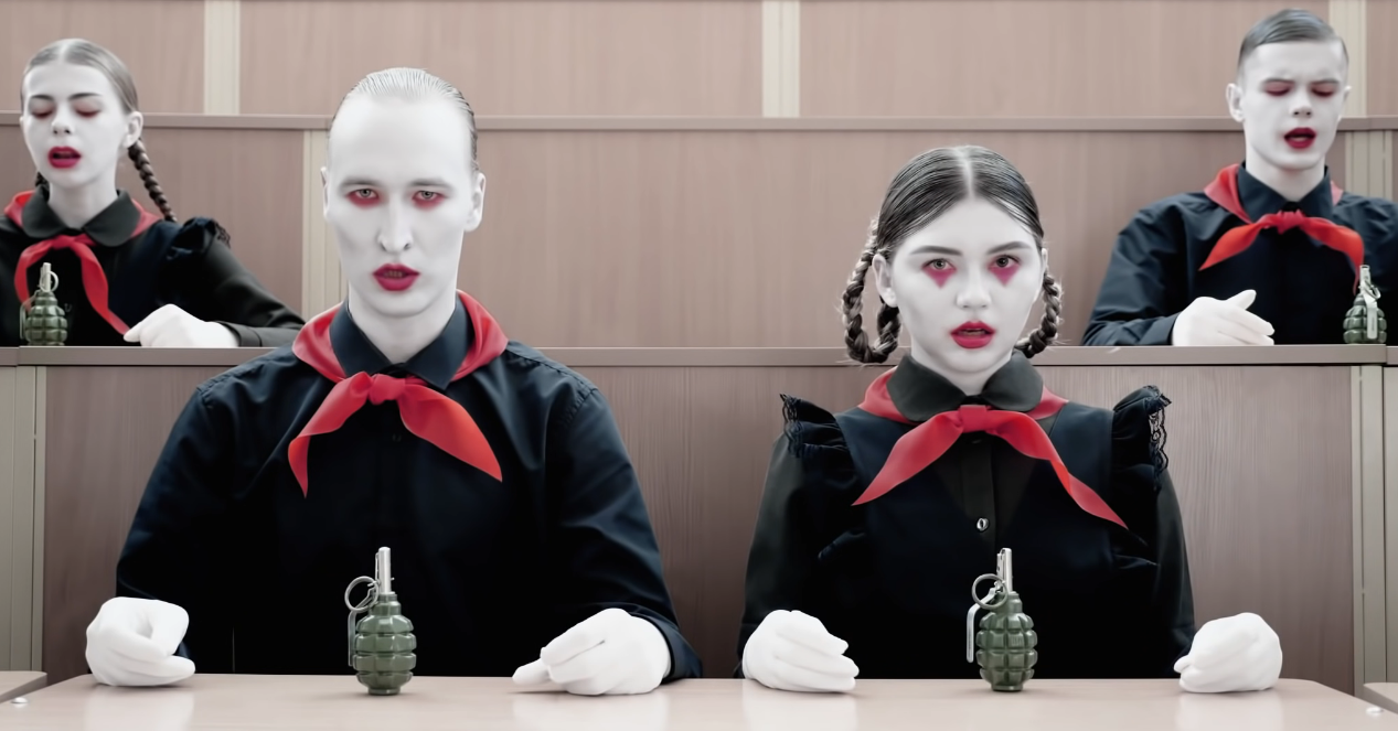
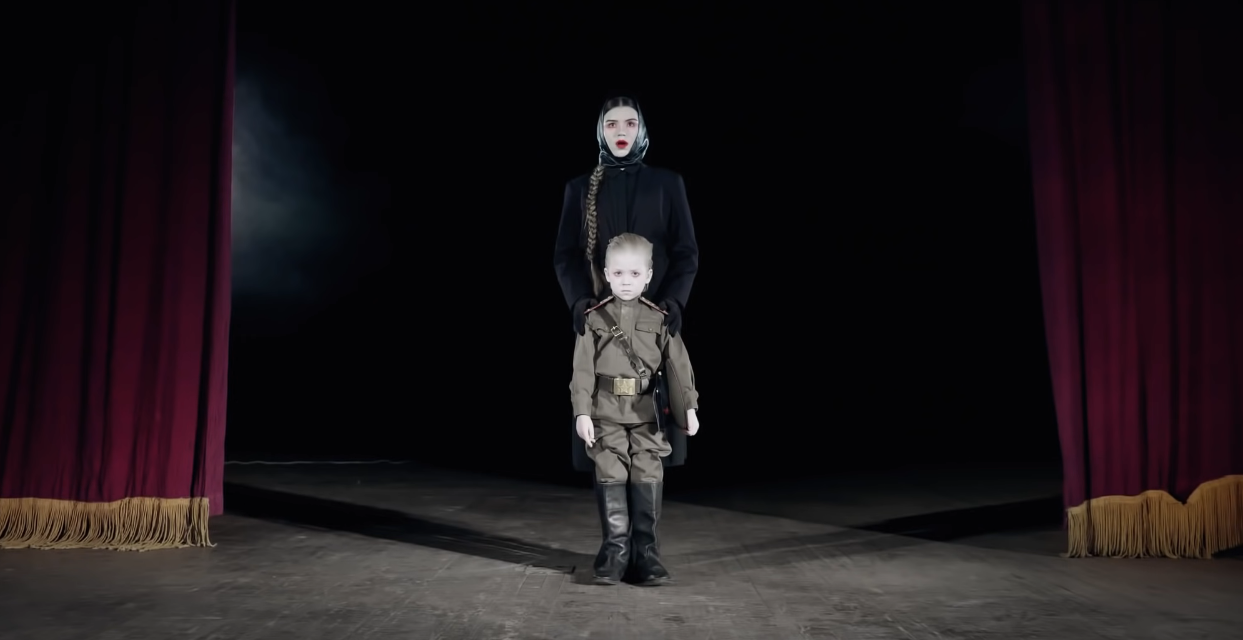
This image from a music video was of the band dressed in russian school uniform with grenades being handed to them. I attempted to use this in my poster however I felt like too much was going on and so I removed it eventually.
|

|
|
|
|
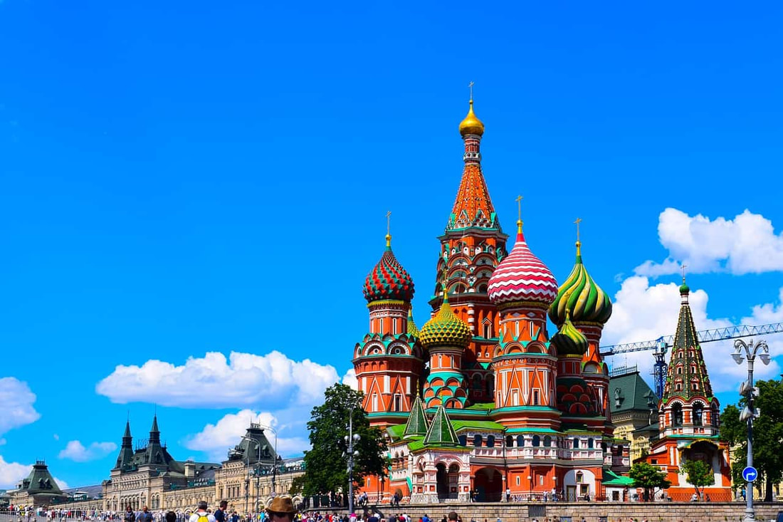
I then proceeded to add St. Pauls Cathedral found from my research. This is a big staple building in Russia and is also used in a music video with IC3PEAK.
I also chose to make this specific building 'stick out' from the original white border I made. I chose this as I feel like this building is important and this might show the significance of the building - by making it not fit inside the set box. I followed this by making Anastasia (the woman at the front of the collage) also follow this rule. She is going against the government and sticking out of the normal crowd with IC3PEAKs music videos and so I wanted to show her significance in this way as well as putting her to the front of the collage.
I also finished off by adding the typography "RUSSIA" in russian which used one of the fonts I had previously found.

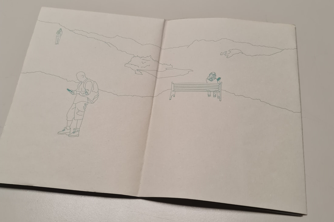
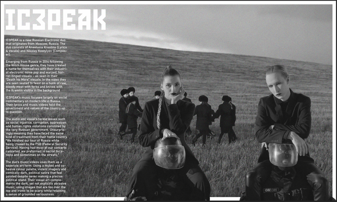
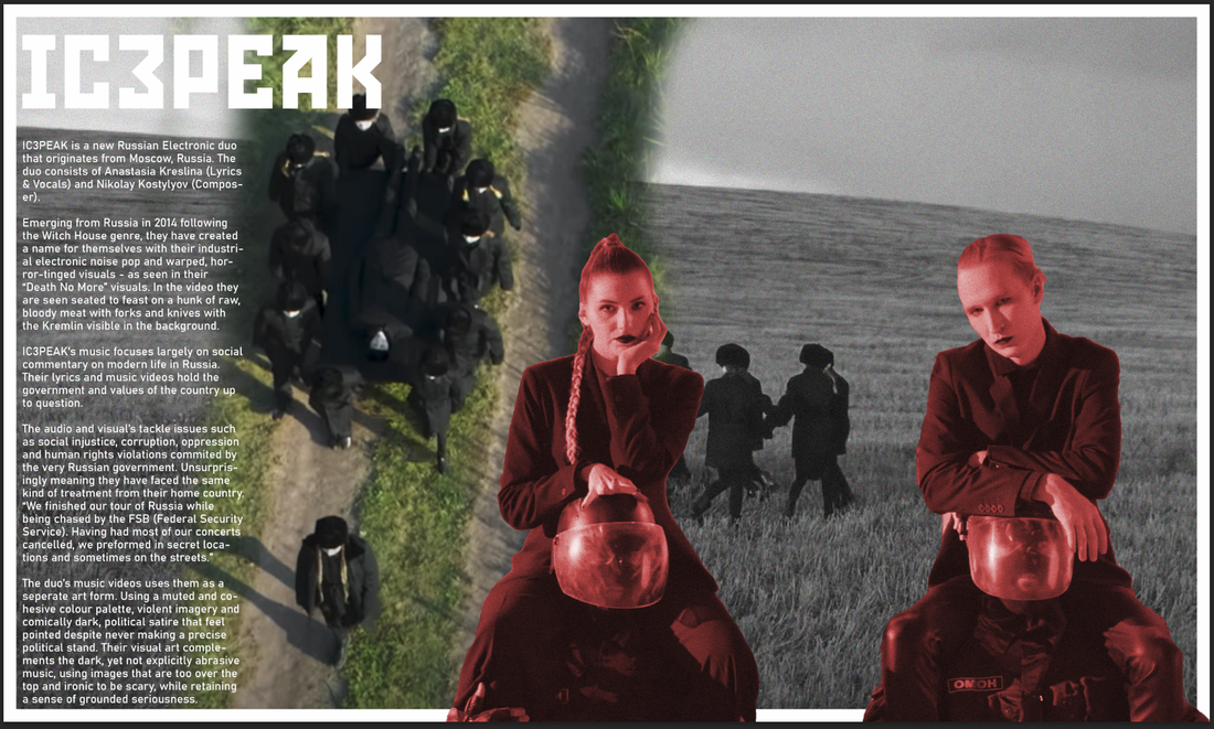
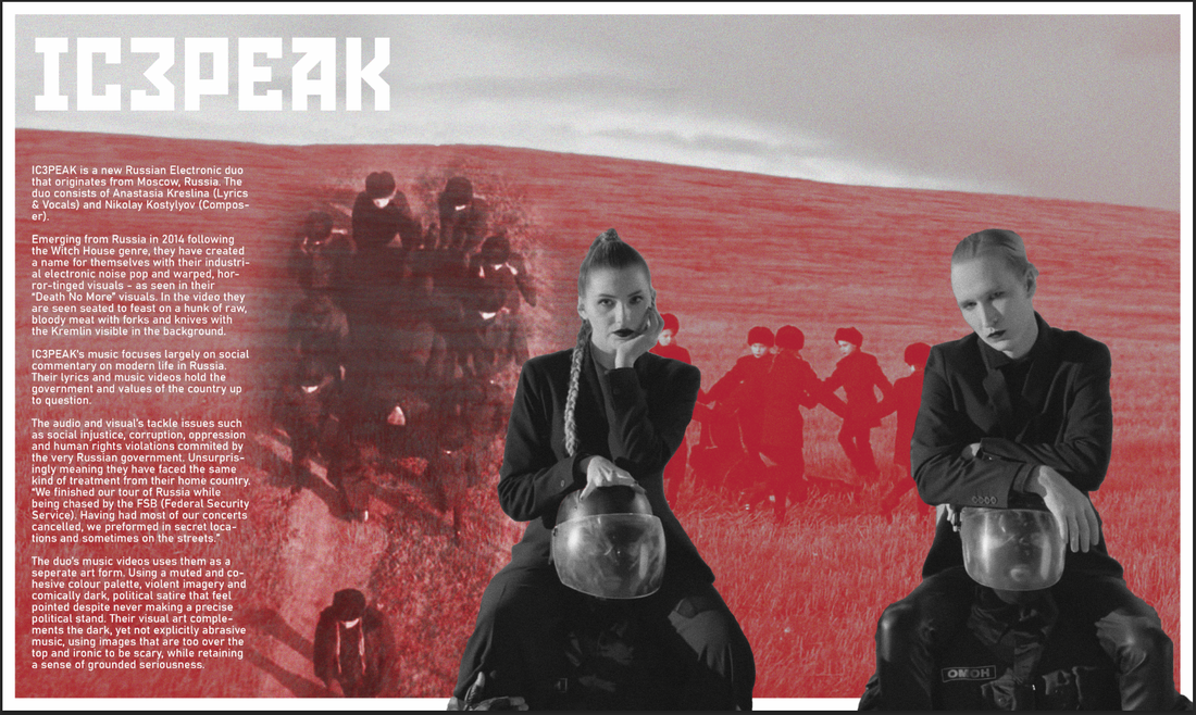
Page 1 & 2
I then moved onto page 1 & 2. These pages, as I planned, would be about IC3PEAK.
I begun by creating the title of the band at the top using the same Russian style font as the poster. The content of the zine used a seperate font as it would be too hard to read using the Russian font. I used the colourscheme red as the background and white to make the text easier to read.
I begun by creating the title of the band at the top using the same Russian style font as the poster. The content of the zine used a seperate font as it would be too hard to read using the Russian font. I used the colourscheme red as the background and white to make the text easier to read.
|
|
|
Using a screenshot from a music video, I was able to get a picture of both band artists sitting on top of Russian riot police. I then used Photoshop to cut them out to put into my double page spread.
|
|
For the background image, I used another screenshot from a music video called "Boo-hoo". I made this image black and white and added noise accordingly - however I changed my mind later.
|
|
|
|
This is my final outcome for the first and second page of my zine.
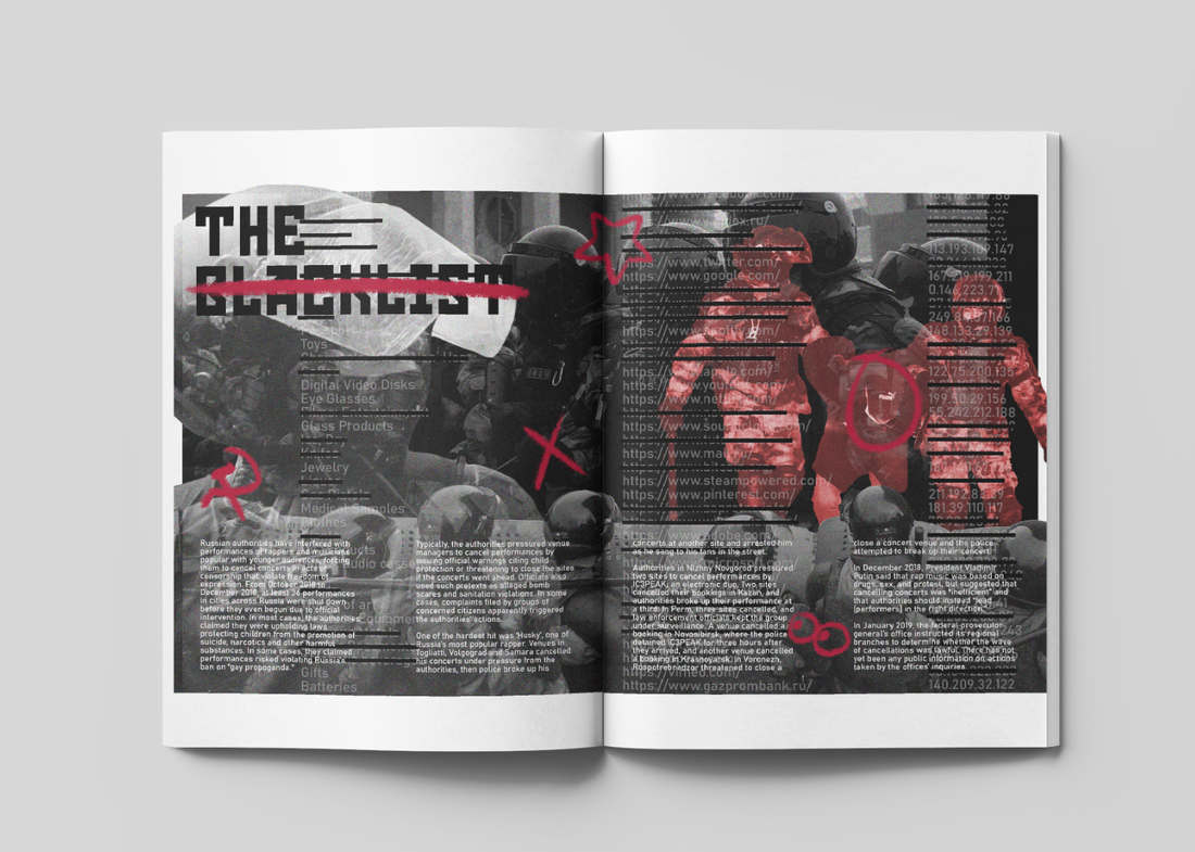
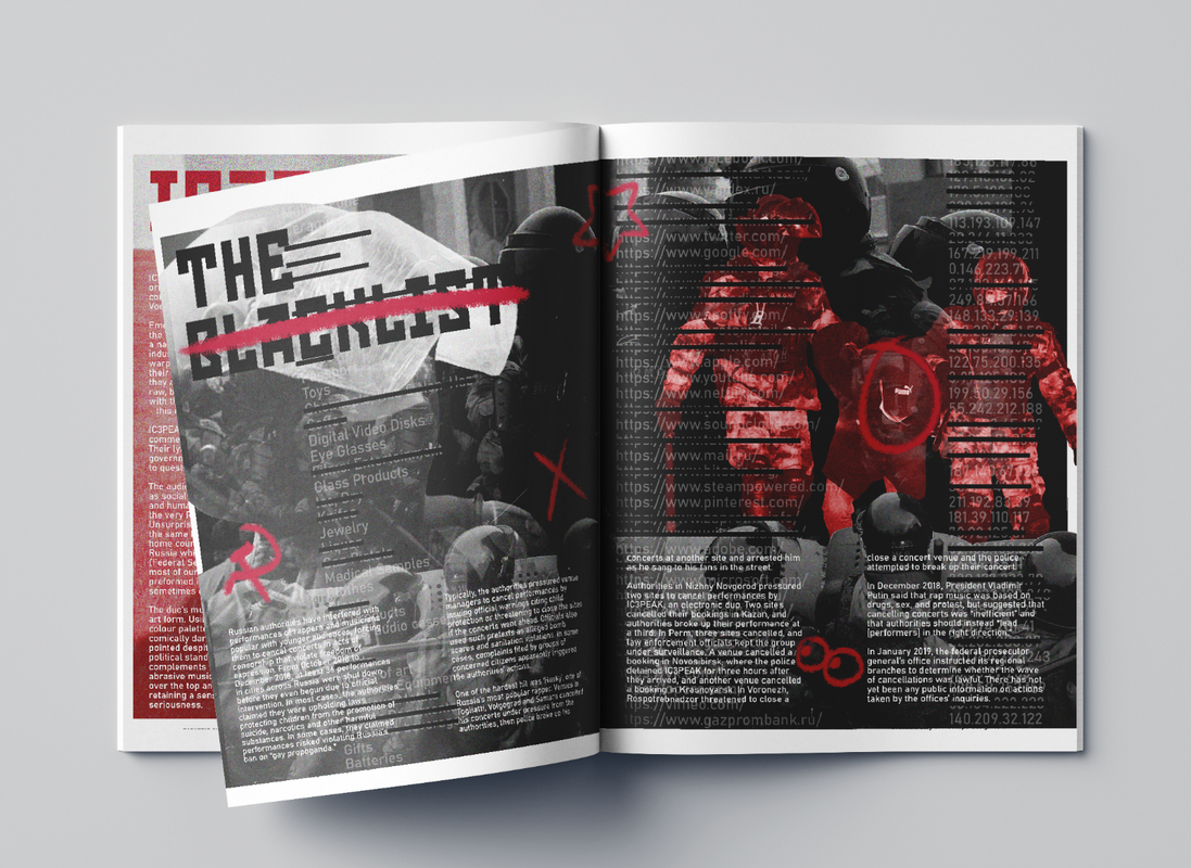
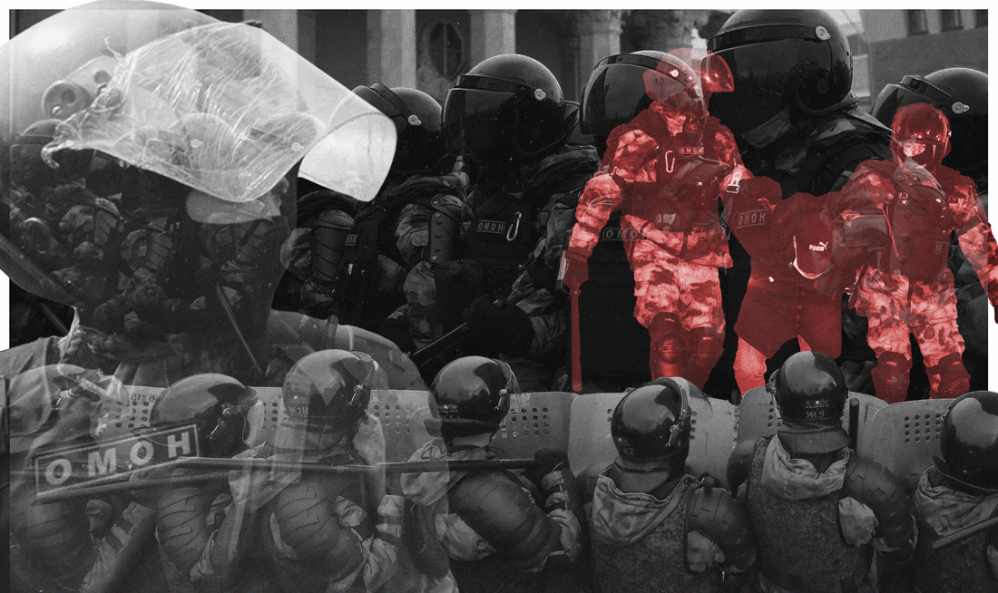
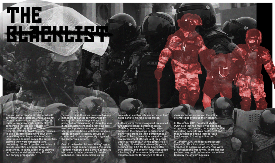
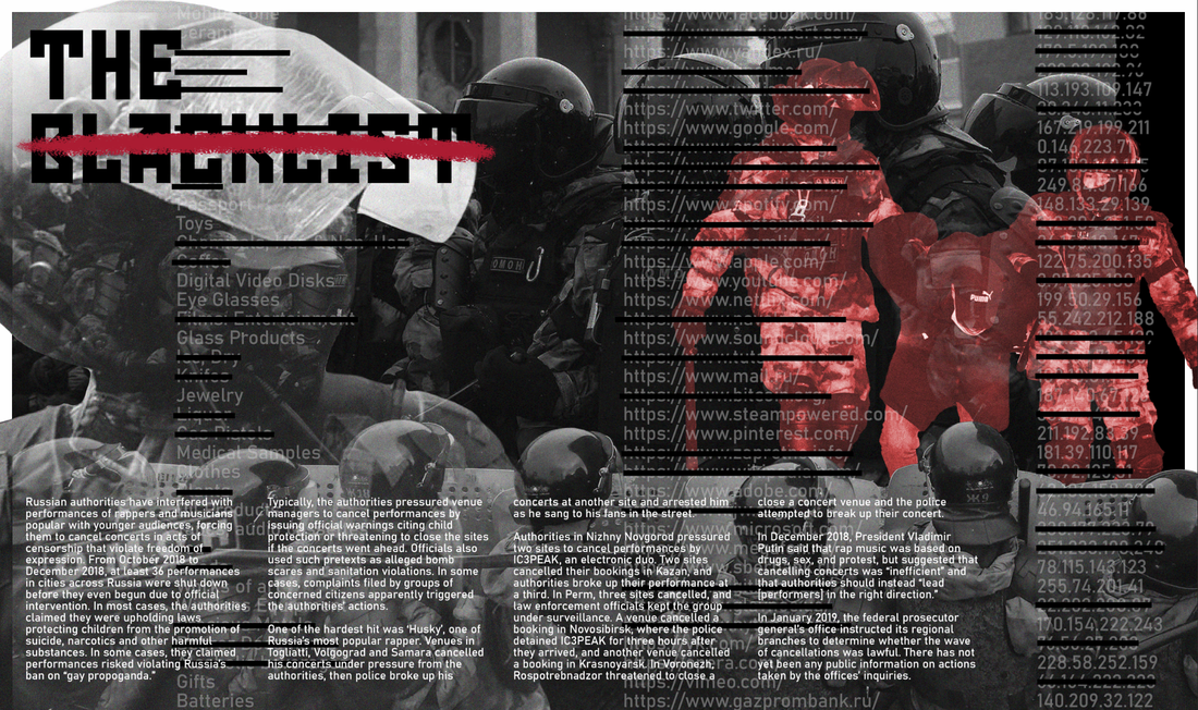
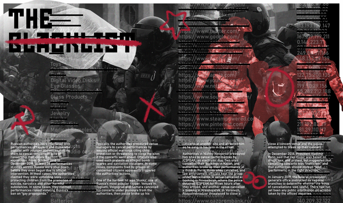
Page 3 & 4
|
|
Once again to make this collage, I began using a picture I used from my research of Russian riot police.

|
|
|
|
I used multiple pictures of different angles to suggest the strong presence of riot police and control in Russia.
|
|
Mixed in with the collage and content of the page - I also decided to add web addresses, items and IP addresses that would have blacked out lines for things that are actually blocked in Russia.

This is my final outcome for the third and fourth page of my zine.
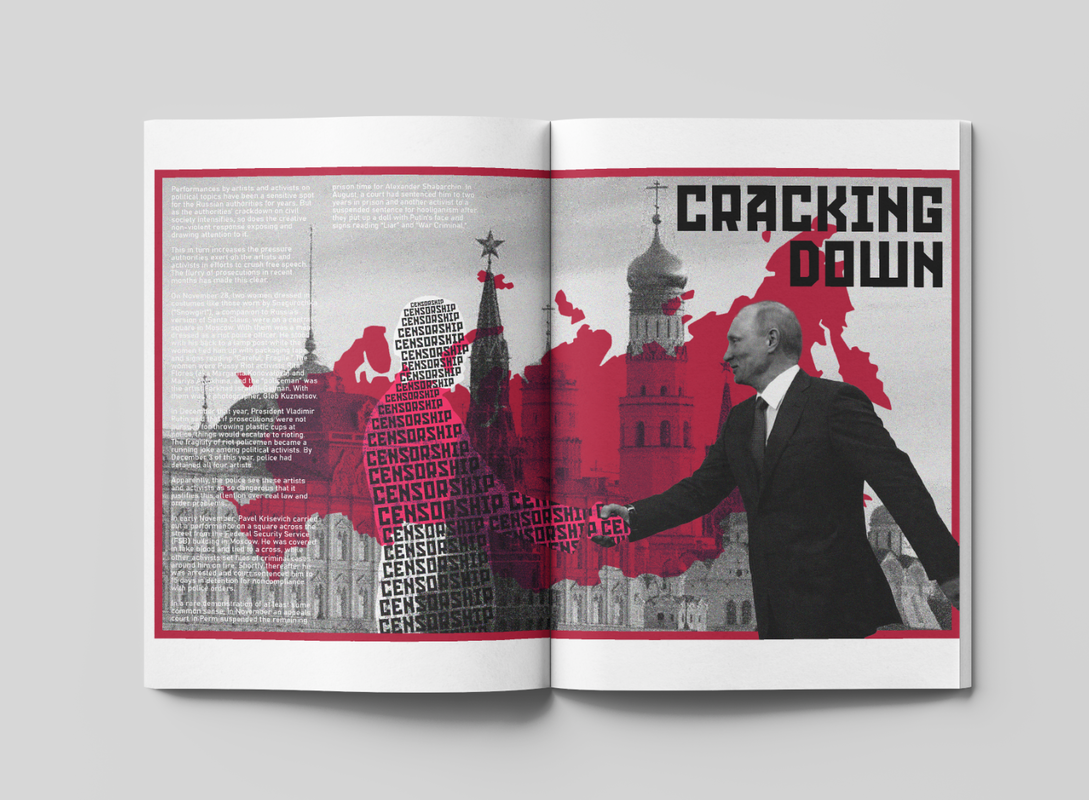
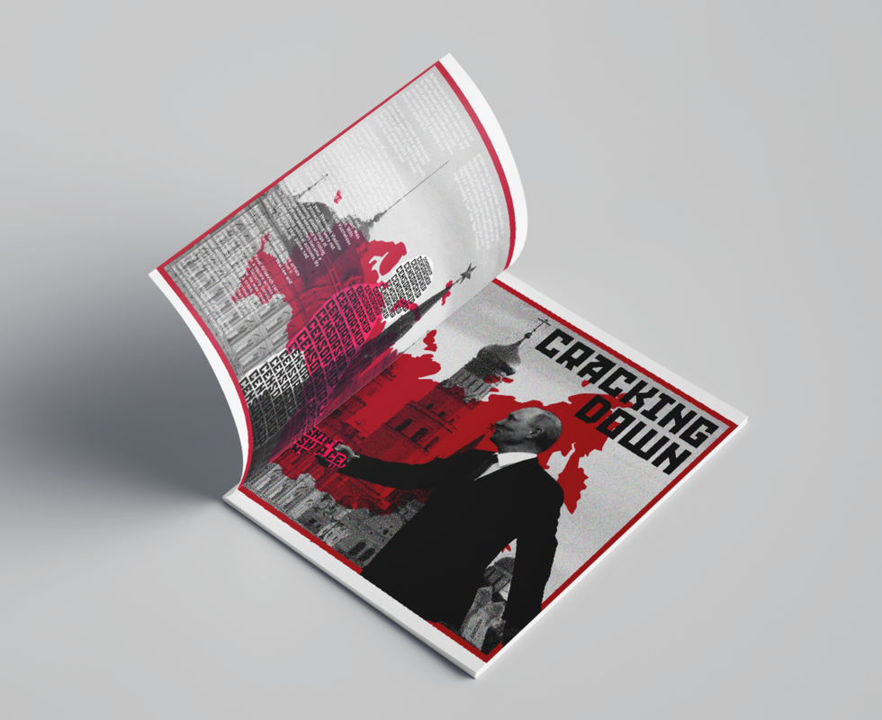
Pages 5&6
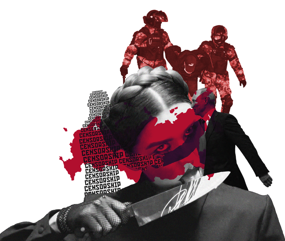
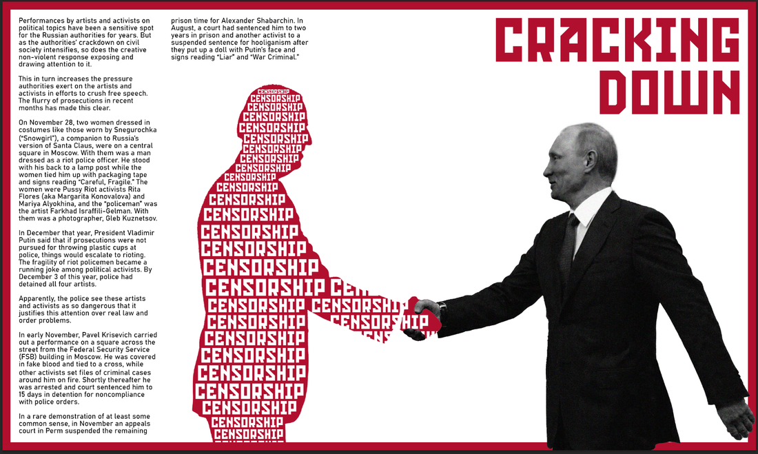
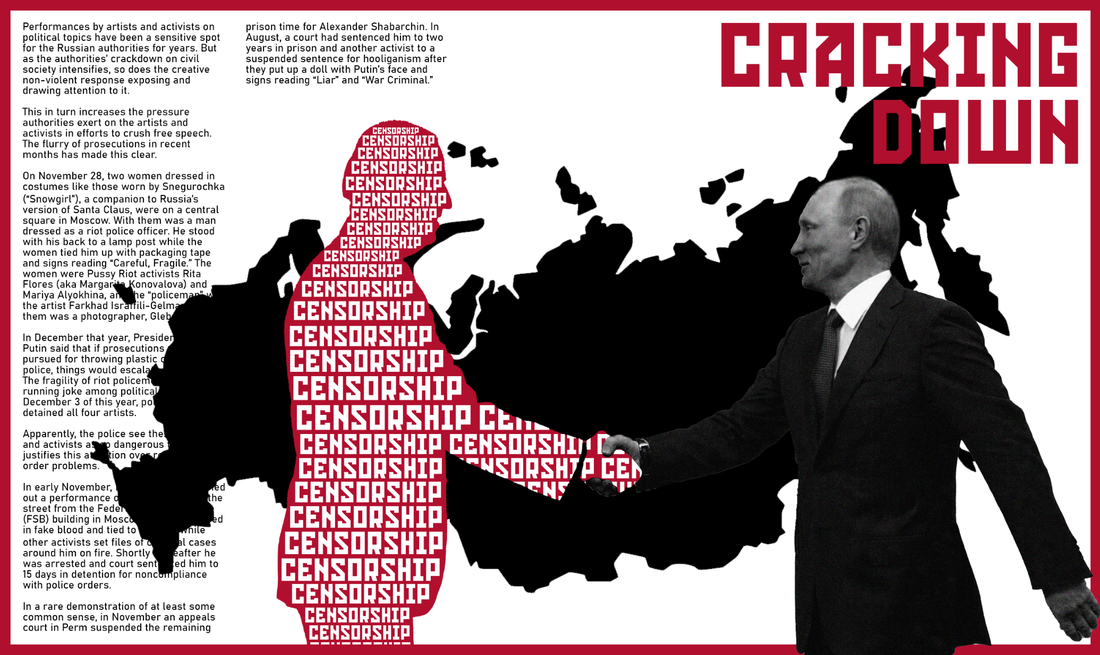
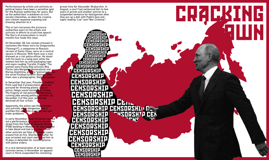
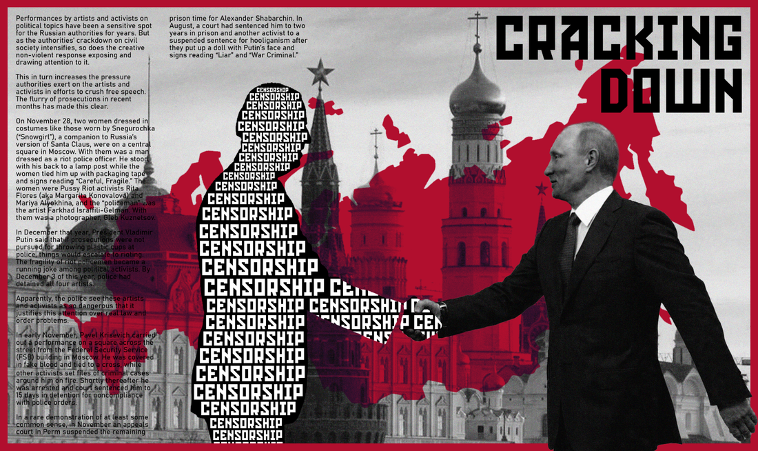
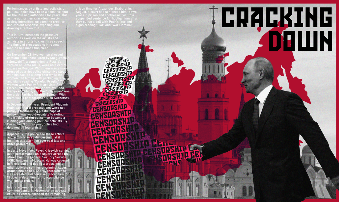
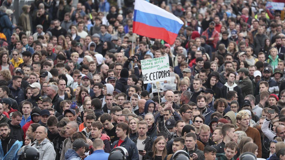
This page, I planned, to be all about the fight the government is having with the people of Russia. I called it "Cracking Down" as it is all about the police trying to shut down peaceful protests in town squares to have control of the people.
|
|
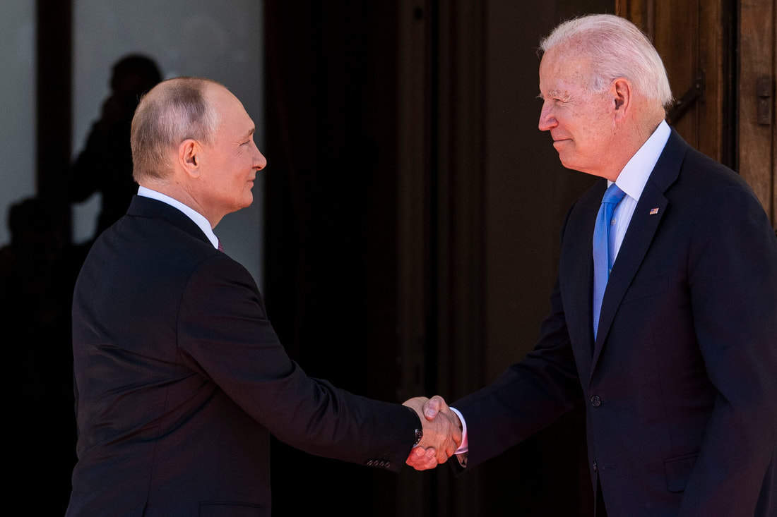
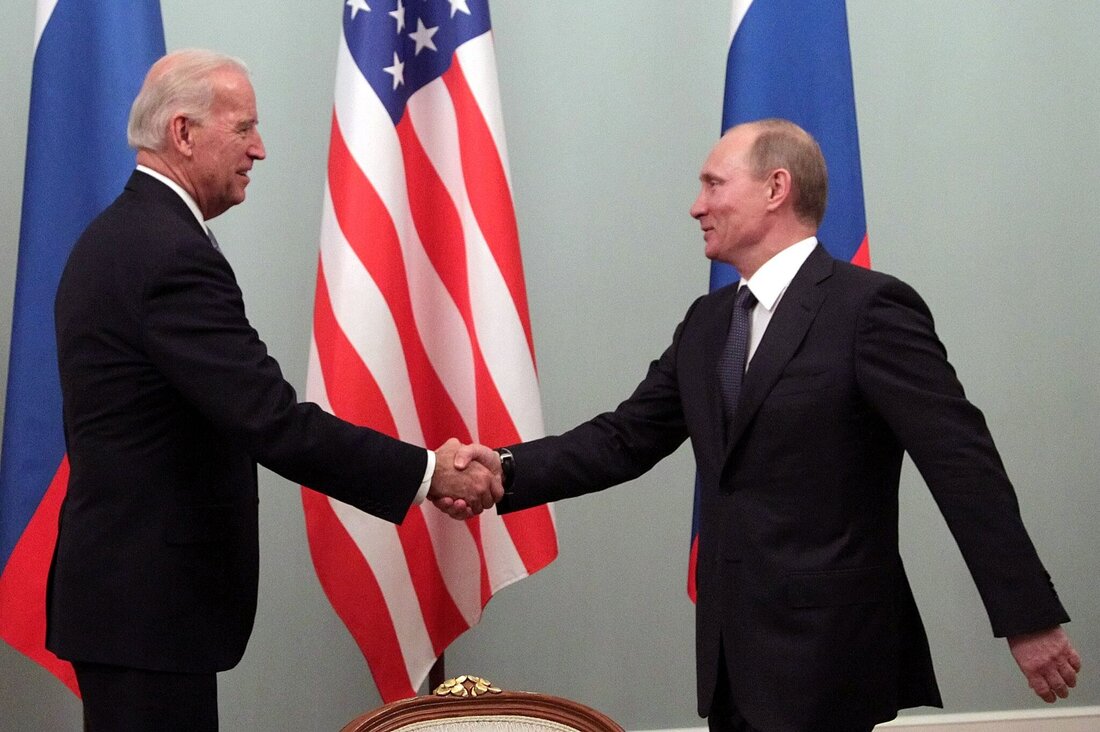
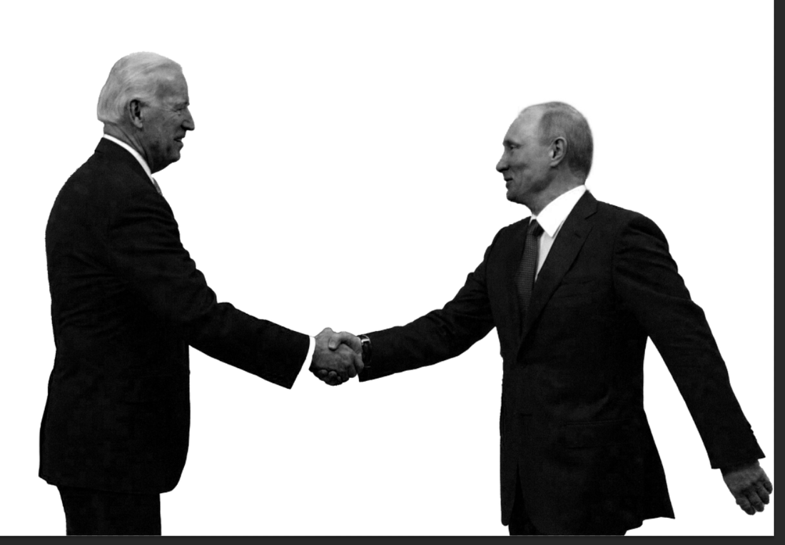
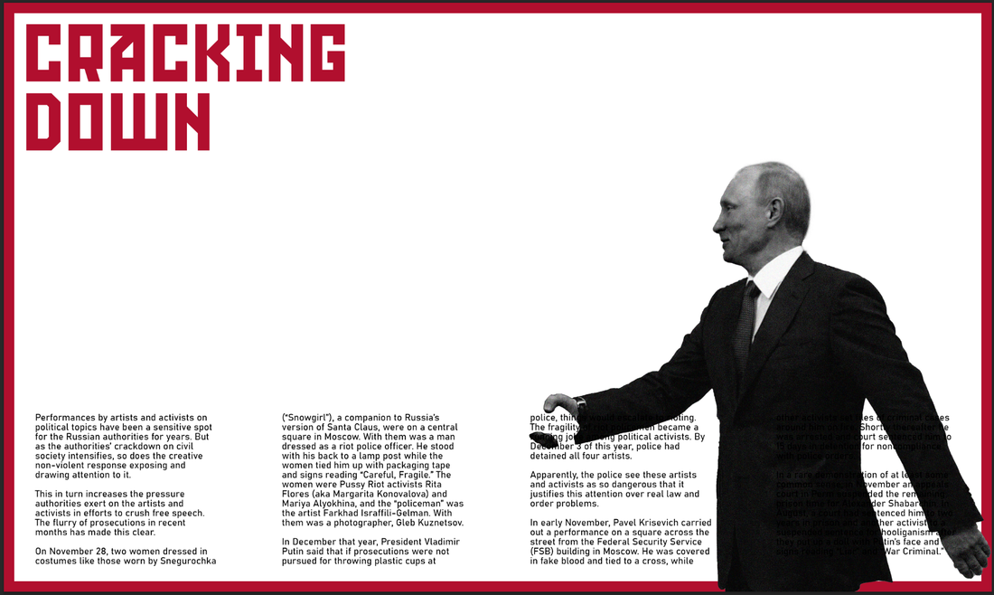
I began by using an image I found through research of President Putin shaking Joe Bidens hand. I then cut this out and put it into my double page spread.
|
|
I changed the image of Joe Biden to be a solid shape with the word "CENSORSHIP" all over the shape to show that Putin works with Censorship as his primary way of controlling the Russian people.
I also added the shape of Russia in the background to suggest how this is happening around the entire of Russia and to suggest also how Putin have control of the entire country.
I also added the shape of Russia in the background to suggest how this is happening around the entire of Russia and to suggest also how Putin have control of the entire country.
|
|
|

|
After a few changes, I finished my fifth and sixth double page zine.
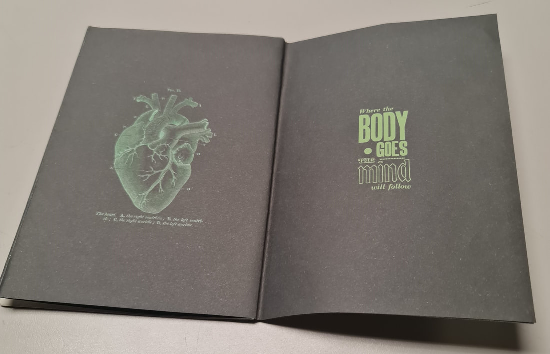
Front Cover
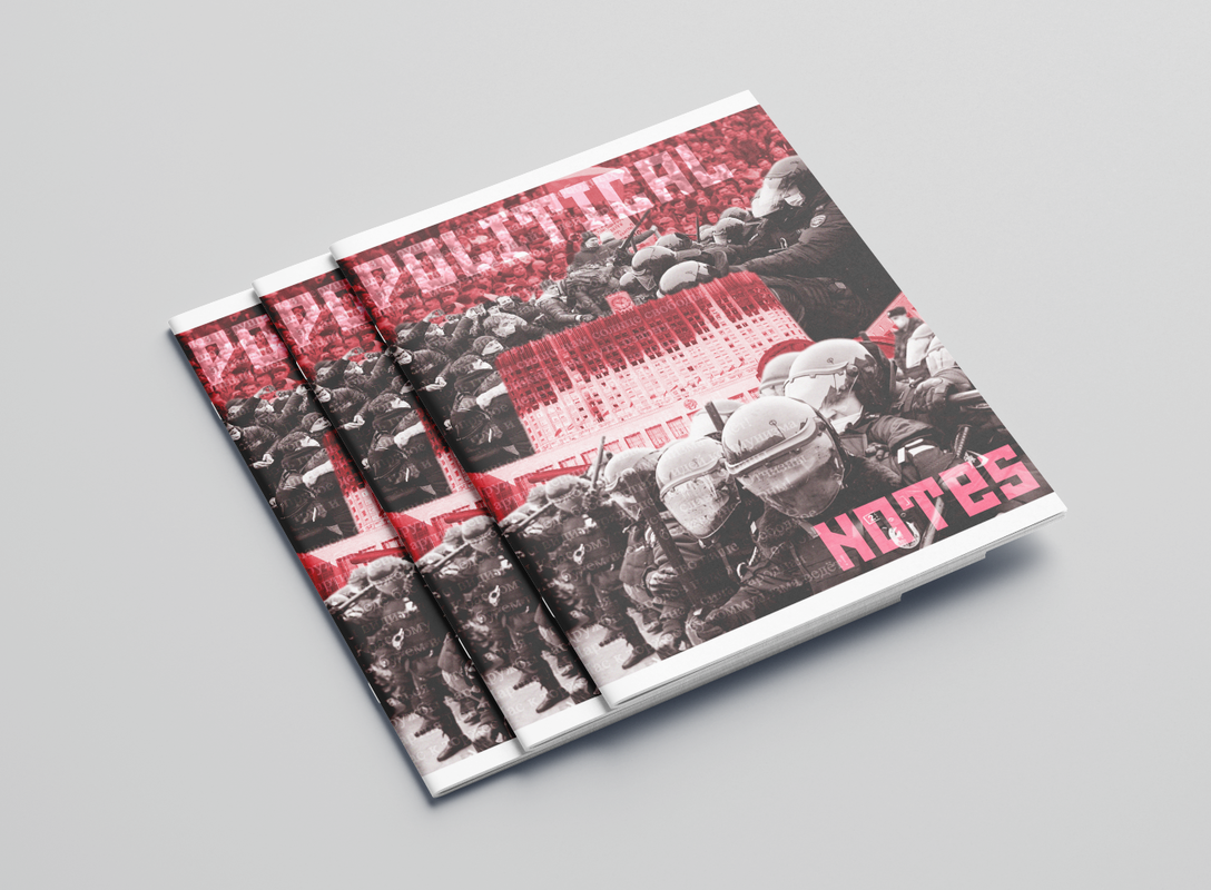
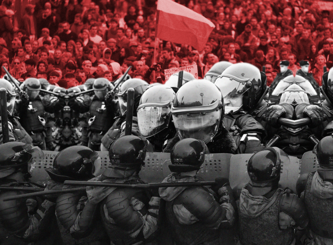
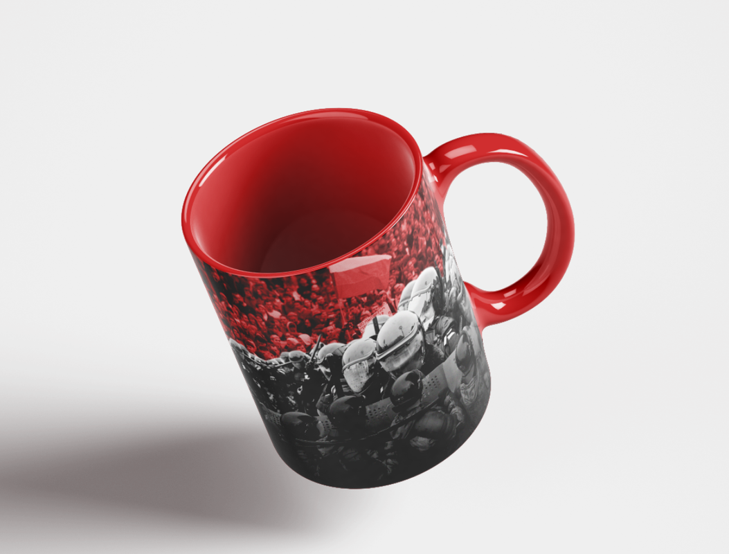
The front cover was going to be another collage, this time of the people of Russia fighting for their own rights. Each image is a photograph of the Russian riot police or the citizens of the powerful country fighting for their country and freedom.
|
|
|
|
|
|
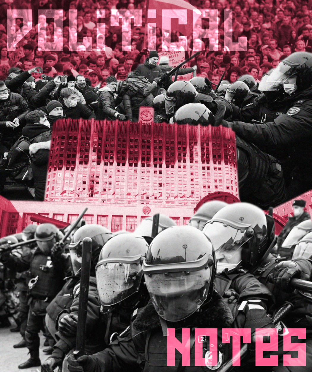
My final touch was to include the Russian National Anthem lyrics within my front cover page. I think this touch is very important as the national anthem is sung everywhere to represent the country and its people. The use of the lyrics along with the imagery is very contrasting as it talks about a strong, powerful country whereas the imagery shows the complete opposite - chaos and disorder of a country almost falling apart. This was my favourite touch of this front cover.
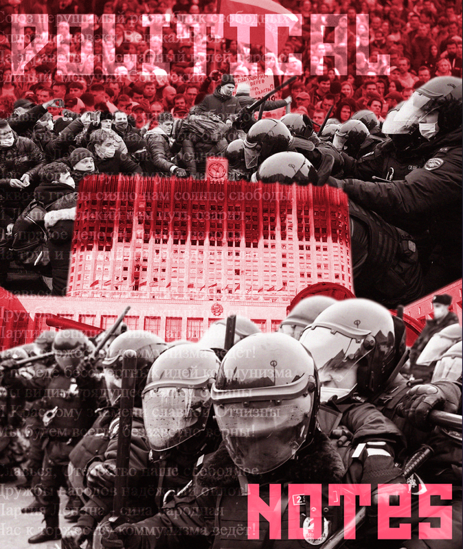
This is my final outcome for the front page of my zine.
Back Cover
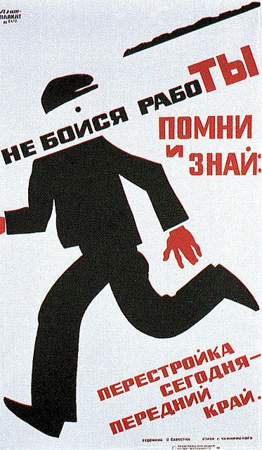
My final task was to create the back cover of the zine. Inspired by my research - I used the poster below as my main inspiration for this back cover. This poster was about not being scared of working/constructions happening nearby. I used this an inpiration for my back cover which would be of not being scared of everything being under control in Russia - an ironic statement which has been contracted and proved that is not true as the Russian people riot and go against the government.
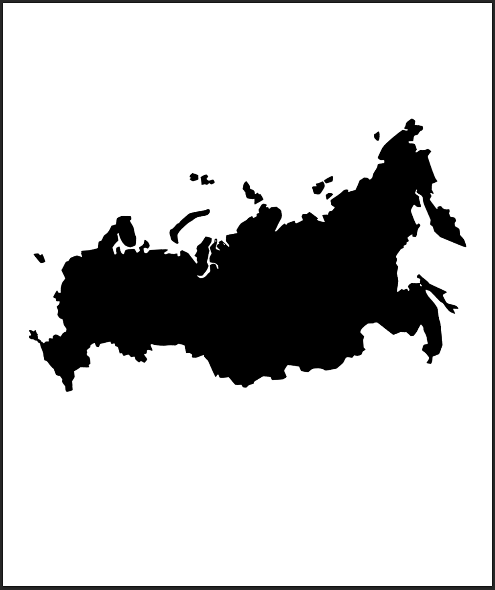
I began this back cover with an image of the country Russia as a shape.
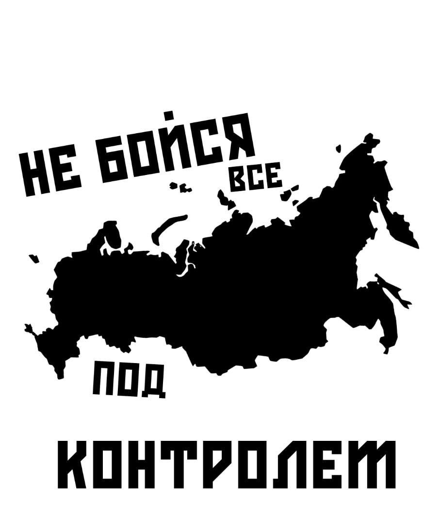
I then added the text "DO NOT WORRY EVERYTHING IS UNDER CONTROL"
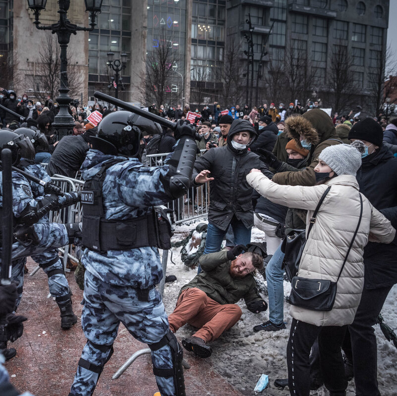
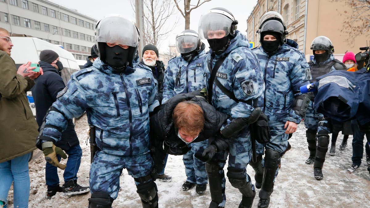
I then found this image of Russian protest police kicking people down on to the ground and hitting them which is a perfect irony for the text I added above and added this into the page.
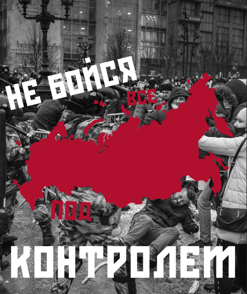
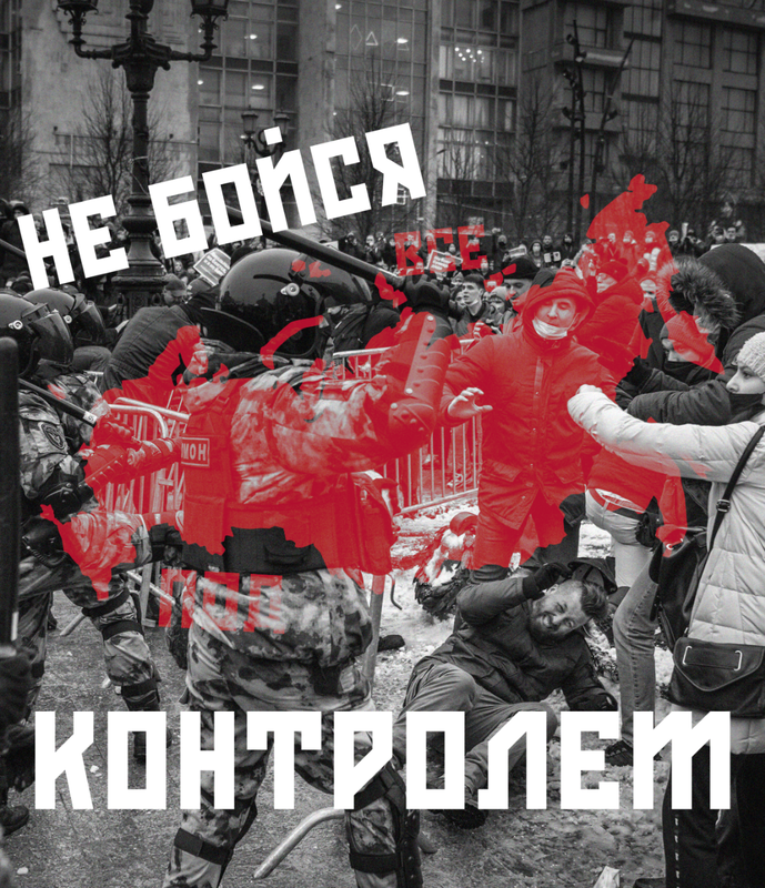
My finishing touch was to play around with the layer styling in Photoshop with the layers. This made the typography stand out from the image.
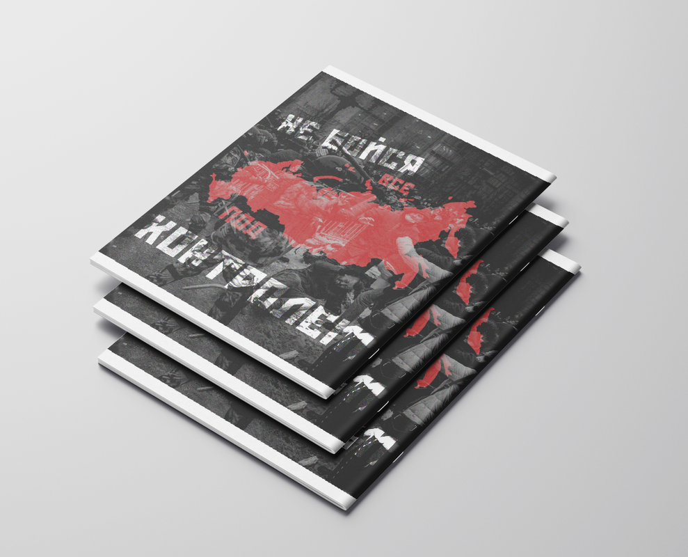
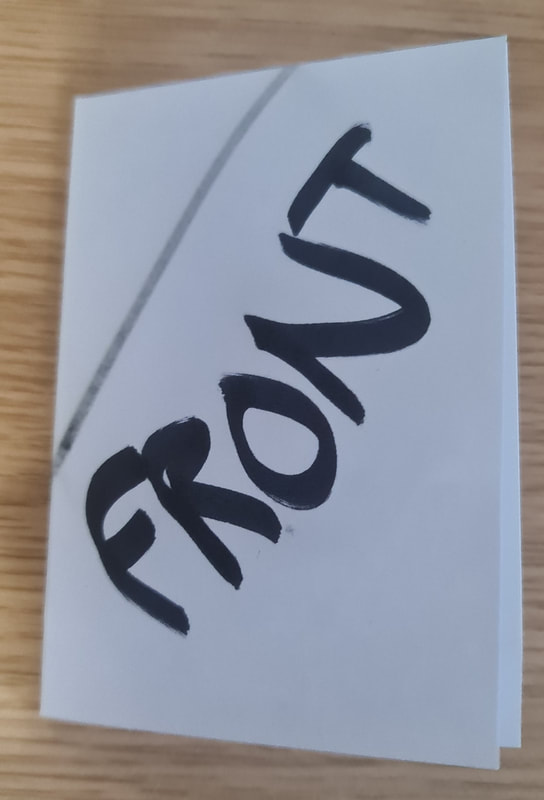
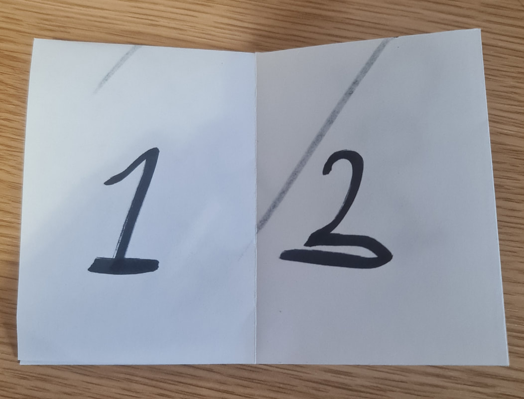
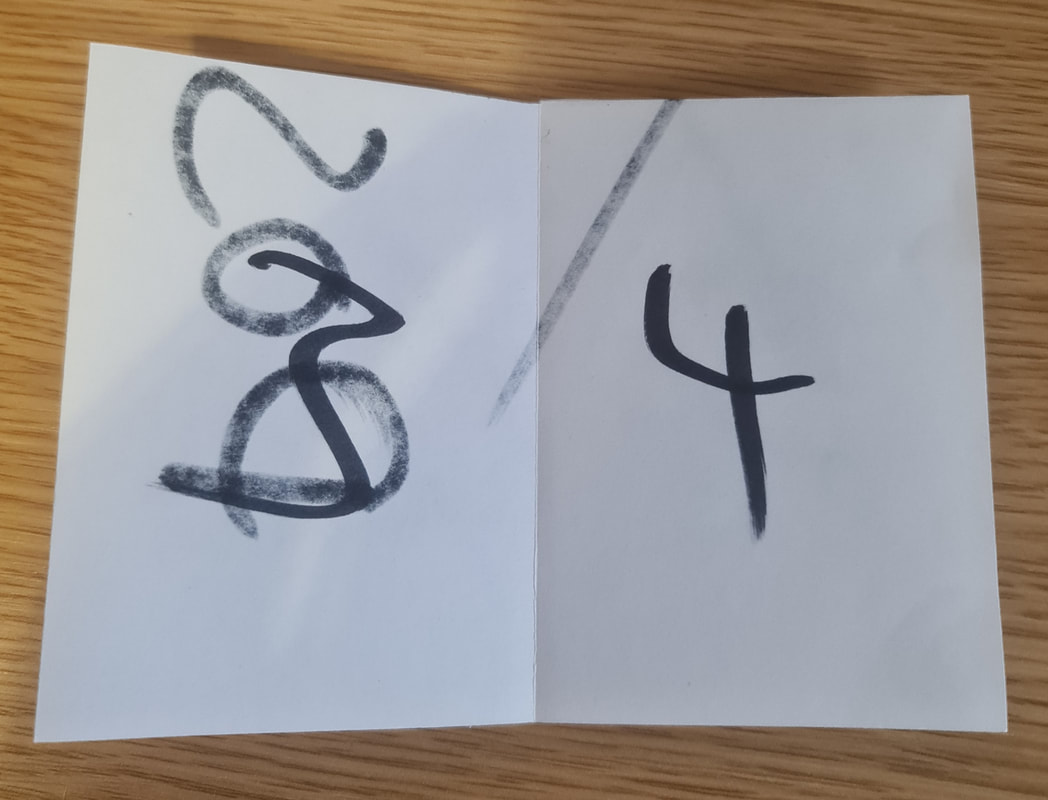
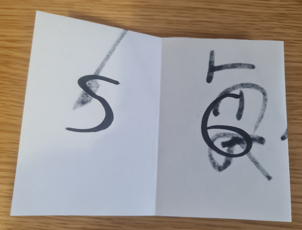
Zine Outcome
Here are all the pages of my Zine all together.
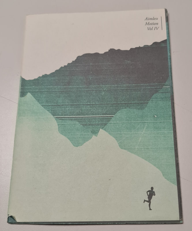
Front Cover

Page 1 & 2
Page 3 & 4

Page 5 & 6

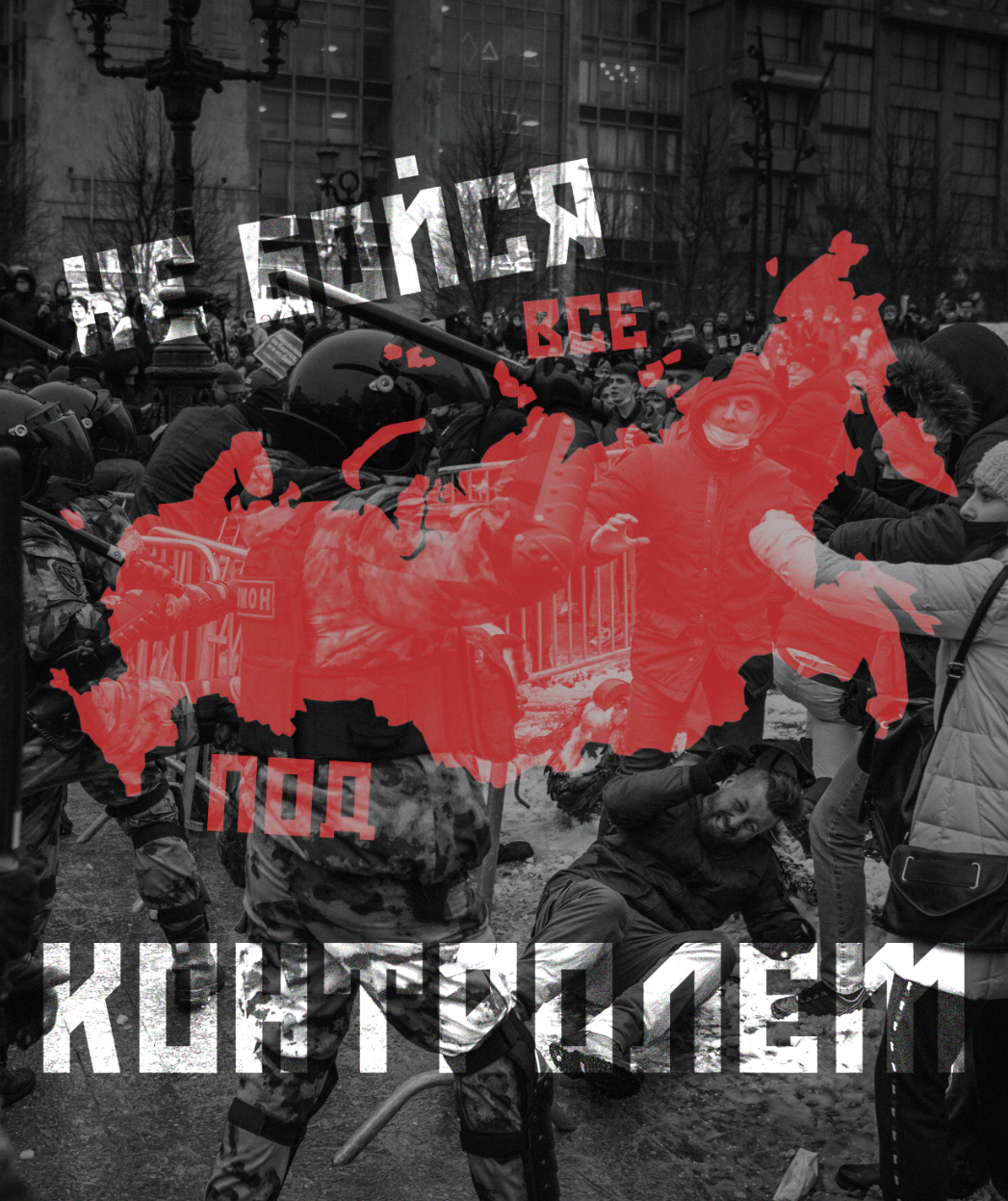
Back Cover
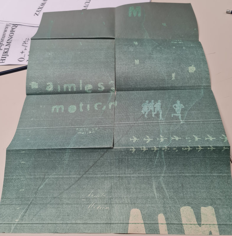
Poster Inside
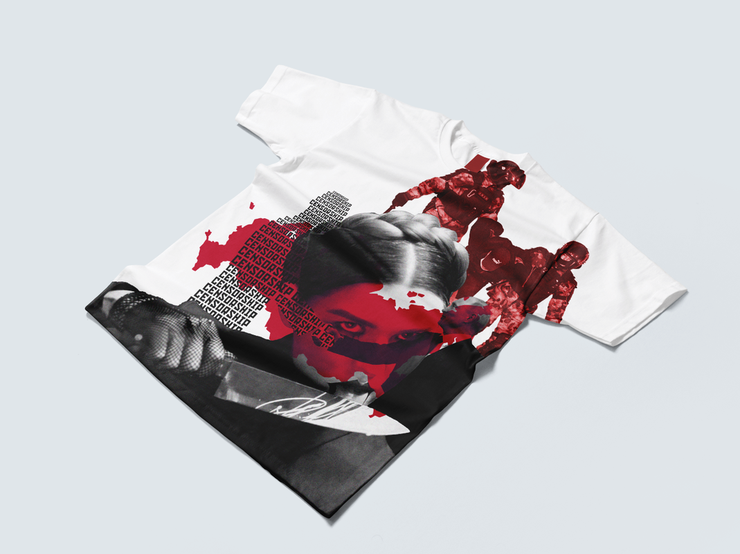
Mockups