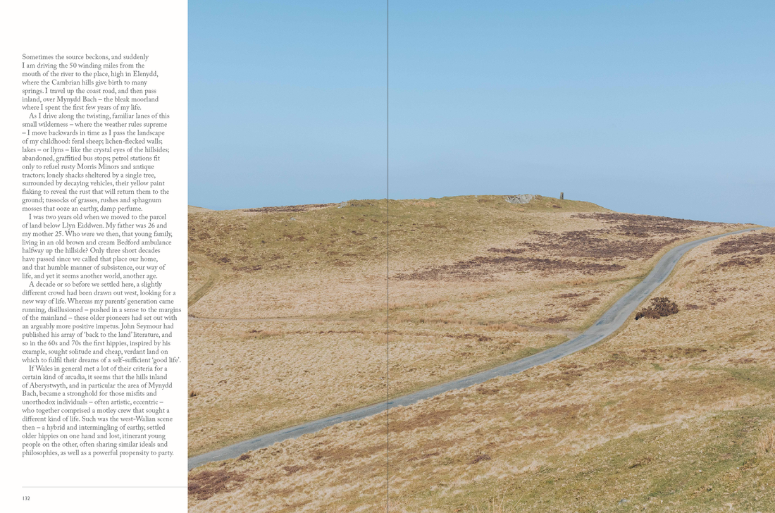
Wild East, Wild West
My first task with the Ernest Journal was to create illustrator-based article called "Wild East, Wild West" which was all about the wild west. I was provided with Ernest Journal's fonts, layout and a copy (text) to be able to match it with the articles however I was tasked with laying it all out and creating illustrations to make the article more of an enjoyable read.
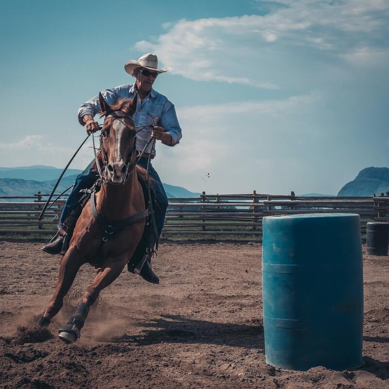
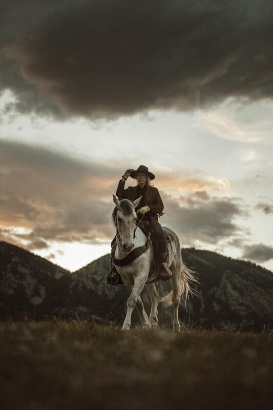
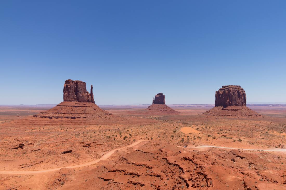
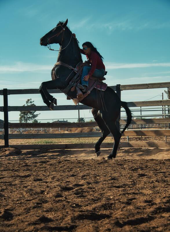
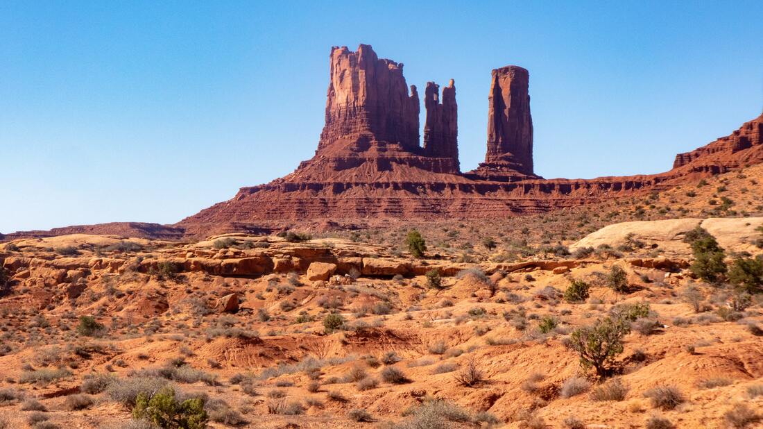
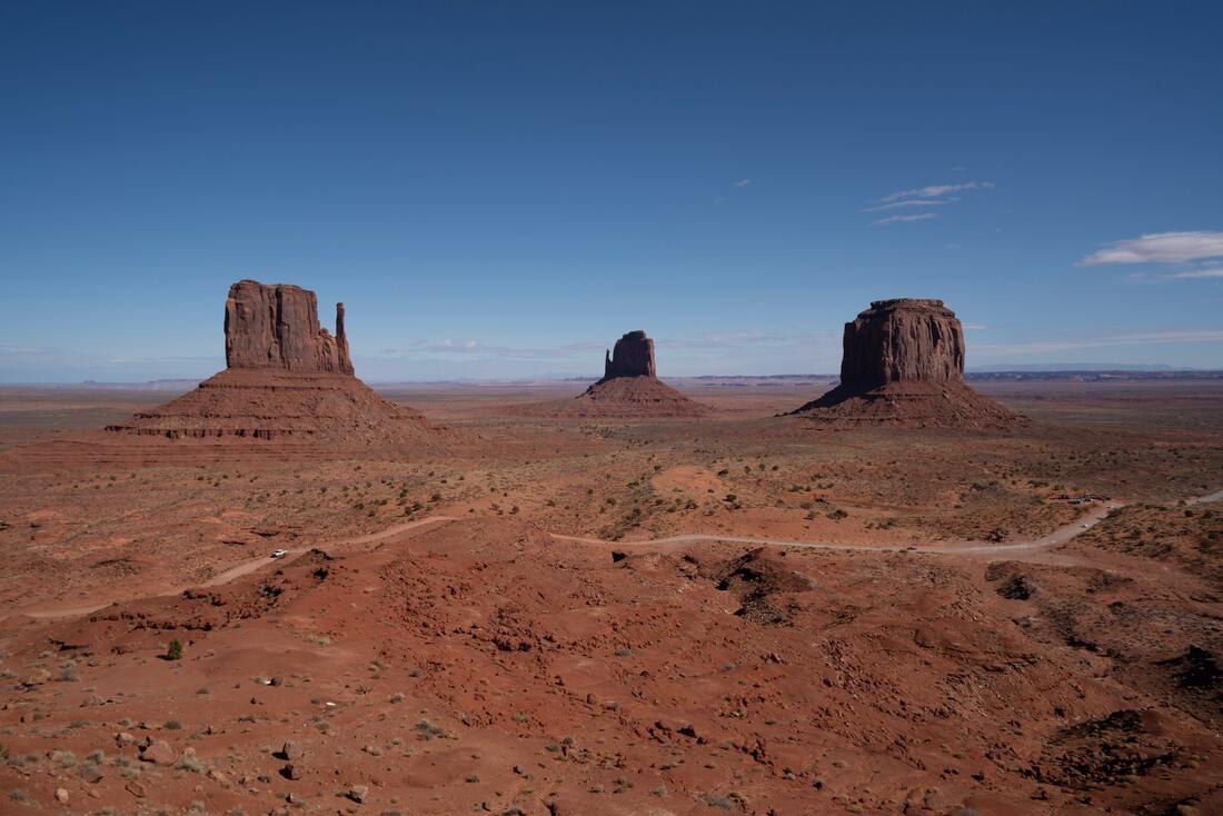
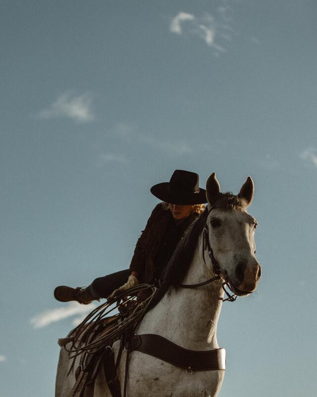
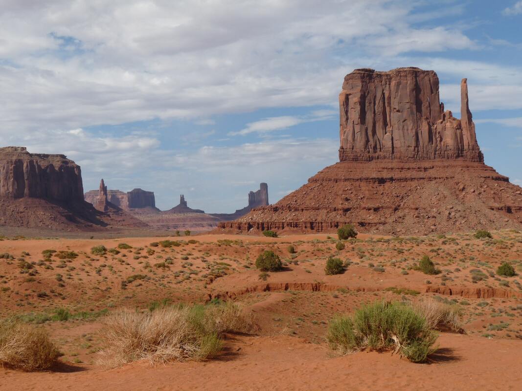
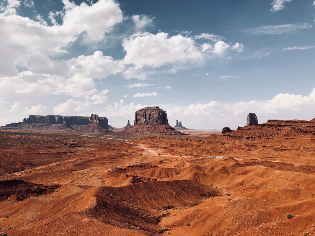
The first thing I did was read the article and once I gathered the theme and story of the article, I looked at few photographs on Unsplash to use for inspiration and ideas.
The first thing I did was read the article and once I gathered the theme and story of the article, I looked at few photographs on Unsplash to use for inspiration and ideas.
|
|
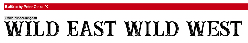
I then began to simply draw a few ideas of double page spreads and other kinds of layouts that I could use for my article pages.
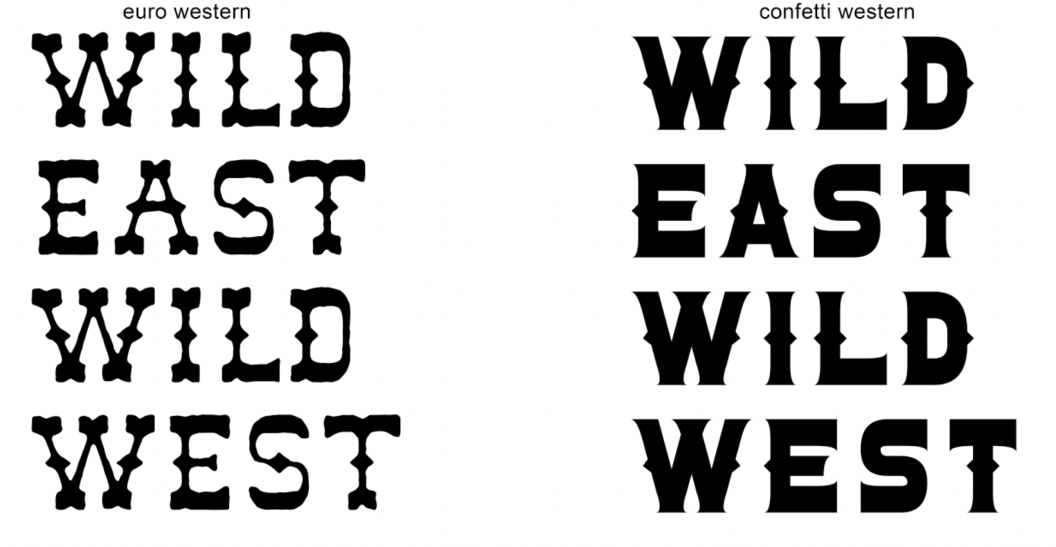
From there - I moved into looking at different type faces for the title of the article. I wanted to use some kind of western font for the title to set the mood/theme of the article which would follow.
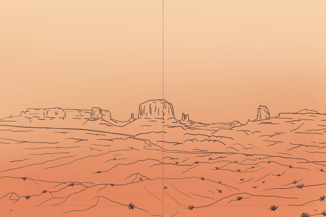
I also looked at different colours, I wanted to use an orange/red colour scheme to match the landscape and sky that is seen in most pictures.
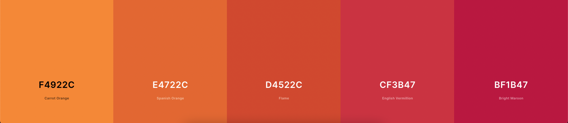
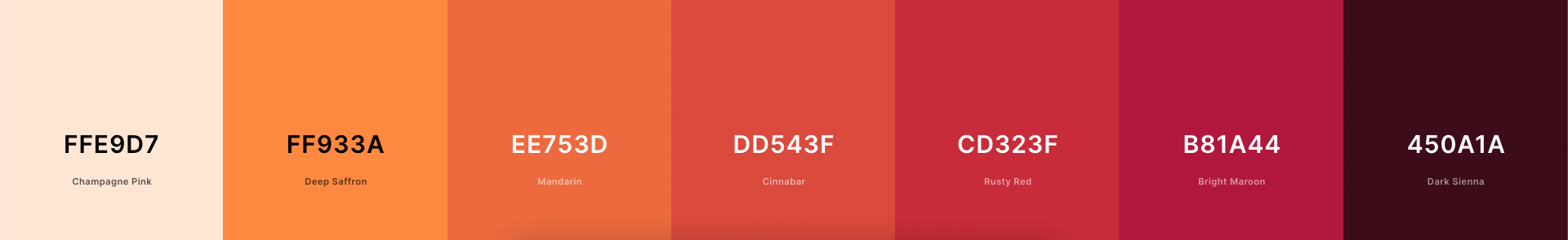
Illustration - Artist research
For my illustration style, I looked at a few artists to use for inspiration to replicate their style for this article. I looked at a website called "handsomefrank.com" which had many different illustrators for me to look at.
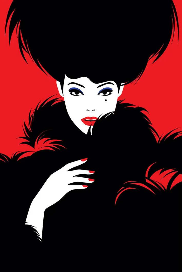
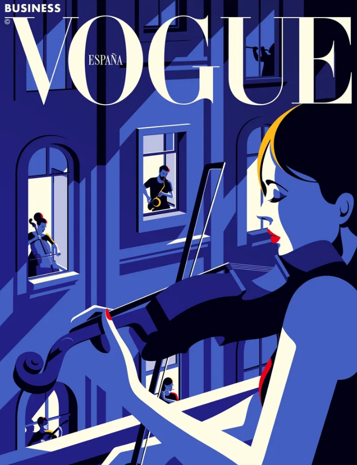
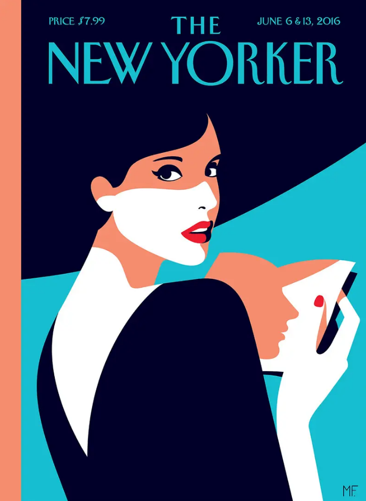
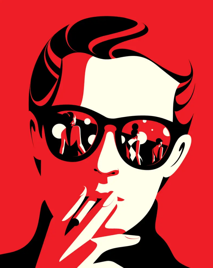
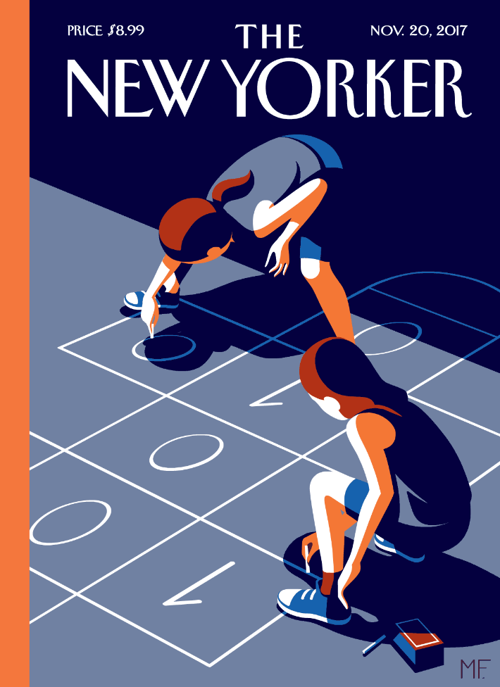
Malika Favre
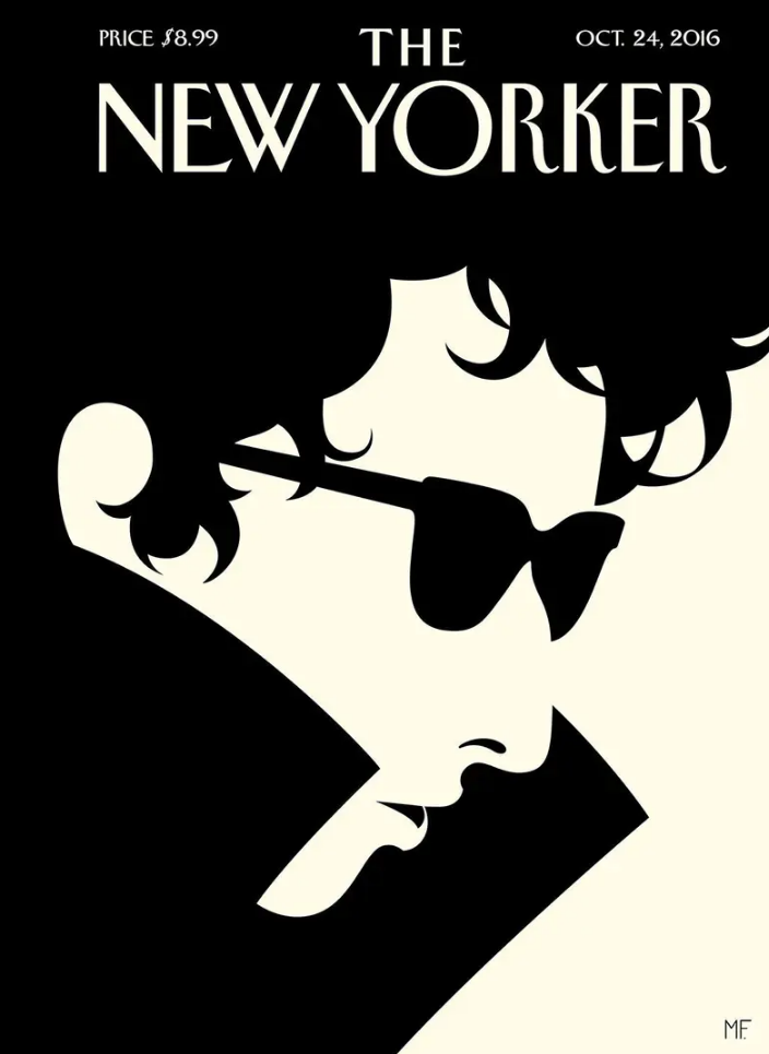
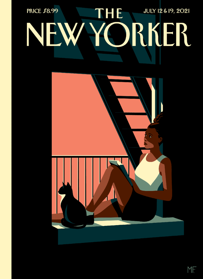
Favre uses a simple style that interested me. Her style is flat colours with lines block colours for shadows or sometimes no shadows at all and a simple 2 colour style poster as seen in the "OCT 24, 2016" example. These create striking imagarey that forces your brain to fill/add more colour and recognise the artwork presented as the use of simple colours create something simplisitic yet complex. Favre has created her vector illustrations for famous clients which include The New Yorker, Vogue, BAFTA and Penguin Books.
|
|
|
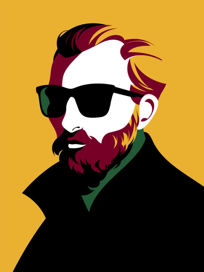
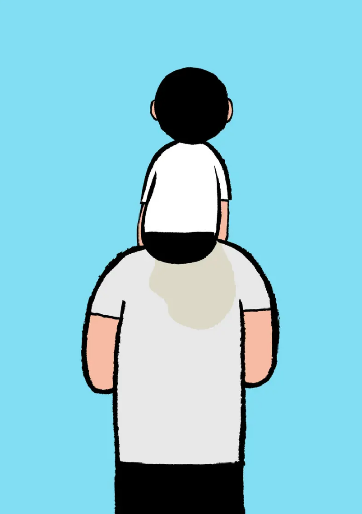
Jean Jullien
Widely-adored French illustrator who has worked on many commissions, exhibitions and mediums simultaneously. His work stands out as a 'doodle' kind-of style with anything from political commentary to simple doodles to humour the viewer. Jullien uses a simple style with shadows and flat colours to create his illustrations. The brush used for the outlines isn't perfect and always has few tiny strokes that stick out or make the illustration 'more real'. This style of illustrating makes the artwork less serious which I think Jullien is attempting to portray.
|
|
|
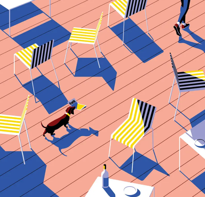
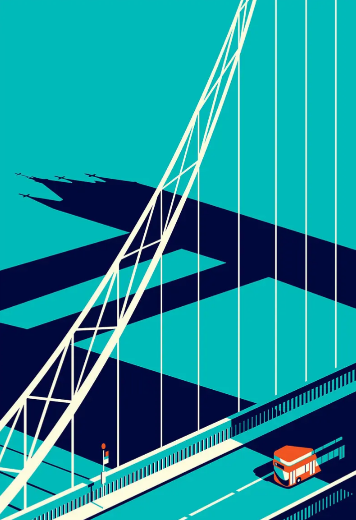
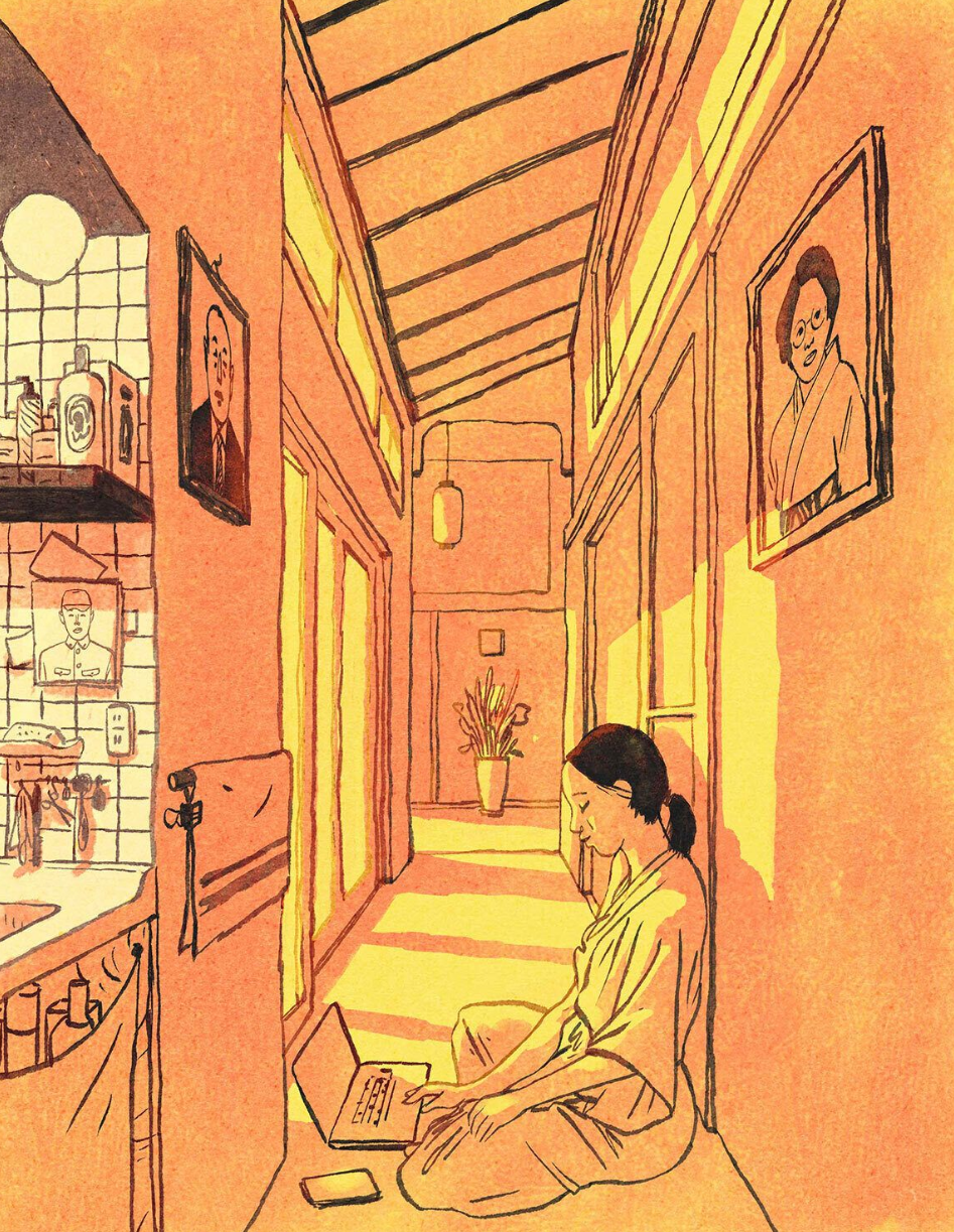
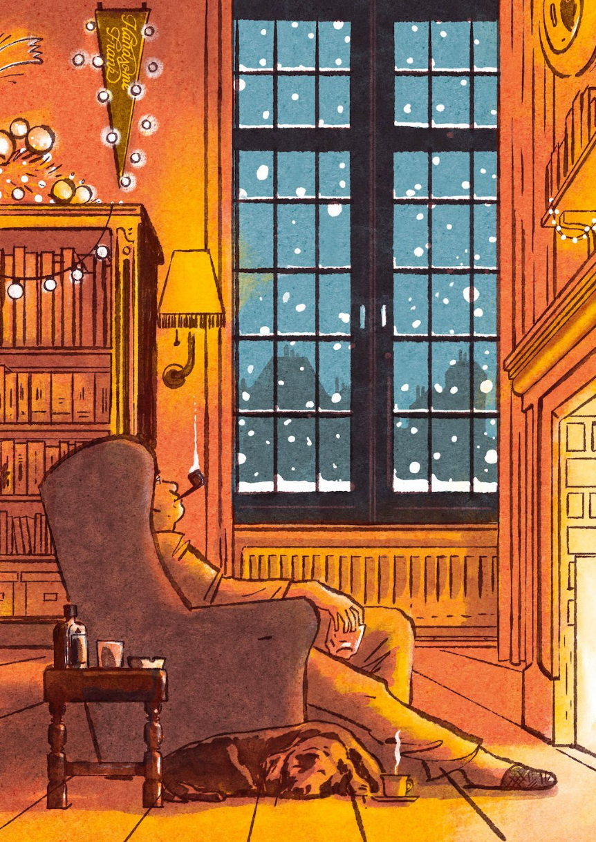
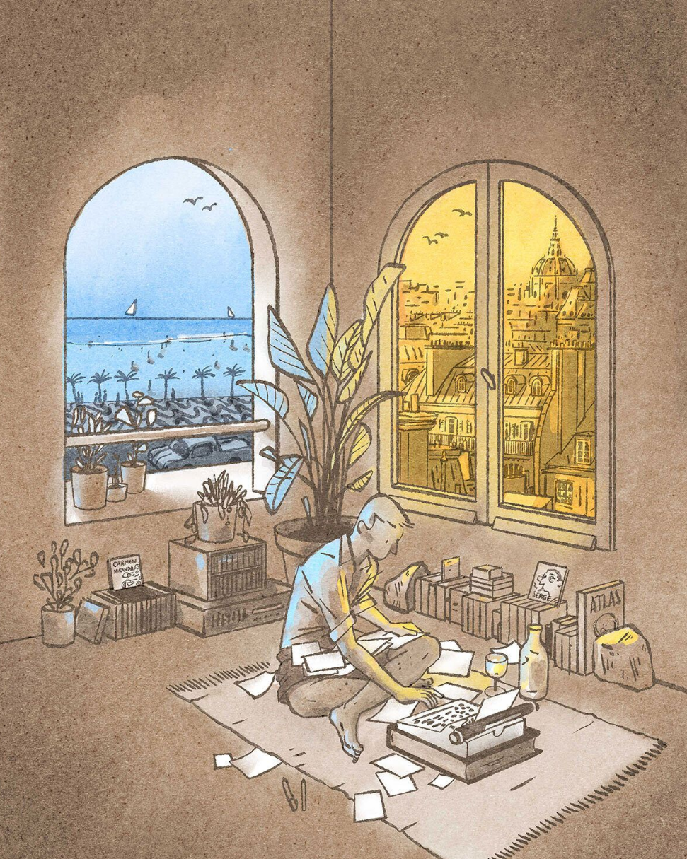
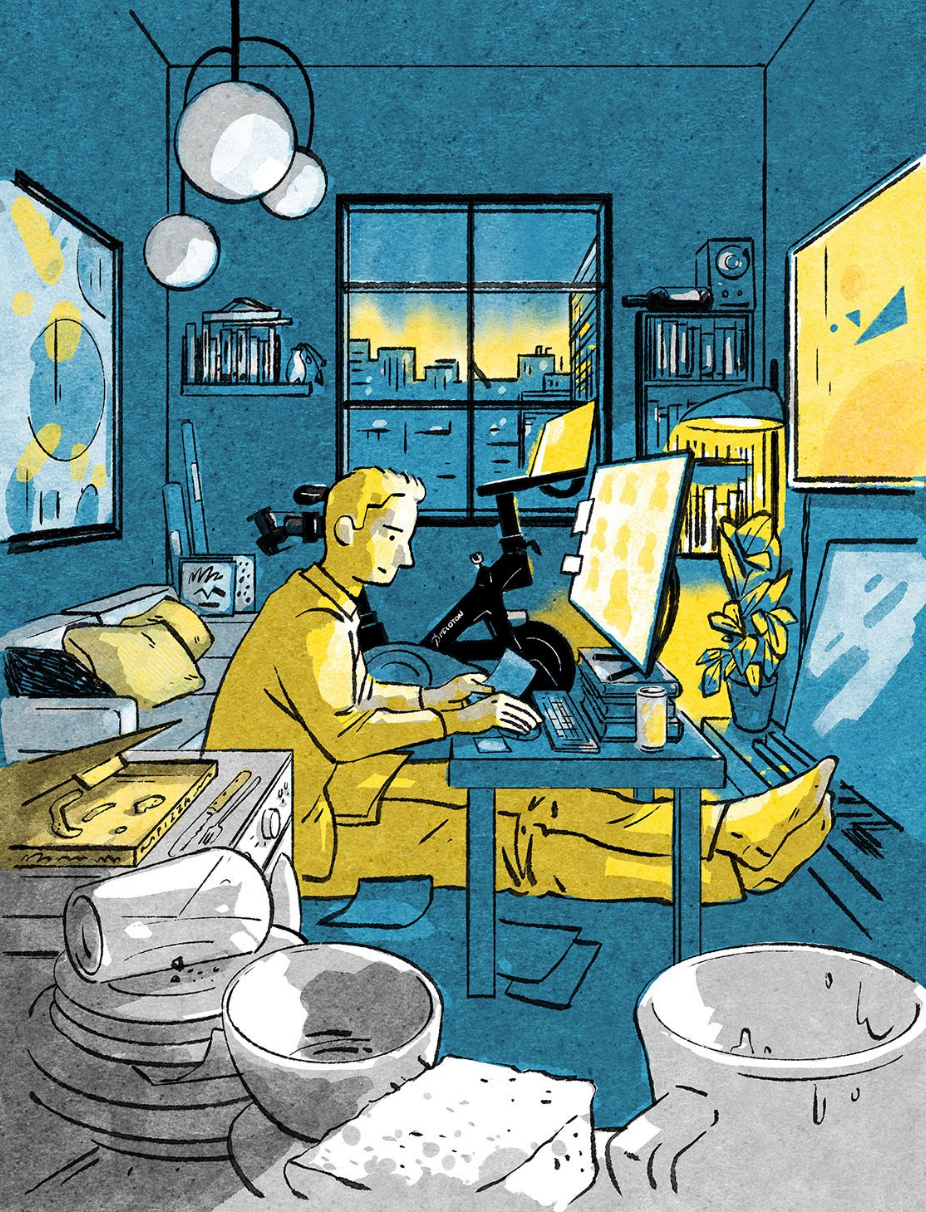
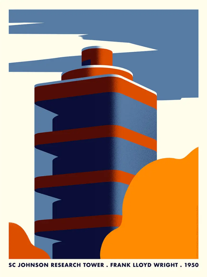
Luis Mendo
Mendo became his career as an illustrator as an Art Director and magazine designer before relocating from Amsterdam to Tokyok and this pushed his career to exploring and becoming an illustrator. He describes his work as 'digital analog' alluding to its inherent tacticle nature and warmth. The illustrations he makes, creates a feeling of something positive and cheerful with his own unique style. His work contain a somewhat 'water colour' style for the colouring of each artwork with the imagery drawn on as if with a brush or crayon that has a rough texture. His colours always work extremly well with not much detail and more simplistic colours with shadows and light portray the mood and feel of each artwork.
|
|
|
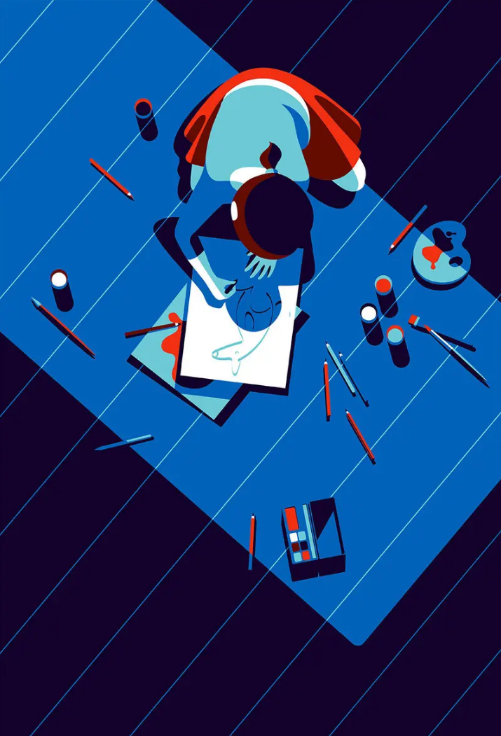
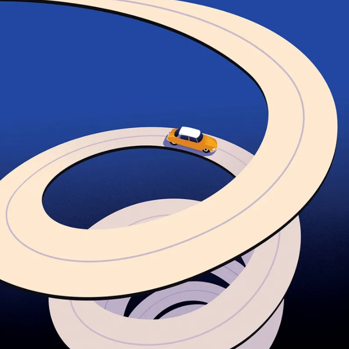
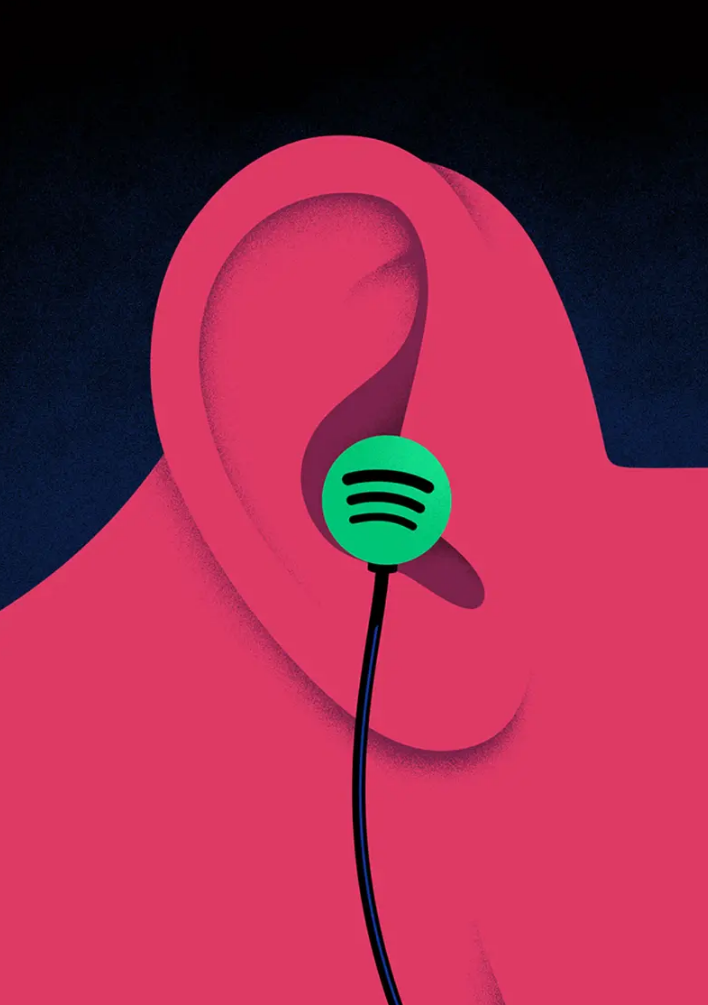
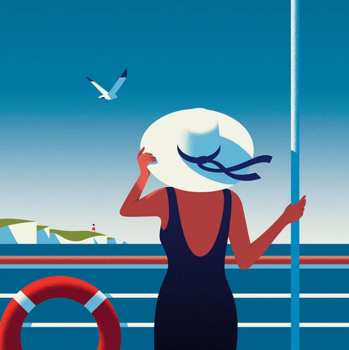
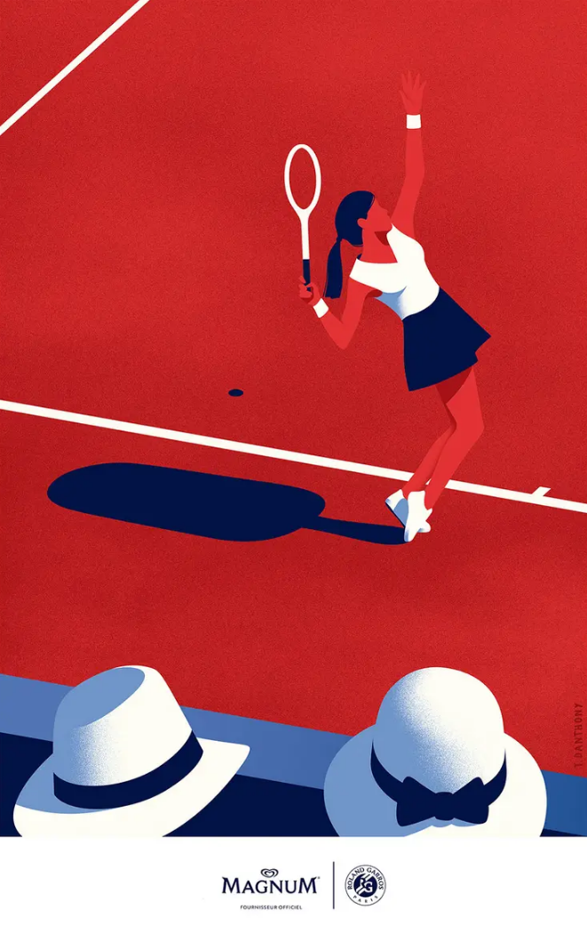
Thomas Danthony
Barcelona-based Thomas Danthony creates his beautifuly crafted illustrations predominantly in Photoshop. Using constrasting light and shadow to illuminate detail whilst stripping everything down to their very essence. His work is perfect for advertising campaigns, book covers and editorial comissions. His work can also hold its own gallery with each piece being a work of art and showing his greate attention to detail and craft.
|
|

|
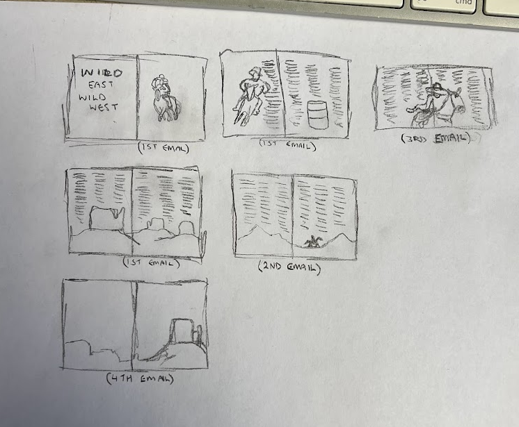
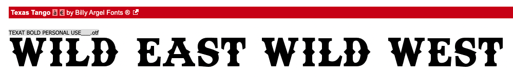
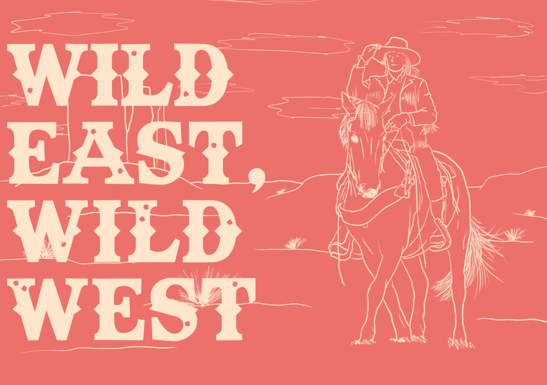
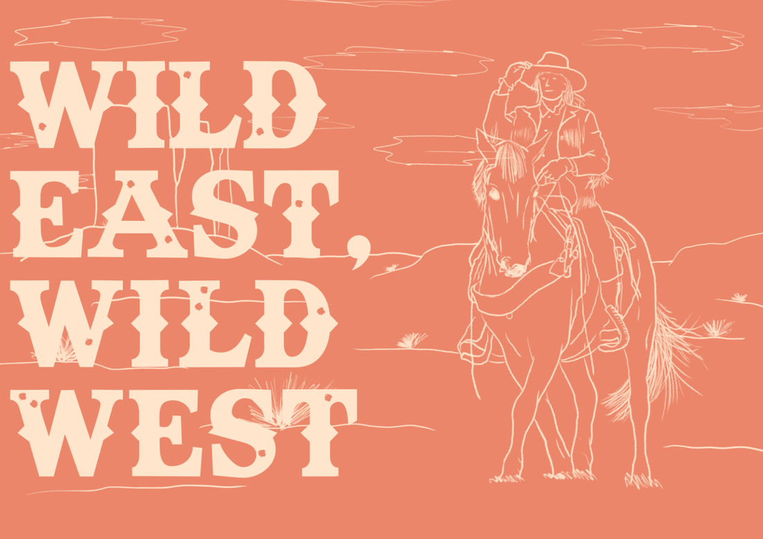
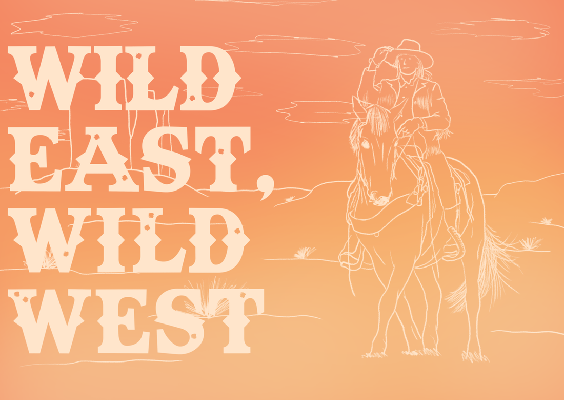
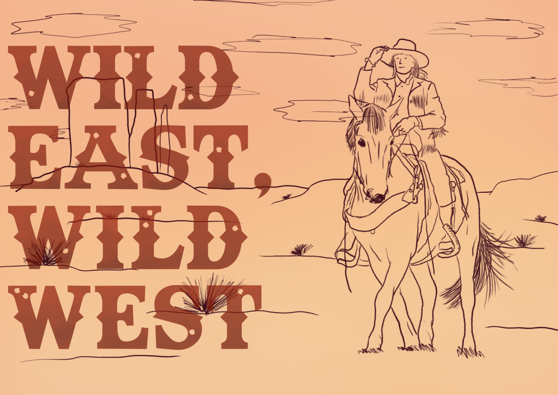
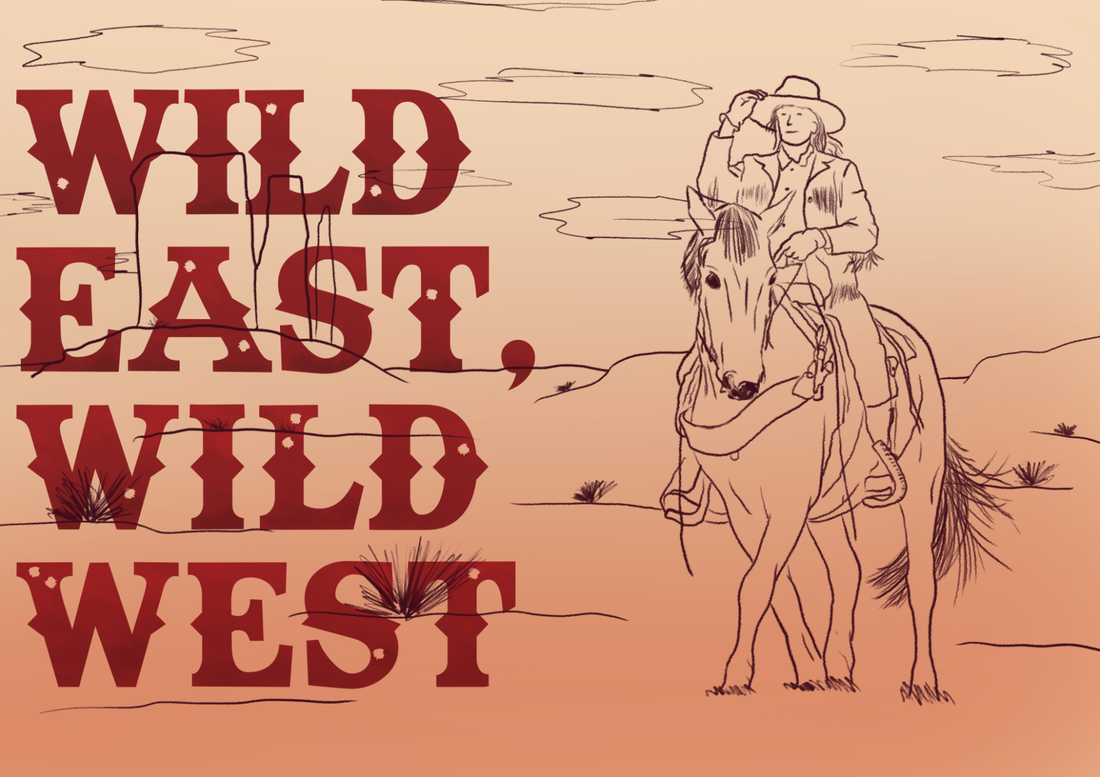
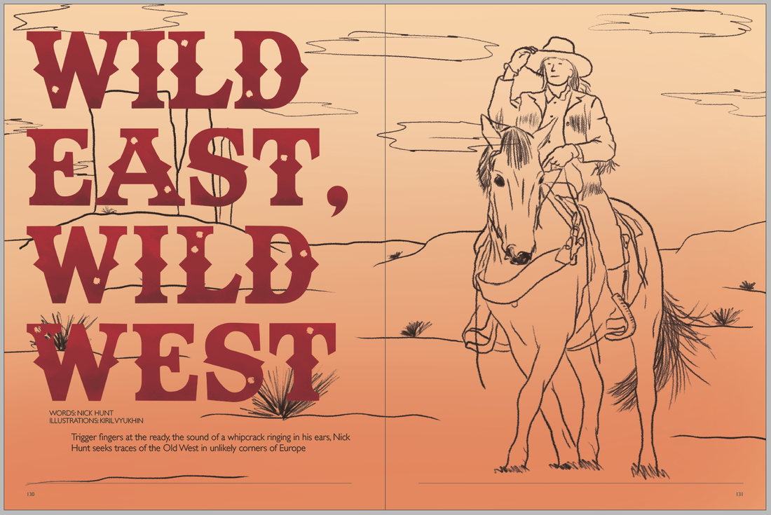
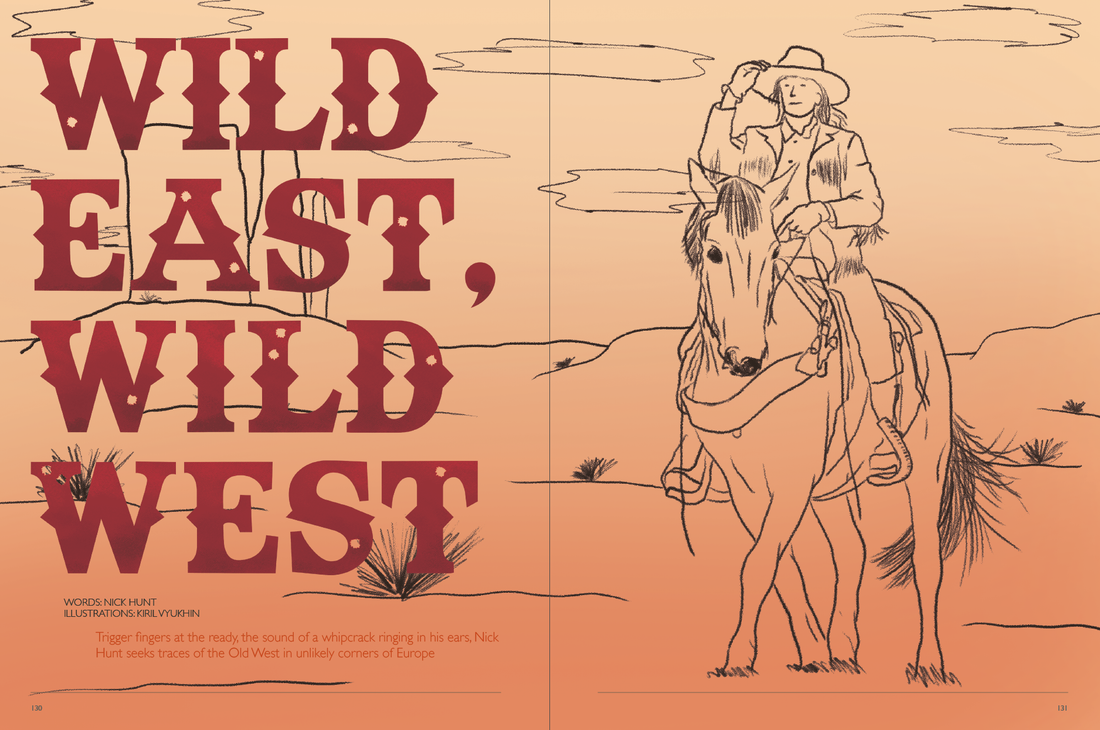
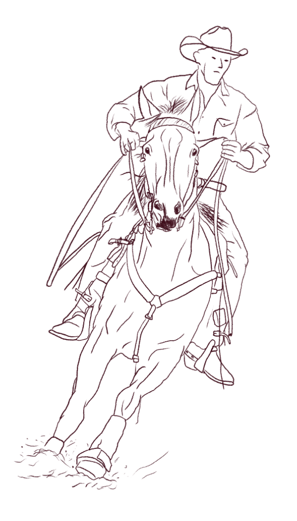
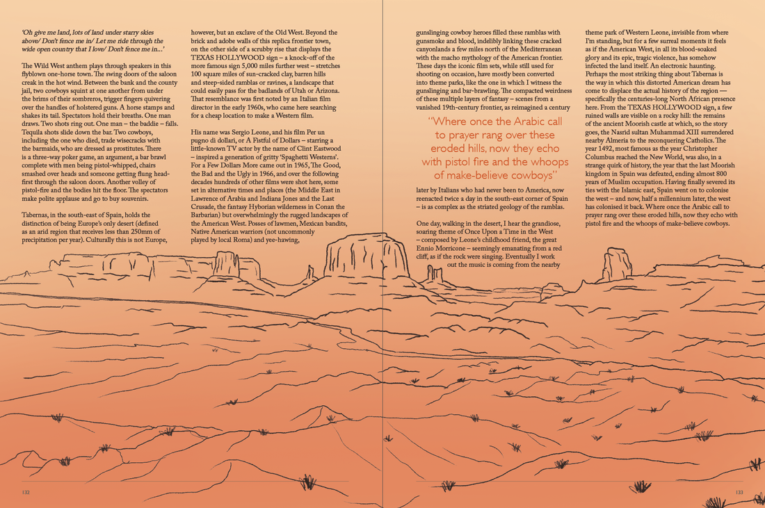
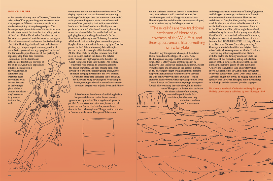
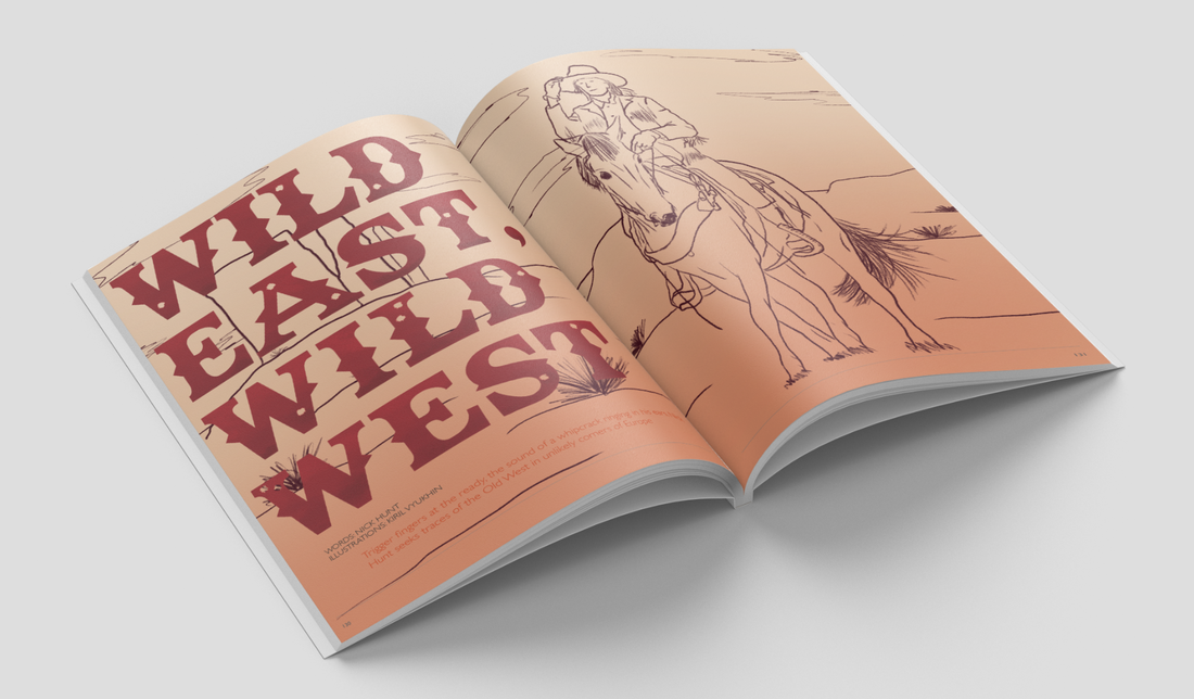
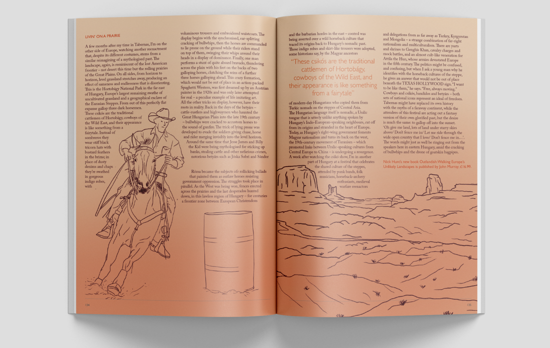
Illustration-based Article 'Wild East, Wild West'
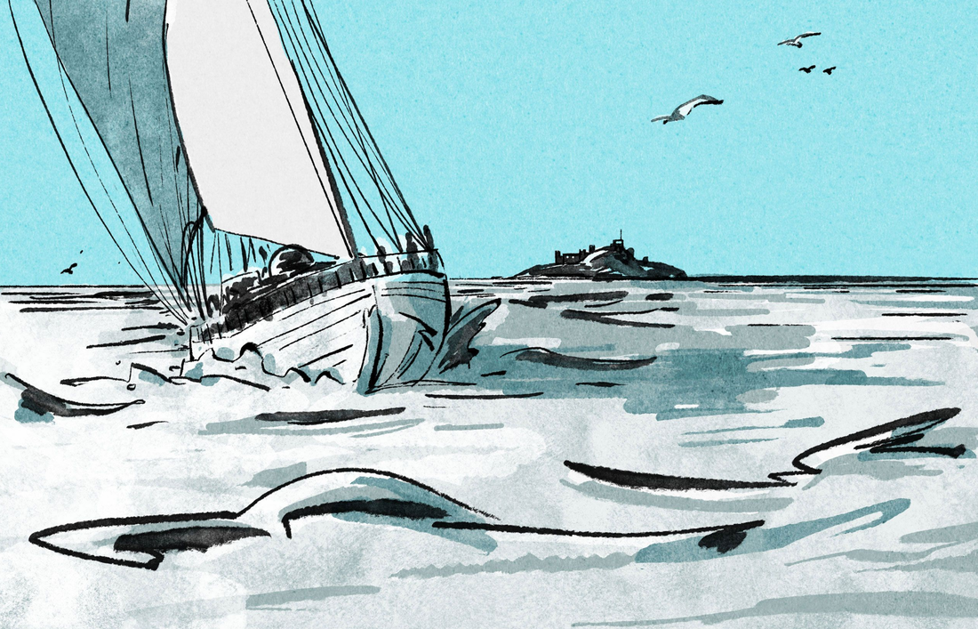
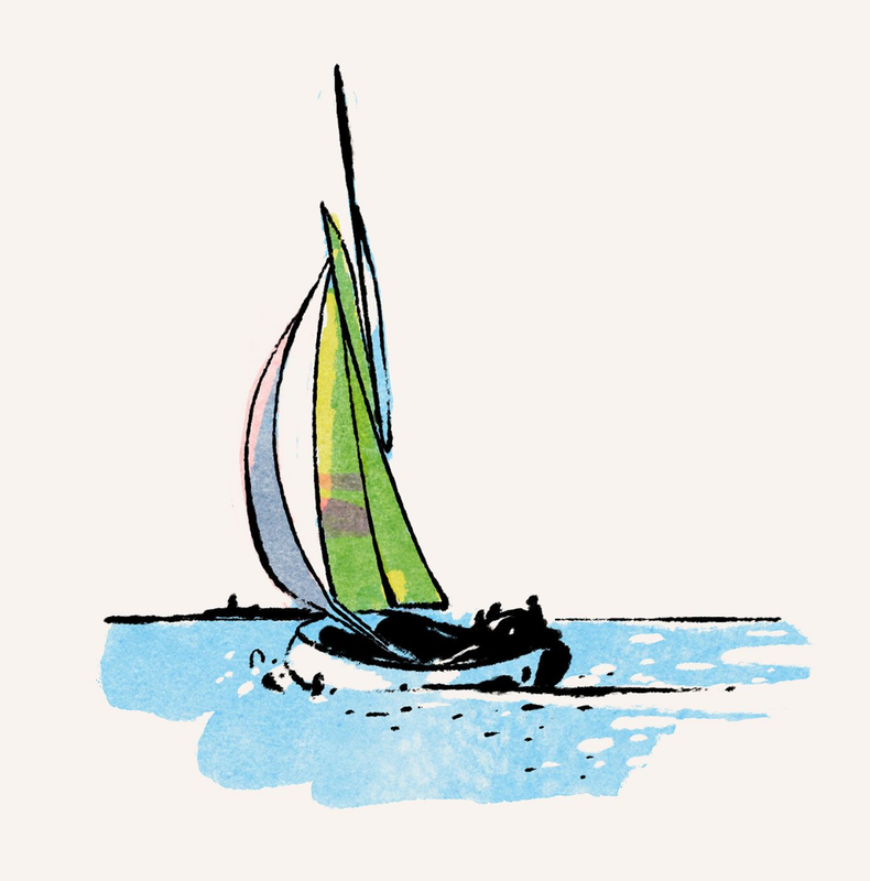
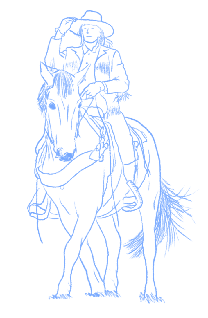
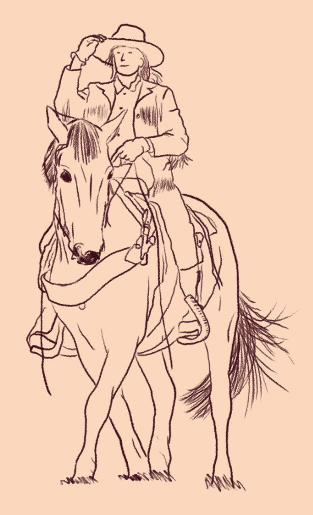
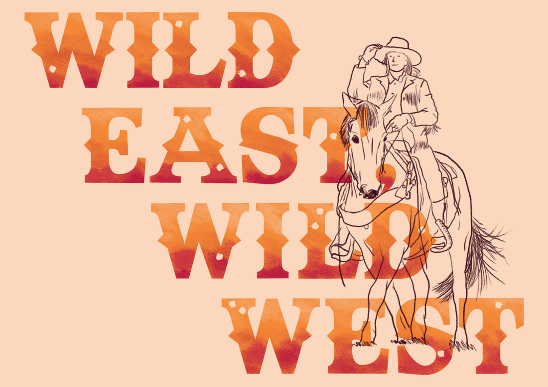
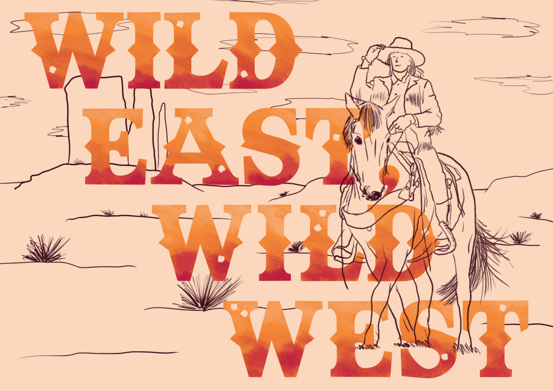
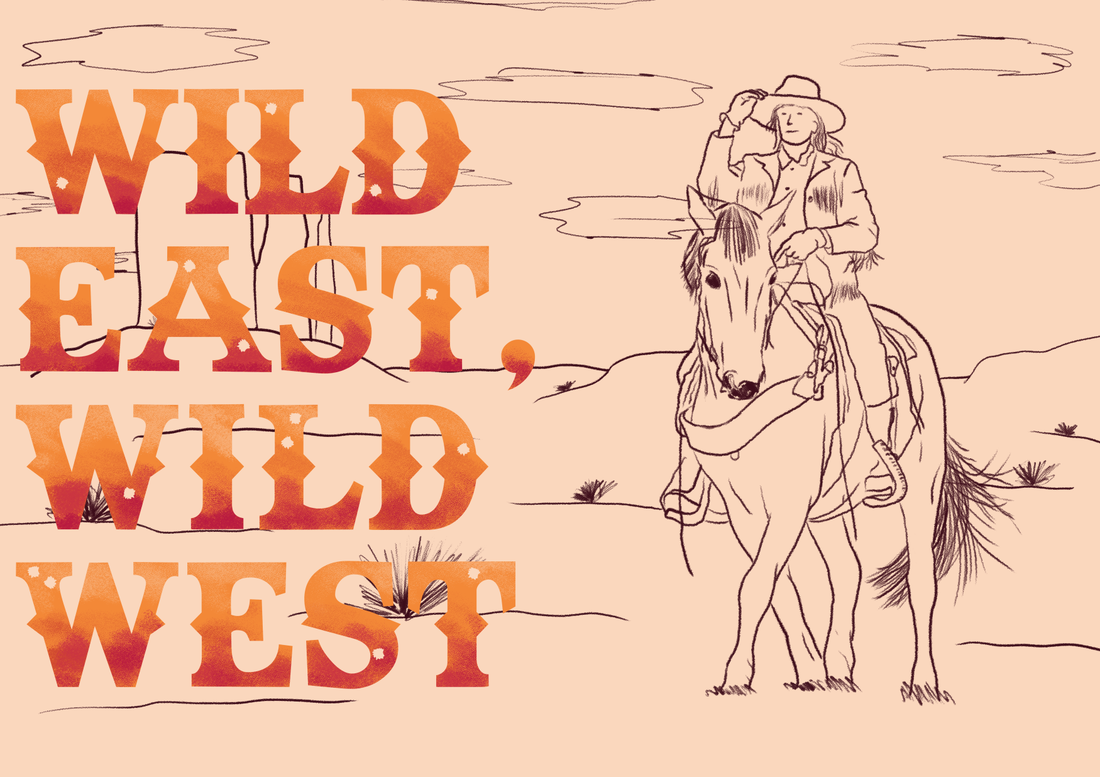
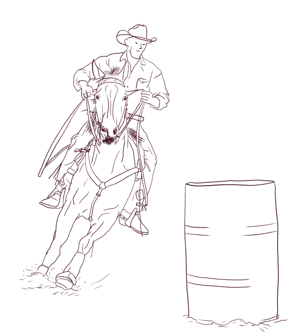
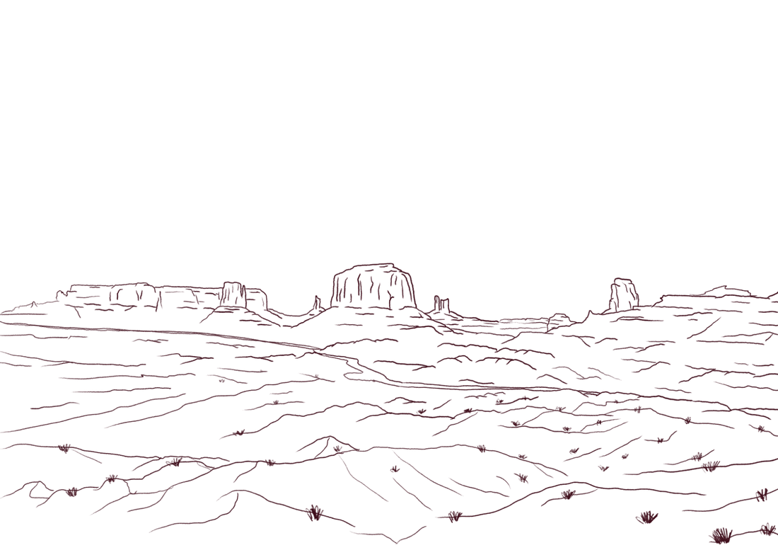
Taking inspiration from Luis Mendo, I began creating illustrations for my illustration-based article. Here I drew some illustrations and a title to go on the first double page spread.
|
|
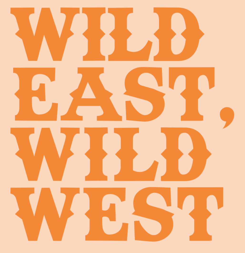
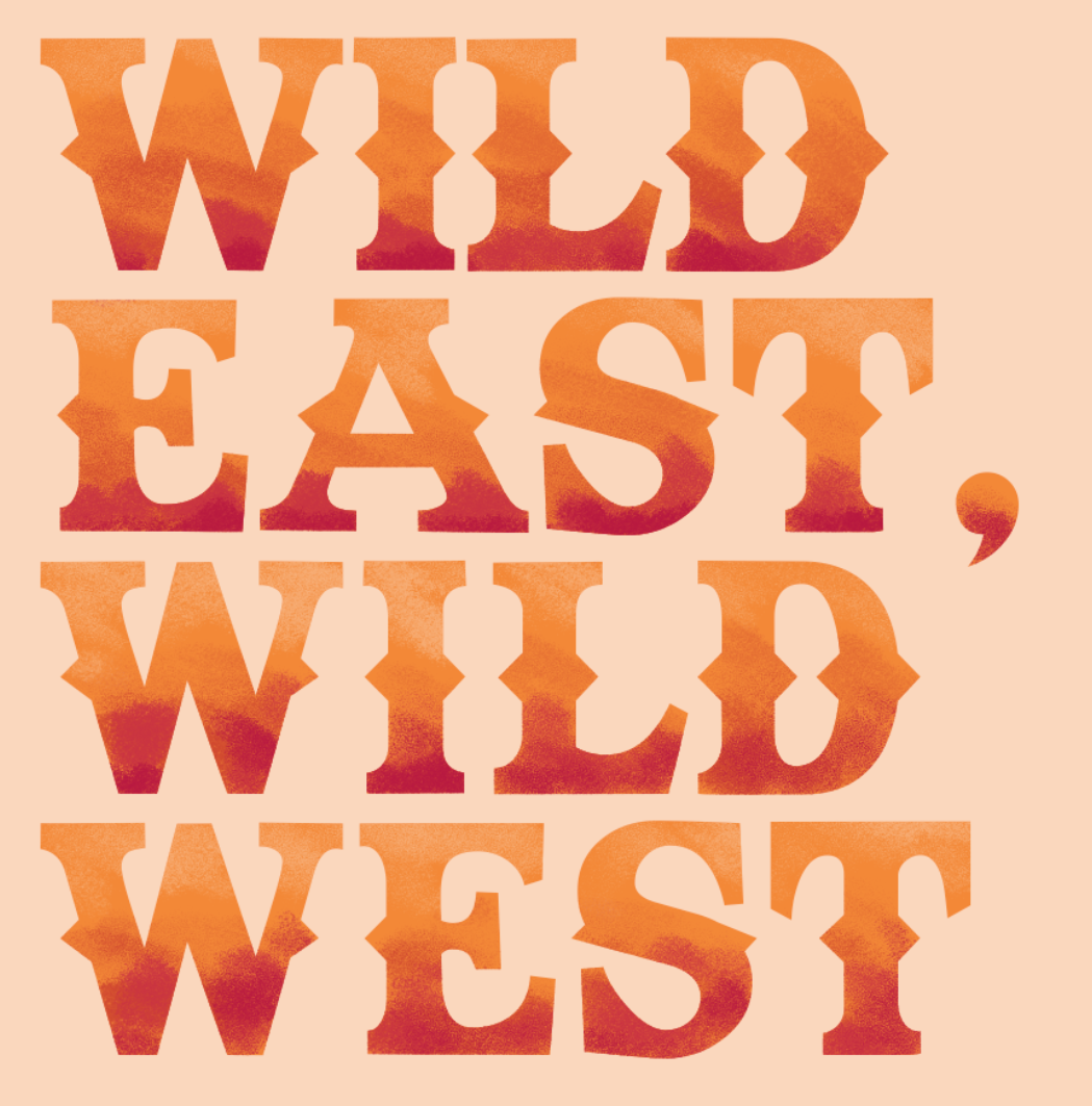
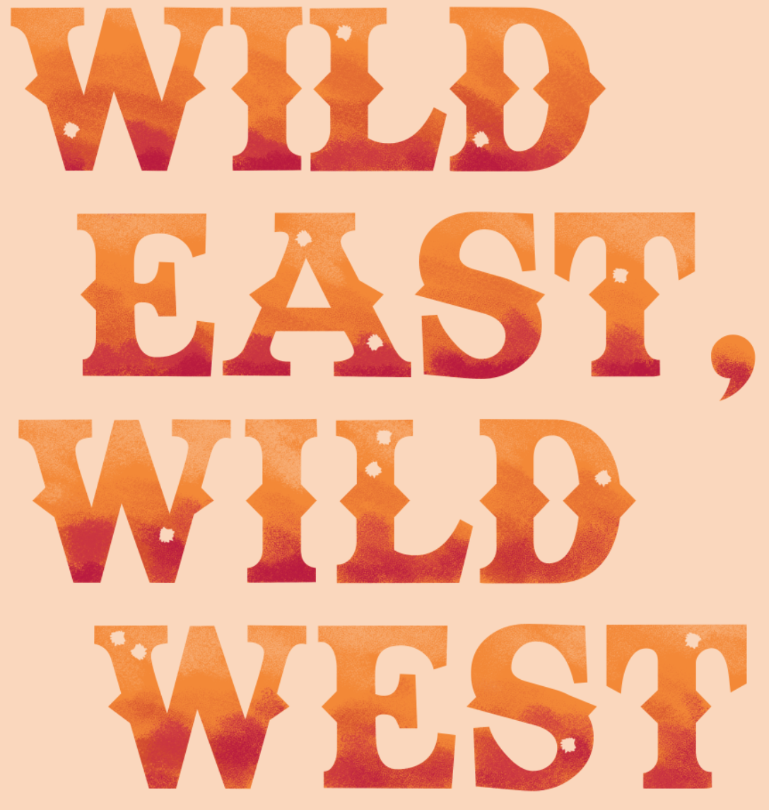
For the title, I decided to use the Texas Tango font which I found from dafont.com as it seemed to suite the style of Ernest Journal as well as this article itself.
|
|
|
|
|
|
|
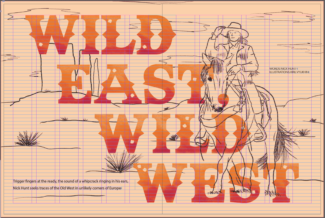
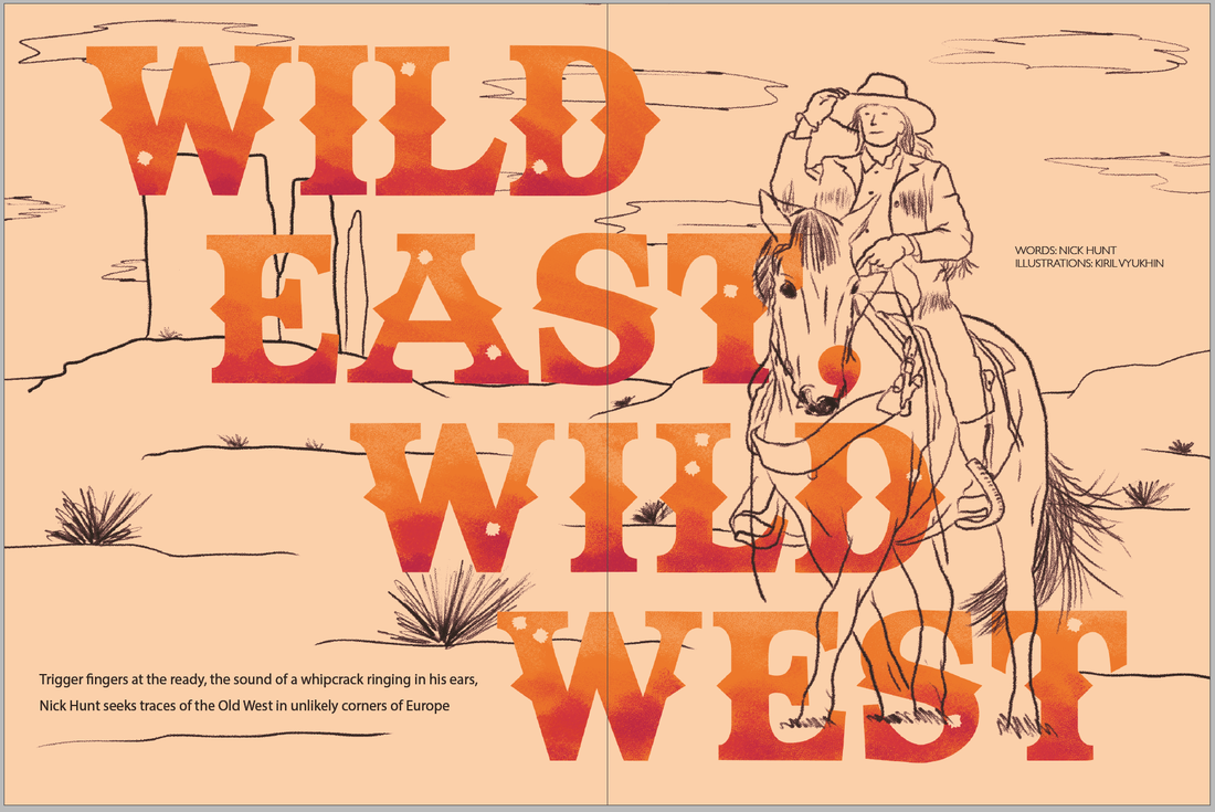
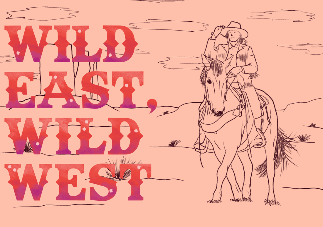
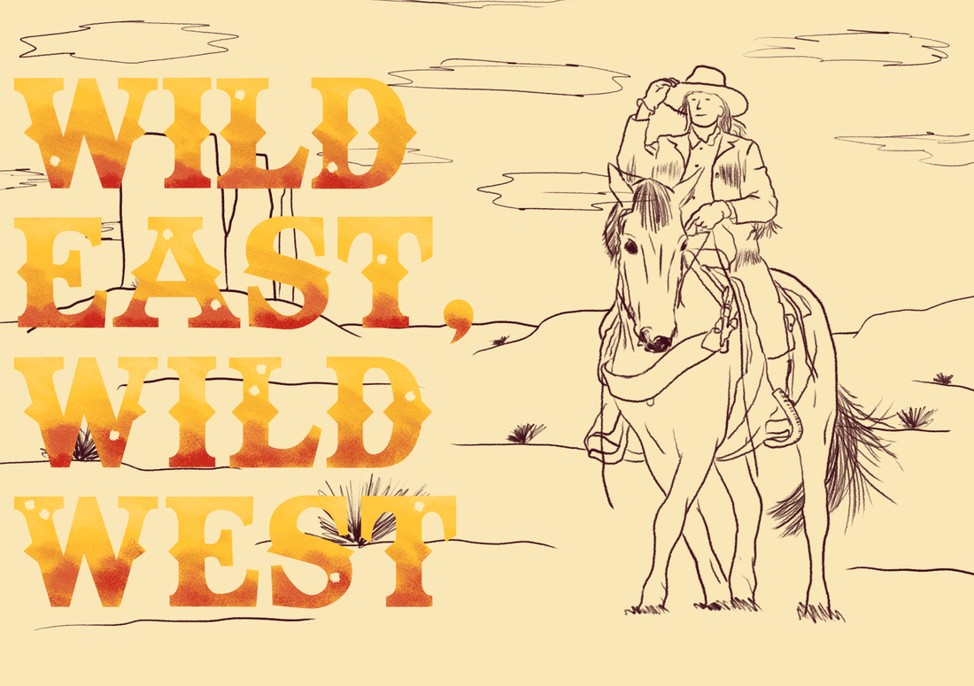
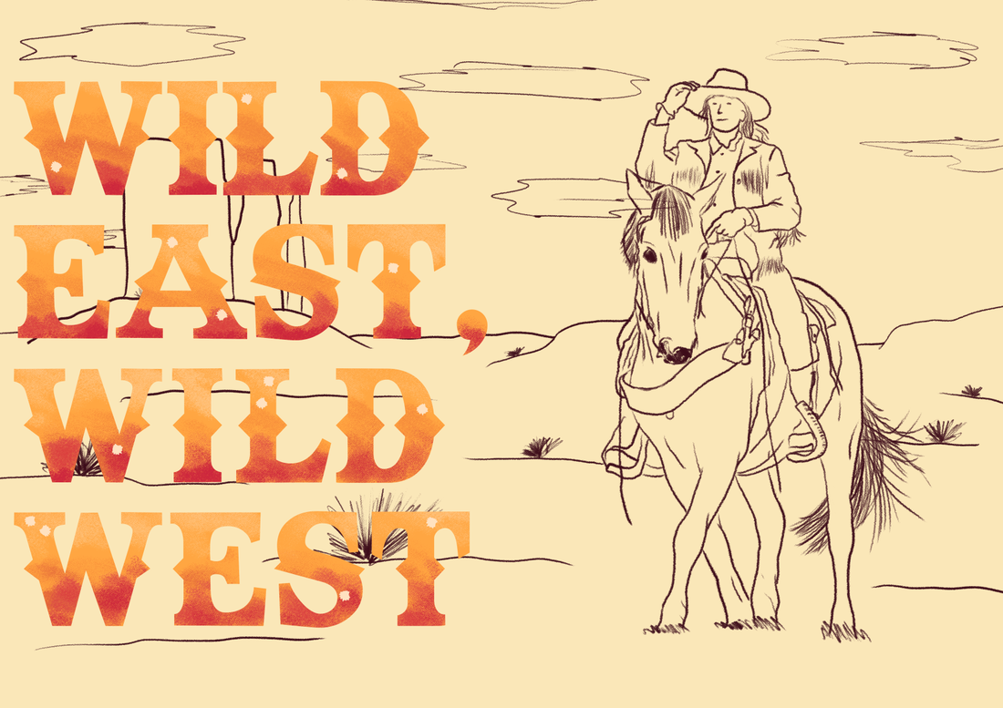
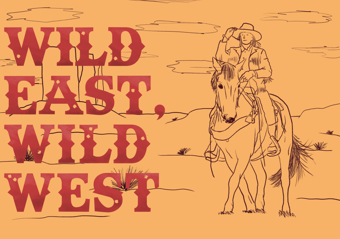
I liked how the title of the article went all over the double page spread however as Ernest Journal is a perfect bound publication and so I would lose some of the letter within the spine area and so I decided to move the title over to the left side.
|
|
|
|
|
|
I trialed many different variations and style of colour to see which would make both the title stand out and the illustrations.
|
|
|
|
|
|
|
|
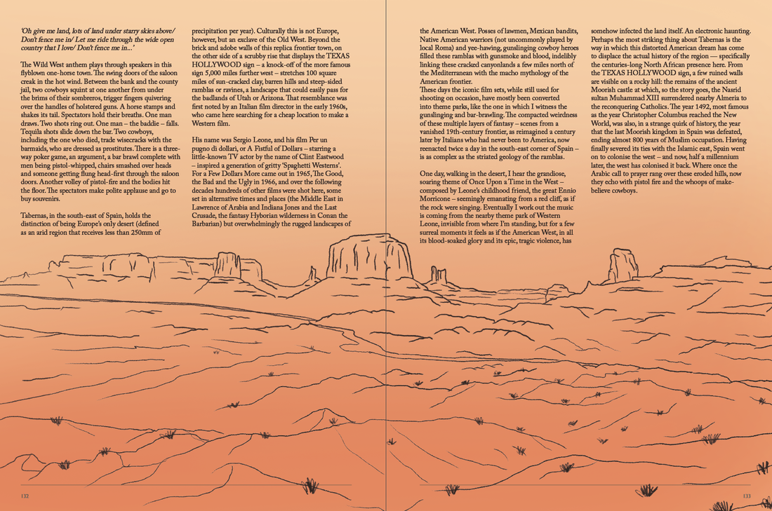
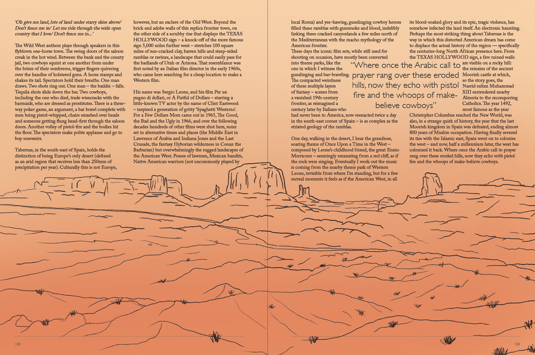
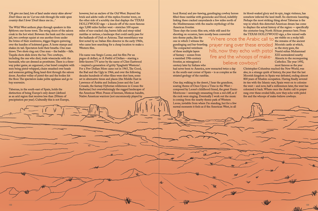
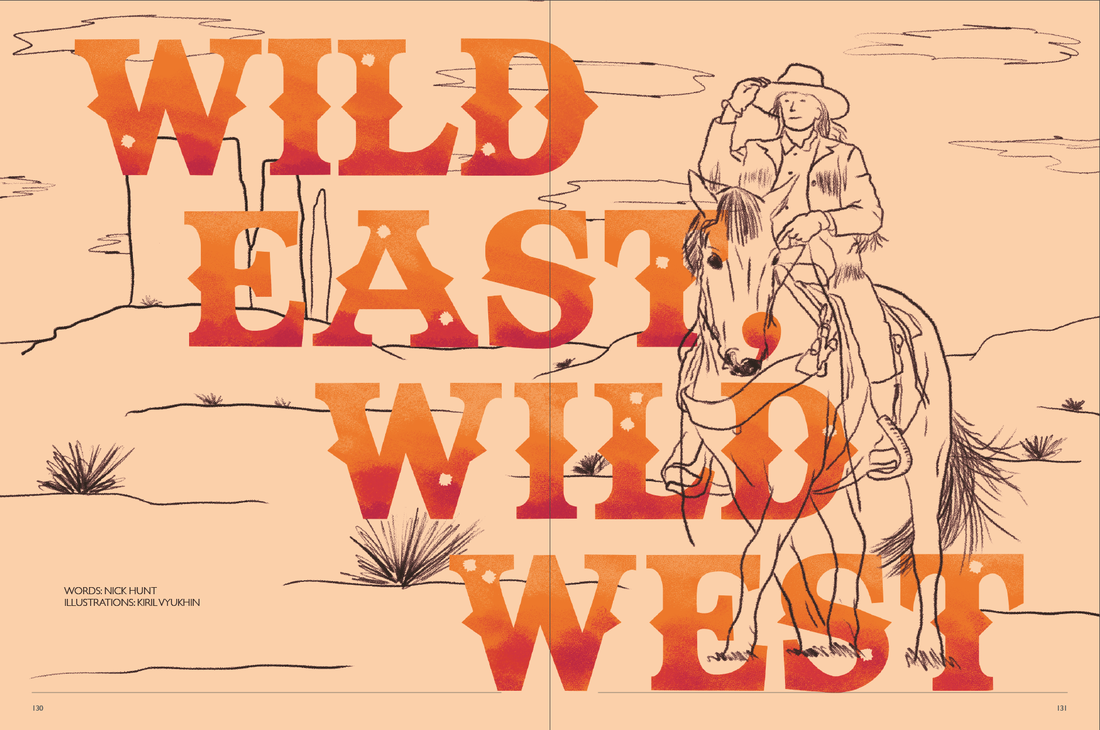
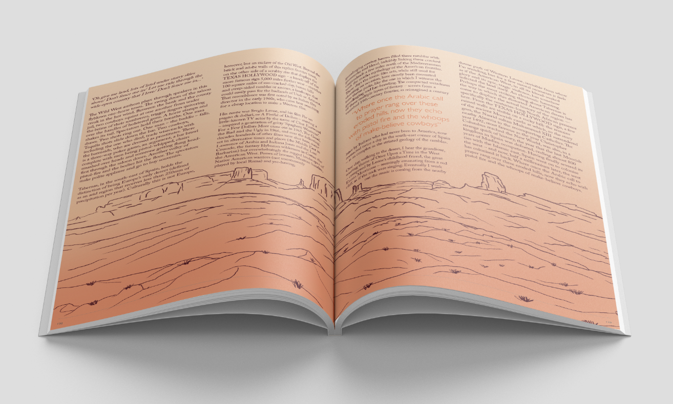
Here I finally added text wrap to my illustrations so that the text went around the illustration instead of just cutting off as previously seen.
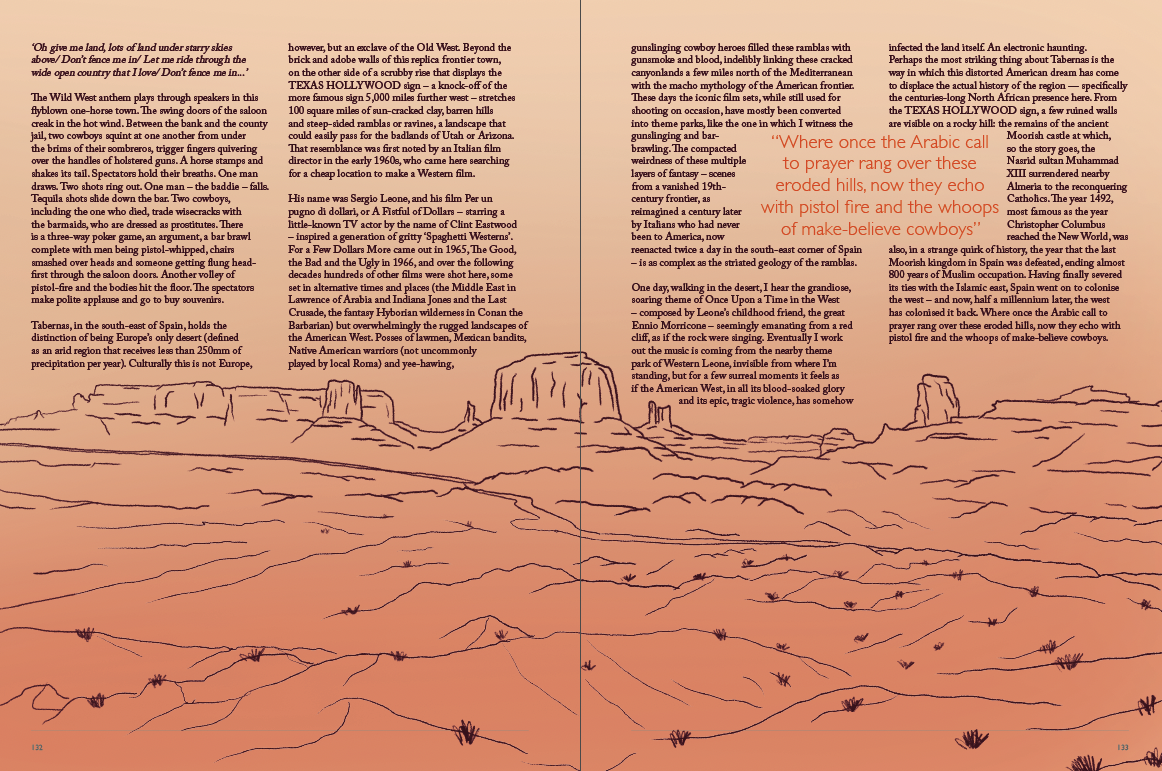
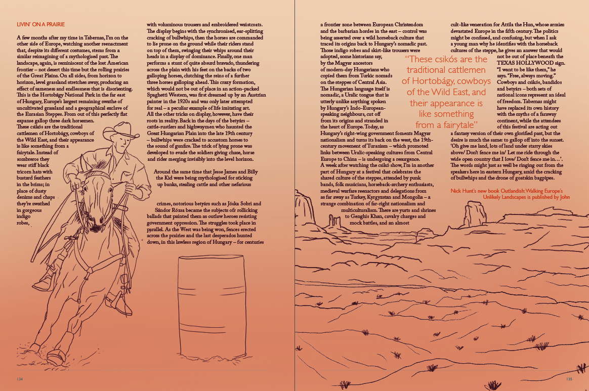
Looking at previous Ernest Journal quotes, I found that the quote is always placed in the same position as the body text with no text wrap and so I changed mine to fit the style of the previously made articles. I found this change made it look more inline with the Ernest style and also made my own article look much better rather than the quote being in the middle of two body text sections.
|
|

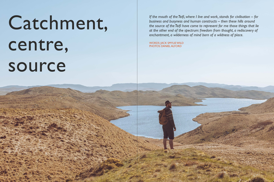
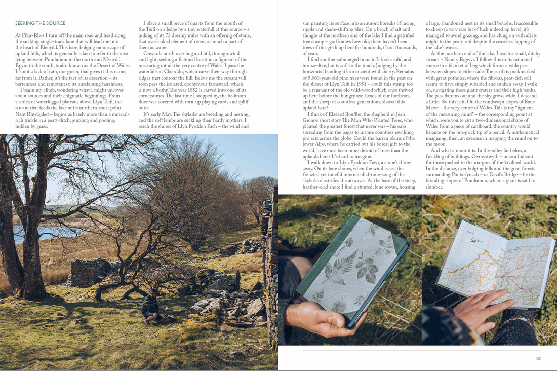
Catchment, centre, source
This part of the Ernest Journal task was to create photographic-based article with a copy provided.
Ernest Front Cover