Analysis
I began by finding and analysing 12 book covers that I found from the internet. Some typographic whereas others using imagery, negative spaces and other styles to portray the book.
|
|
Book cover assignment 1
‘The Hunt for Red October’ design process.
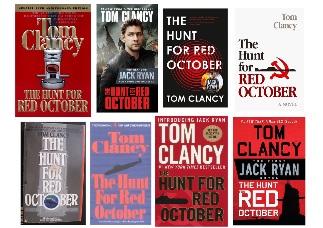
I began with my first book cover for Tom Clancy’s Jack Ryan series book called “The Hunt for Red October”. These are images of previous covers for the book.
This is the runaway bestseller that launched Tom Clancy’s spectacular career and introduced his acclaimed hero, Jack Ryan, in the ultimate submarine adventure.
Red October – Moodboard
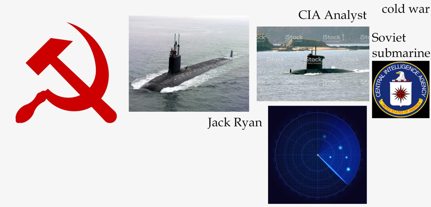
I first began creating a moodboard for the book – using significant things within the story that I may use in the book cover design.
|
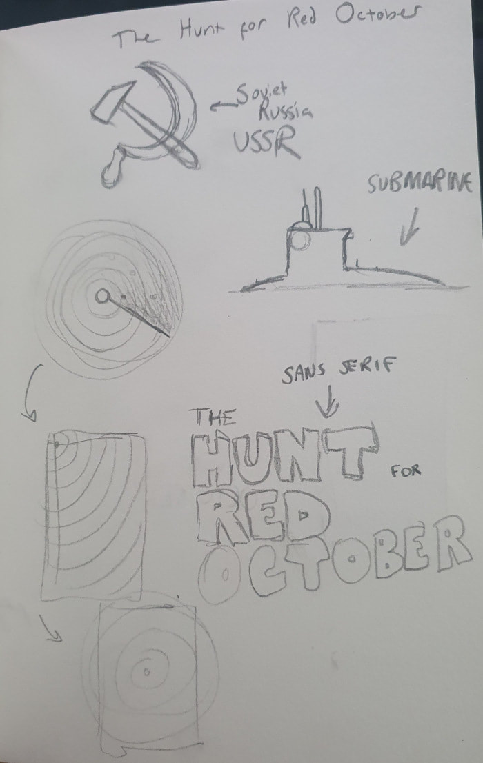
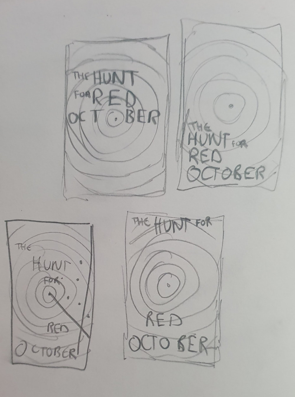
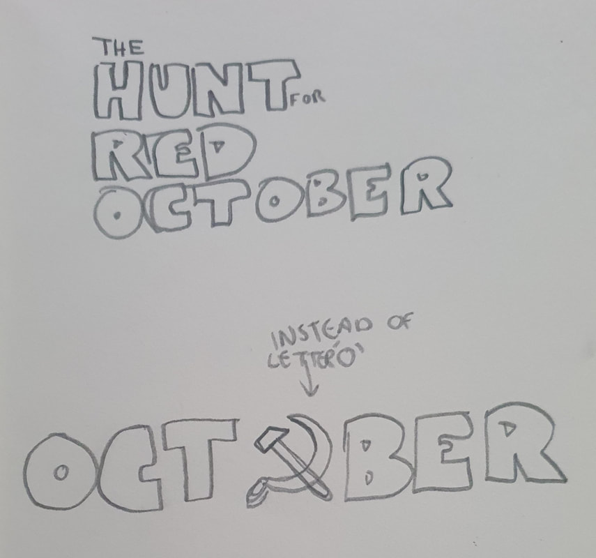
After collecting some resources to possibly use in the book cover, I began sketching ideas for the book cover. In these sketches, I began the process of laying out the front cover – I began using the idea of the radar as the main cover. This was also inspired by one of the previous book covers done by the book. I began exploring the placement of the typography along with the symbols I had found important to the story.
|
Once I had finished the sketches, I began to digitalise the book cover.
I decided to use the dark colour in the background to create the illusion of darkness – as in the story the Red October is a submarine which is hidden below the Atlantic sea. The use of red is because of the Soviet USSR using red as their primary colour.
I added a line within the radar and a dot to create the illusion of the radar currently only finding one submarine – the Red October. Following this I began working with the placement of the typography.
I attempted to include the ‘Hammer & Sickle’ within the radar but I believe it did not work out and so therefore I removed it.
After deciding the placement of the text, I played around (and kept) the idea of having the text slowly fade away as with the radar.
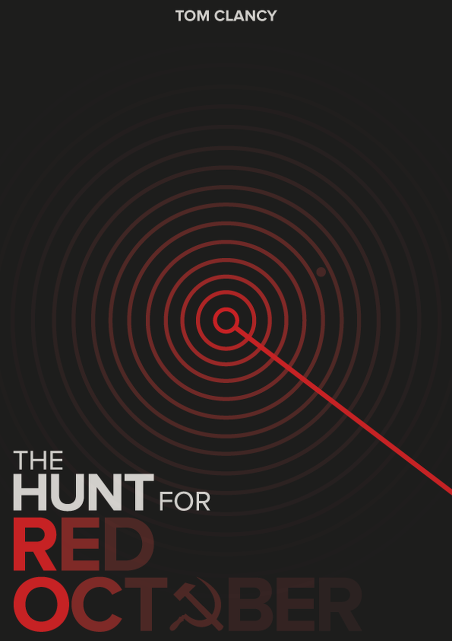
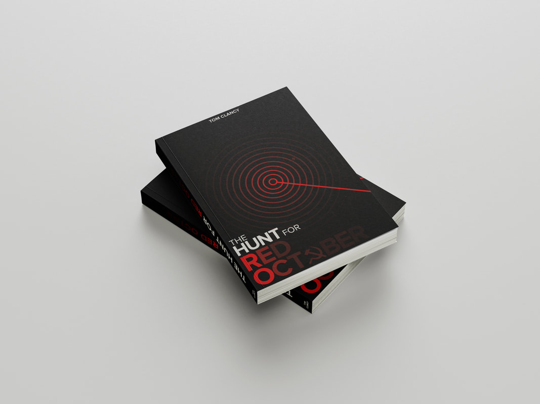
This is the final outcome of the front cover which contains the authors name above and the title of the book below – the name of the submarine slowly fading away to further the style of the radar. As a final step, I also added the ‘Hammer & Sickle’ into the name to further the idea of the Soviet submarine.
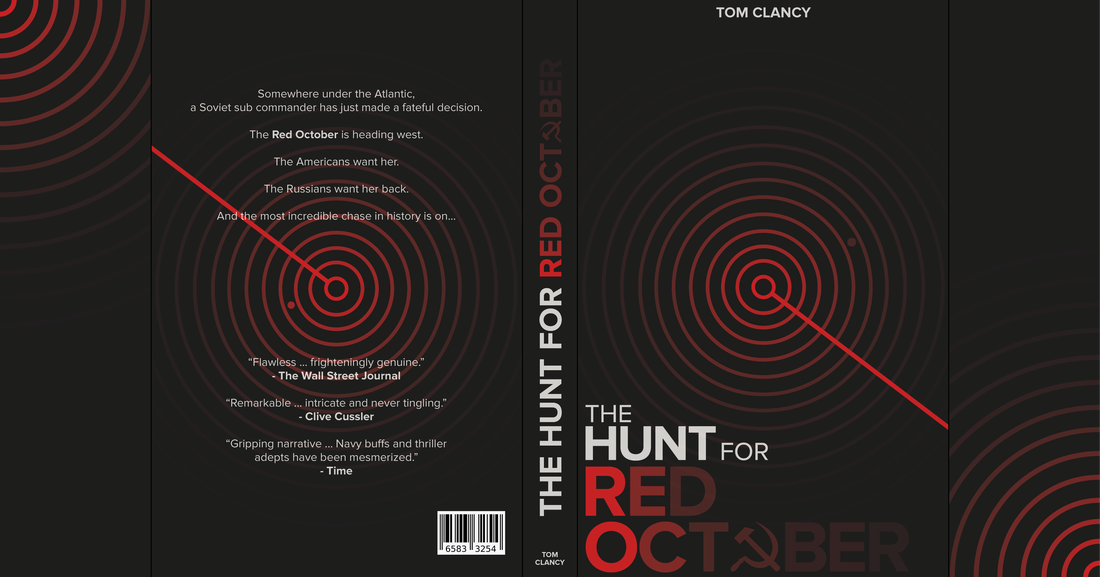
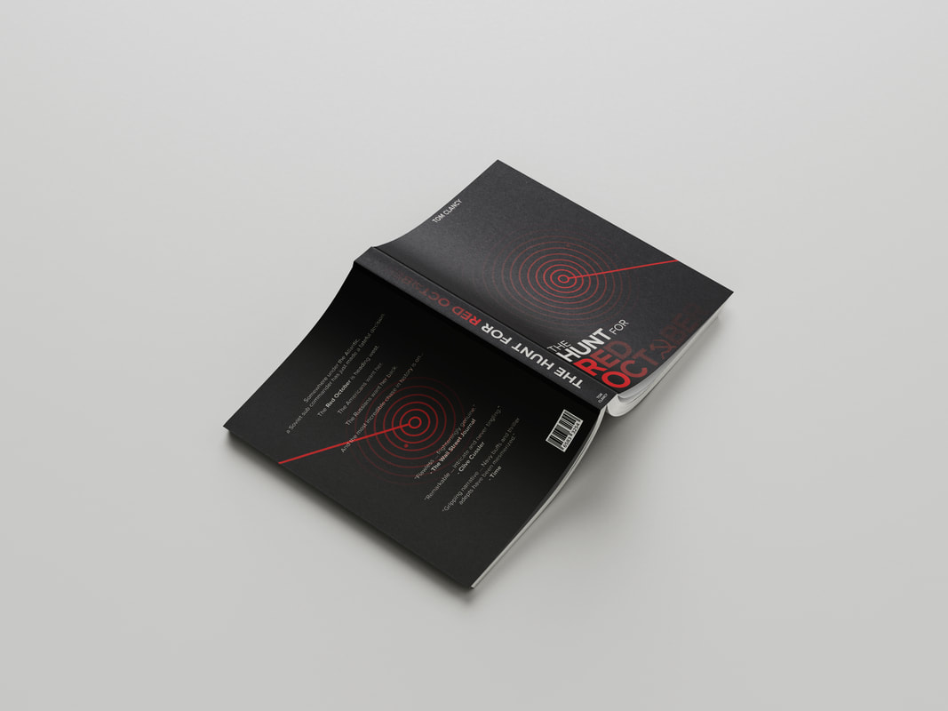
Following this, I created the entire book cover with the sides, back and spine – finishing off with a barcode.
Book cover assignment 2
The Maze Runner design process.
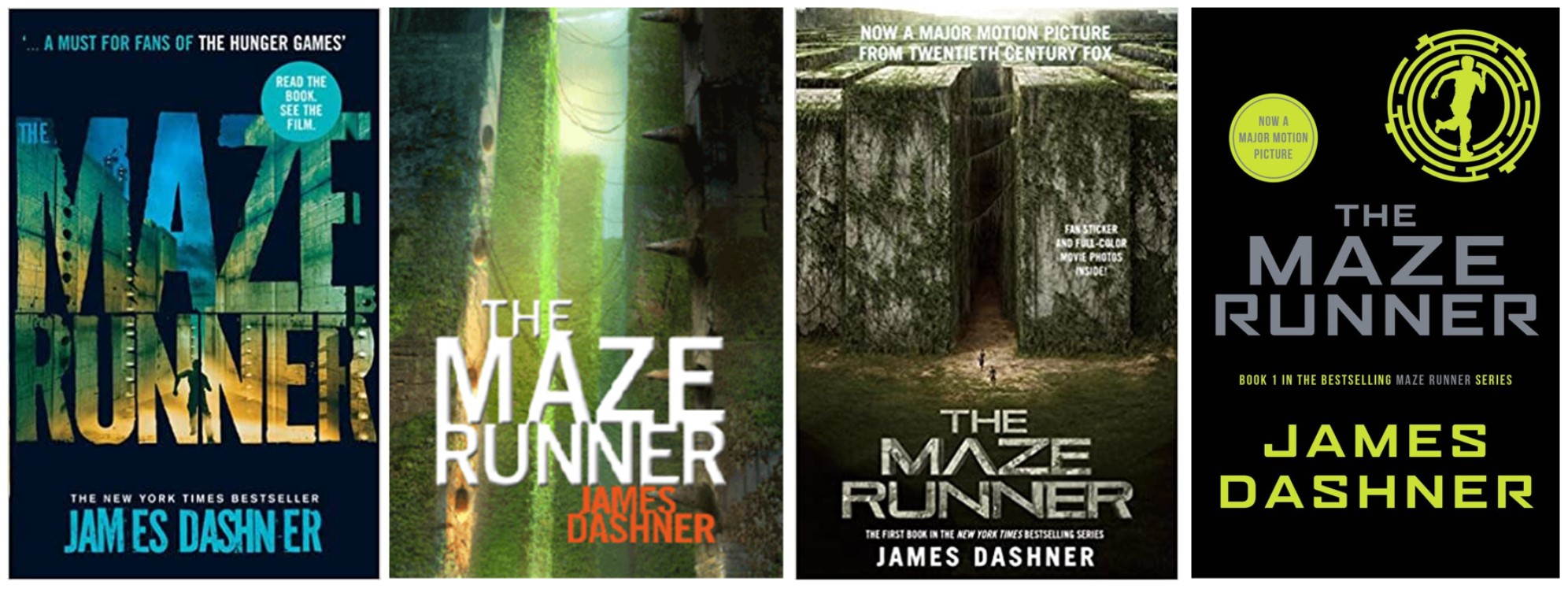
My second book of choice is ‘The Maze Runner’ which is a book among a series of science fiction novels written by James Dashner. These are images of previous covers for the book.
The defining key thing in these books is the maze that the characters have to make their way out of therefore I knew that this would have to be what I would need on my front cover. I was tasked, this time, to create a book cover that was typography based.
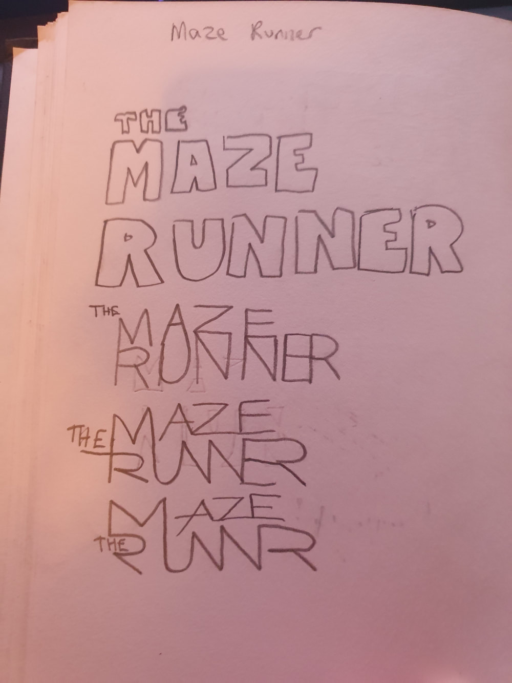
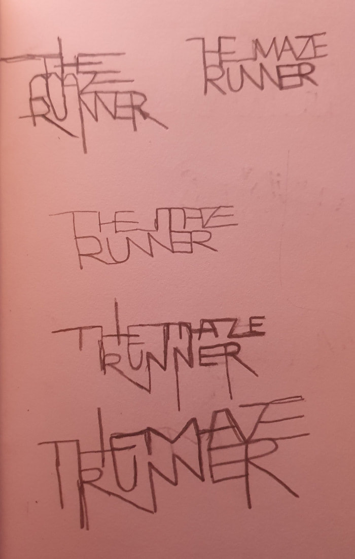
After this, I began sketching ideas for the typographic title of the book. I ran through many ideas, using the idea of the ‘maze’ for all of the book covers.
|
|
|
Using sketches, I picked a font suited for the idea of the ‘Maze’ shape.
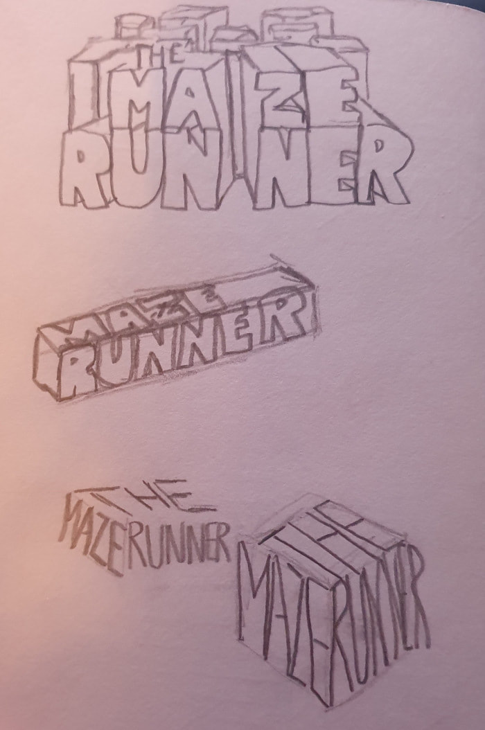
After these sketches, I began replicating it in Illustrator. I began with the logotype on the third page which has the name “MAZE RUNNER” as ‘walls’ which are opened in the middle as the book’s describe with pillars seen above – hinting the maze. Upon reflection when recreating it in Illustrator, I did not like the outcome as I was not able to picture anything else to work with this and although I like the concept, I was unable to further this idea.
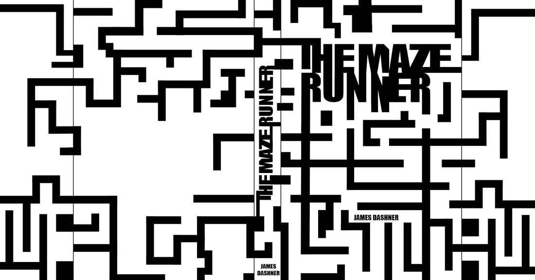
I then ran with the idea of using the name and playing with rectangles that would be pulled and loop, to create the idea of a maze – similar to what I was doing with the sketches.
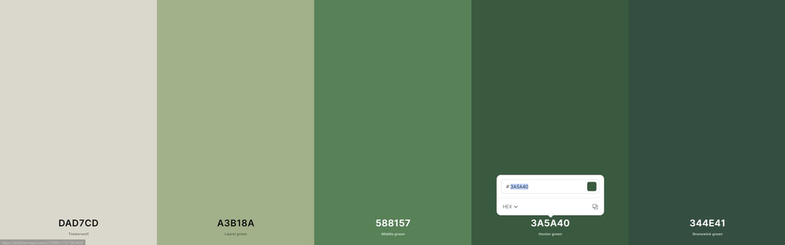
Once finished with the maze idea and shapes, I was able to pick a colour scheme that worked – using the colour green as the main colour as the maze is described to be overgrown and covered in vines, this was the colour I had chosen to work as the colour scheme of the book cover.
Once finished with the maze idea and shapes, I was able to pick a colour scheme that worked – using the colour green as the main colour as the maze is described to be overgrown and covered in vines, this was the colour I had chosen to work as the colour scheme of the book cover.
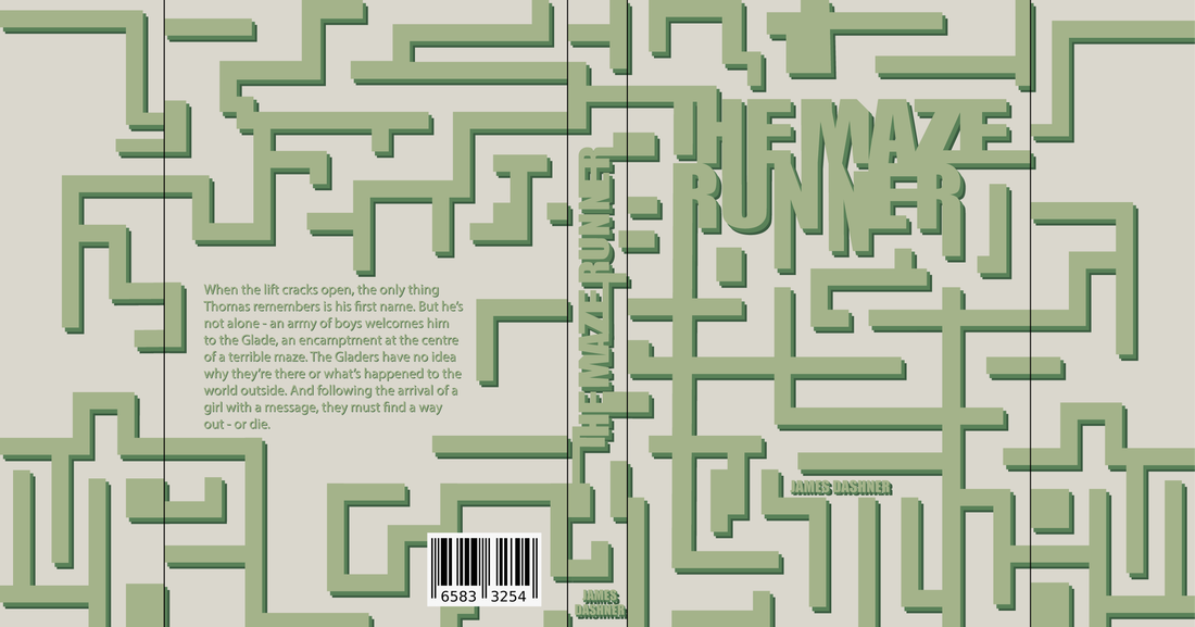
And with this, I was able to finish up the book cover with the finishing touch being the text on the back and a barcode. This created the second, typography-based, book cover for the book ‘The Maze Runner’.
Design Report
| Unit 42 Design Report |
