Research
I began by researching different skateboard/streetwear brands to get an understanding in the already existing market. Below are Moodboards I made of each brand, found from local Bristol skateboard brands or worldwide companies.
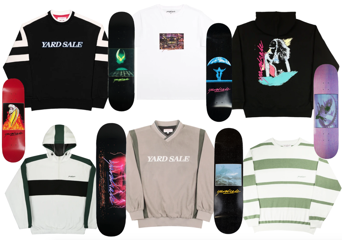
Yard Sale Skateboard Brand
The Yard Sale brand uses a lot of simple clothing with minimal designs and likes to place its logo in a visible place. This is different to their skateboards as they use some kind of interesting illustration or artwork with the brands name places above or somehow within that image. The images are only placed in the centre of the skateboard and there is a lot of empty space around the centered designed. The designs on the skateboards are very simple usually consisting of a square image which I do not particularly like as it seems like not much thought has gone into it.
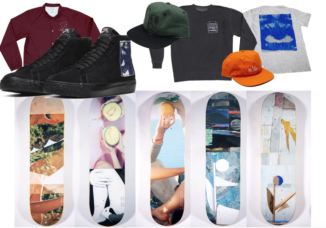
Isle Skateboards
Isle Skateboards use a lot of collage work for their skateboard deck designs with images working together and covering the entire deck from top to bottom. The brand also has a few clothing pieces available as well as shoe designs which all contain small designs to not over complicate the piece - usually placed in the left 'pocket' placement or in the centre of the tshirt. I love the collages on the decks as they are very detailed and make you look into them properly - this makes them more like art and less like a customisability which is not really seen when someone is skating on them.
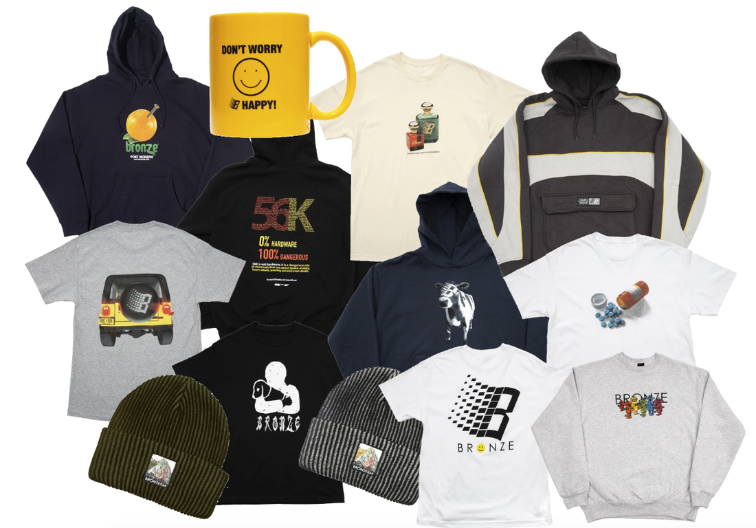
Bronze56K
Bronze 56K uses parody and sarcasm within their art. This is shown through the use of the old Microsoft logo which has been replaced with the letter "B" or the back of a car using that same logo as well as the t-shirt with a design of tablets which all contain the same letter as if their own tablets. The brand finds ways to incorporate their logo within something rather than just putting the typographic logo in a small area in these examples. I like this style as it uses interesting designs for each of the clothing parodying some kind of previous made design. I found the cow design to be funny with the logo of the brand placed on the face of the cow as its very unique but very weird.
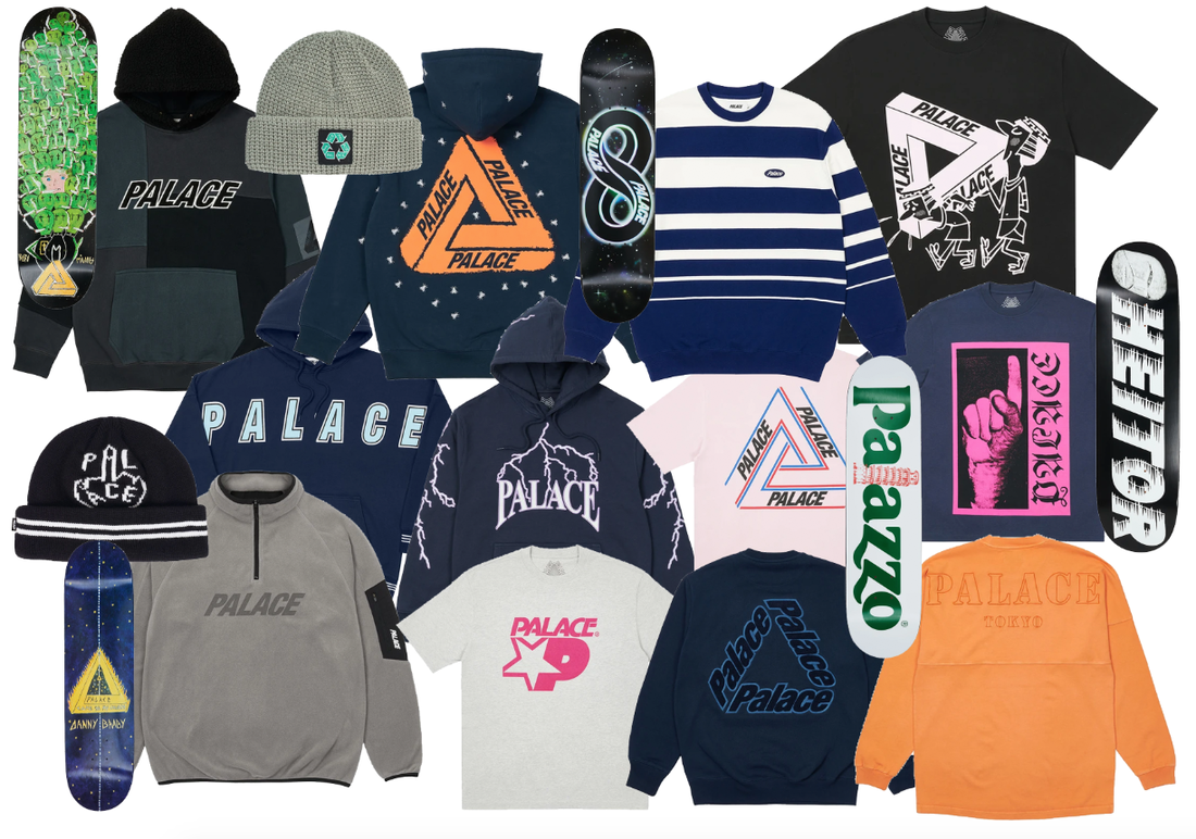
Palace Skateboards
Palace is a very well known brand. Their brand name is placed on every graphic clothing however a lot of them try to incorporate some kind of design on top as seen with the lightning hoodie. Others parody their logo with the people carrying the logo in an illustration as seen in the top right image. Other designs simply have the logo in the center of the clothing to make it very simple. The skateboard decks all have very different designs with none of them being similar however I like them due to them being detailed and intriguing. Some contain typographic designs whereas others contain some kind of artwork all covering the entire deck.
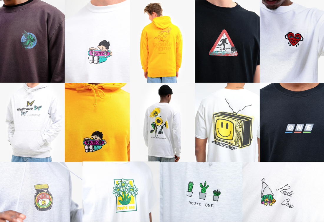
Route One O.B. Clothing
Route One's designs are simple using a lot of illustrations and sometimes parodying some kind of object in the world as seen with the old "BBC" logo or the marmite jar having the "Route One" typography placed on top. The most interesting design on their website I found was the UK road sign with the pedestrian replaced with someone skating and the brand name incorporated as graffiti which is a very cool idea. I also found the BBC logo replaced with the word "ONE" from the brand is a cool idea too.
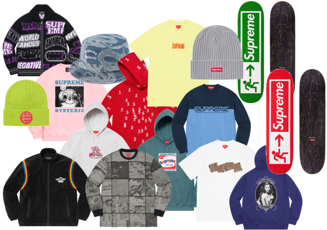
Supreme
Supreme is a very well known brand across streetwear with their designs either being very small or very out there. As an example, one of their hoodies has the Supreme letter "S" overlayed all over the hoodie coloured in their infamous red colour which is part of their brand. This is also used on the skateboard decks. This one parodies the exist sign however the arrow is pointing at the supreme logo almost as if saying "Supreme is this way" rather than it saying "Emergency Exit". Supreme also likes to incorporate their logo in sarcastic and funny ways such as the Supreme Shine advertising as "Maximum Strength" and "Makes everything shine". I like this style a lot as it shows a not so serious brand and uses the brand name in very interesting ways to parody on products and ideas in the world.
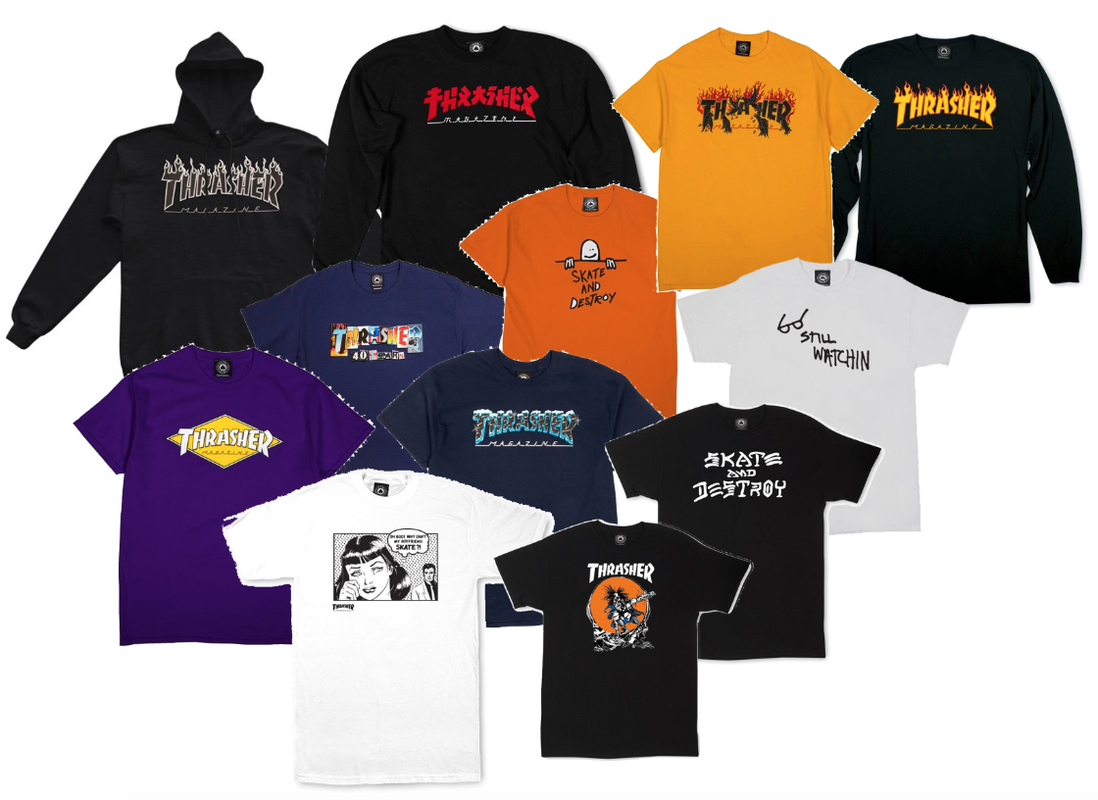
Trasher Magazine
Most Thrasher Magazine designs are very simple with the typographic logo placed in the centre of the hoodie/shirt. WIth a few containing some kind of other design such as the "Skate and Destroy" tshirt however most do contain the logo with some kind of colour change or a slight change. I do not particularly like this as it feels like these do use much thought and are very hard to distinguish as they are all quite similar.
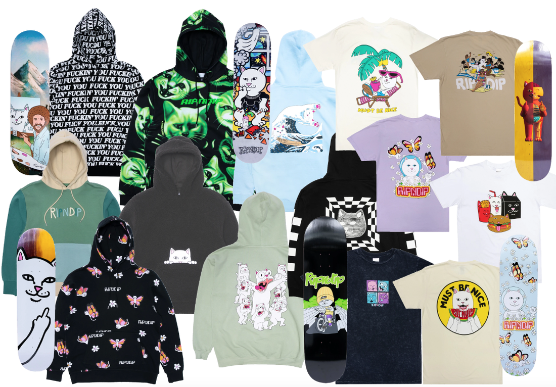
RIPNDIP
RIPNDIP is also a very infamous brand which uses the imagery of a cat in different funny ways. This is seen throughout their brand. Hoodies such as the black in the top left also simply plastered with curse word shows the brand being playful and not so serious. The illustration of the cat is also used a lot in designs such as the cat strangling other cats on the lime hoodie in the center of the moodboard. RIPNDIP's skateboards also use very different designs such as the simple illustration of a cat showing the middle finger and my favourite being the Bob Ross illustration as if he painted the brands cat. This brand is great and I love how different each design is, it makes the brand and each design of clothing stand out from the crowd and their overall collection.
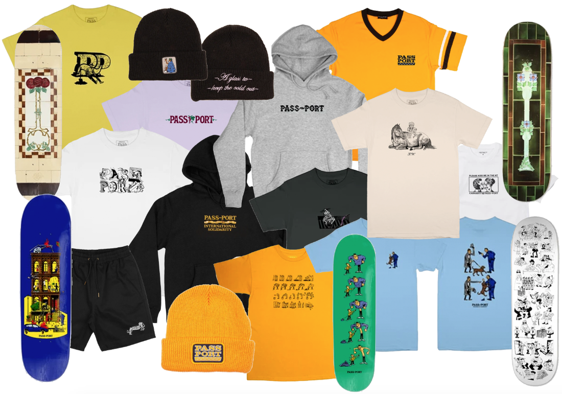
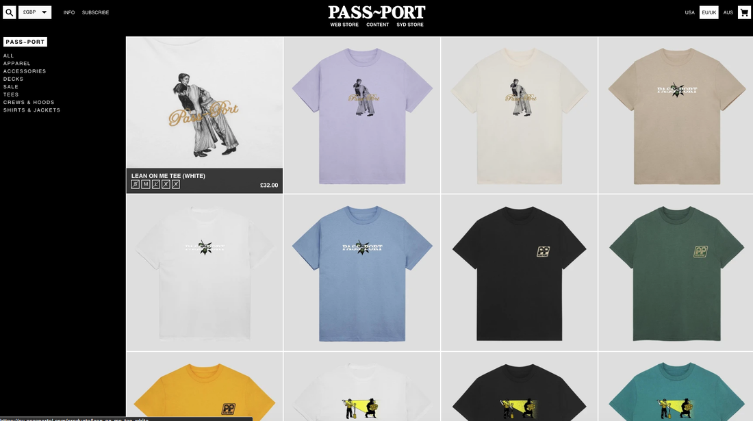
PASS~PORT Skating
PASS~PORT uses a lot of their brand name on their clothing however each time changing it as seen by the yellow t-shirt in the top left which only has the letter P twice in an interesting illustration. Another design like this is the white t-shirt seen below which has the brand name letters all in different illustrations. Other designs include someones jumped being slowly pulled by a string that unwraps to reveal them being a skinny person as seen on the green skateboard deck. These illustrations are very unique are very cool artworks that would be much cooler on display rather than on a skateboard. This brand is very simple yet uses a lot of interesting illustration ideas to make each clothing and skateboard deck design different. I like this brand a lot as it makes it stand out from the crowd despite not being too show-off.
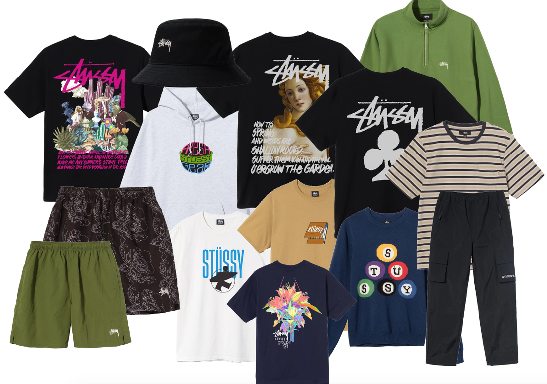
Stüssy
Stüssy, like previous brand, have a range of designs that showcase the brand name in interesting ways such as the billard design which contains the brand name within the white circle of each ball. Other designs simply say "Stüssy" with the club below on a t-shirt which I am not sure how is connected to the brand. The brand uses a lot of black clothing for their designs where most of the t-shirts and other products are available in a simple black with other colours available as a choice. I personally like the design of matchsticks with the brand name on top of the packaging with the box of matchsticks seen slightly opened.
Researching the look
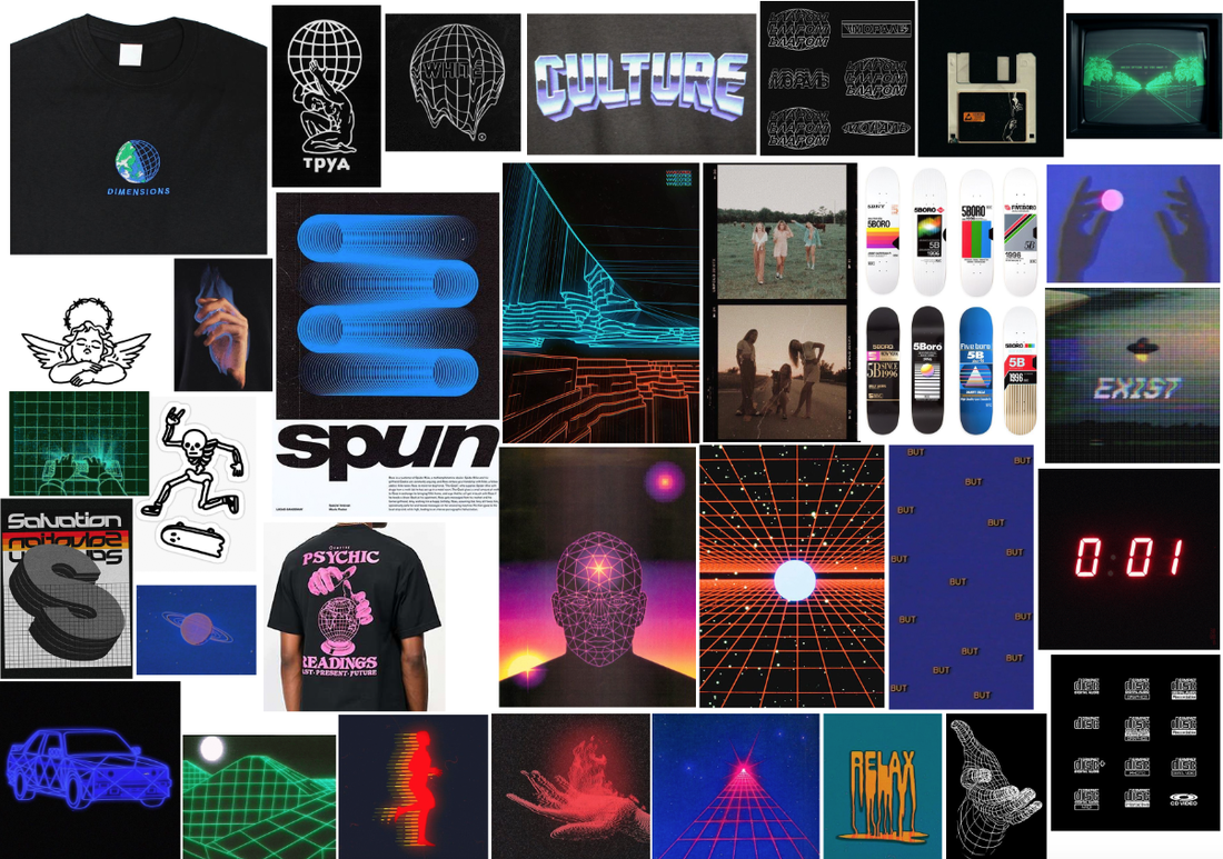
To understand the look I am going for, I began by creating a pinterest board to get feeling and understanding of the brand style and theme.
Artist Research
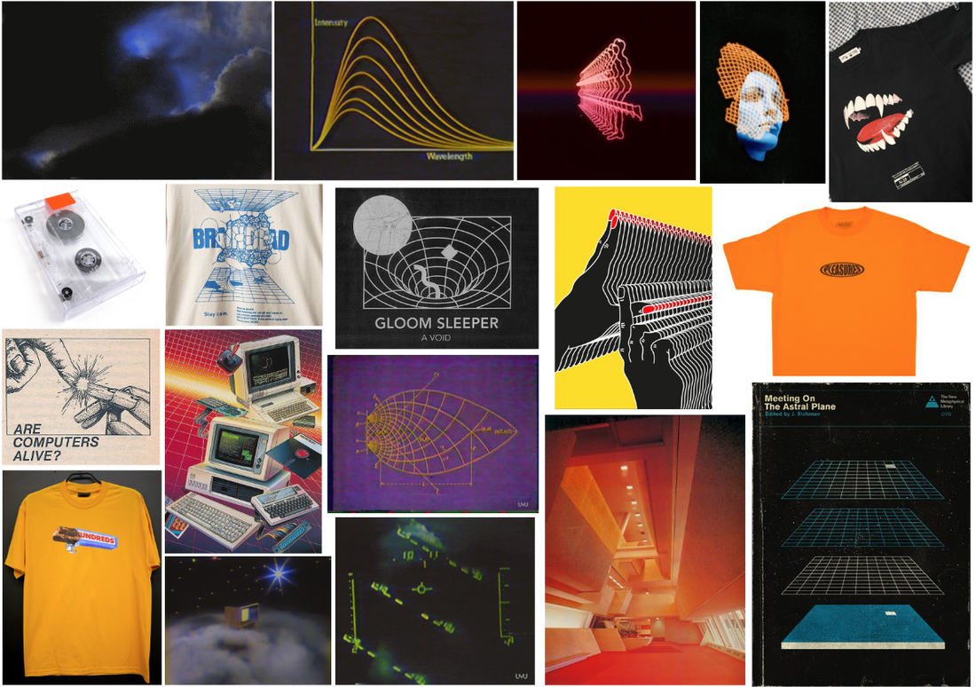
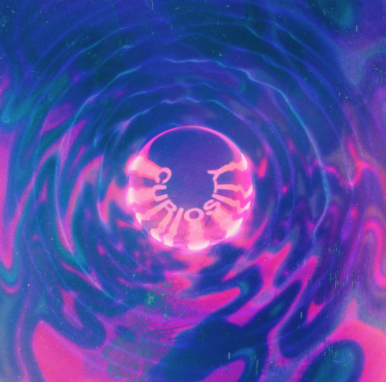
I then looked at artists which I could use as inspiration later for my brand and style.
Polygon
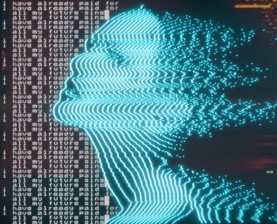
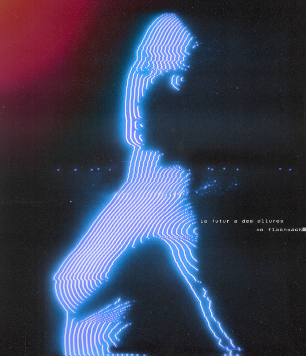
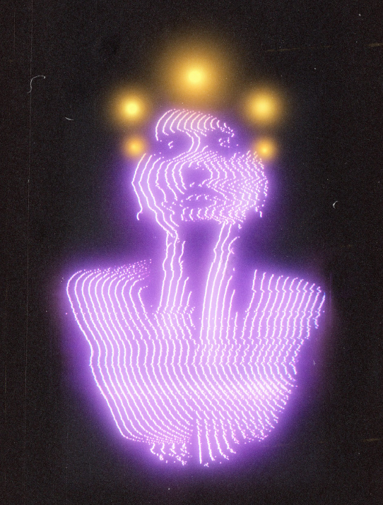
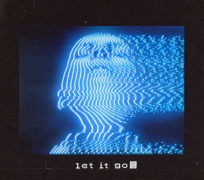
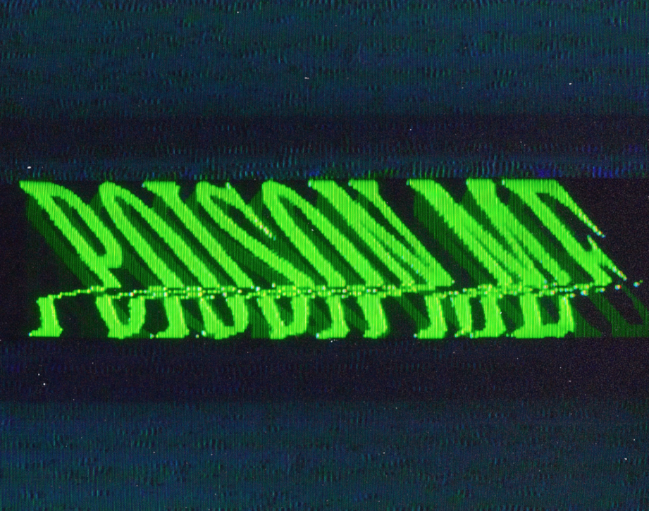
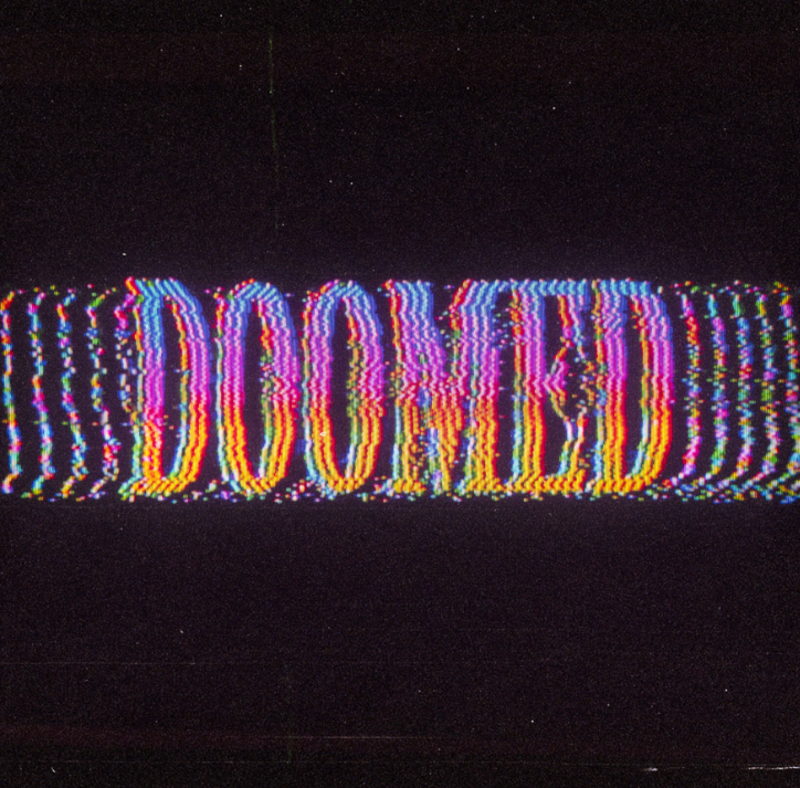
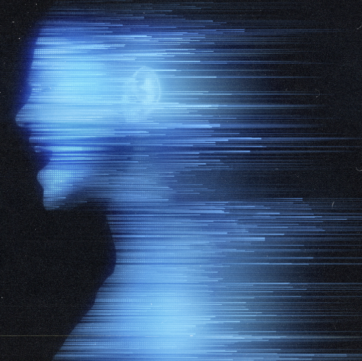
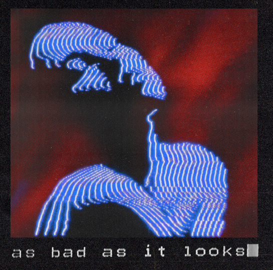
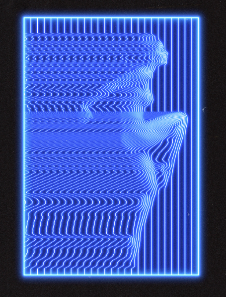
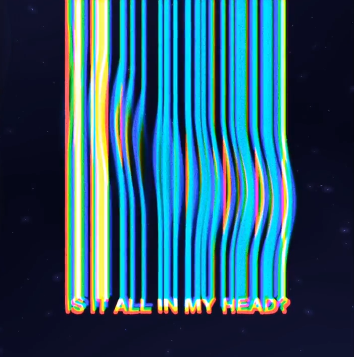
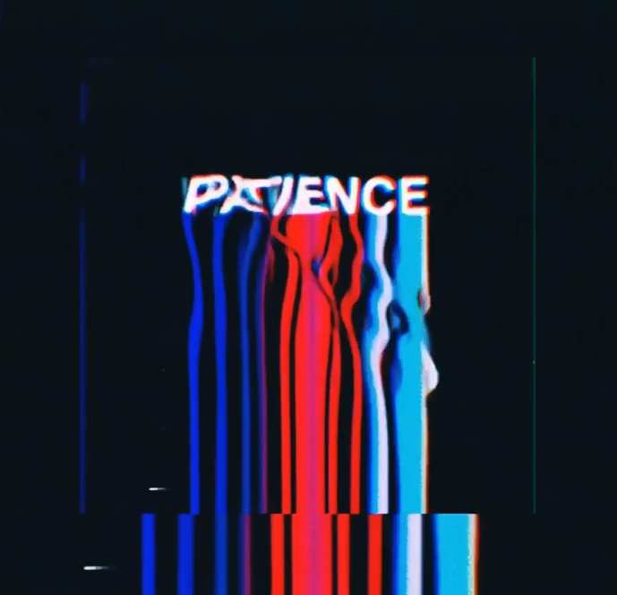
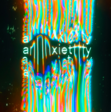
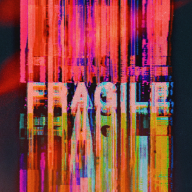
Polygon is an artist from Paris, France who draws the 80s and 90s culture for his creative artworks for music videos, album covers and other artworks. Polygon's work clearly consists of the 80s and 90s TV and technological look of pixels, colours and distortion whether it's the use of a human or typography being distorted to portray an emotion.
|
|
|
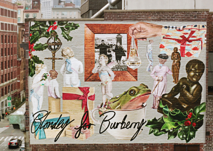
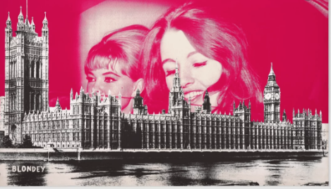
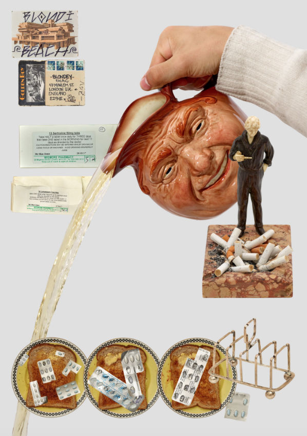
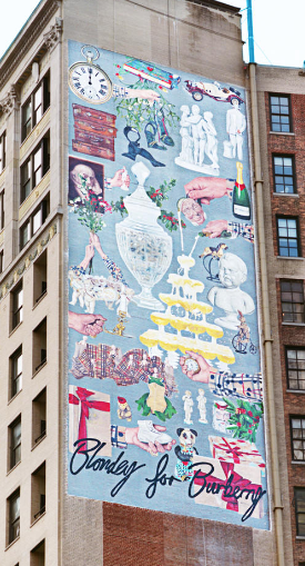
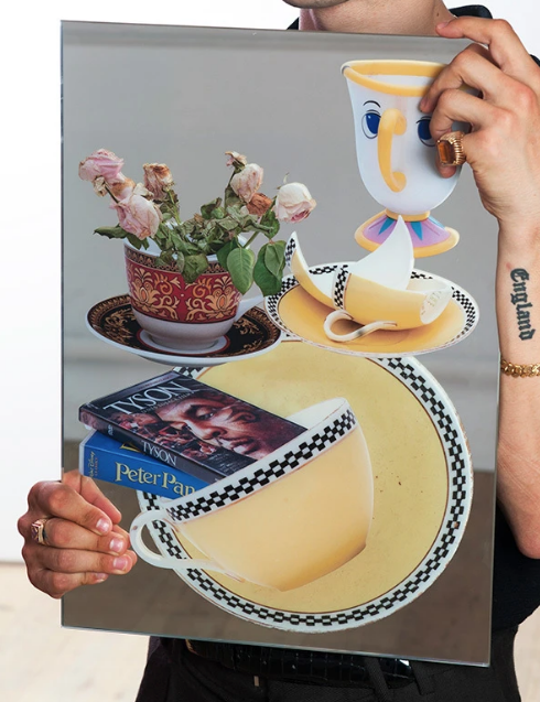
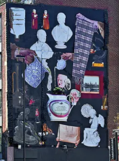
Blondey
Blondey McCoy is a British artist, clothing designer, skateboarder and model, living and working in London. Blondey McCoy produces collages to portray some kind of emotion or feeling such as his most famous "US AND CHEM" which is a collage all kind of objects that relate to himself along with the crazy use of paint all over the collage. He has worked with big companies such as Burberry for their Christmas collage collaboration which was on display in London.
|
|
|
|
|
|
|
|
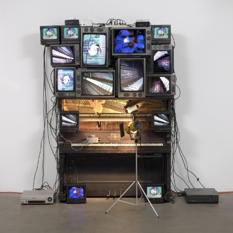
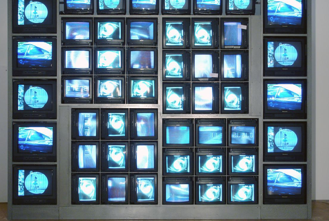
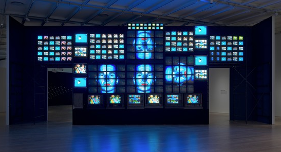
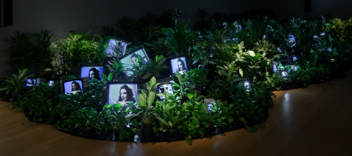
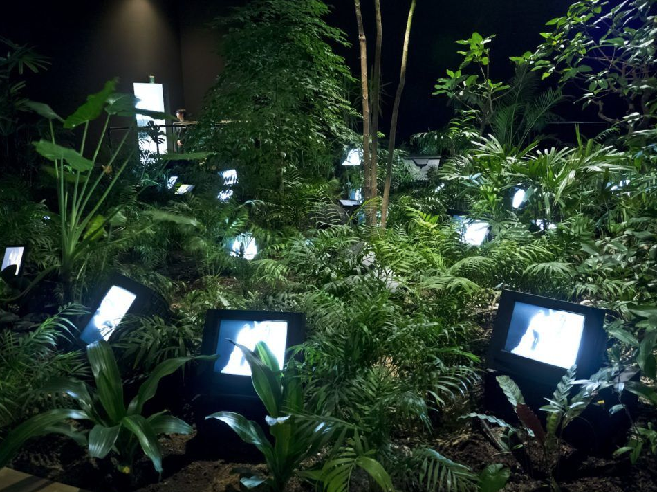
Nam June Paik
Nam June Paik was a Korean American artist. He worked with a variety of media and is considered to be the founder of video art. A lot of his work consits of using televisions displaying some kind of video/picture which is combined with some kind of setting such as a garden or a piano with each television portraying something close up on it.
|
|
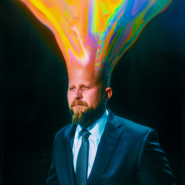
Mishko
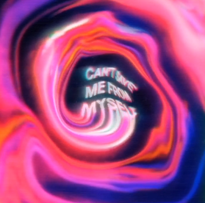
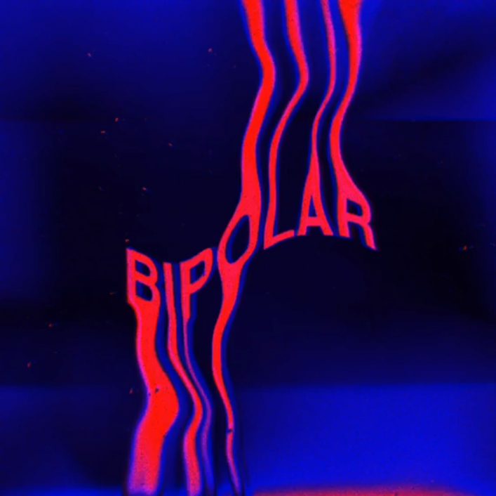
Nevan Doyle AKA Mishko from Los Angeles CA has worked with HBO, Calvin Klein, Apple Music, Disney, Adobe and many more famous companies. A lot of his work consists of playing with typography and liquifying the text to make it flow, curve, bend into different waves and forms. Colour is also super important in his work where it adds to the feeling of whatever the type says.
|
|
|
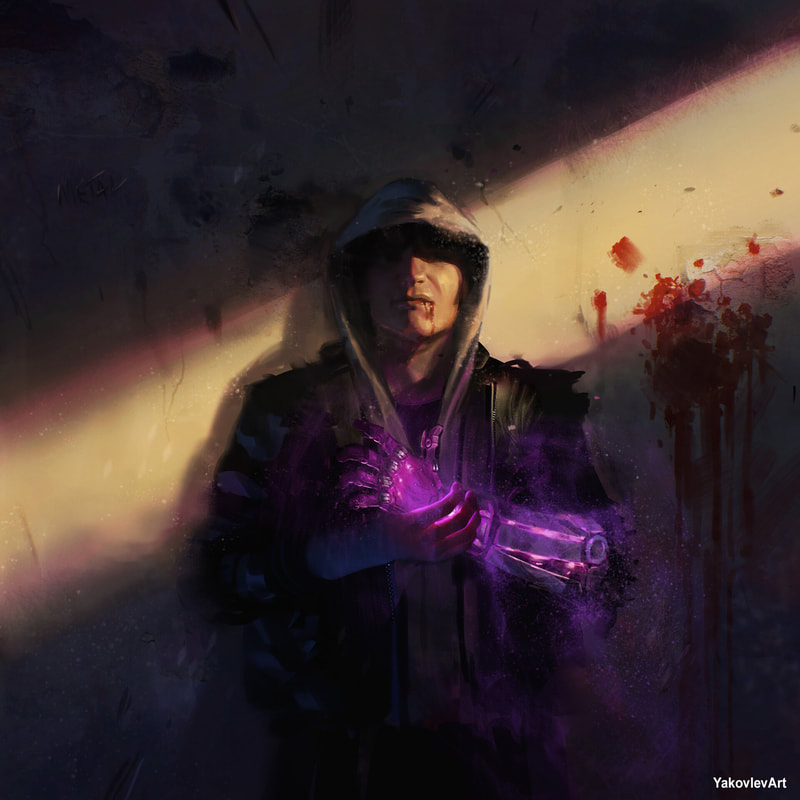
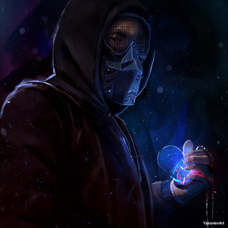
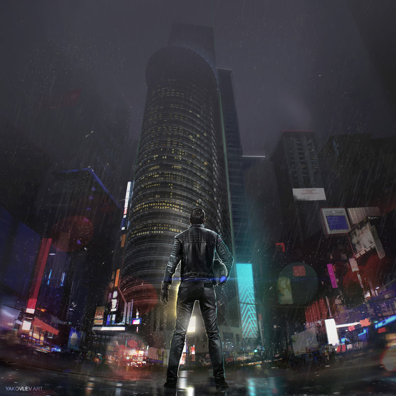
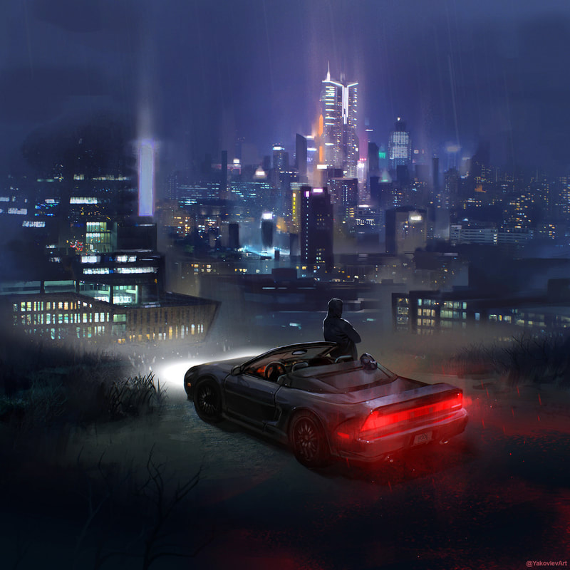
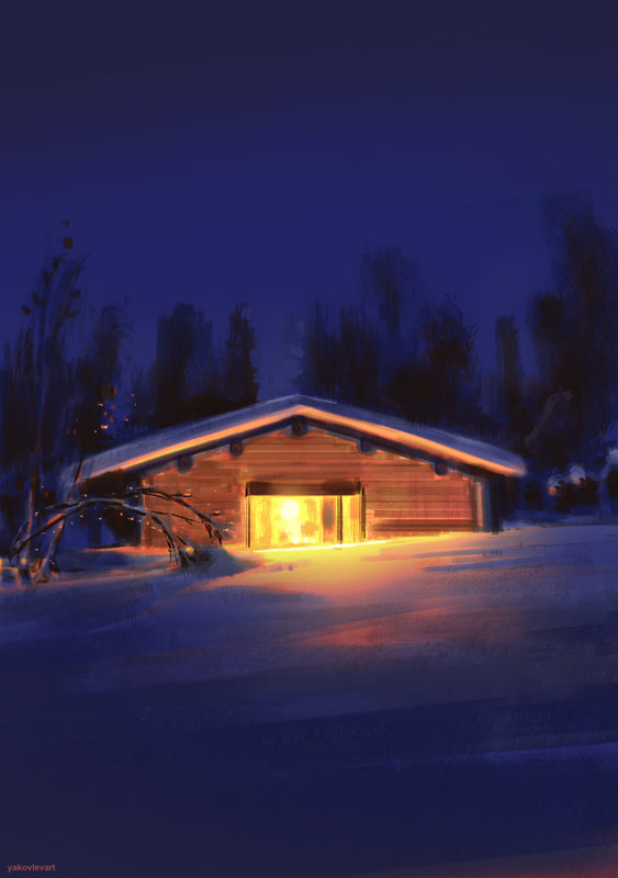
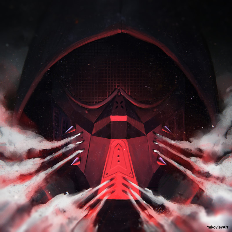
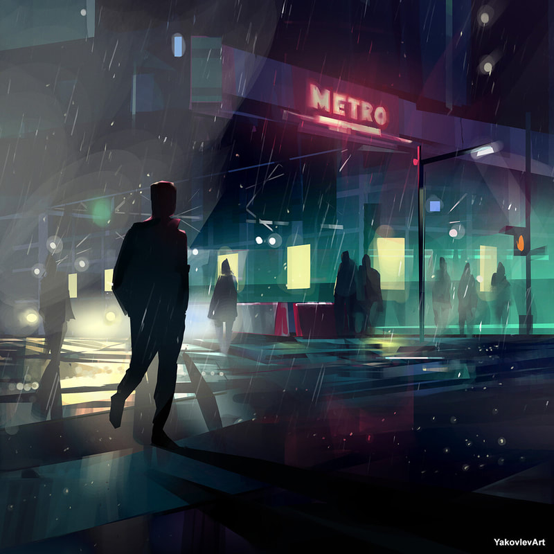
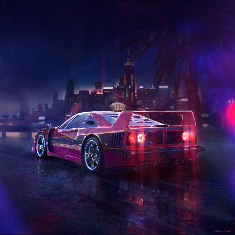
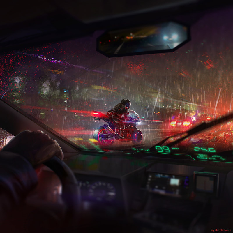
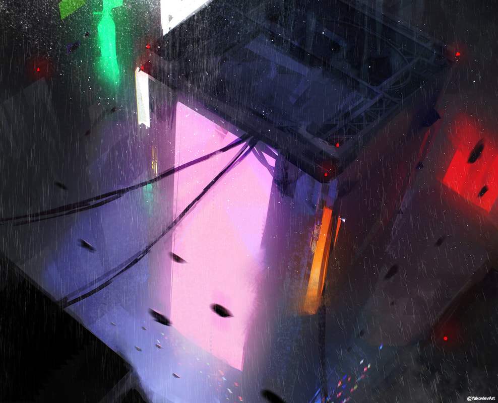
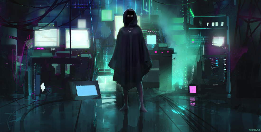
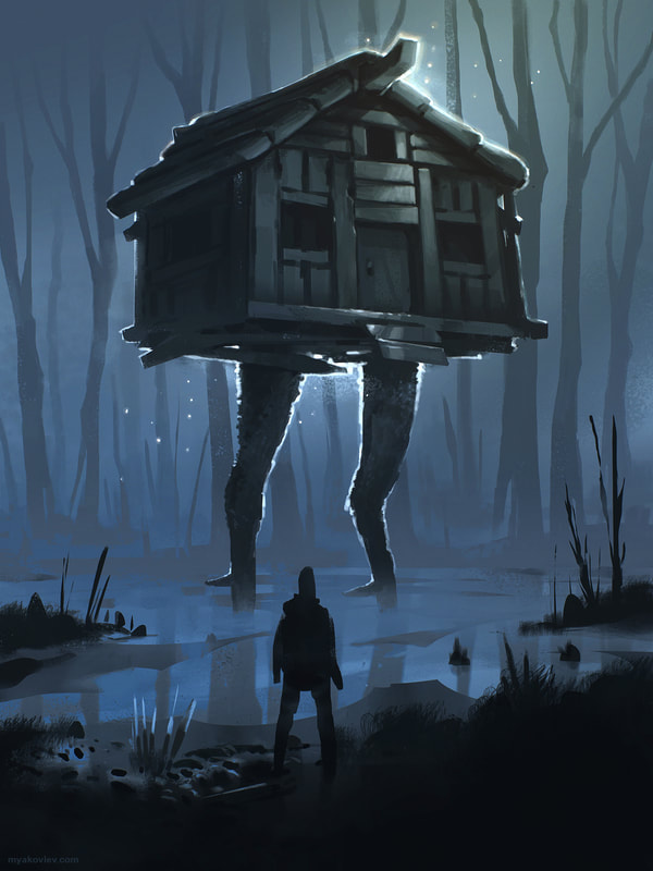
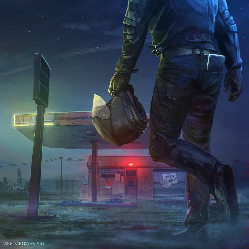
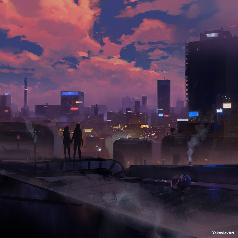
Yakovlev Art
Yakovlev is a freelance digital artist who is from Baltimore, United States.
|
|
|
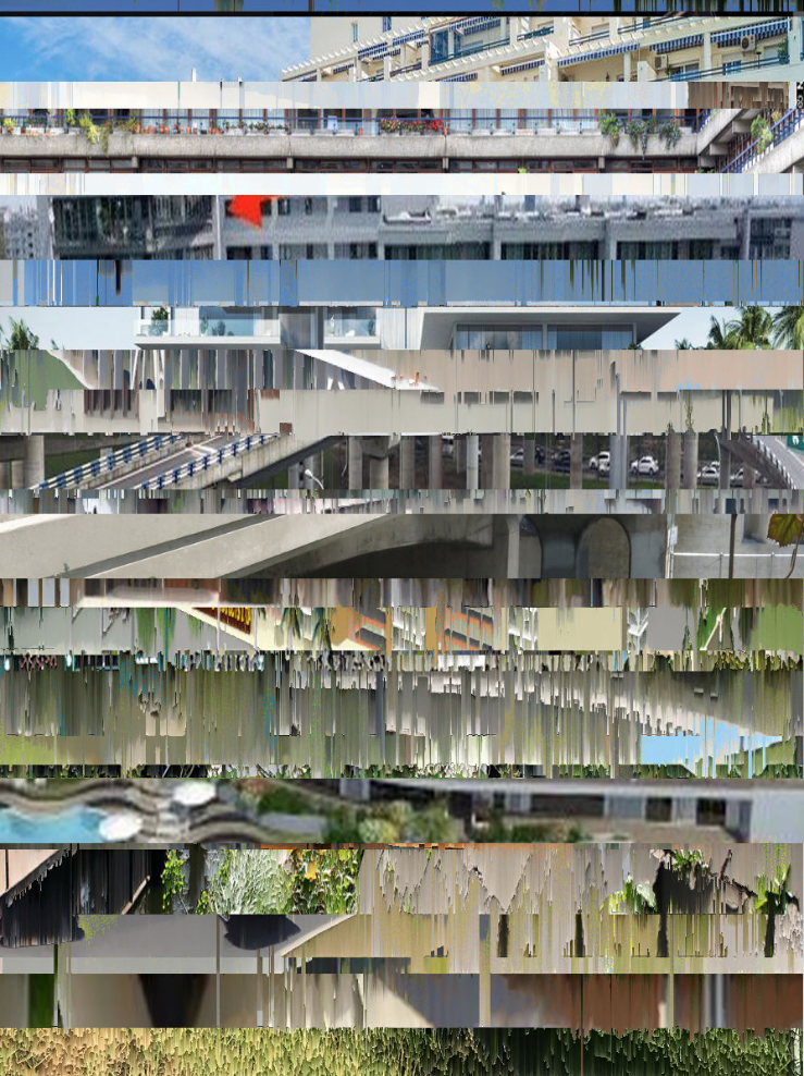
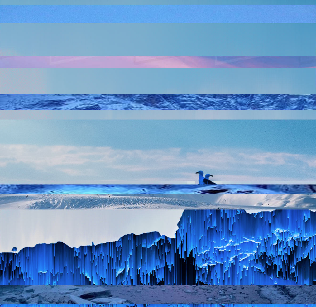
Isabelle Gagné
Stratotype Digital-ien is an autonomous computer program that randomly recomposes images of the Quebec landscape in Canada. Its function is to transform photographs taken by the artist Isabelle Gagné by adding fragments of other similar geomorphological images found on the Google Images platform.
|
|
|
Branding
Typography
I wanted my logo to be typographic as I just believed it to be better suited for the brand. This would mean the name would the 'look' of the brand and as this is a new brand this would make more impact and be more memorable and visible rather than iconography which would be better for a more famous, successful brand which could be simply recognised by the icon rather than any typography attached to it.
To begin with, I began researching logotypes from the 80s and 90s. Eventhough these decades are known full of bright and colourful styles - I wanted to go for a monotone logo as I wanted a 'minimalist' style to be included somewhere in there. I wanted this logo to be able to work on any background, shirt or label and so black/white logos work the best as any colour can be added to this.
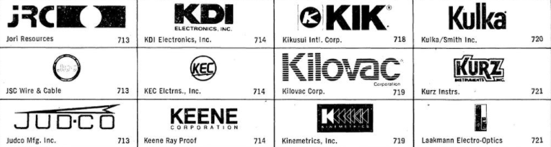
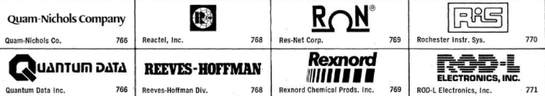
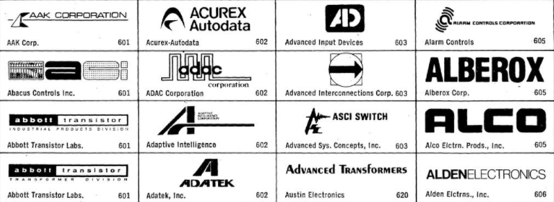
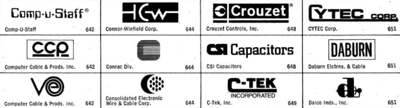
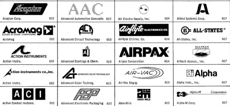
I found a big catalogue of logos from the 1980s tech companies to look through as inspiration for my own.
To begin with, I began researching logotypes from the 80s and 90s. Eventhough these decades are known full of bright and colourful styles - I wanted to go for a monotone logo as I wanted a 'minimalist' style to be included somewhere in there. I wanted this logo to be able to work on any background, shirt or label and so black/white logos work the best as any colour can be added to this.
I found a big catalogue of logos from the 1980s tech companies to look through as inspiration for my own.


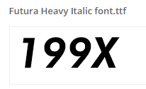
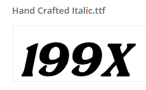
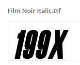
I then looked at fonts which I could use for my typographic logo.
|
|
|
|
|
|
|
|
|
|
|
|
|
|
I then attempted to recreate this kind of typography I found during my research to possibly use for my own typographic logo.
|
|
|
|
|
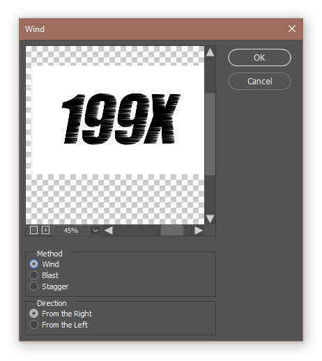
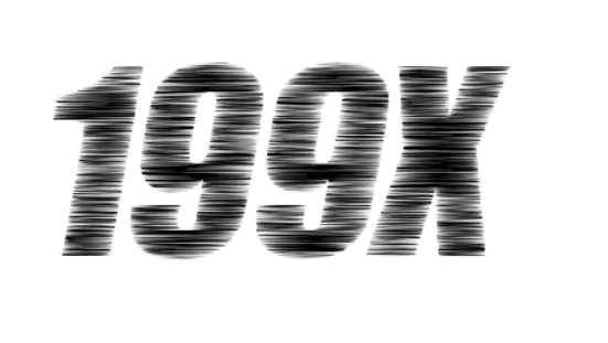
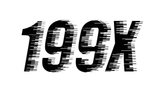
Using Photoshop and Stylize Filter named "Wind", I am able to recreate the same filter seen above with the fonts.
|
|
|
|
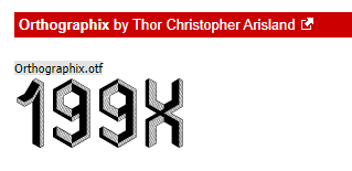
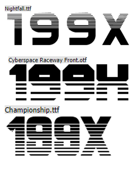
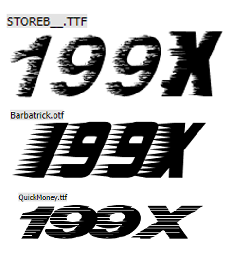
A few of the logos I researched, used an interesting style of lines and so I decided to attempt this but use small 'pixels' kind of style
|
|
|
|
Using the "Shape Builder Tool" in Illustrator, I was able to replicate this style of logo.
|
|
|
|
|
|
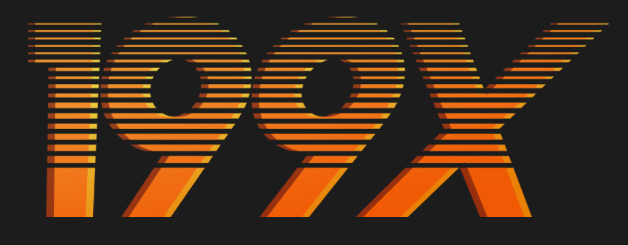
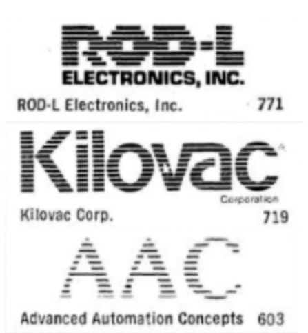
This logo I found, used line to create each letter to make up the logo.
|
|
|
|
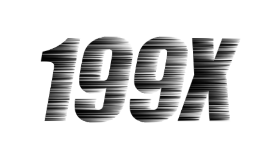
Similar to the one above - however this time it was much more leaning to the side and used thinner lines.
|
|
|
|
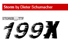
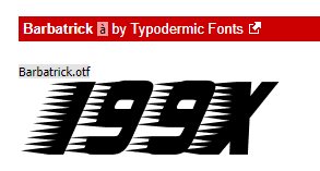
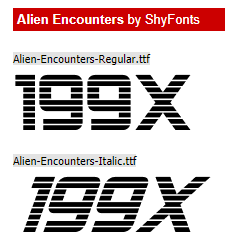
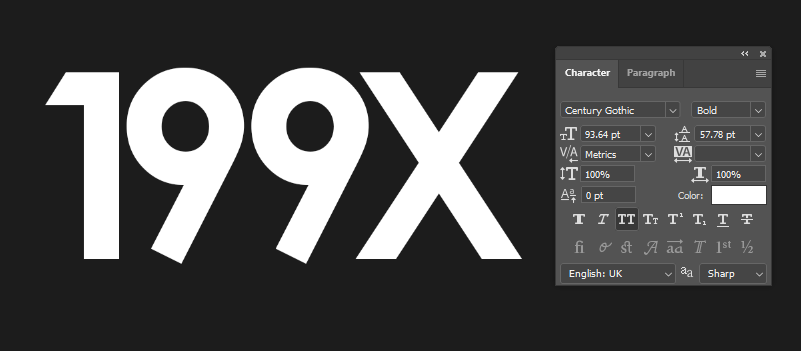
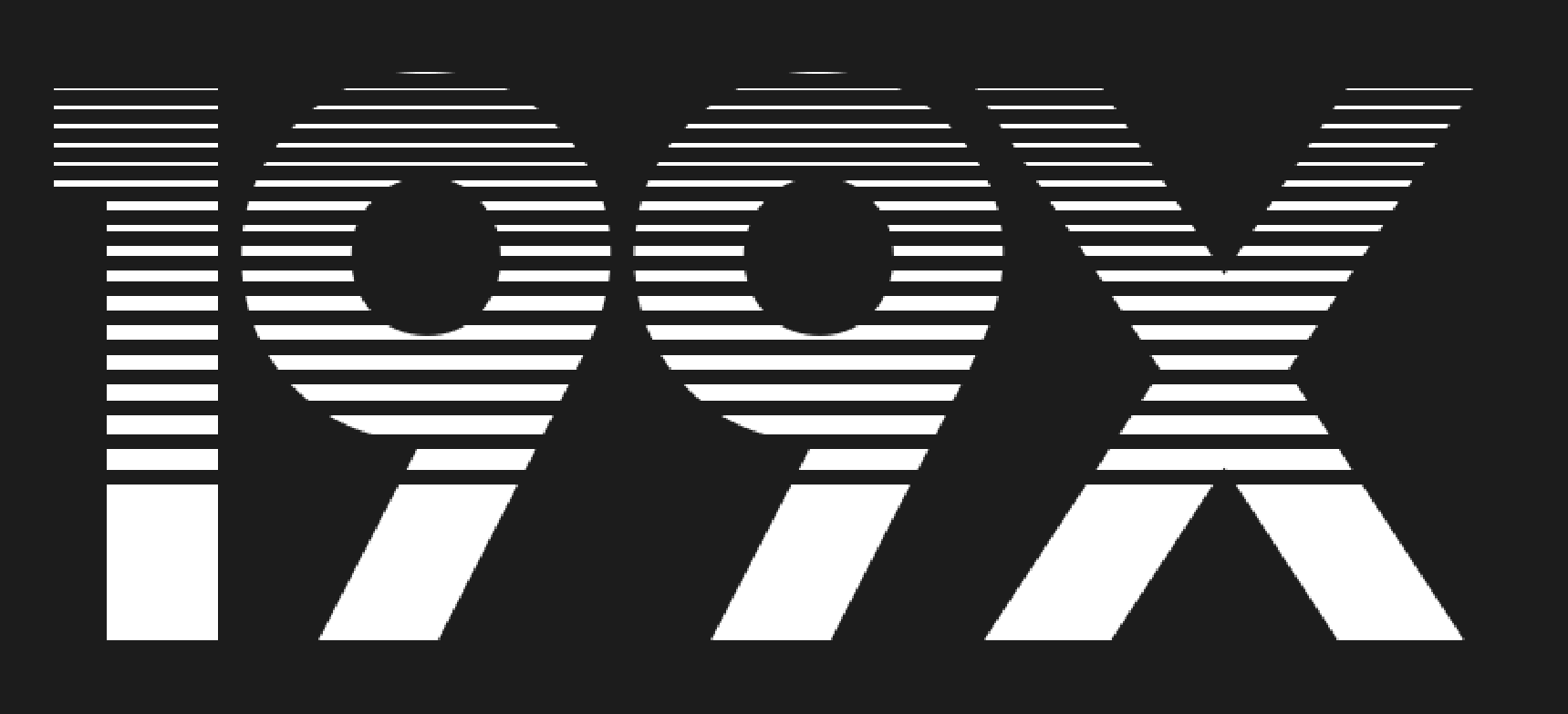
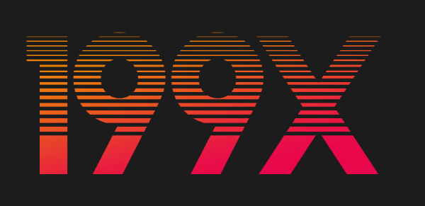
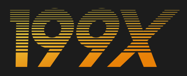
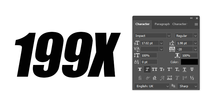
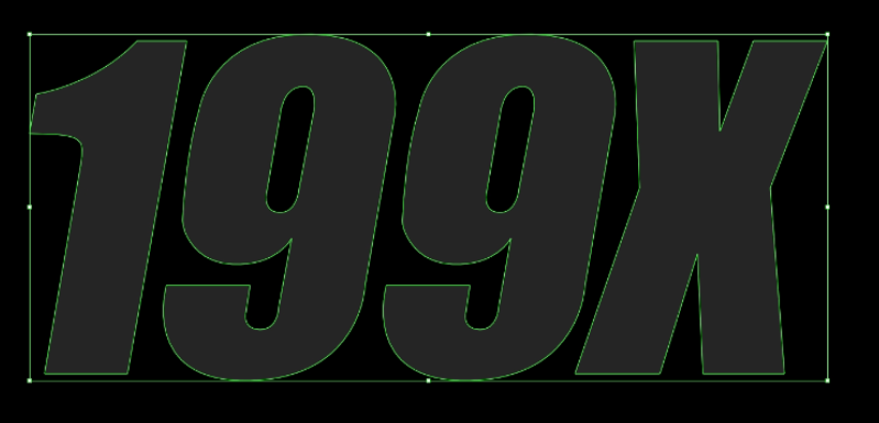
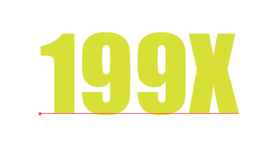
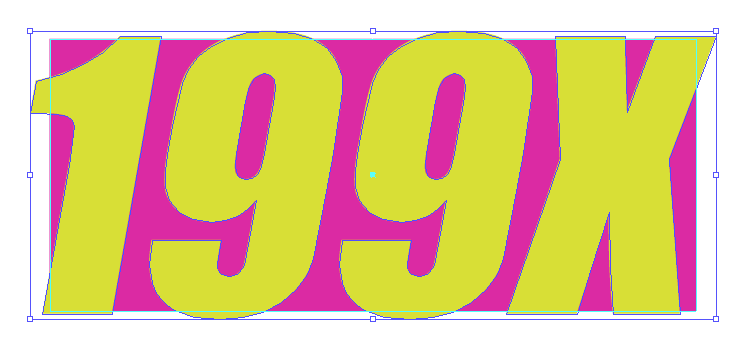
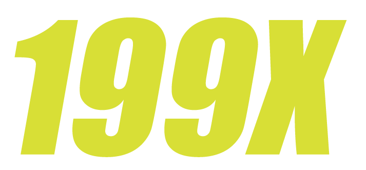
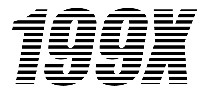
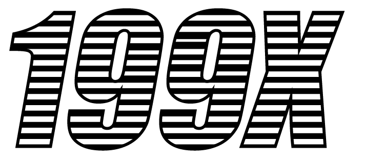
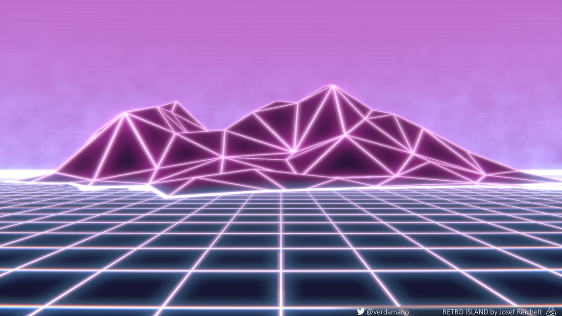
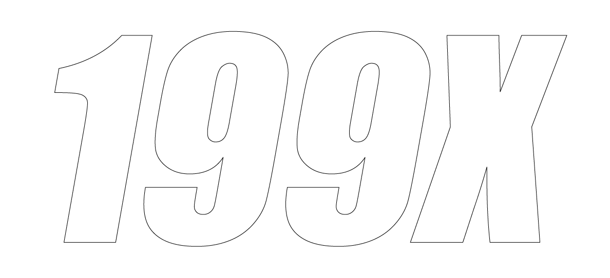
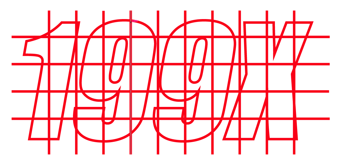
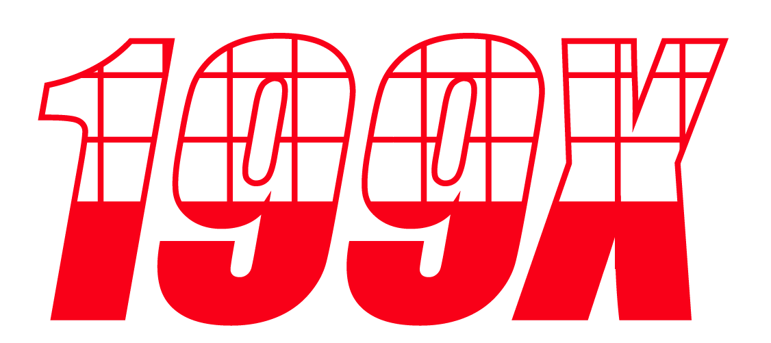
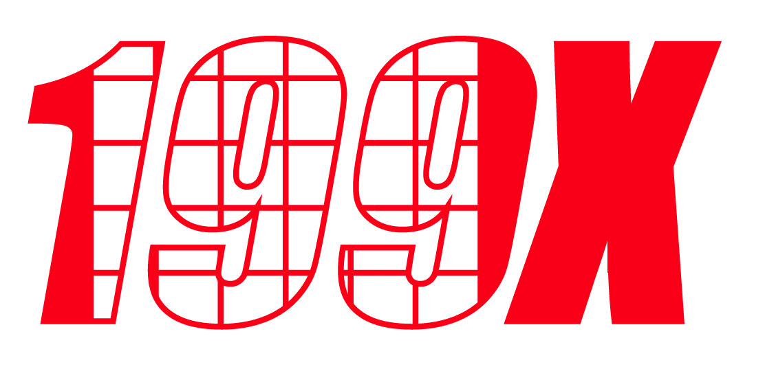
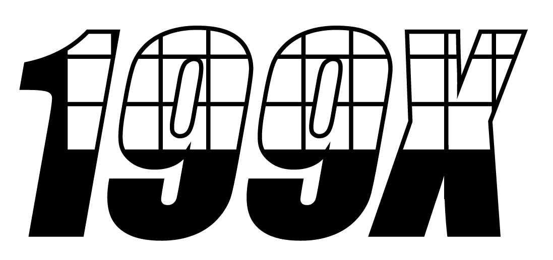
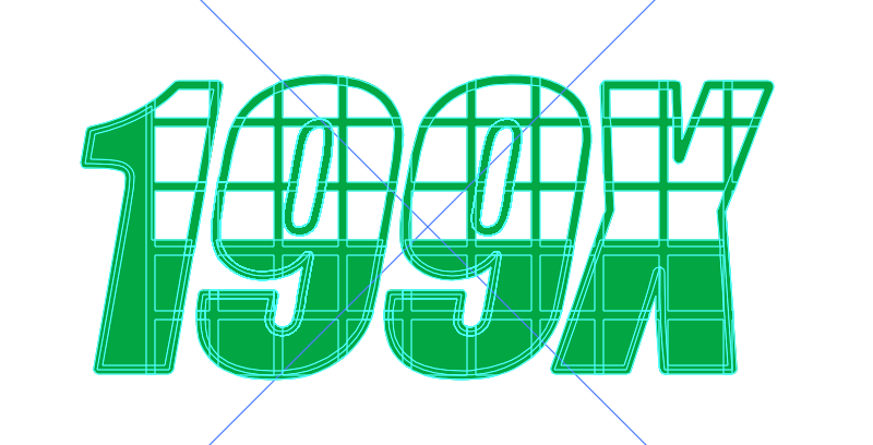
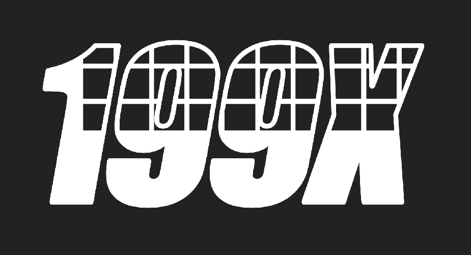
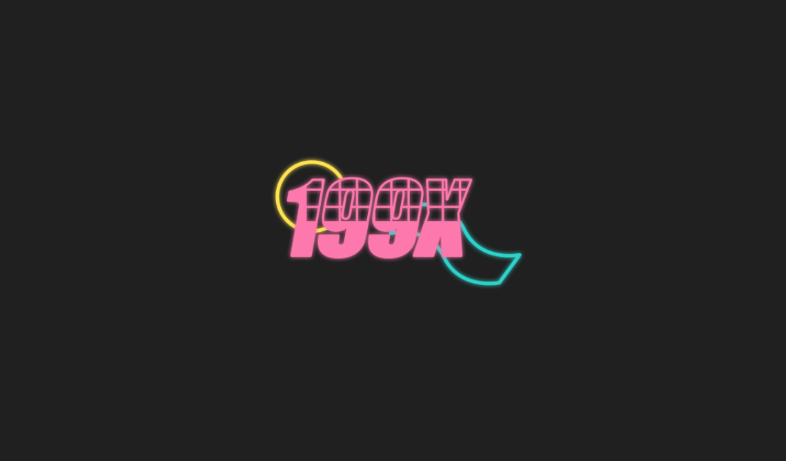
Videogames from the 80s and 90s were very low quality and used "wireframe" to show the shape of an object before the art or "texture" was applied. I was very inspired for this look and the previous logos I attempted had a slight hint towards this and so I decided to attempt making a wireframe logo. I settled on using the IMPACT font as I liked the simplicity of this font however it still had a retro/90s feeling.
|
|
|
|
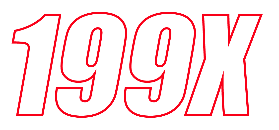
|
|
|
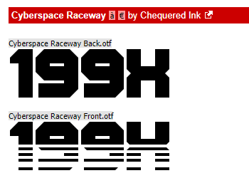
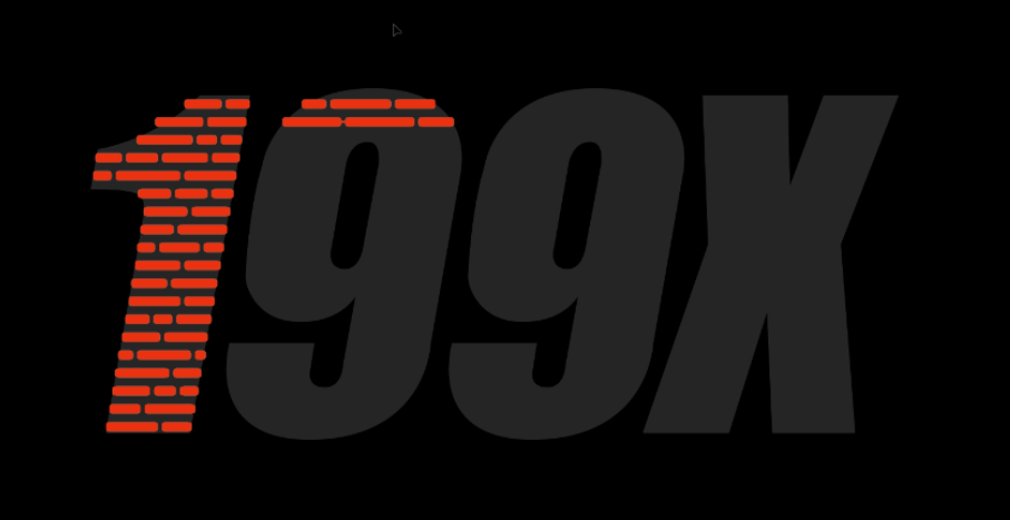
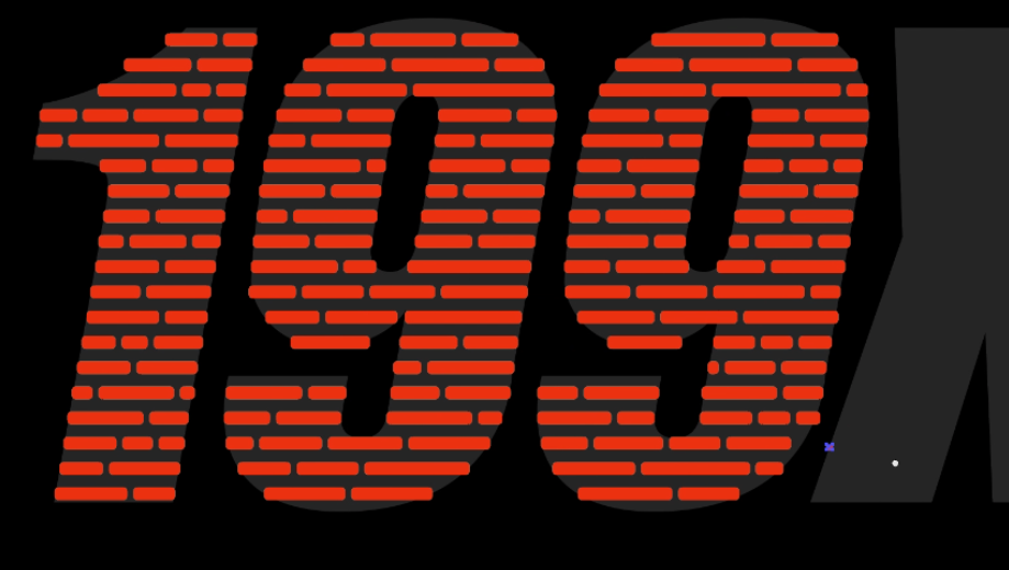
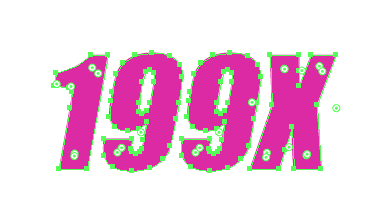
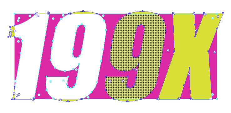
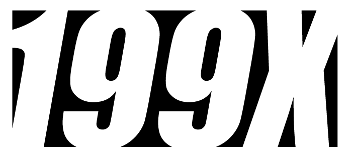
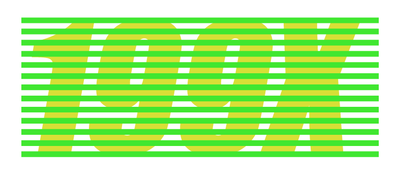
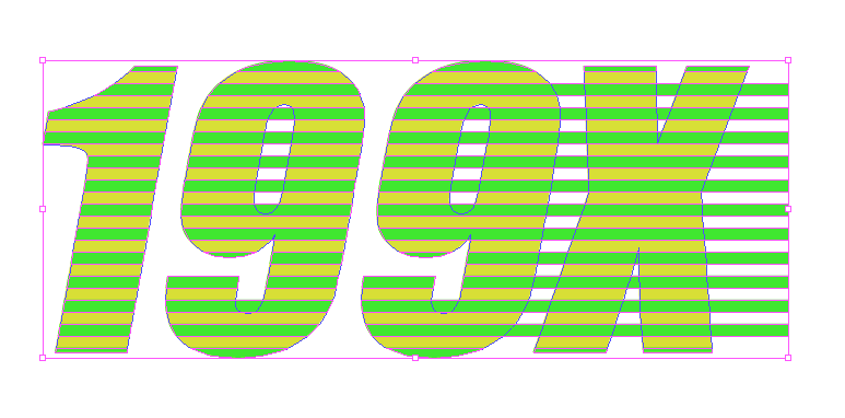
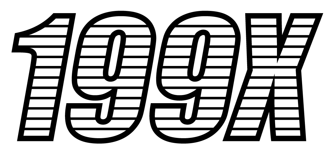
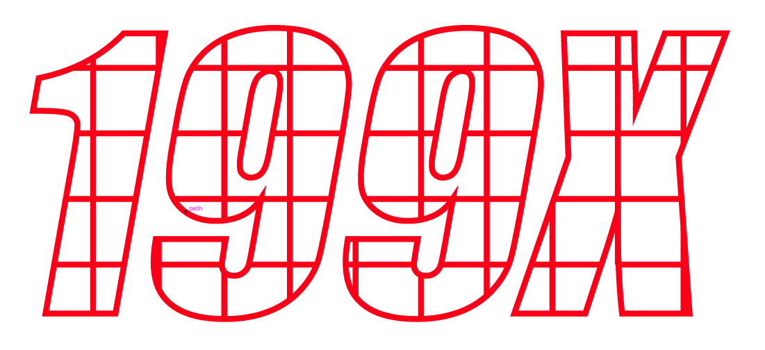
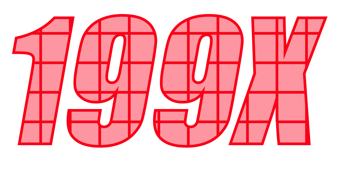
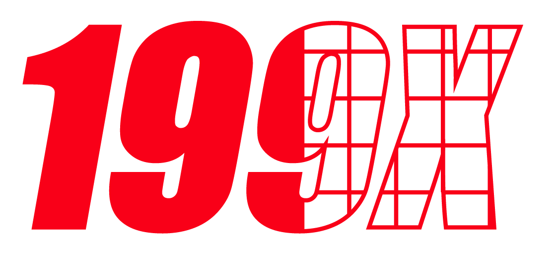
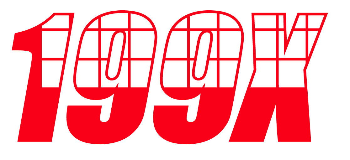
I then decided to try and fill the logo but only with a certain section so that the rest is still seen as the wireframe as if some of the texture is seen whereas the other half still shows the 'barebones' and 'skeleton' of the logo.
|
|
|
|
|
|
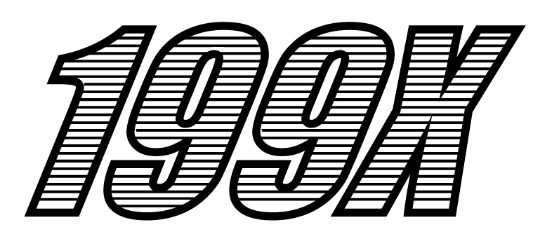
Further Logo Development
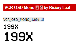
One of the skateboard clothing brands I looked at used a rotating logo for their website so that the logo was never stationary but instead always spinning around. I really liked this and wanted to recreate it for my own website.
Using Adobe After Effects, I was able to make a simple video of the 199X logo rotating around and make that into a gif which loops - this would then be used on the website as the header.
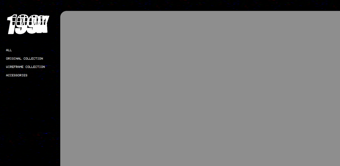
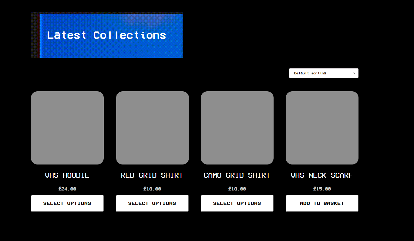
Website Development
Mockup Stage
I then moved onto make the website where the products would be displayed and sold. For inspiration, I used Pass~Port which had a very nice website in my opinion. I then used the program "Figma" which I used to make mockups for the website using the inspiration of 80s and 90s looks vhs along with this Pass~Port website layout.
|
|
Using Figma I began by creating the homepage. This program is useful for making Mockups for websites and UI designs to be then used to make the real thing and works similarly to Adobe Illustrator.
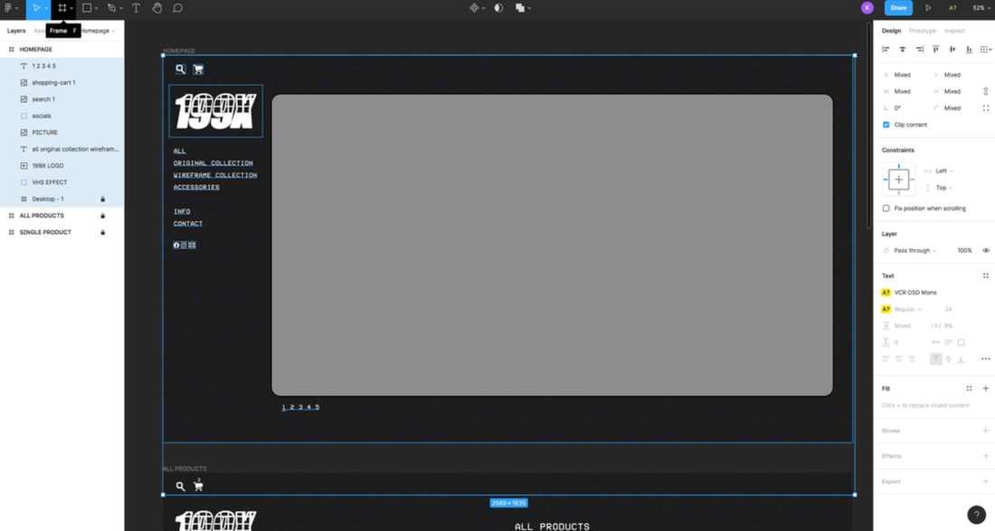
The use of the right area containing an image would be used to display products, videos or a slideshow to showcase the clothing and accessories in the real world. The menu on the left would contain the logo of the brand which rotates.
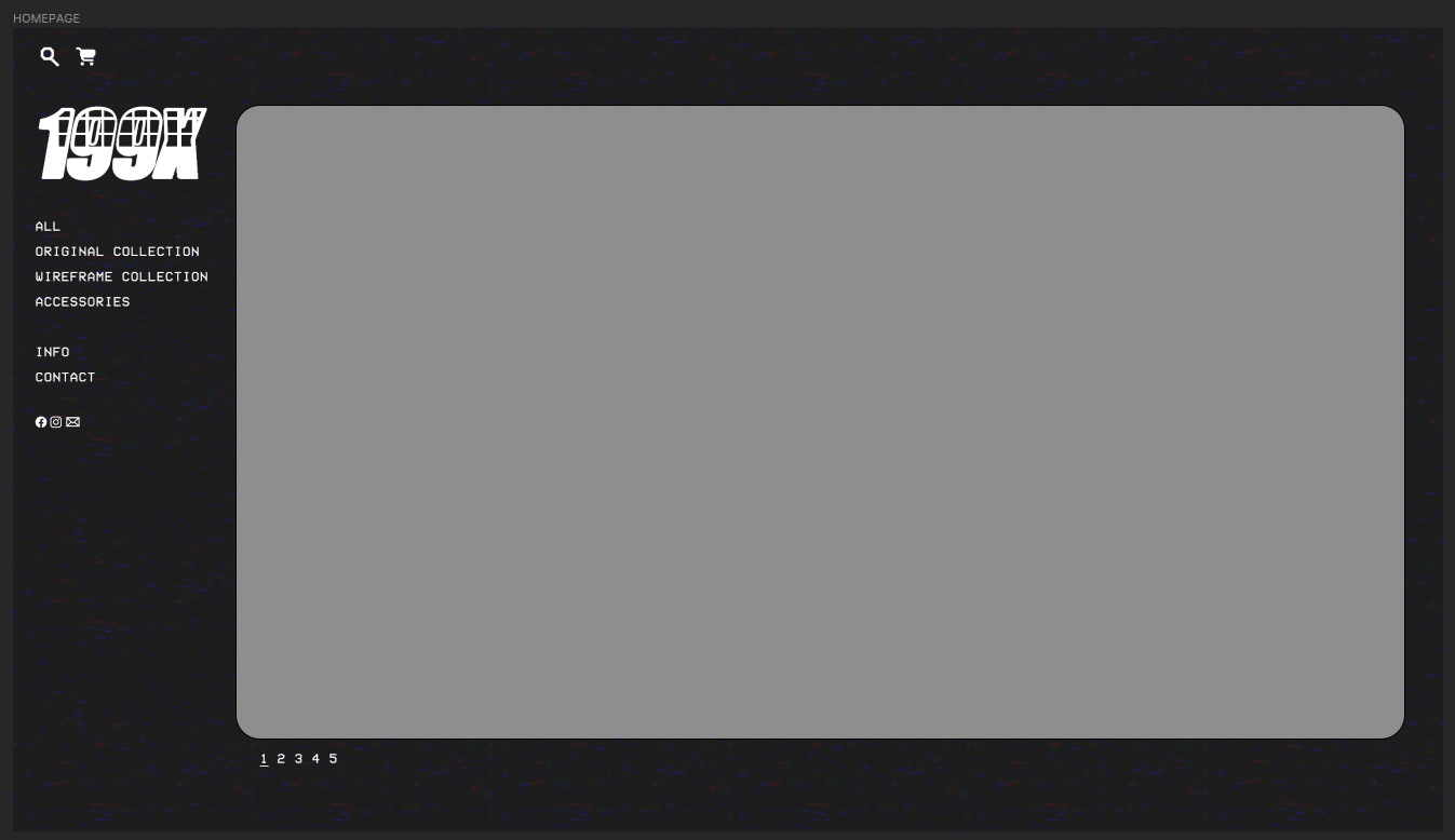
This page would contain a listing of all the products in a grid-like style so that the viewer would be able to see multiple products and scroll through to see if they like anything from the list.
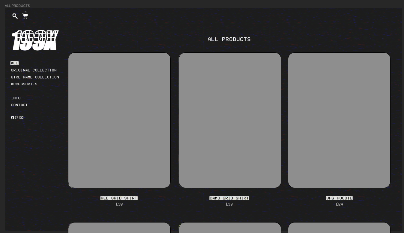
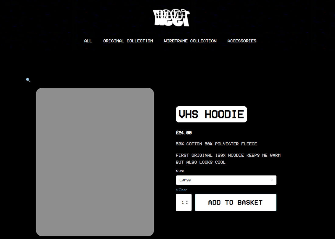
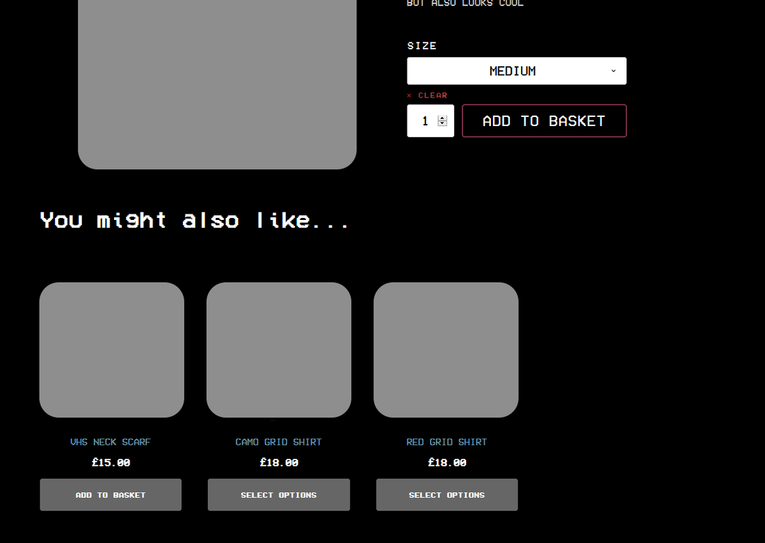
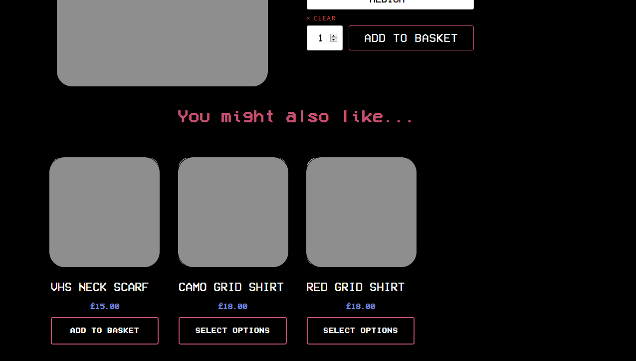
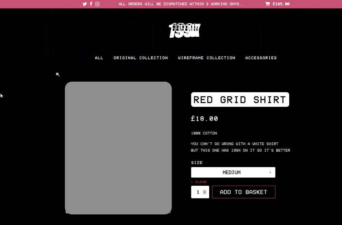
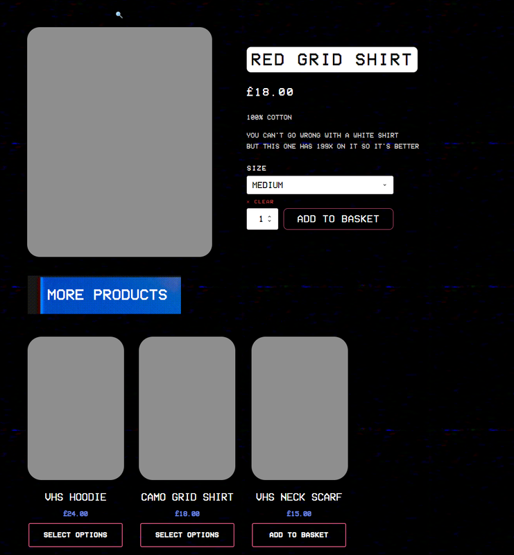
This final page would be the 'Product Page' where the page would display a single product with a title, images, description and an "Add to Cart" button.
This page would be simple and clean - I like the look of this mockup page.
This page would be simple and clean - I like the look of this mockup page.
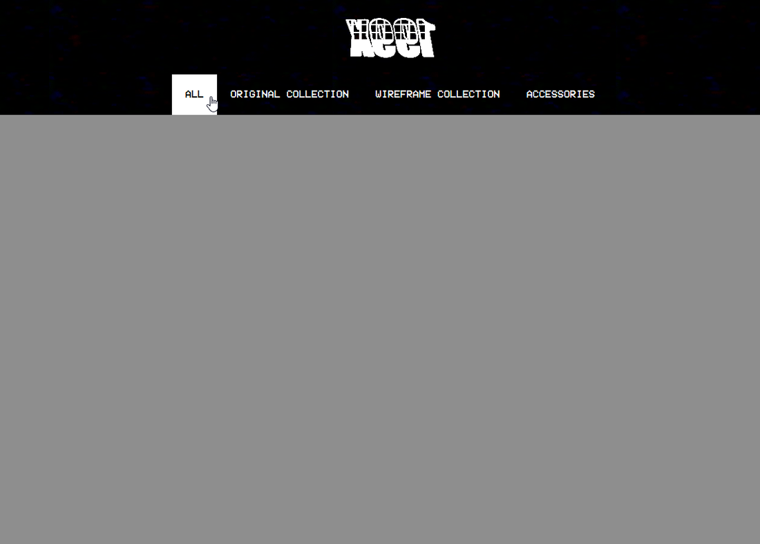
Website Development
Creation Stage
This was the lengthy part where I (and a friend of mine to help with the complicated process) were creating the website from scratch using Wordpress and a plugin called "Oxygen" along with custom code to really make this an original website that would be custom to the brand.
|
|
After attempting both side (as like in the mockup) and top menu (as an idea), I decided that a top menu would suit better as then an image, slideshow or video could be included below which I think would look much better than a side menu.
|
|
|
|
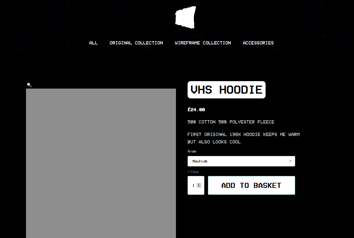
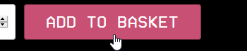
After consideration - a colour scheme was made to add more than just having a black and white website which would make the website more interesting and depth. The colours I decided to use were a pinkish-red and a purple-blue which were inspired by the RGB lights that are in TV's. Not straight from a TV but these colours work very well with black and white and make each colour stand out together and apart.
This colour scheme was then used throughout the website such as the buttons.
|
|
I wanted to include social media icons along with a basket somewhere with a total and so I decided to put this at the top of the website which would be seen on any page.
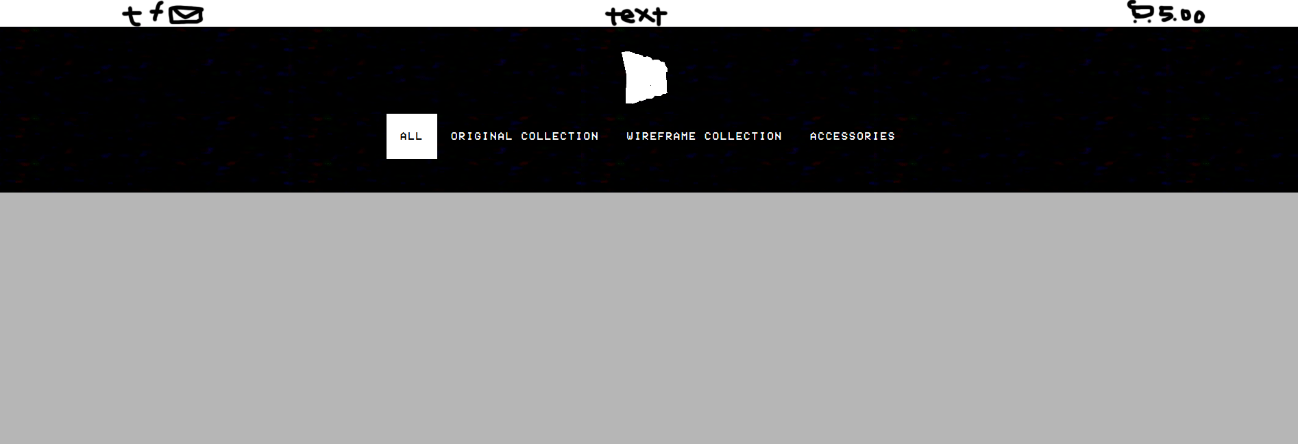
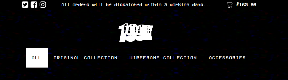
After using black, it did not stand out or look appealing and so I, once again, used the colour scheme pink here to make it stand out.
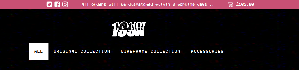
This looked much better on all pages with the use of the colour scheme which was visible all over the website.
Skateboard Designs
I then decided to move onto my skateboard designs which would be displayed on the website. I wanted to create some VHS style skateboard decks that would cover the entire skateboard deck that would look great and match the style of the brand.
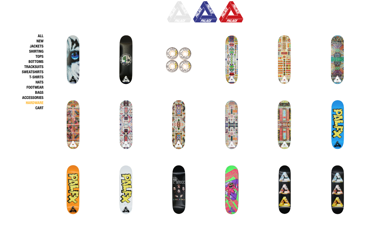
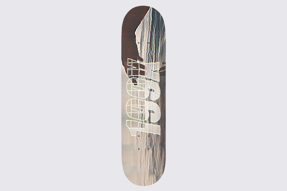
Looking at the Palace website as an example, most of their skateboard decks have artwork that covers the entire deck. Each deck is displayed by a simple white background and the whole deck shown as the preview image.
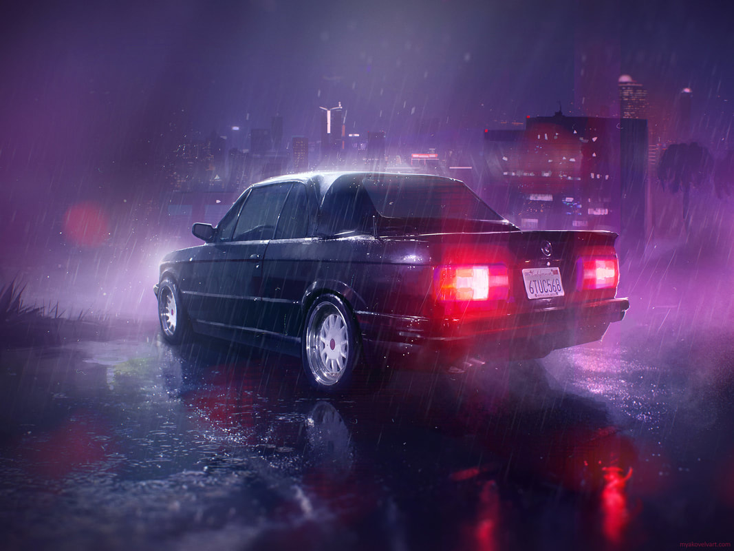
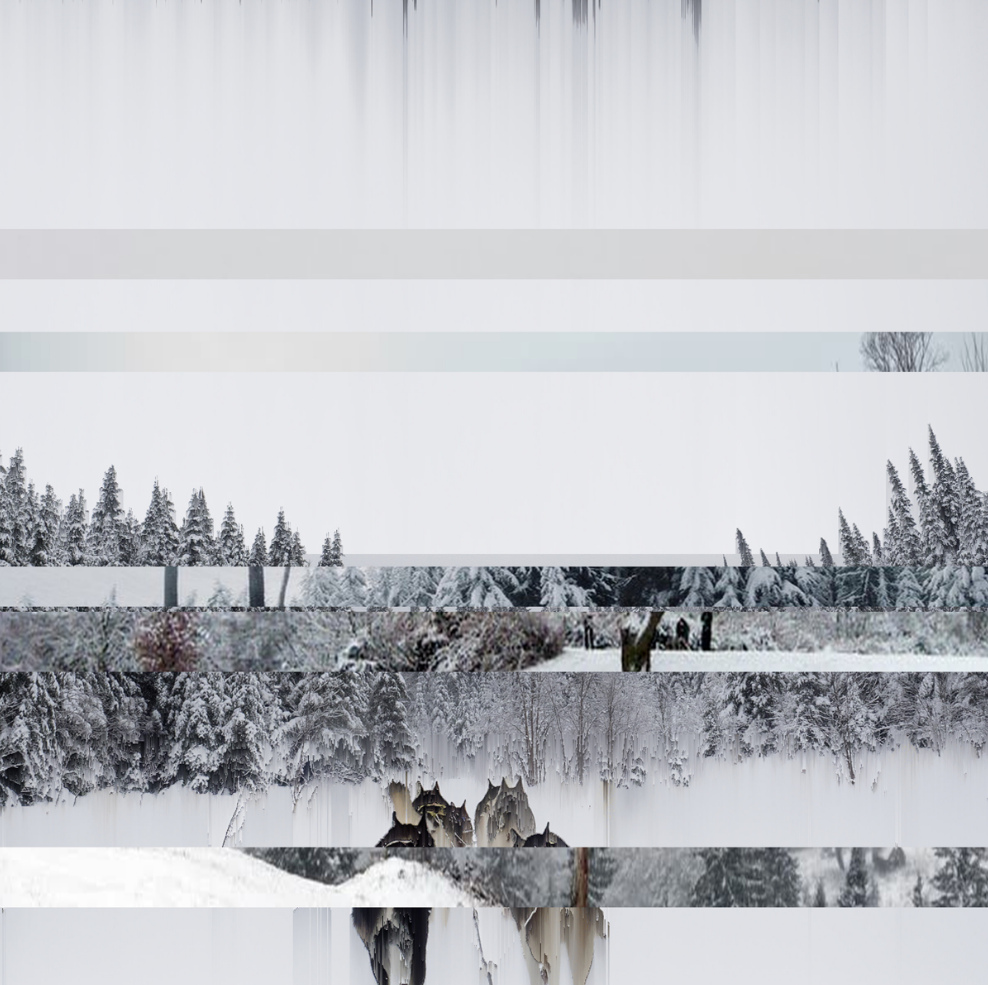
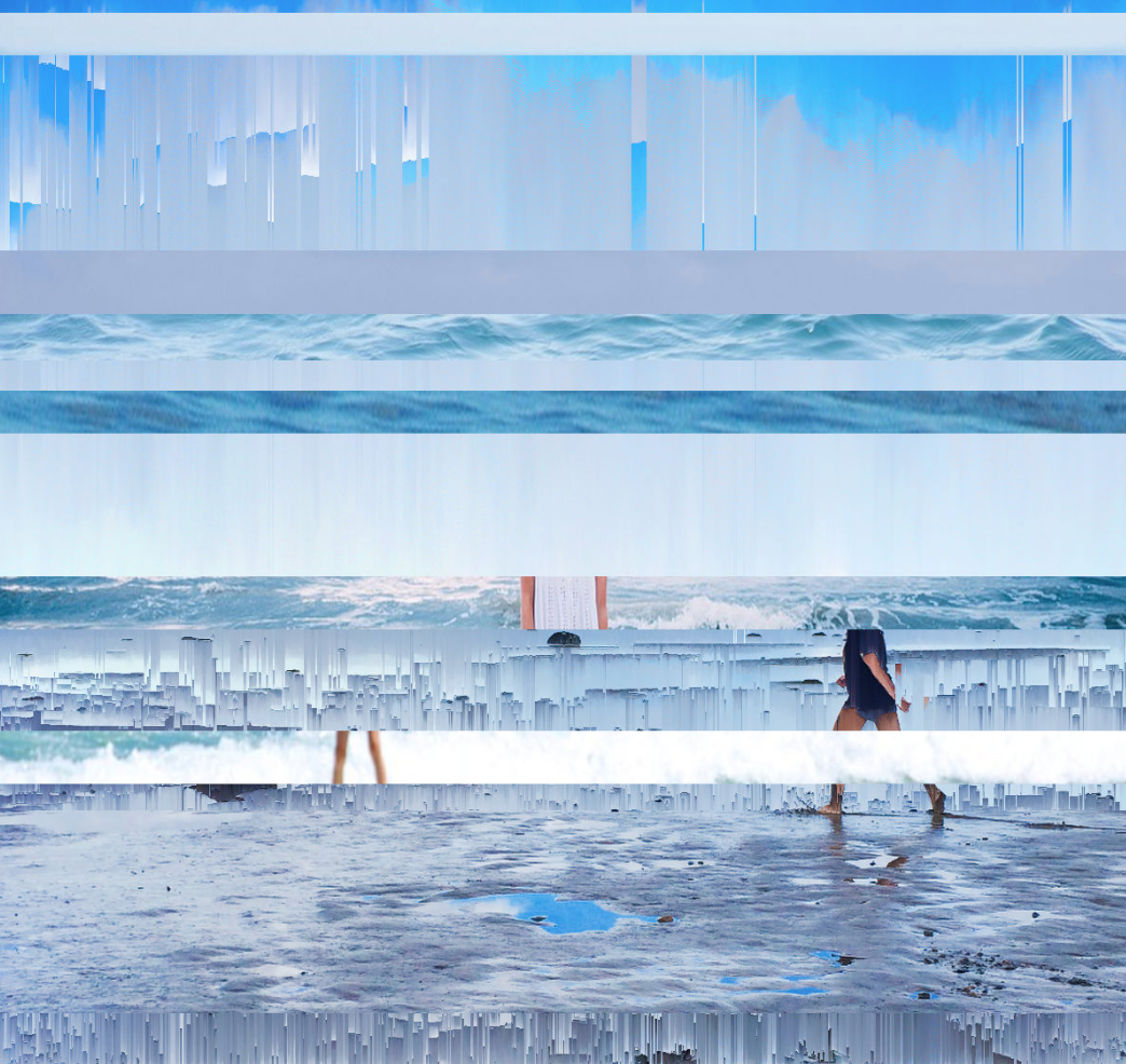
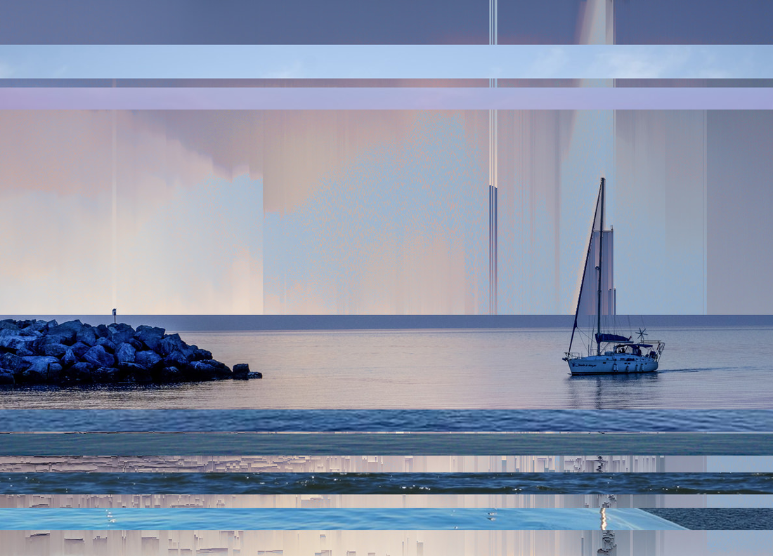
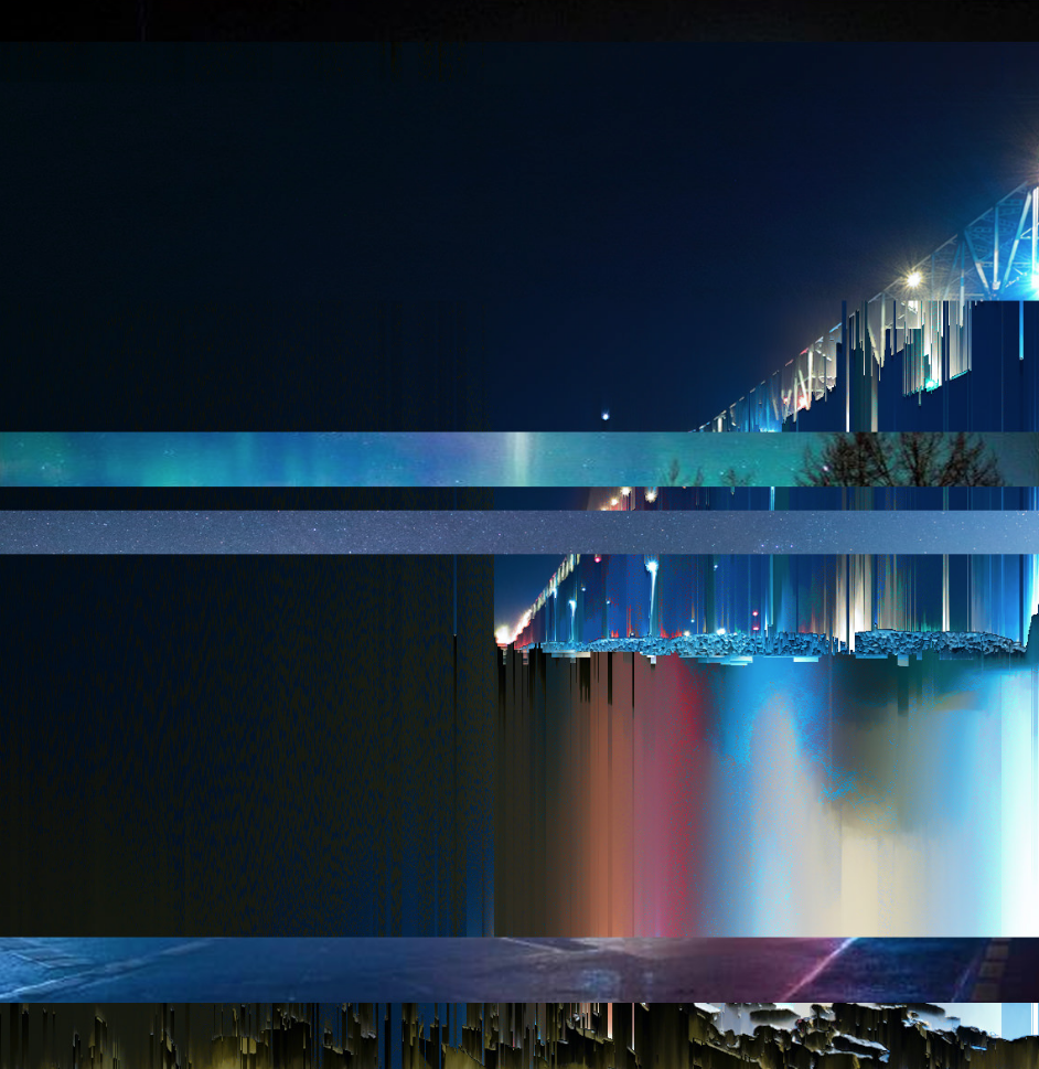
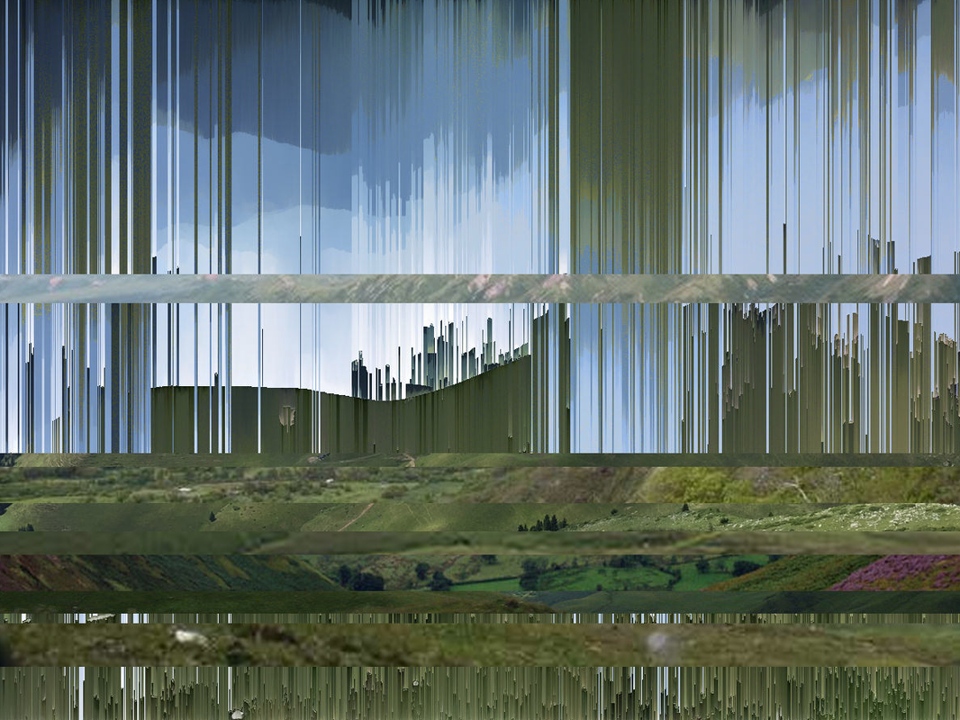
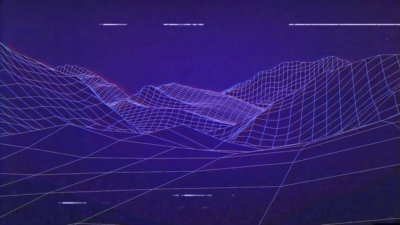
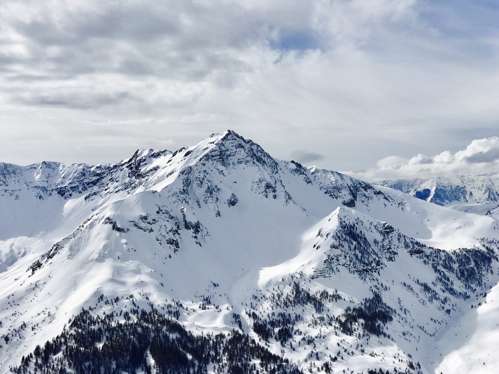
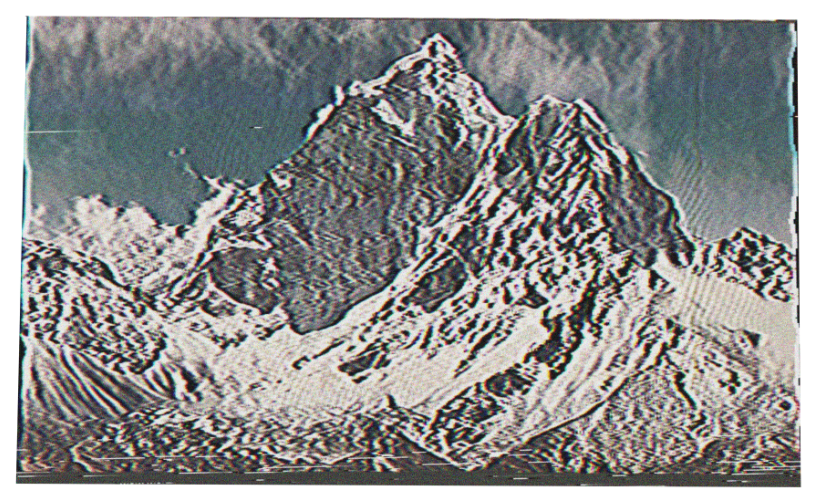
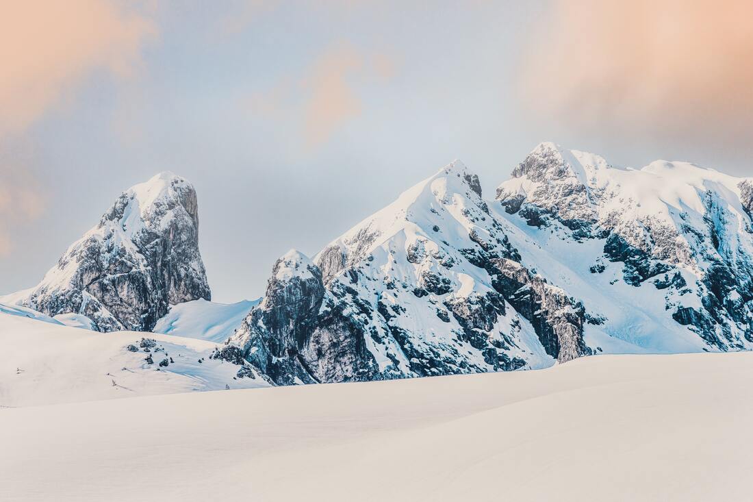
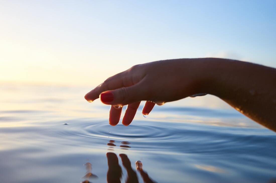
I found this image on the internet and was inspired to make my skateboards in this style of nature or any kind of photography however the image would be styled to be in the VHS/retro style.
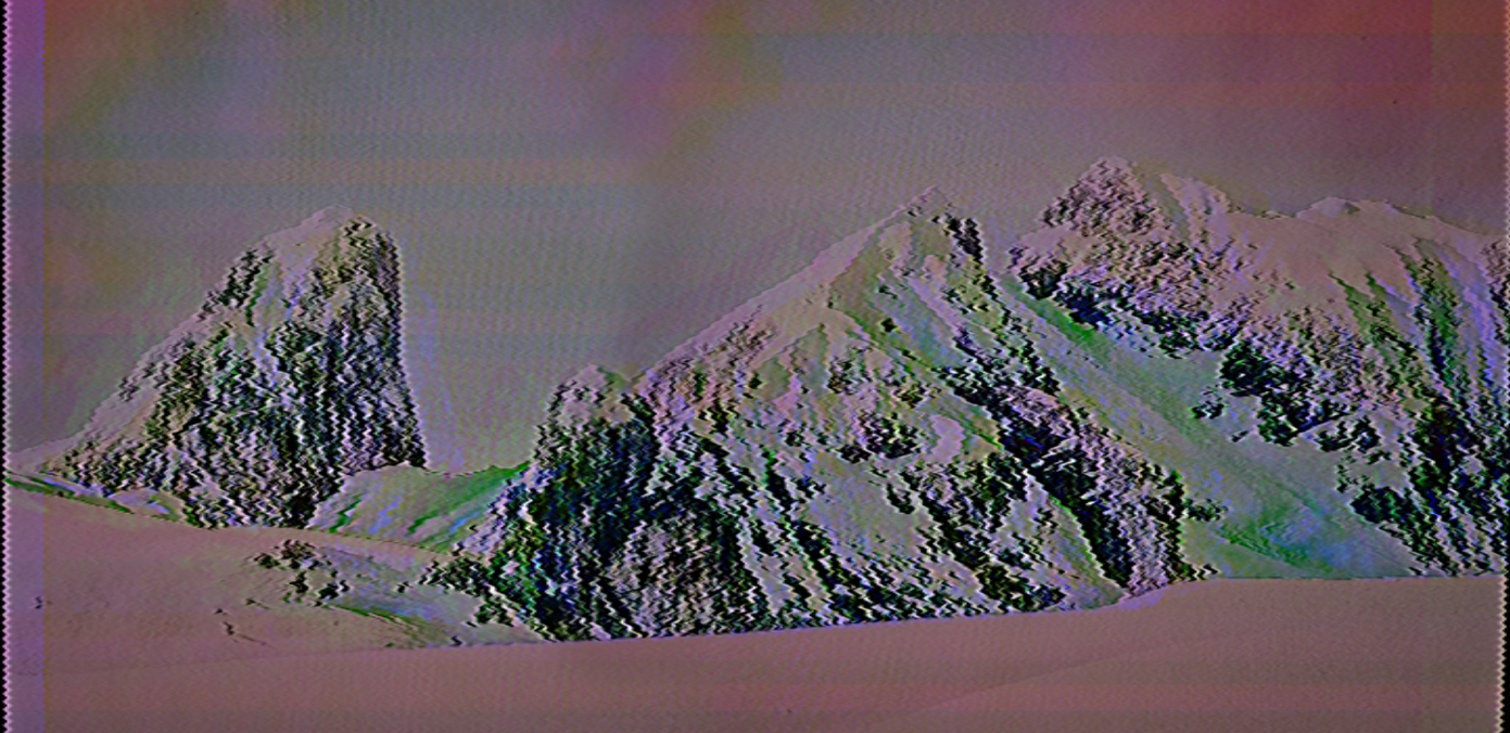
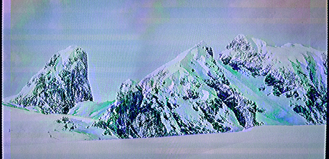
I began by testing out - how to create the style I wanted to create. I began by finding an image that I would then make into a VHS filter style to make the photo look retro and in the style I want.
I began by testing out - how to create the style I wanted to create. I began by finding an image that I would then make into a VHS filter style to make the photo look retro and in the style I want.
|
|
|
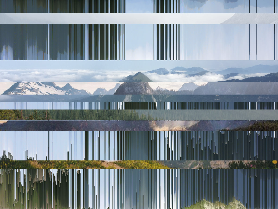
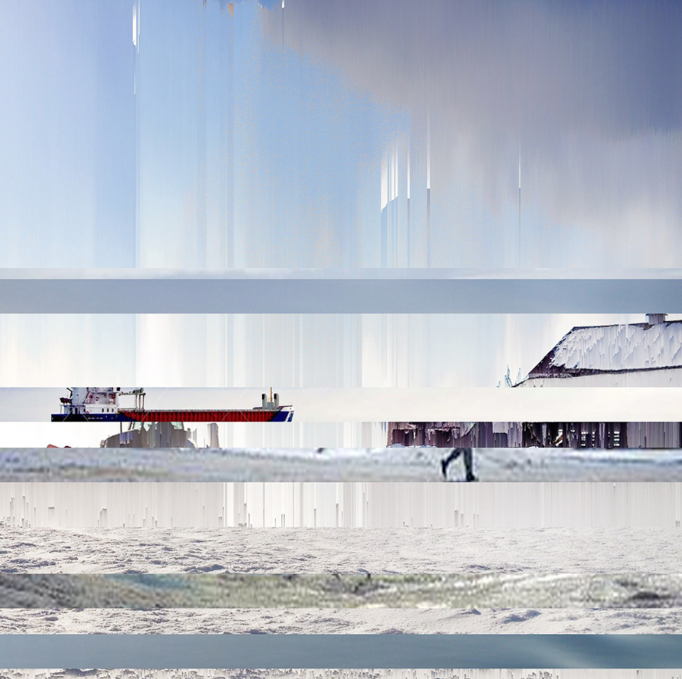
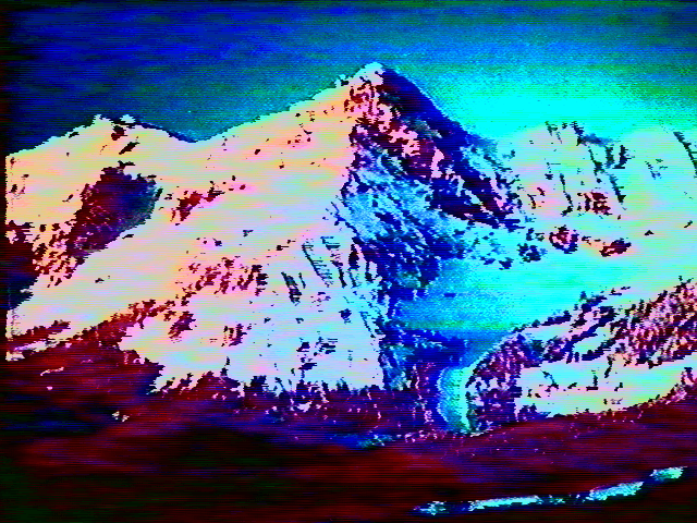
I collected photographs of snow mountains to use in my test and then used an app on my phone to make it into a VHS effect filter. This is what my outcome was once the image was overlayed with the VHS effect. I was happy that this effect made it look quite retro and it seemed as if this image was really taken ages ago compared to the original photograph which is newer, higher resolution photograph.
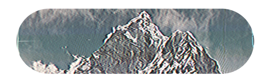
Then, I created the skateboard shape to put the image onto.

|
|
|
|
I was able to create these two test skateboard deck designs which I was happy with and so I used the same method to make my actually three skateboard deck designs to be put on the website.
|
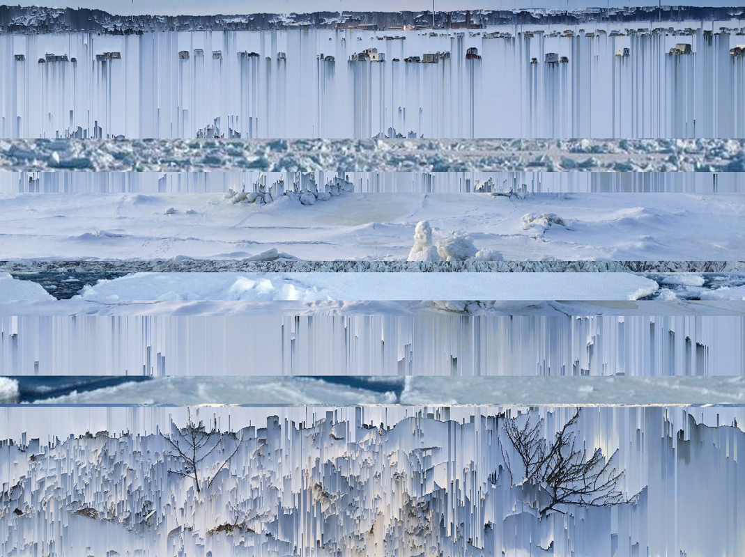
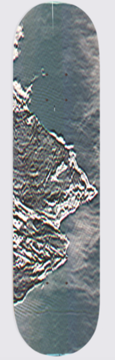
I selected three images from Unsplash.com to use on my designs. My first one was Snowy Mountains again however, this time I wanted to make it look better than the previous one from my test.
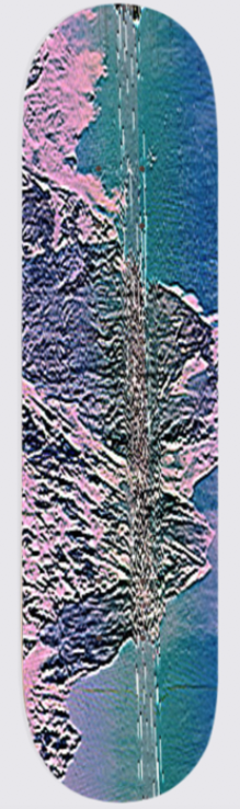
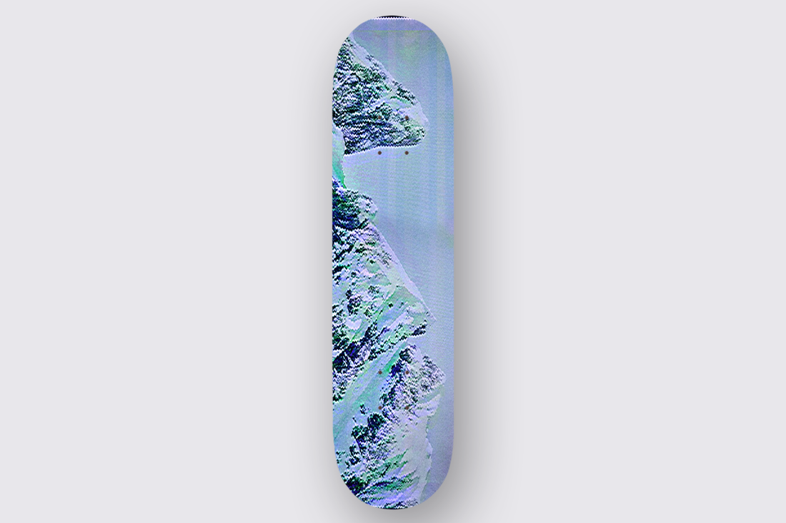
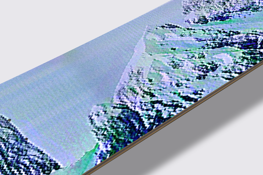
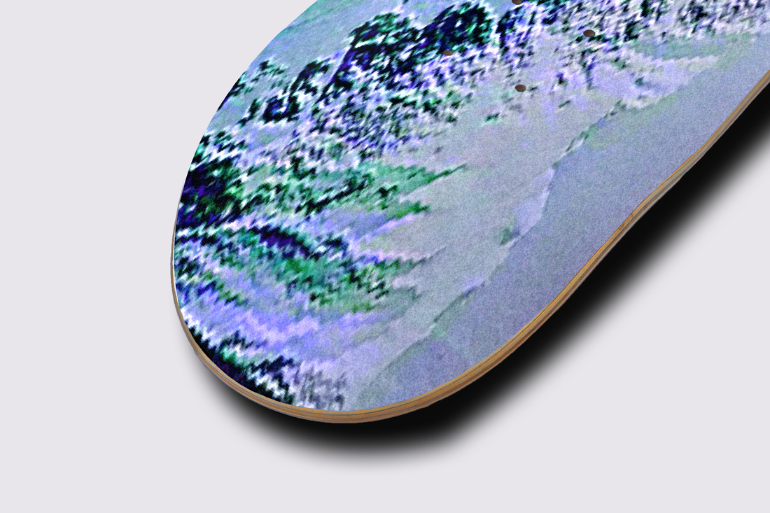
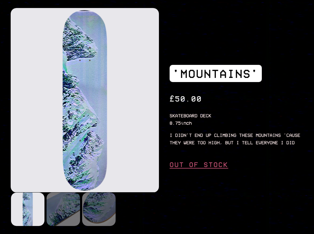
'MOUNTAINS' Skate Deck Design
I then made this image into the VHS/retro style using my phone app.
I felt like the image was too dark and did not have enough white, blue colours in it to represent the mountains and so in Photoshop - I edited the image to look more to my liking.
With this edited image, I then was able to create a mockup on my first skateboard.
|
|
Finally, I uplaoded it to my store website with the mockups along with a title and a description that I was inspired by PALACE as their description of products usually has nothing to do with the actual product which I think is super unique and funny.
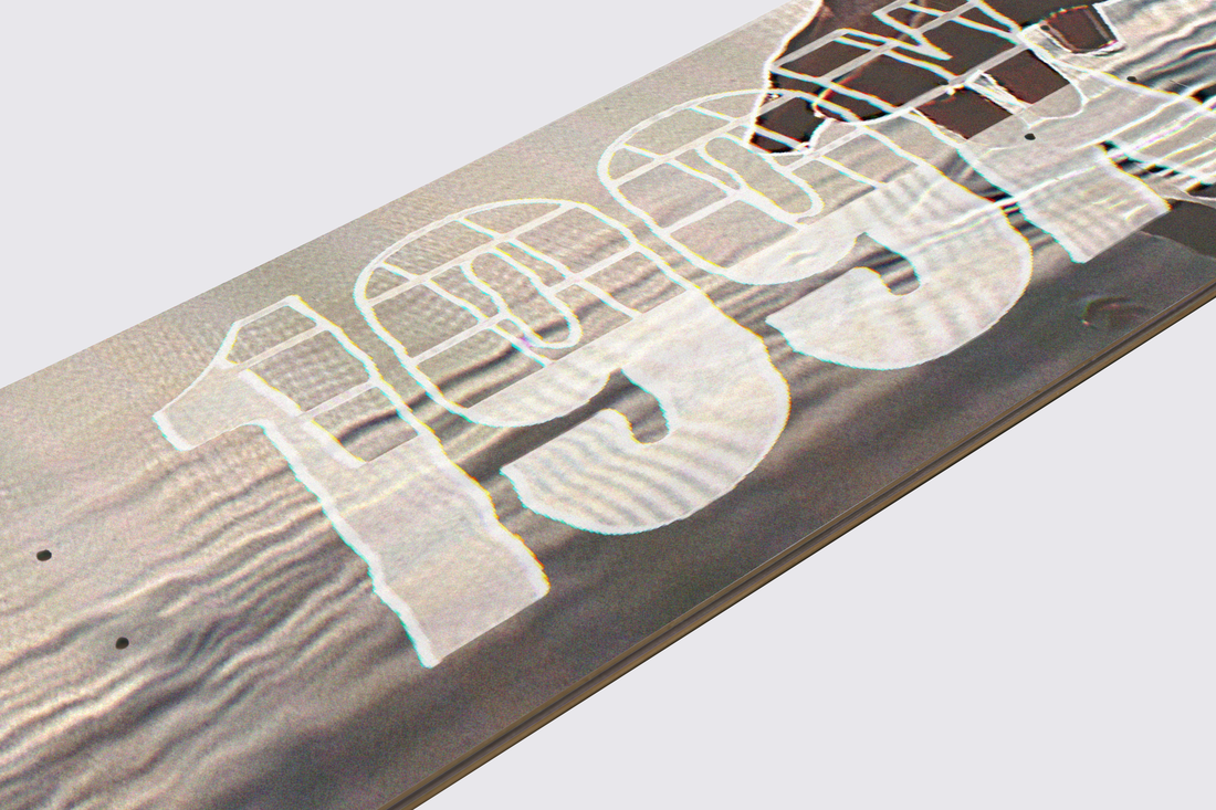
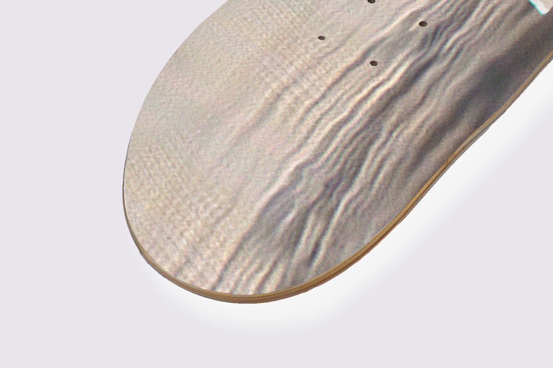
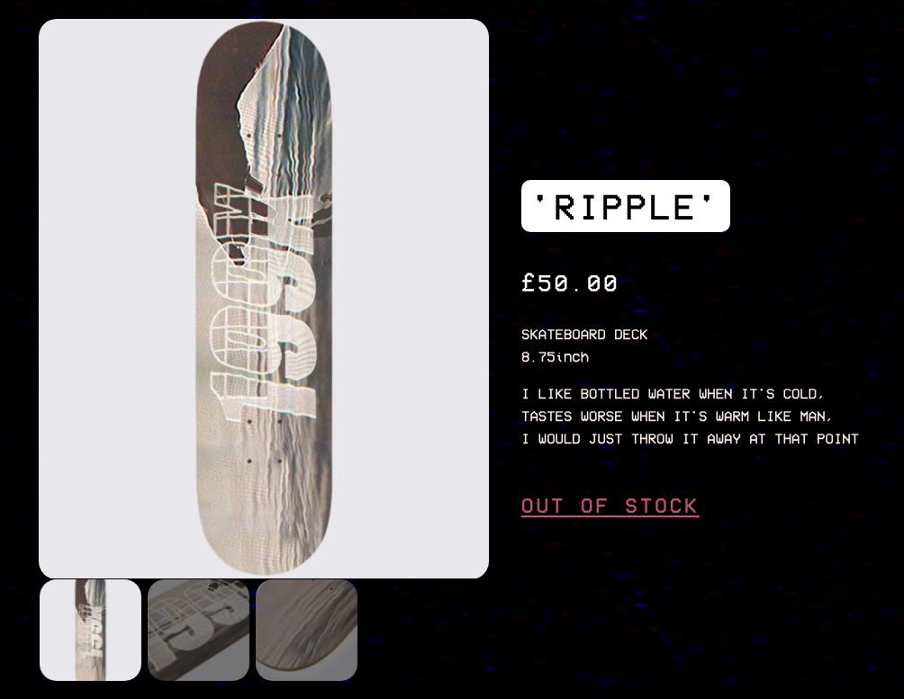
'RIPPLE' Skate Deck Design
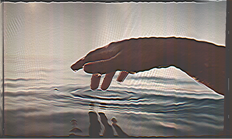
The same process was done to achieve this design for the deck however, this time I decided to add a distorted logo ontop of the image which matched the image style.
|
|
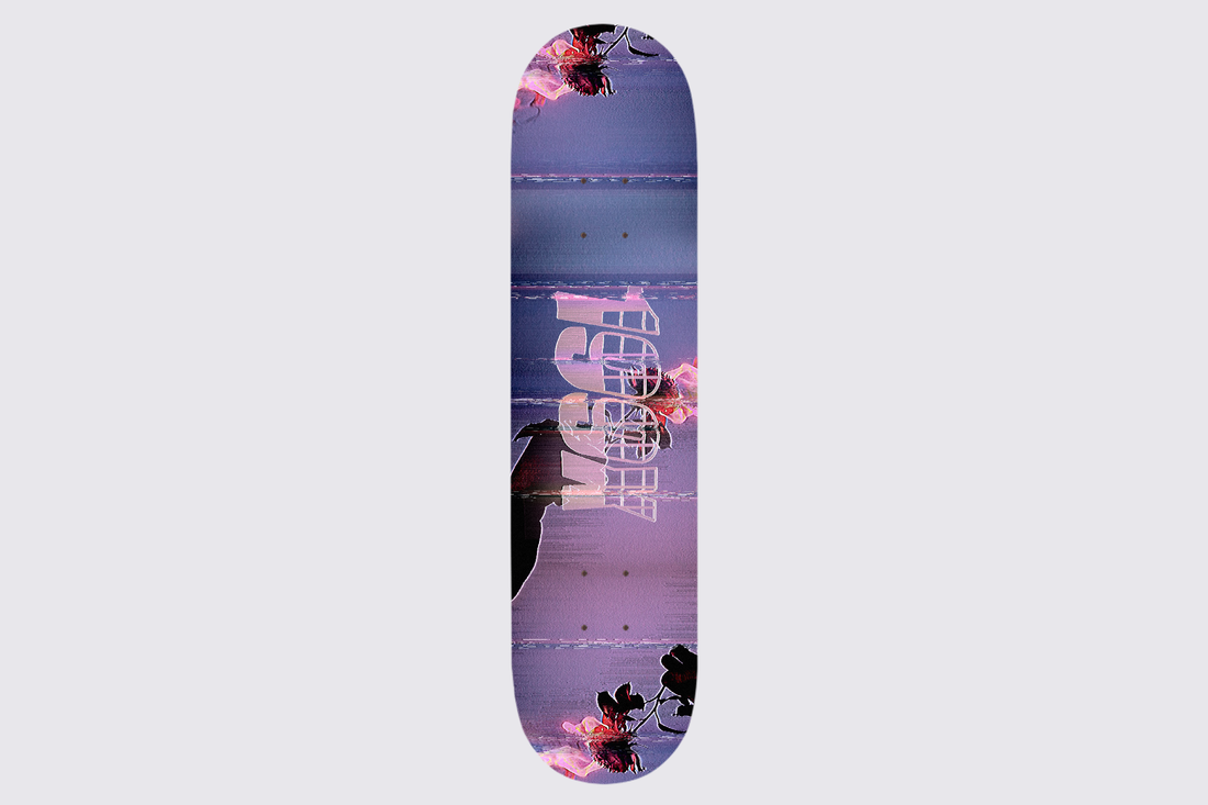
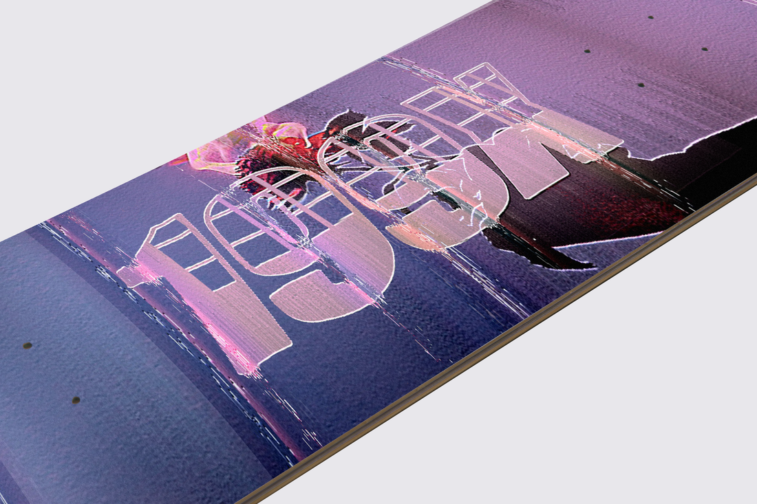
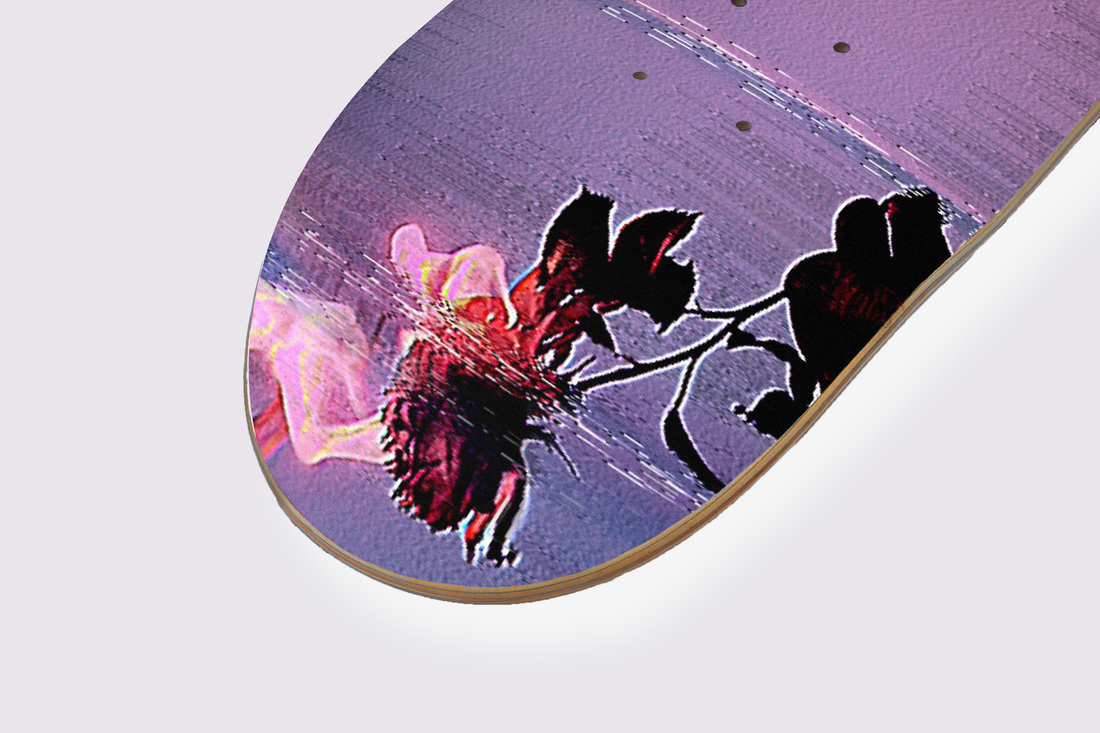
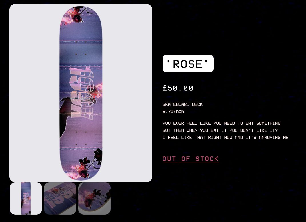
'ROSE' Skate Deck Design
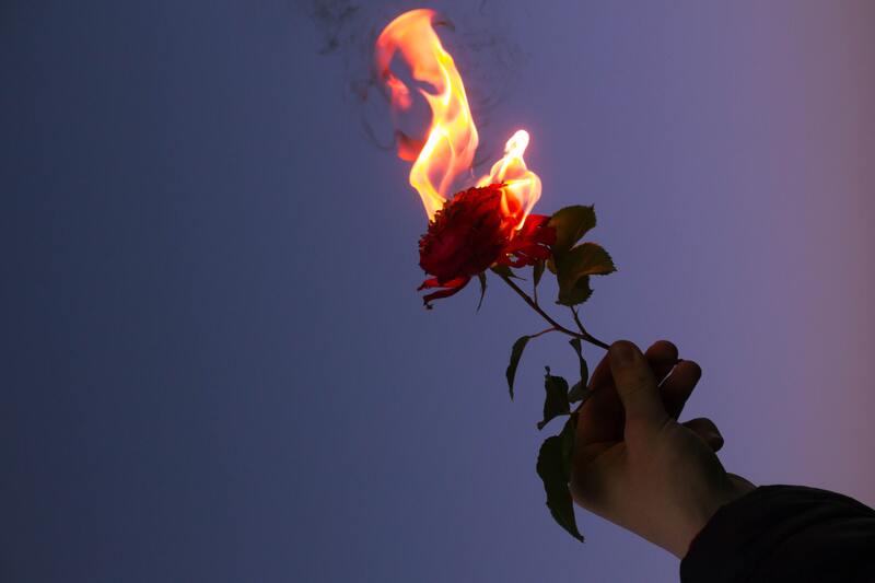
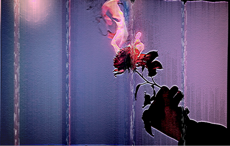
I also inserted the logo into the deck design but I also repeated the main subject of the burning rose into the edges of the deck as I wanted to make a some-what collage as well as a repeating pattern which made the deck look cooler.
|
|
Shirt Designs
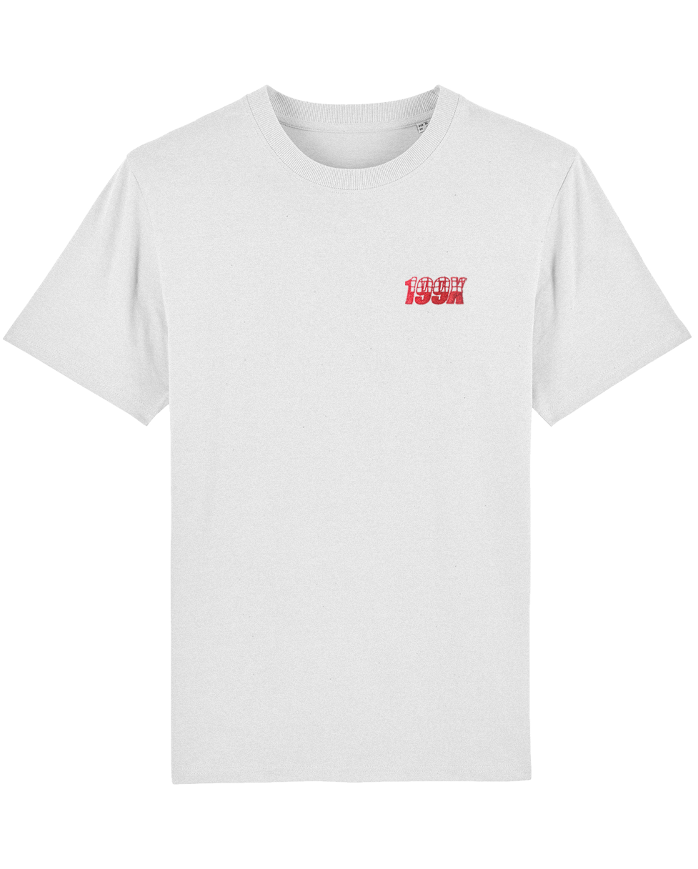
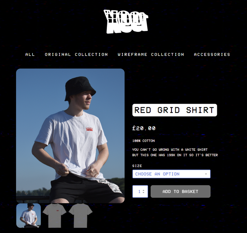
Red Grid Shirt Design
My next step was to create my shirt designs to be put on the website.
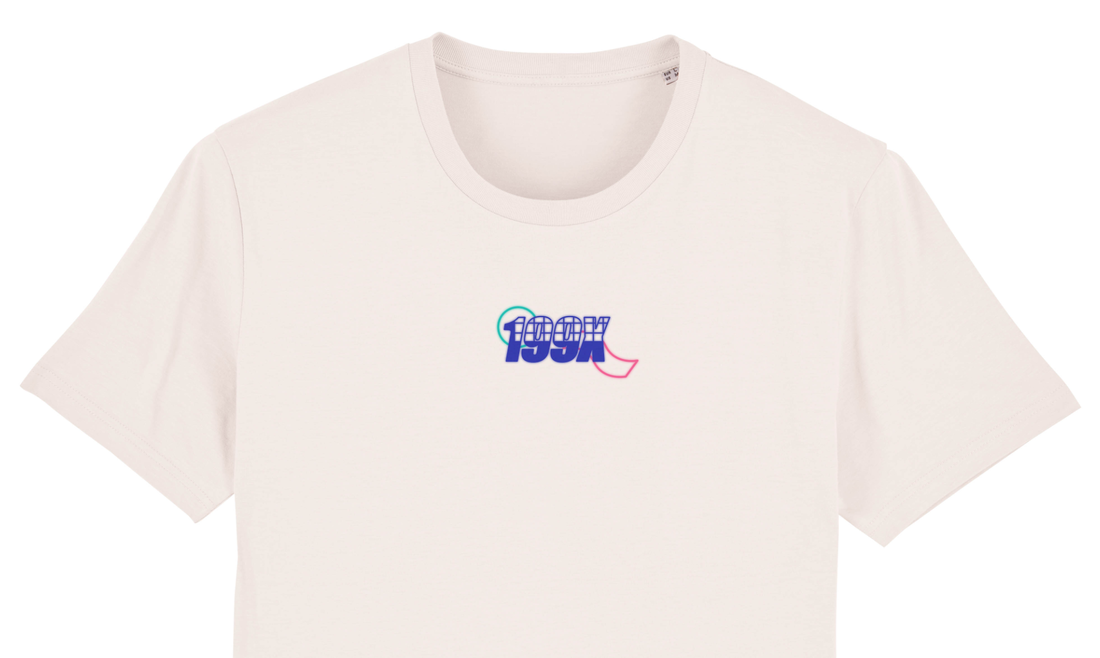
I wanted to make some simple shirts as well as some interesting designed ones and so my first two shirts would be a simple shirt with the logo on the chest for simplicity.
I wanted to make some simple shirts as well as some interesting designed ones and so my first two shirts would be a simple shirt with the logo on the chest for simplicity.
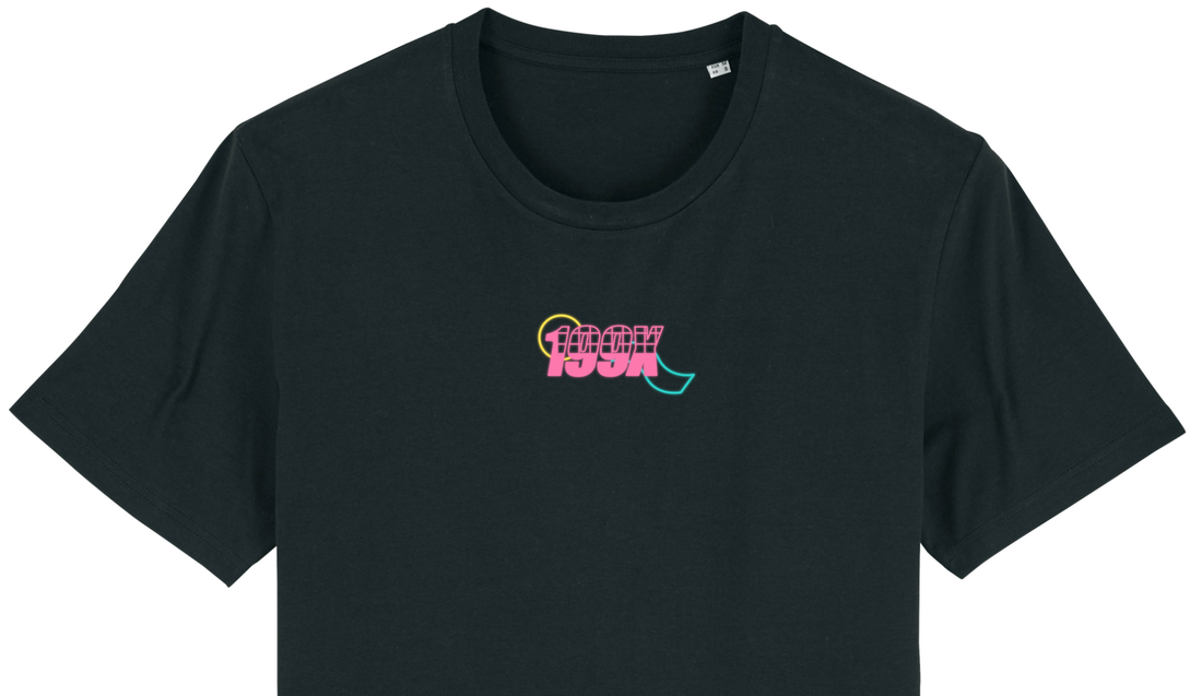
To make this shirt simple, I put the logo I made in Adobe Illustrator and put the logo in the top left chest area of the shirt. This would make a nice, clean shirt for the first simple product.
|
|
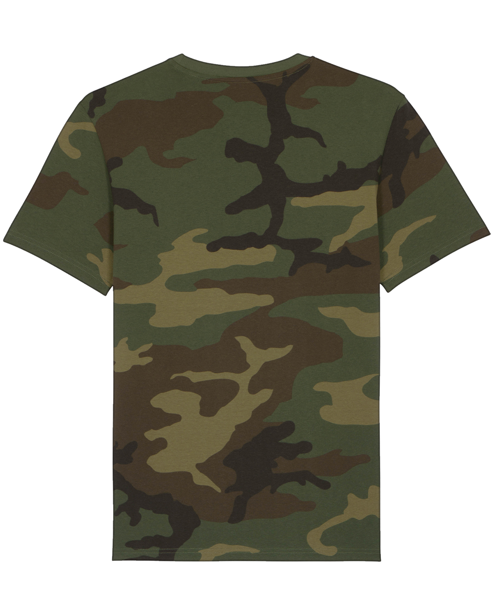
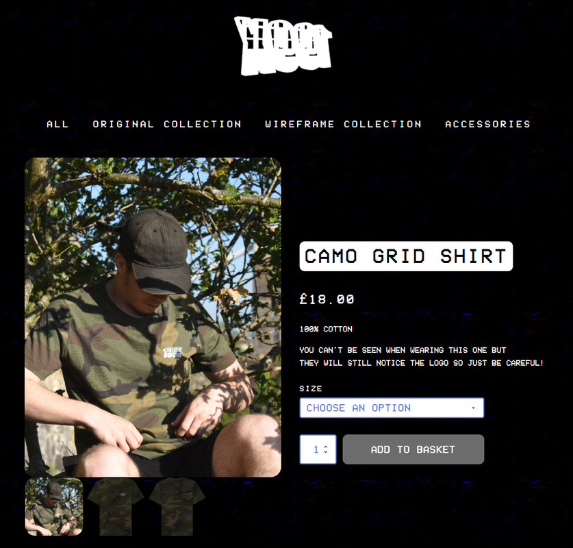
Camo Grid Shirt Design
For my second shirt, I wanted to make something more interesting while still making a shirt that only has the logo in the top left corner. On the website I found to make the shirts - I saw a camouflage print shirt and so I decided to make this my second design.
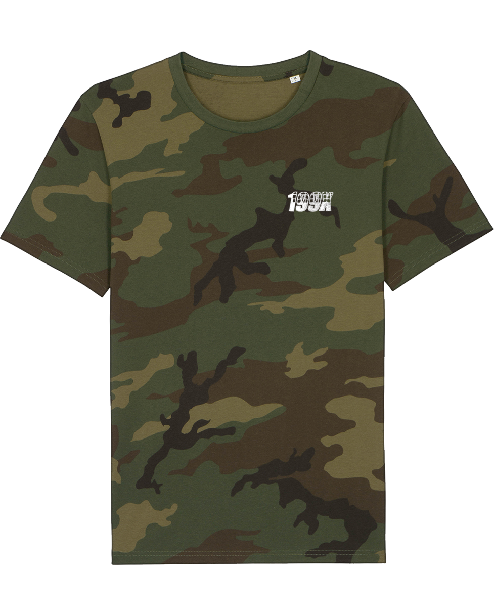
|
|
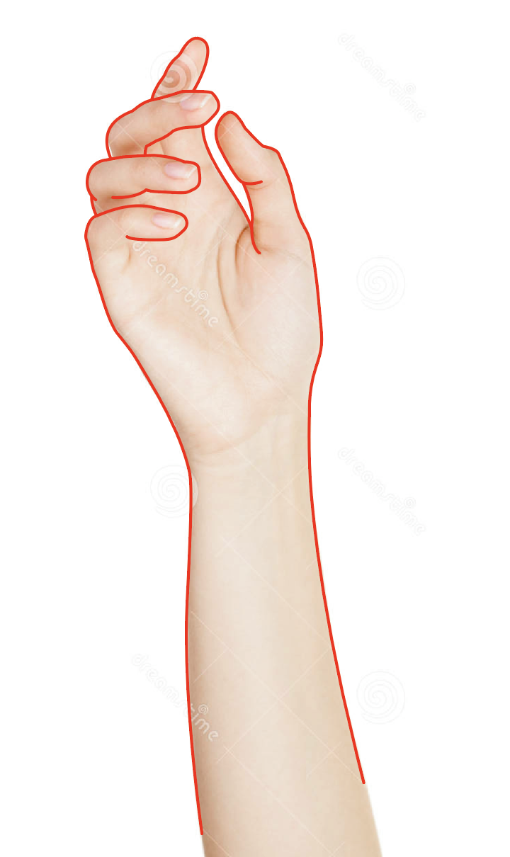
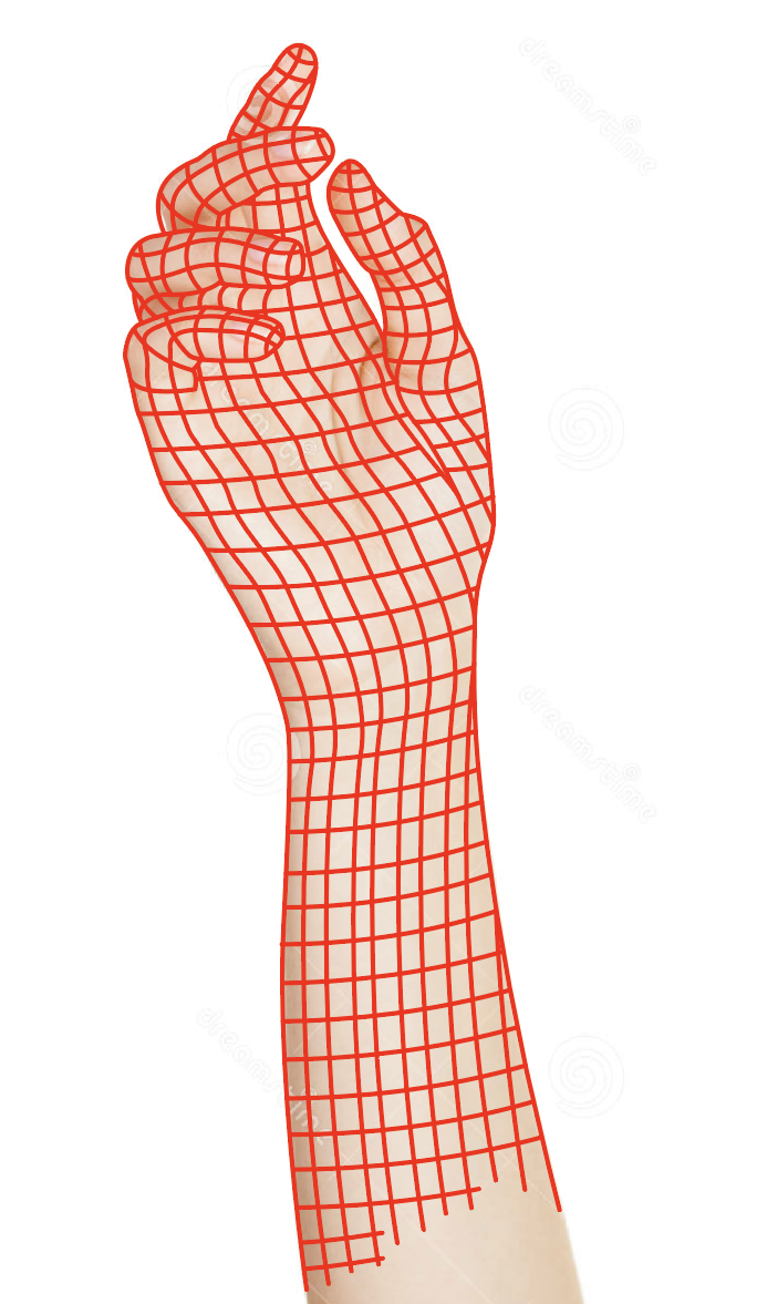
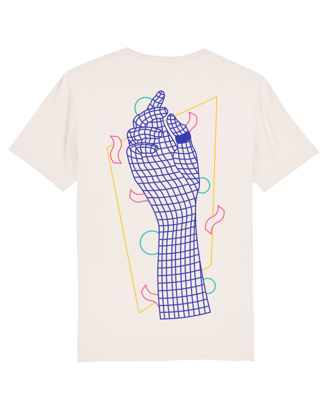
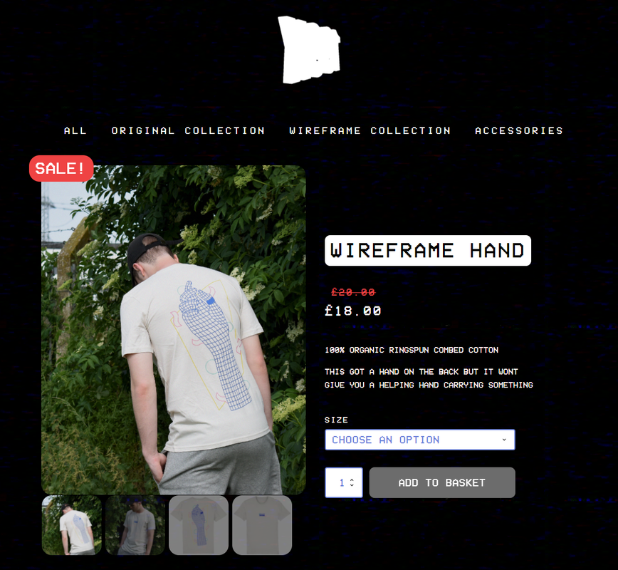
Wireframe Hand Shirt Design
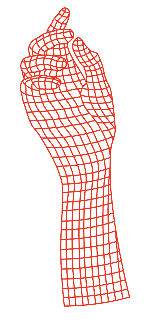
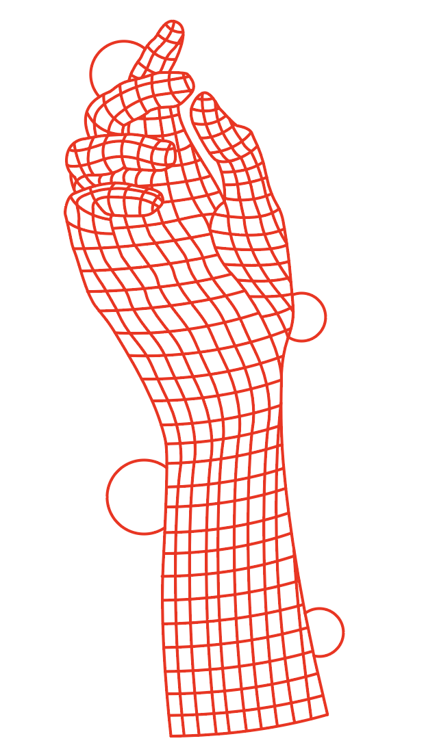
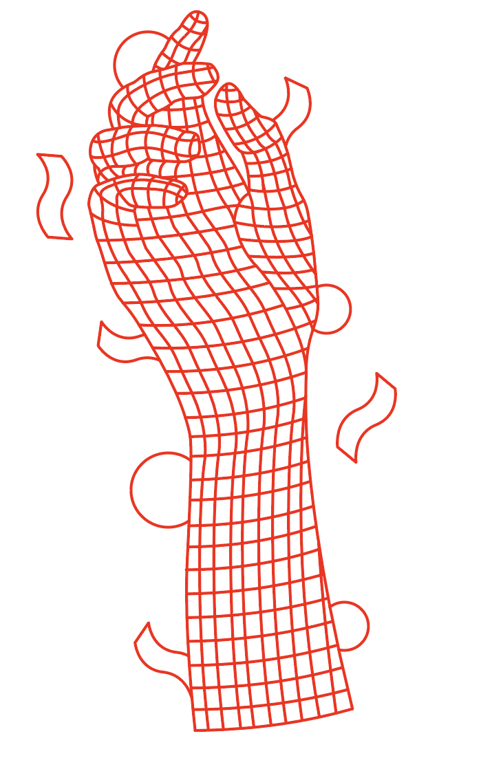
My first collection would be called 'Wireframe Collection" as inspired by the 80s and 90s Wireframe used on computers in graphics. So for my first shirt design in this collection - I wanted a hand to put up and so I found an image on the internet of which to create this illustration. I began drawing around the hand and then making the grid style squares all over the hand.
|
|
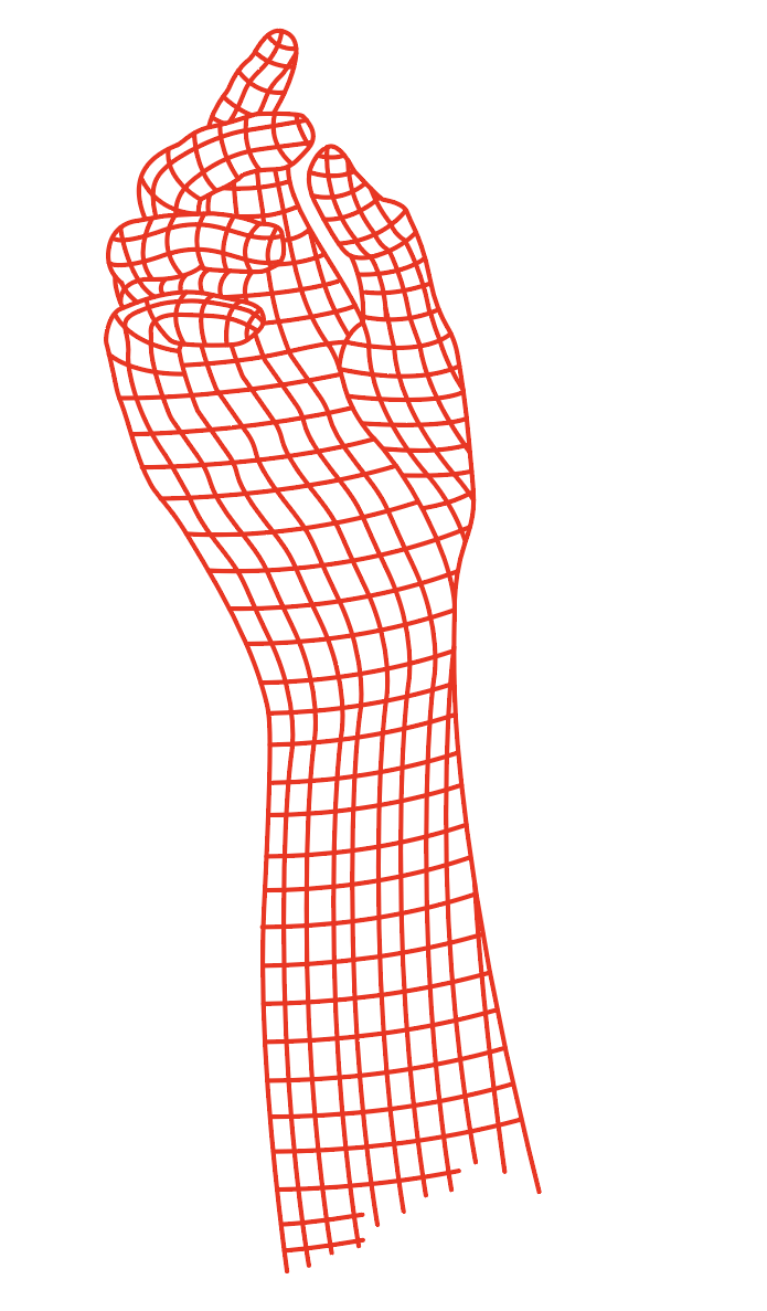
|
|
|
|
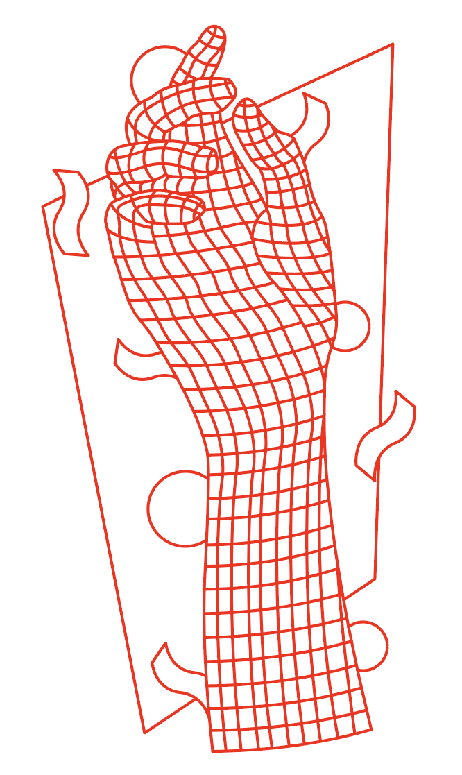
|
|
|
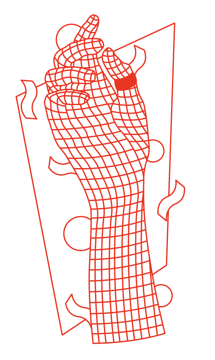
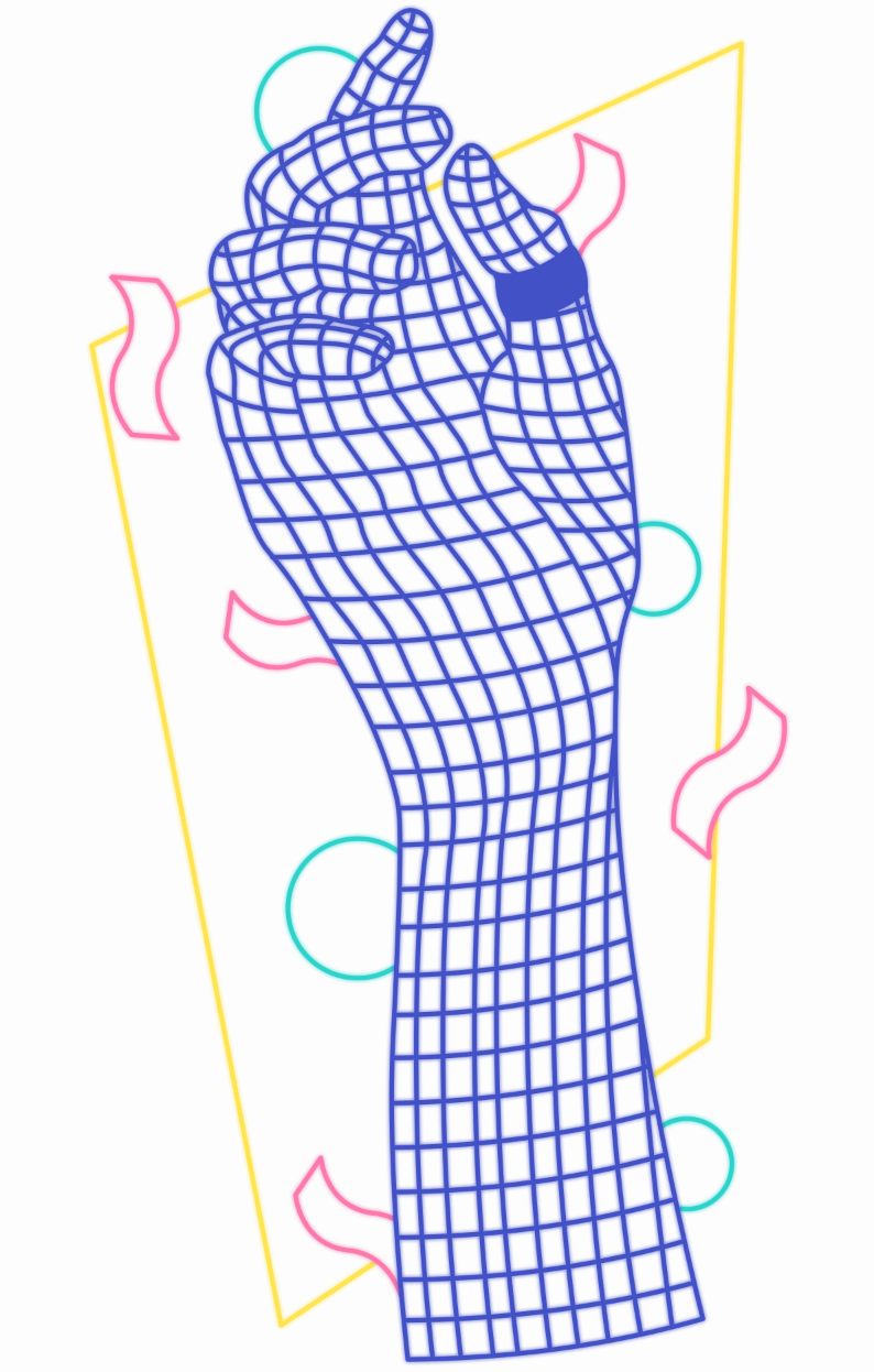
Once I liked the design of the hand along with the shapes, I went into Photoshop and worked on adding colours to make the design more interesting. This would be the big design that would go on the back.
I also made a front design for the shirt which was the logo along with the shapes. 
|
|
I then made a mockup with a "Vintage White" t-shirt colour.
|
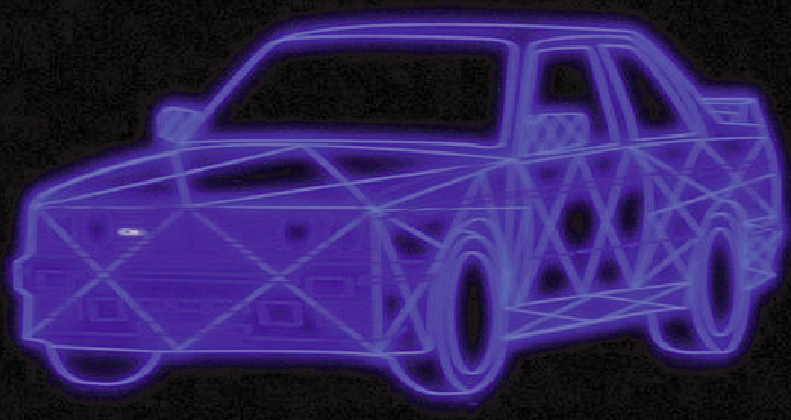
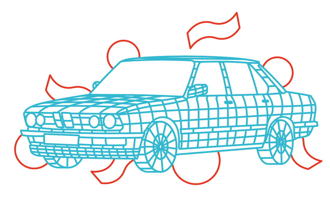
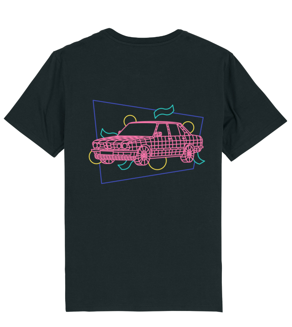
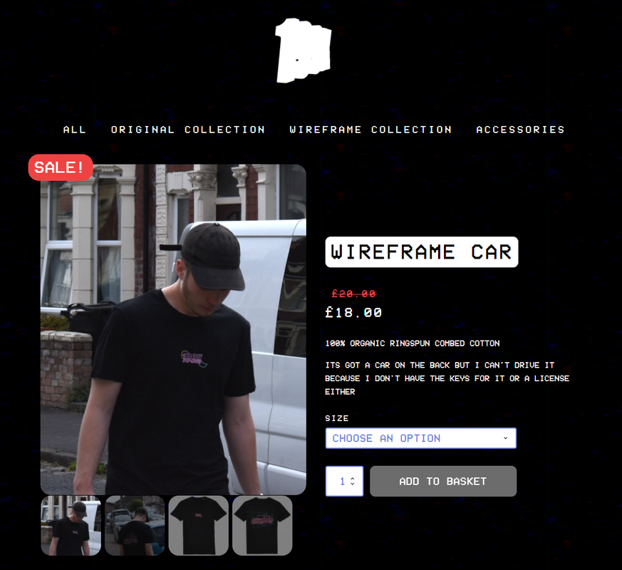
Wireframe Car Shirt Design
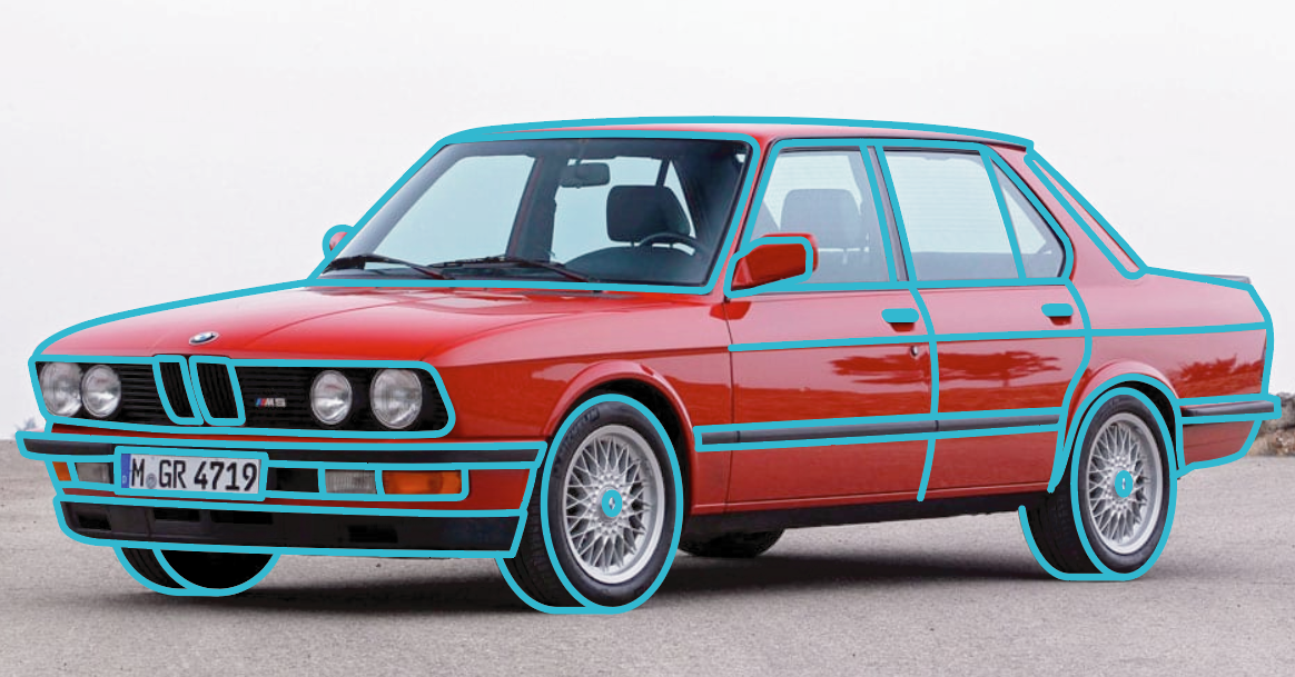
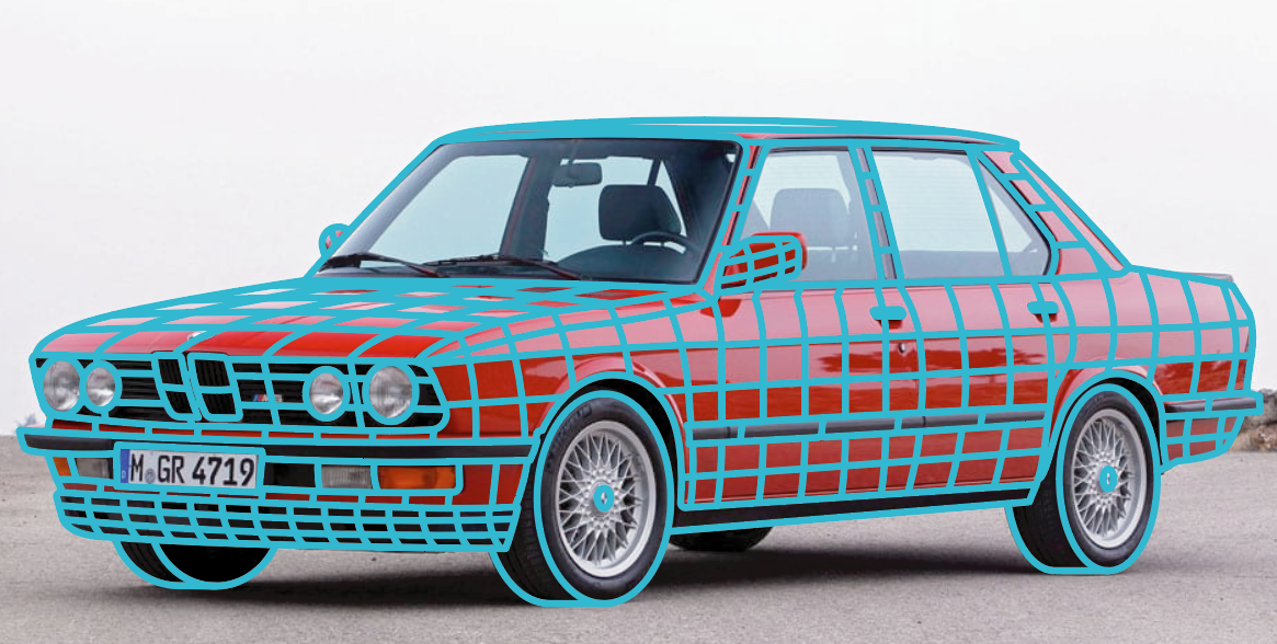
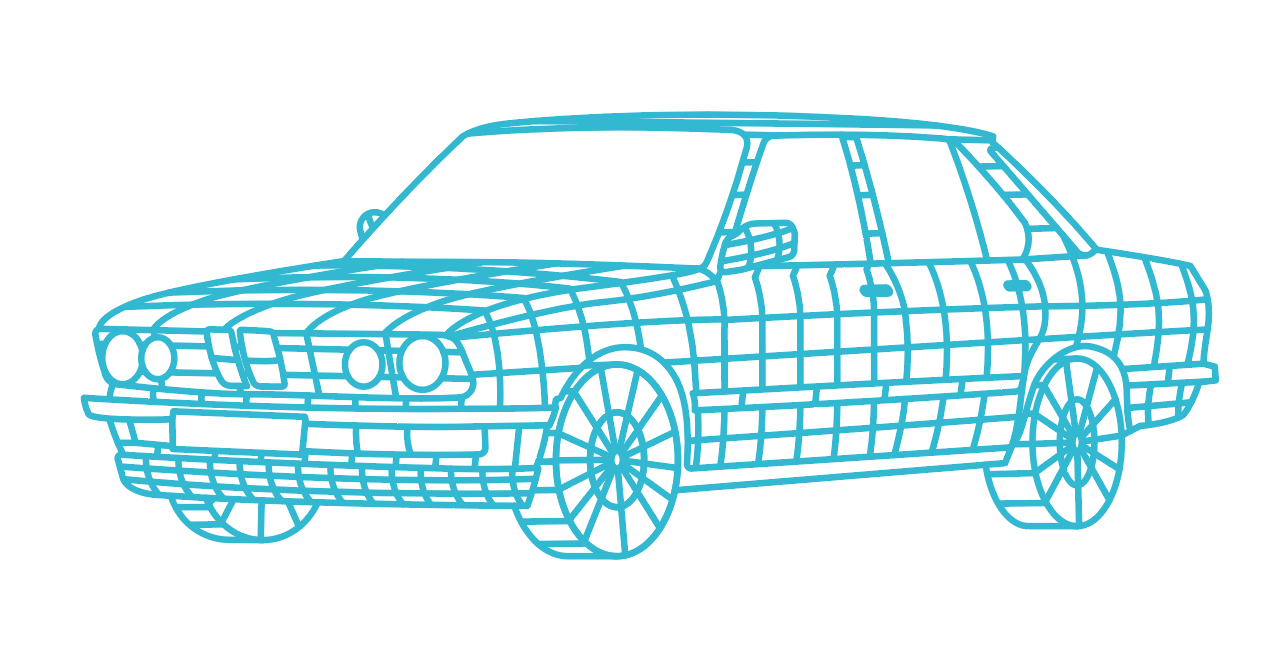
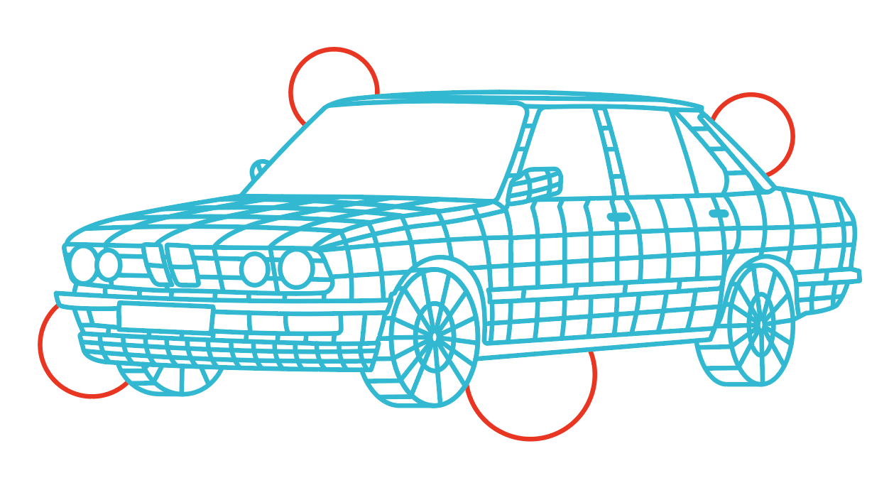
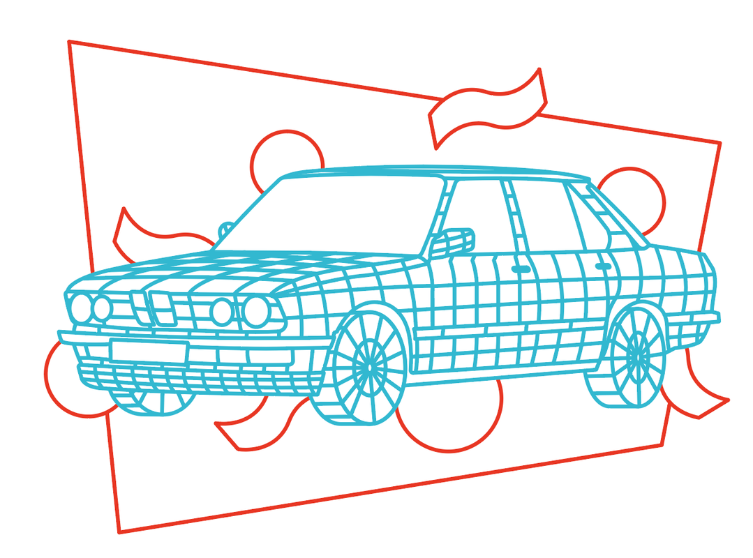
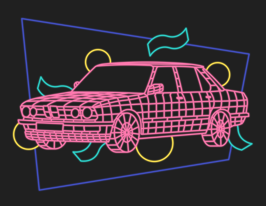
For my second Wireframe Collection Shirt - I was inspired by this image I found on pinterest and wanted to make something similar to it for the back design. I began by slowly making an outline of a car in Adobe Illustrator, I liked from the 80's. Making the shapes I had previously used and finishing the colours I had used.
|
|
|
|
|
|
Then moving to Photoshop to add the colours.
|
I then made the mockups of the design on a darker t-shirt to show what the product would look like.
|
Promotional Photograph
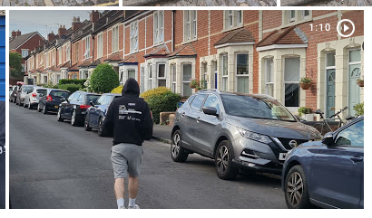
To finish off, I ordered the finished products to be able to take promotional photography. This would then be displayed on social media as well as used on the website.
I then picked out the best images to feature on the pages and edited these to fit them into the product pages.
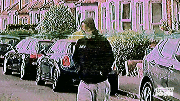
To finish off, I made a video to be displayed in the banner of the website and used on social media. To achieve this - I made a few simple short clips of me walking and then applied a VHS filter on top. I edited these short videos in Sony Vegas Pro and then created this into a simple gif.
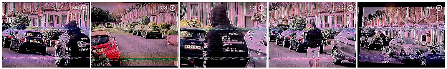
This was the final outcome of the short gif that I was able to create.
| Final Major Project Design Report |
