FORMAL ELEMENTS WORKSHOP
Task 1
My first task in this workshop was to analyse the images I was given with appropriate subject terminology.
My first task in this workshop was to analyse the images I was given with appropriate subject terminology.
|
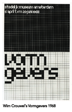
This image uses a simple monochrome theme with a grid layout for placement. The title of the image 'Vormgevers' is included towards the near bottom of the image and uses negative space and subtraction for the type's colour. There is a sense of order and harmony as all these 'squares' or 'blocks' are all lined up and are in order so there is some kind of structure involved - tessellation. |
|
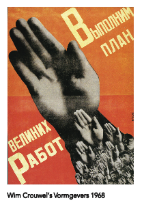
This poster uses a lot of repetition of the hand. This poster refers to 'getting the plan done' and 'willing to work' which is reflected in the focal point of the hands all being raised as if to say they are ready to achieve this. The font used for the words is a strong, bold and sans serif font to suggest seriousness and matches the style of the posters context. The font is in a colour that is lighter than the orange background however, still sticking to the orange theme whereas the collage of hands is monochrome.
|
|
|
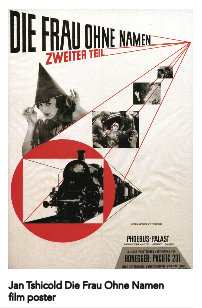
This film poster uses a colour theme that is red along with black and white. The main and first focal point is the red circle around the train which stands out from the rest - mostly black and white - poster. This drags the attention of the viewer. The positioning of the rest of the images is placed within the lines that are slowly going into each other as if an expanding image from one single point. The type also fits in these lines. The use of black is a perfect contrast with the white background of the poster which makes the viewer understand the poster and read it. There is a sense of unity and harmony as everything is hierarchy, alignment however it does feel like there is some kind of movement.
|
|
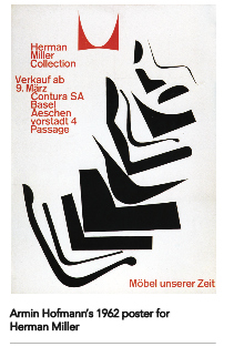
Similar to the poster above, the poster once again uses red along with black and white for its colour scheme. The focal point is the big object in the middle of the poster that is made up many black objects that are very close to each other. Each object is different and creates a sense of disharmony and randomness. This contrasts with the use of typography that is a simple sans serif font that uses structure and contains order. This typography is in red to stand out from the black illustration in the middle of the poster however has no real alignment to the black illustration.
|
|
|
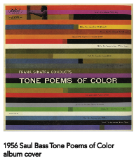
This album cover art by Saul Bass contains a lot of colour with repetition of the use of lines. I feel like there is no focal point that stands out as there are many colours that mix and also stand out so nothing specifically catches the eye. Despite this, there is still a sense of structure due to tessellation of the colourful lines and the placement of the typography being within the colourful bars. The use of colour matches perfect with the title of the album as the "tone poems of colour" is reflected with the use of colours and tones of each colour in each bar with no gradients being present.
|
Task 2
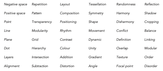
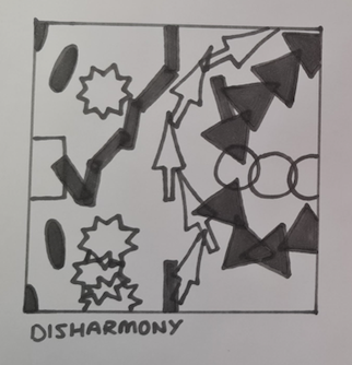
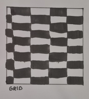
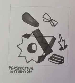
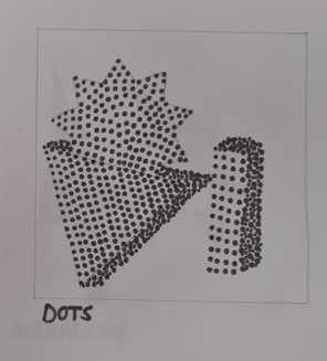
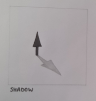
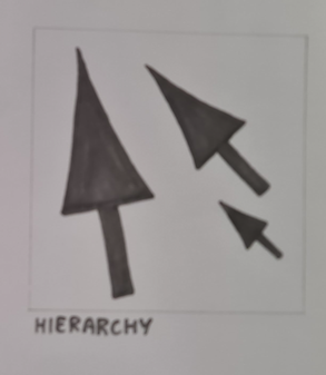
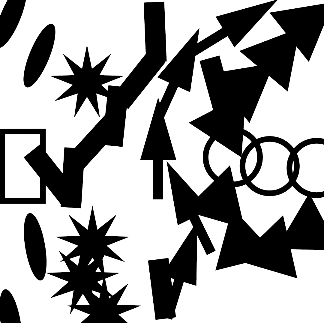
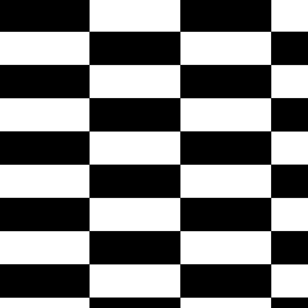
My second task in this workshop was to create a range of compositions that explore the elements from a given list.
My second task in this workshop was to create a range of compositions that explore the elements from a given list.
|
|
|
|
|
|
Task 3
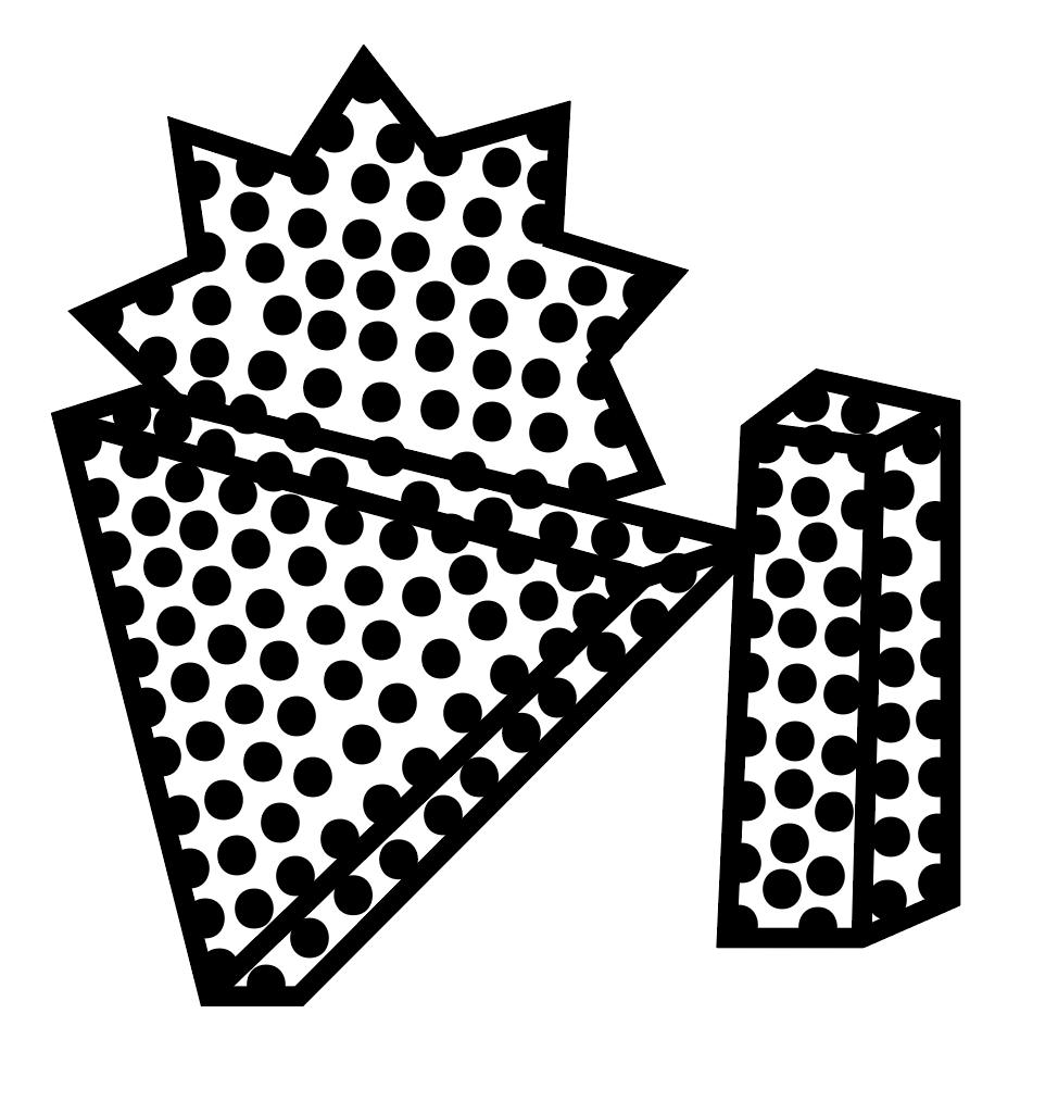
My final task in this workshop was to recreate the previous compositions above into Adobe Illustrator to make them look more professional and neat.
My final task in this workshop was to recreate the previous compositions above into Adobe Illustrator to make them look more professional and neat.
|
|

|
|

|

|
